.NET MAUI Chat Buttons Styling
This section describes how to style the send, more and speech to text buttons inside the RadChat control.
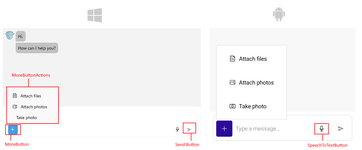
Style the Send Button
To customize the icon of the send button, use the SendMessageButtonImage (ImageSource) property.
The example below shows how to customize the Send button in your Chat control.
<FontImageSource x:Key="SendIconSource"
                 FontFamily="Your font family name"
                 Glyph="icon code"
                 Color="Black"
Size="16" /> <telerik:RadChat x:Name="chat"
SendMessageButtonImage="{StaticResource SendIconSource}"/>To style the send button, set RadChat.InputAreaStyle to a Style targeting Telerik.Maui.Controls.RadPromptInput and, within that style, set SendButtonStyle (Style with target type Telerik.Maui.Controls.RadTemplatedButton).
Style the More Button
The More button provides additional options for the user, such as attaching files or accessing other functionalities.
You can configure and style the More button using the following properties:
-
IsMoreButtonVisible(bool) property controls the visibility of the more button. The default value isfalse. -
AutoGenerateMoreButtonActions(bool)—Defines whether to automatically generate default actions for the More button. The default value istrue. -
MoreButtonActions(IList<PromptInputButtonAction>)—Defines the actions that appear when the More button is tapped. -
Style the More button using the
MoreButtonStyle(Stylewith target typeTelerik.Maui.Controls.RadDropDownButton) property. -
Use
MoreButtonActionItemViewStyle(Stylewith target typeTelerik.Maui.Controls.RadTemplatedButton) to style the action items inside the More button dropdown.
Style the SpeechToTextButton
To configure the SpeechToTextButton, use the following properties:
-
IsSpeechToTextButtonVisible(bool) property controls the visibility of the SpeechToTextButton. By default, the button is visible on Android, iOS and MacCatalyst and not visible on Windows. Review the [Speech to Text on Windows](%slug speechtotextbutton-winui-support%) article for more information on how to set up this feature on Windows. -
SpeechToTextButtonStyle(Stylewith target typeTelerik.Maui.Controls.RadSpeechToTextButton) property is used to style the SpeechToTextButton.