.NET MAUI Chat Attachments Styling
Any change in the appearance of the RadChat components depends on the referenced styles.
When working with attachments, you need to grant permissions to access the device camera and device external storage. For more details, review the Microsoft Media Picker article.
Style the Attachments in the Input Area
The Telerik UI for .NET MAUI Chat control allows you to customize the appearance of the attachments in the input area, by using the ChatInputAreaAttachedFileItemView as implicit style. The ChatInputAreaAttachedFileItemView exposes the following properties for customization:
ImageStyle(Stylewith target typeImage)—Defines the style of the icon of the attached file.SubtitleStyle(Stylewith target typeLabel)—Defines the style of the label representing the size of the attached file.TitleStyle(Stylewith target typeLabel)—Defines the style of the label representing the name of the attached file.RemoveButtonStyle(Stylewith target typeRadTemplatedButton)—Defines the style of the remove button used to remove the attached file from the input area.
Here is an example for styling the attachments in the messages:
<Style TargetType="telerik:PromptInputAttachedFileItemView">
    <Setter Property="TitleStyle">
        <Setter.Value>
            <Style TargetType="Label">
                <Setter Property="FontAttributes" Value="Italic" />
            </Style>
        </Setter.Value>
    </Setter>
    <Setter Property="RemoveButtonStyle">
        <Setter.Value>
            <Style TargetType="telerik:RadTemplatedButton">

            </Style>
        </Setter.Value>
    </Setter>
    <Setter Property="ImageStyle">
        <Setter.Value>
            <Style TargetType="Image">
                <Setter Property="Source" Value="{Binding AttachedFile.FileName, Source={RelativeSource Mode=TemplatedParent}, Converter={StaticResource ChatFileExtensionToImageSourceConverter}}" />
            </Style>
        </Setter.Value>
    </Setter>
</Style>
And the needed converter for the images inside the attachments icon in the input area:
<telerik:ChatFileExtensionToImageSourceConverter x:Key="ChatFileExtensionToImageSourceConverter">
    <telerik:ChatFileExtensionToImageSourceConverter.FallbackValue>
        <FontImageSource FontFamily="{Static telerik:TelerikFont.Name}"
                         Glyph="{Static telerik:TelerikFont.IconFile}"
                         Size="16"
                         Color="#F18900" />
    </telerik:ChatFileExtensionToImageSourceConverter.FallbackValue>
    <telerik:ChatFileExtensionToImageSourceConverterItem FileExtensions=".pdf, .doc, .docx, .pptx">
        <telerik:ChatFileExtensionToImageSourceConverterItem.ImageSource>
            <FontImageSource FontFamily="{Static telerik:TelerikFont.Name}"
                             Glyph="{Static telerik:TelerikFont.IconGallery}"
                             Size="16"
                             Color="#8660C5" />
        </telerik:ChatFileExtensionToImageSourceConverterItem.ImageSource>
    </telerik:ChatFileExtensionToImageSourceConverterItem>
    <telerik:ChatFileExtensionToImageSourceConverterItem FileExtensions=".png, .jpg, .bmp, .jpeg">
        <telerik:ChatFileExtensionToImageSourceConverterItem.ImageSource>
            <FontImageSource FontFamily="{Static telerik:TelerikFont.Name}"
                             Glyph="{Static telerik:TelerikFont.IconImage}"
                             Size="16"
                             Color="#80CBC4" />
        </telerik:ChatFileExtensionToImageSourceConverterItem.ImageSource>
    </telerik:ChatFileExtensionToImageSourceConverterItem>
</telerik:ChatFileExtensionToImageSourceConverter>
This is the result:
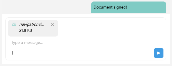
For a runnable example with Styling the Chat Attachments in the Input Area, see the SDKBrowser Demo Application and go to Chat > Features category.
Style the Attachments in the Messages
To customize the appearance of the attachments in the messages, you can use the ChatAttachmentsMessageView as an implicit style. The ChatAttachmentsMessageView exposes the following properties for customization:
BorderStyle(Stylewith target typeRadBorder)—Defines the style of the border of the message with the attachments.LabelStyle(Stylewith target typeLabel)—Defines the style of the label in the attached messages.AttachmentsListViewStyle(Stylewith target typeChatMessageAttachmentsListView)—Defines the style of the list view containing the attached files in the message. The properties for customizing the list view are:DownloadAllButtonStyle(Stylewith target typeRadTemplatedButton)—Defines the style for the Download All button used to download all attached files in the message.AttachmentStyle(Stylewith target typeChatMessageAttachmentView)—Defines the style of the entire attachment view in the attachments message.ImageStyle(Stylewith target typeImage)—Defines the style of the icon of the attached file in the message area.SubtitleStyle(Stylewith target typeLabel)—Defines the style of the label representing the size of the attached file in the message area.TitleStyle(Stylewith target typeLabel)—Defines the style of the label representing the name of the attached file in the message area.ActionsViewStyle(Stylewith target typeChatMessageAttachmentActionsView)—Defines the style of the actions view containing the download and remove buttons for the attached file in the message area. The properties for customizing the actions view are:MenuButtonStyle(Stylewith target typeImage)—the custom image style that represents the attachment icon.
In addition, you can style the incoming and outgoing attachments messages separately targeting the following implicit styles:
-
ChatIncomingAttachmentsMessageView—Represents all incoming attachments messages. -
ChatIncomingFirstAttachmentsMessageView—Represents a view that visualizes the first incoming attachments message, out of a few consecutive messages from the same author. -
ChatIncomingMiddleAttachmentsMessageView—Represents a view that visualizes the middle incoming attachments message, out of a few consecutive messages from the same author. -
ChatIncomingLastAttachmentsMessageView—Represents a view that visualizes the last incoming attachments message, out of a few consecutive messages from the same author. -
ChatIncomingSingleAttachmentsMessageView—Represents a view that visualizes a single incoming attachments message, out of a few consecutive messages from the same author. -
ChatOutgoingAttachmentsMessageView—Represents all outgoing attachments messages. -
ChatOutgoingFirstAttachmentsMessageView—Represents a view that visualizes the first outgoing attachments message, out of a few consecutive messages from the same author. -
ChatOutgoingMiddleAttachmentsMessageView—Represents a view that visualizes the middle outgoing attachments message, out of a few consecutive messages from the same author. -
ChatOutgoingLastAttachmentsMessageView—Represents a view that visualizes the last outgoing attachments message, out of a few consecutive messages from the same author. -
ChatOutgoingSingleAttachmentsMessageView—Represents a view that visualizes a single outgoing attachments message, out of a few consecutive messages from the same author.
Use the properties listed for the ChatAttachmentsMessageView for the customization of the incoming and outgoing attachments messages.
Here is an example for styling the ChatAttachmentsMessageView and ChatOutgoingAttachmentsMessageView:
<VisualStateGroupList x:Key="ChatOutgoingMessageAttachmentsDropDownMenuButtonVisualStates">
    <VisualStateGroup Name="CommonStates">
        <VisualState Name="Normal" />
        <VisualState Name="Focused" />
        <VisualState Name="PointerOver">
            <VisualState.Setters>
                <Setter Property="telerik:RadDropDownButton.Background" Value="#EBEBEB" />
            </VisualState.Setters>
        </VisualState>
        <VisualState Name="FocusedMouseOver">
            <VisualState.Setters>
                <Setter Property="telerik:RadDropDownButton.Background" Value="#EBEBEB" />
            </VisualState.Setters>
        </VisualState>
        <VisualState Name="Opened">
            <VisualState.Setters>
                <Setter Property="telerik:RadDropDownButton.Background" Value="#D6D6D6" />
            </VisualState.Setters>
        </VisualState>
    </VisualStateGroup>
</VisualStateGroupList>
<Style x:Key="OutgoingAttachmentImageStyle" TargetType="Image">
    <Setter Property="Source" Value="{Binding Attachment.FileName, Source={RelativeSource Mode=TemplatedParent}, Converter={StaticResource ChatOutgoingFileExtensionToImageSourceConverter}}" />
</Style>
<Style x:Key="OutgoingChatMessageAttachmentDropDownMenuButtonStyle" TargetType="telerik:RadDropDownButton">
    <Setter Property="TextColor" Value="#000000" />
    <Setter Property="VisualStateManager.VisualStateGroups" Value="{StaticResource ChatOutgoingMessageAttachmentsDropDownMenuButtonVisualStates}" />
</Style>
<Style x:Key="OutgoingAttachmentActionsViewStyle" TargetType="telerik:ChatMessageAttachmentActionsView">
    <Setter Property="MenuButtonStyle" Value="{StaticResource OutgoingChatMessageAttachmentDropDownMenuButtonStyle}" />
</Style>

<Style x:Key="OutgoingMessageAttachmentStyle" TargetType="telerik:ChatMessageAttachmentView">
    <Setter Property="ImageStyle" Value="{StaticResource OutgoingAttachmentImageStyle}" />
    <Setter Property="TitleStyle">
        <Setter.Value>
            <Style TargetType="Label">
                <Setter Property="TextColor" Value="Black" />
            </Style>
        </Setter.Value>
    </Setter>
    <Setter Property="SubtitleStyle">
        <Setter.Value>
            <Style TargetType="Label">
                <Setter Property="TextColor" Value="Black" />
            </Style>
        </Setter.Value>
    </Setter>
    <Setter Property="ActionsViewStyle" Value="{StaticResource OutgoingAttachmentActionsViewStyle}" />
</Style>

<Style x:Key="DownloadButtonStyle" TargetType="telerik:RadTemplatedButton" >
    <Setter Property="TextColor" Value="Black" />
    <Setter Property="VisualStateManager.VisualStateGroups">
        <VisualStateGroupList>
            <VisualStateGroup Name="CommonStates">
                <VisualState Name="Normal" />
                <VisualState Name="Focused" />
                <VisualState Name="MouseOver">
                    <VisualState.Setters>
                        <Setter Property="BackgroundColor" Value="#EBEBEB" />
                    </VisualState.Setters>
                </VisualState>
                <VisualState Name="FocusedMouseOver">
                    <VisualState.Setters>
                        <Setter Property="BackgroundColor" Value="#EBEBEB" />
                    </VisualState.Setters>
                </VisualState>
                <VisualState Name="Pressed">
                    <VisualState.Setters>
                        <Setter Property="TextColor" Value="{DynamicResource RadOnPrimaryColorAlpha80}" />
                        <Setter Property="BackgroundColor" Value="#D6D6D6" />
                    </VisualState.Setters>
                </VisualState>
                <VisualState Name="FocusedPressed">
                    <VisualState.Setters>
                        <Setter Property="TextColor" Value="{DynamicResource RadOnPrimaryColorAlpha80}" />
                        <Setter Property="BackgroundColor" Value="#D6D6D6" />
                    </VisualState.Setters>
                </VisualState>
                <VisualState Name="Disabled">
                    <VisualState.Setters>
                        <Setter Property="TextColor" Value="#FFFFFF" />
                    </VisualState.Setters>
                </VisualState>
            </VisualStateGroup>
        </VisualStateGroupList>
    </Setter>
</Style>

<Style x:Key="OutgoingAttachmentsListViewStyle" TargetType="telerik:ChatMessageAttachmentsListView">
    <Setter Property="AttachmentStyle" Value="{StaticResource OutgoingMessageAttachmentStyle}" />
    <Setter Property="DownloadAllButtonStyle" Value="{StaticResource DownloadButtonStyle}" />
</Style>
<Style TargetType="telerik:ChatOutgoingAttachmentsMessageView" ApplyToDerivedTypes="True">
    <Setter Property="BorderStyle">
        <Setter.Value>
            <Style TargetType="telerik:RadBorder">
                <Setter Property="BackgroundColor" Value="#80CBC4" />
            </Style>
        </Setter.Value>
    </Setter>
    <Setter Property="LabelStyle">
        <Setter.Value>
            <Style TargetType="Label">
                <Setter Property="TextColor" Value="Black" />
            </Style>
        </Setter.Value>
    </Setter>
    <Setter Property="AttachmentsListViewStyle" Value="{StaticResource OutgoingAttachmentsListViewStyle}" />
</Style>

<Style TargetType="telerik:ChatAttachmentsMessageView" ApplyToDerivedTypes="True">
    <Setter Property="BorderStyle">
        <Setter.Value>
            <Style TargetType="telerik:RadBorder">
                <Setter Property="BackgroundColor" Value="#80CBC4" />
            </Style>
        </Setter.Value>
    </Setter>
    <Setter Property="LabelStyle">
        <Setter.Value>
            <Style TargetType="Label">
                <Setter Property="TextColor" Value="Black" />
            </Style>
        </Setter.Value>
    </Setter>
</Style>
And the needed converter for the attachments icon inside the messages area:
<telerik:ChatFileExtensionToImageSourceConverter x:Key="ChatOutgoingFileExtensionToImageSourceConverter">
    <telerik:ChatFileExtensionToImageSourceConverter.FallbackValue>
        <FontImageSource FontFamily="{Static telerik:TelerikFont.Name}"
                         Glyph="{Static telerik:TelerikFont.IconFile}"
                         Size="16"
                         Color="#000000" />
    </telerik:ChatFileExtensionToImageSourceConverter.FallbackValue>
    <telerik:ChatFileExtensionToImageSourceConverterItem FileExtensions=".pdf, .doc, .docx, .pptx">
        <telerik:ChatFileExtensionToImageSourceConverterItem.ImageSource>
            <FontImageSource FontFamily="{Static telerik:TelerikFont.Name}"
                             Glyph="{Static telerik:TelerikFont.IconGallery}"
                             Size="16"
                             Color="#000000" />
        </telerik:ChatFileExtensionToImageSourceConverterItem.ImageSource>
    </telerik:ChatFileExtensionToImageSourceConverterItem>
    <telerik:ChatFileExtensionToImageSourceConverterItem FileExtensions=".png, .jpg, .bmp, .jpeg">
        <telerik:ChatFileExtensionToImageSourceConverterItem.ImageSource>
            <FontImageSource FontFamily="{Static telerik:TelerikFont.Name}"
                             Glyph="{Static telerik:TelerikFont.IconImage}"
                             Size="16"
                             Color="#000000" />
        </telerik:ChatFileExtensionToImageSourceConverterItem.ImageSource>
    </telerik:ChatFileExtensionToImageSourceConverterItem>
</telerik:ChatFileExtensionToImageSourceConverter>
This is the result:
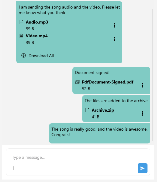
For a runnable example with Styling the Chat Attachments in the Messages, see the SDKBrowser Demo Application and go to Chat > Features category.