Kendo UI for jQuery Dialog Overview
Updated on Dec 10, 2025
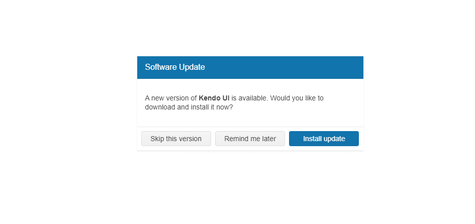
The Dialog is a modal popup that brings information to the user.
 Start Free Trial
The component also provides actions through its action buttons to prompt the user for input or to ask for a decision. The Dialog can also contain more complex UI elements that require the focus of the user.
The Dialog is a subset of the Kendo UI for jQuery Window where the most prominent difference is the added functionality for actions and predefined dialogs.
Functionality and Features
- Basic operations—The jQuery Dialog enables you to perform basic operations such as opening, closing, and destroying the component.
- Predefined Dialog types—You can seamlessly integrate the predefined Dialog types and implement alert, prompt, and confirm dialogs for common use cases in your project.
- Action buttons—The Dialog can also render action buttons, such as OK and Cancel, and allows you to define custom actions for each button.
- Printing—You can also add a printing functionality to the Dialog component and enable the user to print its content.
- Appearance—The Dialog allows you to customize its appearance by setting CSS classes, templates, and other styling options.
Next Steps
- Getting Started with the Kendo UI Dialog for jQuery
- Dialog Overview (Demo)
- Using the API of the Dialog (Demo)