Blazor Expander control

1 Answer 12 Views
Card General Discussions
Joel
Top achievements
Rank 2
Iron
Iron
Iron
Joel asked on 14 May 2025, 10:15 PM
I'm trying to replicate the Expander that you have in your AspNetCore.  I'm attempting to do it with a TelerikCard then the Drawer.  Whatever help you can give would be appreciated.

What I'm trying to replicate:


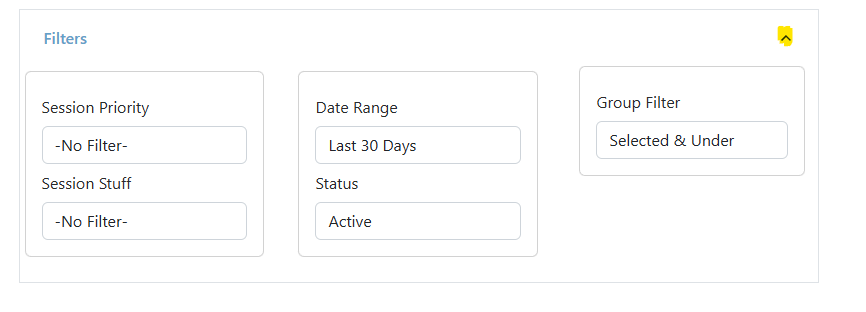
So, I got close using the card.  Starting with the Header, I need to align the Telerik button to the right.  Then, when I push the button, I need it to toggle the CardBody open/closed.
            <TelerikCard>
                <CardHeader Class="gsi-border-width-0 gsi-border-color-white">
                    <TelerikStackLayout Orientation="StackLayoutOrientation.Horizontal">
                        <h5>Filter</h5>

                        <TelerikButton Id="filterChevronButton" FillMode="Clear" Class="gsi-border-width-0 gsi-border-color-white"
                                       Icon="@( FilterVisible? Telerik.SvgIcons.SvgIcon.ChevronUp : Telerik.SvgIcons.SvgIcon.ChevronDown)" />

                    </TelerikStackLayout>
                </CardHeader>
                <CardBody>
                    <TelerikStackLayout Spacing="5px">
                        <TelerikCard Width="33vh">
                            <CardBody>
                                A
                            </CardBody>
                        </TelerikCard>
                        <TelerikCard Width="33vh">
                            <CardBody>
                                B
                            </CardBody>
                        </TelerikCard>
                        <TelerikCard Width="34vh">
                            <CardBody>
                                C
                            </CardBody>
                        </TelerikCard>
                    </TelerikStackLayout>
                </CardBody>
            </TelerikCard>

Drawer, which looks interesting, but didn't have any success.
            <TelerikDrawer MiniMode="false">
                <DrawerContent>

                    <DrawerItem>
                        <TelerikCard Width="33vh">
                            <CardBody>
                                A
                            </CardBody>
                        </TelerikCard>
                    </DrawerItem>

                    <DrawerItem>
                        <TelerikCard Width="33vh">
                            <CardBody>
                                A
                            </CardBody>
                        </TelerikCard>
                    </DrawerItem>

                    <DrawerItem>
                        <TelerikCard Width="33vh">
                            <CardBody>
                                A
                            </CardBody>
                        </TelerikCard>
                    </DrawerItem>

                </DrawerContent>
            </TelerikDrawer>

1 Answer, 1 is accepted

Sort by
1
Dimo
Telerik team
answered on 15 May 2025, 06:11 AM | edited on 15 May 2025, 06:18 AM

Hello Joel,

You can consider the code examples on these pages:

If you prefer the Card, you can render the CardBody conditionally.

The Drawer is not a suitable option in this case.

<TelerikCard>
    <CardHeader Class="gsi-border-width-0 gsi-border-color-white">
        <div style="display:flex;justify-content:space-between;">
            <h5>Filter</h5>

            <TelerikButton Id="filterChevronButton" FillMode="Clear" Class="gsi-border-width-0 gsi-border-color-white"
                           OnClick="@( () => FilterVisible = !FilterVisible)"
                           Icon="@( FilterVisible? Telerik.SvgIcons.SvgIcon.ChevronUp : Telerik.SvgIcons.SvgIcon.ChevronDown)" />
        </div>
    </CardHeader>

    @if (FilterVisible)
    {
        <CardBody>
            <TelerikStackLayout Spacing="5px">
                <TelerikCard Width="33vh">
                    <CardBody>
                        A
                    </CardBody>
                </TelerikCard>
                <TelerikCard Width="33vh">
                    <CardBody>
                        B
                    </CardBody>
                </TelerikCard>
                <TelerikCard Width="34vh">
                    <CardBody>
                        C
                    </CardBody>
                </TelerikCard>
            </TelerikStackLayout>
        </CardBody>
    }

</TelerikCard>

@code {
    private bool FilterVisible { get; set; }
}


Regards,
Dimo
Progress Telerik

Love the Telerik and Kendo UI products and believe more people should try them? Invite a fellow developer to become a Progress customer and each of you can get a $50 Amazon gift voucher.

Joel
Top achievements
Rank 2
Iron
Iron
Iron
commented on 15 May 2025, 02:56 PM

So, this is interesting if you like the "popup" look.  This exposes A, B, C over the content below it.  However, I'm going to try the other solution because the Expander would push the rest of the content down.


                <TelerikCard>
                    <CardBody>

                        <div style="display:flex;justify-content:space-between;">

                            <h5 class="gsi-color gsi-margin-0 gsi-padding-5">Filters</h5>
                            <TelerikButton Id="filterChevronButton"
                                           FillMode="Clear"
                                           Class="gsi-border-width-0 gsi-border-color-white"
                                           Icon="@( FilterVisible? Telerik.SvgIcons.SvgIcon.ChevronUp : Telerik.SvgIcons.SvgIcon.ChevronDown)"
                                           OnClick="@ExpandCollapse" />

                        </div>

                    </CardBody>
                </TelerikCard>
                <TelerikAnimationContainer @ref="@AnimContainer" Width="100%" Height="100vm">
                    <TelerikStackLayout Spacing="5px">
                        <TelerikCard Width="33vh">
                            <CardBody>
                                A
                            </CardBody>
                        </TelerikCard>
                        <TelerikCard Width="33vh">
                            <CardBody>
                                B
                            </CardBody>
                        </TelerikCard>
                        <TelerikCard Width="34vh">
                            <CardBody>
                                C
                            </CardBody>
                        </TelerikCard>
                    </TelerikStackLayout>
                </TelerikAnimationContainer>

Joel
Top achievements
Rank 2
Iron
Iron
Iron
commented on 15 May 2025, 09:58 PM

The PanelBar doesn't work without bindings.  I have comboboxes/selections so that doesn't seem to be an option.
Dimo
Telerik team
commented on 16 May 2025, 05:54 AM | edited

The overlapping is caused by the AninationContainer, which uses absolute positioning. Here is an example that works without it:

https://blazorrepl.telerik.com/cfEfbUuJ54rNy1fP20

Joel
Top achievements
Rank 2
Iron
Iron
Iron
commented on 16 May 2025, 02:19 PM | edited

I like that... but, I also kinda like the "popup" I have going on too.  I'll let my users decide.

Of note, its a popup because I'm using the Animation Container where your solution is expanding on the card body.
Dimo
Telerik team
commented on 16 May 2025, 02:34 PM

Yes, sorry for not noticing it earlier. I edited my post.
Tags
Card General Discussions
Asked by
Joel
Top achievements
Rank 2
Iron
Iron
Iron
Answers by
Dimo
Telerik team
Share this question
or