Hi,
I'm using Telerik UI for ASP.NET Core with a custom theme exported from Theme Builder (Default base). The theme is loaded as a local CSS.
Theme
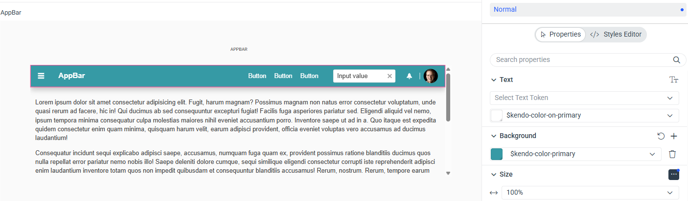
Custom Theme Builder export with a teal primary color.
Layout (`_Layout.cshtml`)
What works
The AppBar correctly changes background when switching between `AppBarThemeColor.Dark`, `AppBarThemeColor.Light`, and `AppBarThemeColor.Inherit`. The theme is loading and the component is initializing correctly.

Questions
1. Is there a way to apply `primary` as the AppBar theme color using the Tag Helper?
Thanks
I'm using Telerik UI for ASP.NET Core with a custom theme exported from Theme Builder (Default base). The theme is loaded as a local CSS.
Theme
Custom Theme Builder export with a teal primary color.
Layout (`_Layout.cshtml`)
<head>
    <link rel="stylesheet" href="~/css/my-theme.v0.1.0.css" asp-append-version="true" />
    <script src="https://code.jquery.com/jquery-3.7.1.min.js"></script>
    <script src="https://cdn.kendostatic.com/2026.1.415/js/kendo.all.min.js"></script>
    <script src="https://cdn.kendostatic.com/2026.1.415/js/kendo.aspnetmvc.min.js"></script>
</head>
<body class="k-body k-bg-surface">
    <header>
        <kendo-appbar name="appBar">
            <items>
                <appbar-item type="AppBarItemType.ContentItem"
                    template="<a class='k-button k-button-flat' href='/Index'>Index</a>">
                </appbar-item>
            </items>
        </kendo-appbar>
    </header>
</body>
What works
The AppBar correctly changes background when switching between `AppBarThemeColor.Dark`, `AppBarThemeColor.Light`, and `AppBarThemeColor.Inherit`. The theme is loading and the component is initializing correctly.
Questions
1. Is there a way to apply `primary` as the AppBar theme color using the Tag Helper?
Thanks