R1 2021 SP: What's New in Telerik UI for WPF and WinUI

Summarize with AI:
The R1 2021 Service Pack for Telerik UI for WPF and Telerik UI for WinUI is now live! It brings .NET 6 Preview 1 support and over 70 improvements for Telerik UI for WPF as well as WinUI Preview 4 support and new DataGrid feature for Telerik UI for WinUI. Let’s dive in together in what is new with the Service Pack.
What's New in Telerik UI for WPF
.NET 6 Preview 1 Support
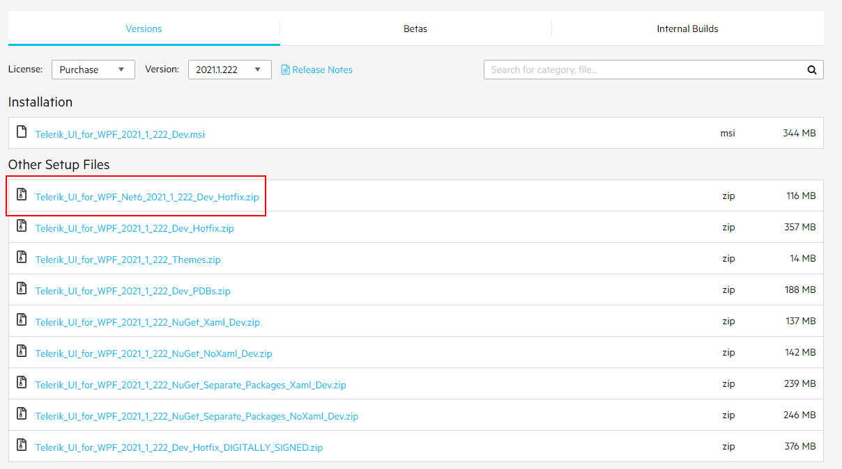
Literally, the first preview of .NET 6 was announced last week by Microsoft (check out the announcement blog post) and we are introducing support for it today. 🚀 The new set of binaries is located in separate zip archive that can be found in your Telerik account—see the screenshot below:

So, feel free to play around with latest .NET framework and experiment with our WPF controls as well. Any feedback that you would have will be appreciated—please do let us know! 😊
PathButton: Horizontal and Vertical Content Alignment
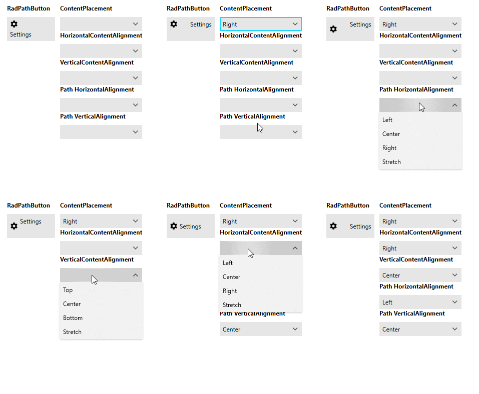
By default, in RadPatButton only either the HorizontalContentAlignment or the VerticalContentAlignment takes effect depending on the ContentPlacement property. For example when Top or Bottom only the HorizontalContentAlignment setting is respected and identically for Left or Right the VerticalContentAlignment takes effect.
Now it is possible to apply both by firstly preventing the path from stretching (by setting its Stretch property to None through the PathStyle) and changing its horizontal or vertical alignment. This way the content will be aligned in the available space according to both HorizontalContentAlignment and VerticalContentAlignment settings of the button. Sounds a little bit complicated, I know, however I hope by seeing the GIF below it will become clearer:

For more details please check the Path Button help article.
SyntaxEditor: Character Data Section Colorization
Now the character data section of the XML file is recognized and colorized as seen in VisualStudio. You can customize that color by modifying the new palette setting—XmlCharacterDataColor. See below how the character data section looks in the Fluent Light theme:

For more info about the SyntaxEditor color palettes check the Palettes article.
SpreadProcessing: Exported CSV should have an extra comma-separated field in place of empty cells
The CsvFormatProvider now supports a new mode that allows you to export empty values at the end of each row. Although this is not completely necessary it adds some clarity and this way, we comply with the CSV specification. This feature is controlled by the ShouldExportEmptyValues property which ensures that the current behavior will remain intact.
Spreadsheet: Introduced an API for changing the culture used by the library
The new functionality allows you to set a culture that differs from the current thread culture. This can be achieved by setting the static CultureHelper property:
FormatHelper.CultureHelper = new SpreadsheetCultureHelper(new CultureInfo("en-US"));
Other Features
- TreeView: Added the option to customize the expander button min width (link)
- PdfProcessing: Introduced a mechanism for loading custom font files when importing TrueType fonts (link)
- PdfViewer: Introduced a mechanism for loading custom font files when importing TrueType fonts (link)
- RadRichTextBox: Added support for the export of .ico image files
- SpreadProcessing: Introduced an API for changing the culture used by the library (link)
- WordsProcessing: Introduced support for Run properties as part of the Structured Document Tag properties
Check Out the Detailed Release Notes
We have a lot more! To get an overview of all the latest features and improvements we’ve made, check out the release notes for the products below:
What is new in Telerik UI for WinUI
Preview 4 Support
The latest WinUI Preview 4 was released couple of weeks ago and we immediately uploaded new versions of our controls supporting it. Make sure to play around with the demos application and try out the capabilities of our new additions in R1 2021 – RibbonView, Barcode, Rating, BusyIndicator and Pagination.
Please drop me a line if have any feedback about out Telerik UI for WinUI controls. You can share what other controls you expect to see in the suite as well as what other features you need from the currently available ones. 📝
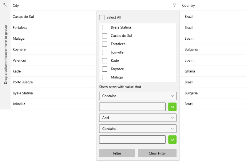
DataGrid: Excel-Like Filtering

<grid:DataGridTextColumn PropertyName="City" ShowDistinctValuesFilter="False" />
For all other filtering options please refer to the Filtering section from the DataGrid online help documentation.
Share Your Feedback
Feel free to drop us a comment below sharing your thoughts. Or visit our Feedback portals about UI for WPF, WinUI and Document Processing Libraries and let us know if you have any suggestions or if you need any particular features/controls.
Don't wait—try out the latest:
Telerik UI for WPF Telerik UI for WinUI
In case you missed it, here are some of the updates from our last release:
🎯WPF
🎯WinUI

