What's New for Telerik UI for ASP.NET MVC and Telerik UI for ASP.NET Core in R3 2018

Summarize with AI:
We take a deeper look at the new components, features, themes and more for Telerik UI for ASP.NET MVC and Telerik UI for ASP.NET Core in R3 2018.
You've probably already seen the summary provided in the Telerik R3 2018 overview blog post, but I wanted to take a deeper look at specifically what is new for the Telerik UI for ASP.NET MVC and Telerik UI for ASP.NET Core components with this exciting new release!
New MVC & Core Components
Let’s cover some of the common updates across both Telerik UI for ASP.NET MVC and Telerik UI for ASP.NET Core, as there are quite a few.
Kicking things off, let’s mention the brand new components that we’re adding. I'm happy to say that with R3 2018 we delivered on the most top-voted feedback item: a dropdown with a table structure for each item.
Introducing the MultiColumnComboBox
As the name might indicate, with the R3 2018 release we now officially have a ComboBox component that provides a grid as a way to display additional data values for each individual item.
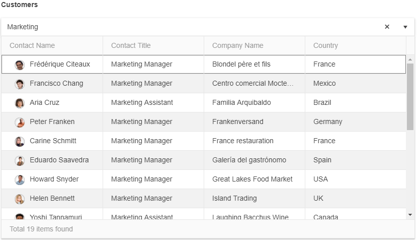
The power within this component comes from the features that stem from a ComboBox, including:
- Server filtering
- Virtualization
- Grouping
- Templates
- Keyboard Navigation
- Cascading MultiColumnComboBoxes
For those of you familiar with our regular ComboBox, these are all features already available within this component. Thanks to us referencing the ComboBox when implementing this component we already have a long list of important features added in, so this component is truly ready to be added in to any MVC or Core web application.
Data Visualization - Adding the Arc Gauge
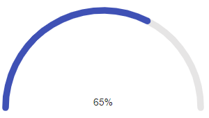
While our data entry and complex UI components are popular, we do often receive feature requests around our data visualization components as well. The gauges are certainly no exception and we’ve received quite a few requests about the type of gauges that we can offer. To satisfy your appetite for more visuals we added in a brand new component, the ArcGauge. This widget gives you a simple and elegant way to display a value or a percentage of a value without any additional bloat.
Updates to Existing Components
Comprehensive Updates to the TreeList
The TreeList component is the perfect component when you have data that always has the same set of fields, otherwise known as homogenous data. Often times folks want to display this in a set of hierarchical grids, where each data item has a set of columns that are displayed. Of course, sharing a structure with a Grid means that there are plenty of features that can also be added in to the TreeList. With R3 2018 we took care of the top-requested items pertaining to the TreeList component, many which stem from the similarities in the Grid.
Multi-Column Headers
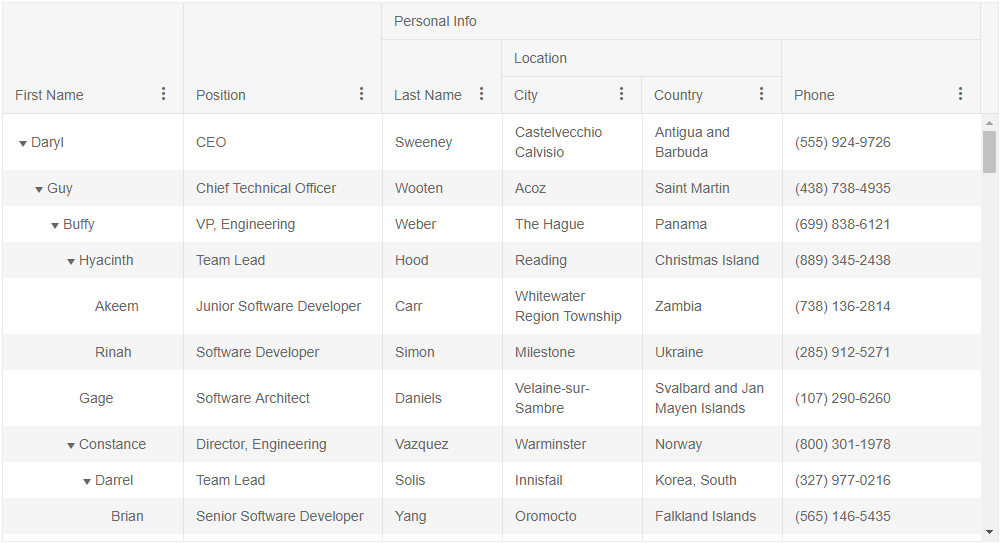
Often times we may want to showcase that the headers of a grid are part of a particular category or group, which is where multi-column headers come in to play! This gives you the option to define a column which might span over several sub-columns.
Client-side Paging
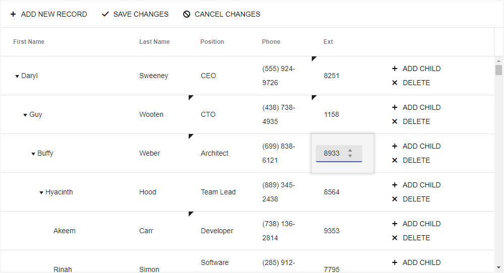
This feature is intended to help with large data sets within the TreeList. It is currently specifically for the client-side, which means that all of the data has been loaded on the client, but this new feature should help tremendously in the way of performance.
Batch/InCell Editing

As the name gives away in-cell (or “batch” as it is called as well) allows end-users to edit individual cells rather than putting an entire row in edit mode. Updates, additions, or items that have been removed, can then Be synced in one single request going back to the server.
Keyboard Navigation
The name gives it away, but we have officially added full keyboard navigation support to the TreeList component.
Grid Component Updates & Conversational UI Improvements
The Grid is the most-used component in any of our libraries, especially within Telerik UI for ASP.NET MVC and Telerik UI for ASP.NET Core, so I want to make sure that I mention the features we added here as well.
Group Summaries Now Available in Group Header
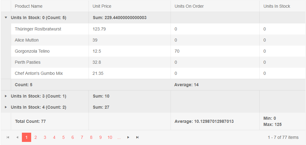
While the data of group summaries has been available in the header of a group (the item that you click on to expand or collapse your groups), it wasn’t automatically aligned with columns like in the footer. With R3 2018 we added the same style of summaries to the header of your groups that you’ve enjoyed in the footer of a group. No custom templates or CSS required, just a configuration option set on a column definition.
Updates to Responsive Behaviors
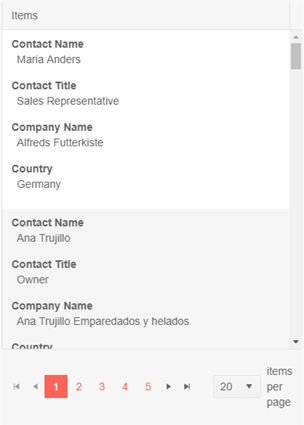
As we continue to look at how we can improve our support for Progressive Web Apps, we wanted to add some more functionality to the Grid. Specifically we took a feature that folks have enjoyed in our Angular grid which is to have a media property available for each column. This uses the matchMedia string API in order to define what columns are displayed or hidden depending on the viewport.
API Added: Update column width programmatically
Up until now, once a column width has been defined a re-render of the Grid would be required to update any width of a column. Thanks to the new API call that we added with R3 2018 you can now define the width of any column of the Grid programmatically and have it update the Grid accordingly.
Conversational UI Updates
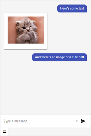
The Conversational UI component was introduced last release and we’ve been receiving some pretty good feedback so far! An item that we’ve seen requested and which is often used in some of our other UI libraries offering the same component is the toolbar feature. This gives users additional ways to interact with your chat, including adding images and voice recordings. This is of course something that we offer a template for, so you can customize this even further to fit your requirements
Material Theme Comes to MVC & Core
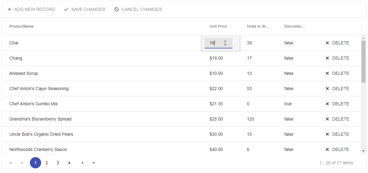
I’m excited to say that the wait is finally over: the new Sass-based Material Theme has landed for Telerik UI for ASP.NET MVC and Telerik UI for ASP.NET Core!
Official Support for Core 2.1
This is specific to ASP.NET Core, but Telerik UI for ASP.NET Core officially supports ASP.NET Core 2.1 This means that not only do we have all of the Tag Helpers available to you, we also support the latest and greatest within the framework itself. One big item that comes from this support is that we now integrate with SignalR for ASP.NET Core.
We Want to Hear from You!
Many of these features may not have been added if it wasn't for the fact that we hear from our developers. So, if you feel like we missed any new components, or any features, make your voice heard! Add a comment in the comment section below, or submit feedback to our our feedback portal.
Want to See the Updates in Action?
Last thing, I promise. This blog post might have been a lot to digest and if you prefer to see things covered live then I've got great news! As a part of the R3 2018 release we have the LIVE Telerik Webinar happening on October 2 at 11 a.m. ET! Join Developer Advocates Ed Chabeneau and Sam Basu for a live webinar where we'll go over the changes that have been introduced with R3 2018. There are limited seats so make sure that you reserve yours as soon as possible!
Save My Seat

Carl Bergenhem
Carl Bergenhem was the Product Manager for Kendo UI.
