What’s New in Kendo UI Angular Components with R3 2019
.png?sfvrsn=9996829a_0)
Summarize with AI:
It seems like only yesterday that we were talking about the latest release of Kendo UI for Angular, but time certainly flies when you’re having fun and it’s already time to talk about what is new in the latest release of our Angular components with R3 2019!
Support for Angular 8
While some of you may already have taken advantage of this, all of the Kendo UI for Angular components currently support Angular 8! As long as you upgrade your packages to the latest and greatest version you will be able to take advantage of Angular 8 goodness.
What about Ivy? Well, we are making steady progress to be able to support the new rendering engine but we’re not quite there yet. Ivy is not the default (yet) for Angular 8.0.x projects, but we want to make sure we can support Ivy as soon as we can!
New Angular Components
With this release we have been able to focus on releasing quite a few new components, along with ensuring that existing components received updates as well.
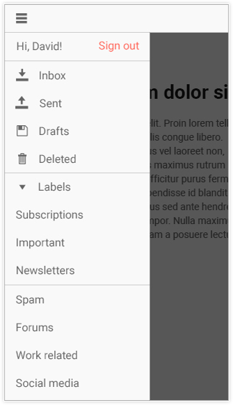
New Drawer Component

Seems like any modern application uses a drawer as a default navigation element nowadays, which is why we wanted to add this component to the list of native Angular components that we offer! With the new Drawer component you can quickly set up a navigation for any new or existing applications. The component comes with the default behavior of being able to expand and collapse the menu, providing a default hamburger-style button to toggle the expansion, as well as the ability to serve items with icons and text at the same time. It even offers a “mini” mode that only takes use of the defined icons if your navigation does not need a full description for every navigation option.
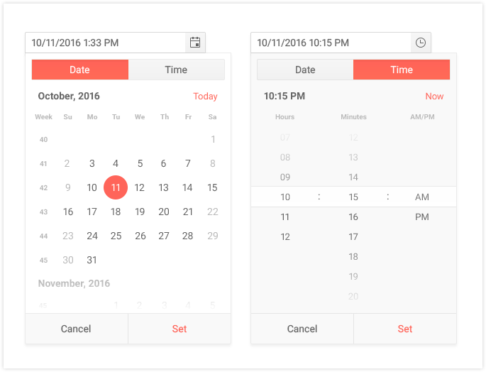
New DateTimePicker Component

The DateTimePicker combines two of our popular pickers, the DatePicker and the TimePicker, in to a single component. With one single input and drop down your users can now select both a date and specific time.
New ProgressBar Component

Just like the name gives away, the new Angular ProgressBar component gives you a slick way to showcase progress of something in your application. Whether this is bound to an active asynchronous loading action, or you are manually updating the progress, this component fits naturally in to any application.
Angular Scheduler is now RTM
This is something I know that many of you have been waiting for: The Kendo UI Angular Scheduler has now dropped its beta tag and is officially in RTM!
While we will continue to add features as they appear and are requested, this latest release includes all of the features that we think should be included as a base level for a Scheduler component. This includes the latest inclusions of keyboard navigation and accessibility compliance for WCAG 2.0.
For a full run-down of what is possible with the Scheduler component head on over to the Angular Scheduler docs and demos page.
Expanded Component Features
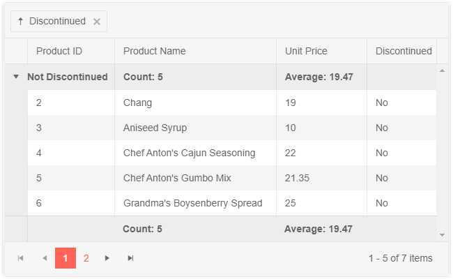
Grid - Header & Footer Aggregates

Whenever grouping is enabled within the Grid we usually want to be able to provide a summary of the grouped data in some way. With R3 2019 we have introduced the Group Header & Footer Aggregates feature that allows you take full control over what is displayed within the header or footer of a group via a template while easily accessing built-in aggregate data from the Grid itself. This makes displaying an aggregate for an overall group, or on a column-by-column basis.
For more information on how to add your own aggregates you can head on over to the Kendo UI Angular Grid Aggregates demo!
Grid - Auto-sizing Columns
While we have had the ability to auto fit columns to their content through our API (see this documentation section for autoFitColuomns) we wanted to take the time for R3 2019 and focus on providing a way to ensure that Grid columns can auto-fit to their content when defining your Grid in a more declarative way. With the latest version of the Angular Grid component this is now a built-in feature.
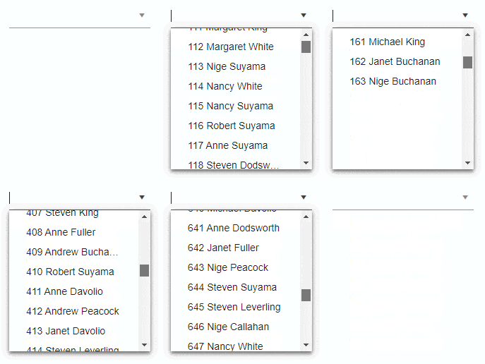
DropDowns - Virtualization

A long-awaited feature that we have had to spend some extra time on but I’m happy to say that between R2 and R3 2019 we finally released built-in support for virtualization in the Kendo UI Angular DropDown package! Head on over to the various DropDown demos to see this performance-focused feature in action!
Toolbar - Responsive Toolbar
While the Toolbar has been a useful component both in a standalone fashion, as well as within the Angular Editor, we wanted to add in some functionality that could benefit the toolbar and all of its users: responsive behavior. This allows for the Toolbar to hide available items in drop downs when screen real estate is limited.
To see just how to work with this new feature head on over to the Toolbar demos.
Calendars & DatePickers - Disabled Dates
The Calendar component, a component that is a part of so many other components, now has the ability to disable certain dates across the calendar. This also means that the MultiViewCalendar, DatePicker, DateRangePicker and DateTimePicker all have this functionality built in! Here’s a quick link to the calendar demo showcasing disabled dates for inspiration.
Editor - Insert Table Tool

One of the most-requested features for our Editor component so far has been the ability to add tables through a built-in tool. Well, we were able to add this as a part of R3 2019! As you can see from the above animated gif, this tool can be used to quickly insert tables in to the Editor. This is all a part of the journey to bring the Editor out of beta and into RTM, with this feature being a huge part of this story. Check out this new feature in the Angular Editor demos.
Editor - API Updates & Stabilization
Another special note is the constant updates, bug fixes and overall stabilization work that we have done to the Editor over the last couple of months. While it is not always apparent when only looking at individual features, this is another large part of ensuring that the Editor can hit RTM status in a timely fashion and something we have spent a lot of time on since the previous release.
Feedback Wanted
As always we want to hear from you! Are there any components missing that you need? Any missing features from existing components? Feel free to head on over to the Kendo UI for Angular feedback portal or comment in the comment section below to make sure you let us know what you would like to see coming up in a future release of our Angular UI components!
Register for our Live R3 2019 Webinar!
The Kendo UI team is doing a live webinar on October 8th that will cover everything mentioned in this blog post (and more) - all live! The Angular components will be covered on October 8th, 11:00 - 11:30 AM ET and you can register to reserve your seat right here. Make sure you register early as seats are limited!

Carl Bergenhem
Carl Bergenhem was the Product Manager for Kendo UI.
