Using the IndicatorView in Xamarin Forms

Summarize with AI:
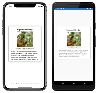
IndicatorView teams up with CarouselView to let users know which slide of a carousel they’re on. Today let’s learn how to use this tool!
One way to make our applications more fun and at the same time display more information without needing additional space is when we present it on the same page in a carousel.
The user experience in this case would be much better if we add positioning indicators to it. 🤔 For example, if we are viewing an album of images, it is very good for the user to see indicators that allow them to know the position of each image they are viewing. So, in this article, we’ll see how to achieve this with IndicatorView!

(Image obtained from Microsoft official documentation.)
What Is the IndicatorView?
This control allows us to display indicators to represent the total number and the current position of items in a CarouselView. It contains properties that are backed by BindableProperty objects, which allow us to use data bindings. It’s important to know that this control is available from Xamarin.Forms 4.4 on the iOS and Android platforms, and from 4.5 on the Universal Windows Platform.
⚠ If you want to know more information about CollectionView, you can visit the docs.
✔ Let’s Start Creating the IndicatorView
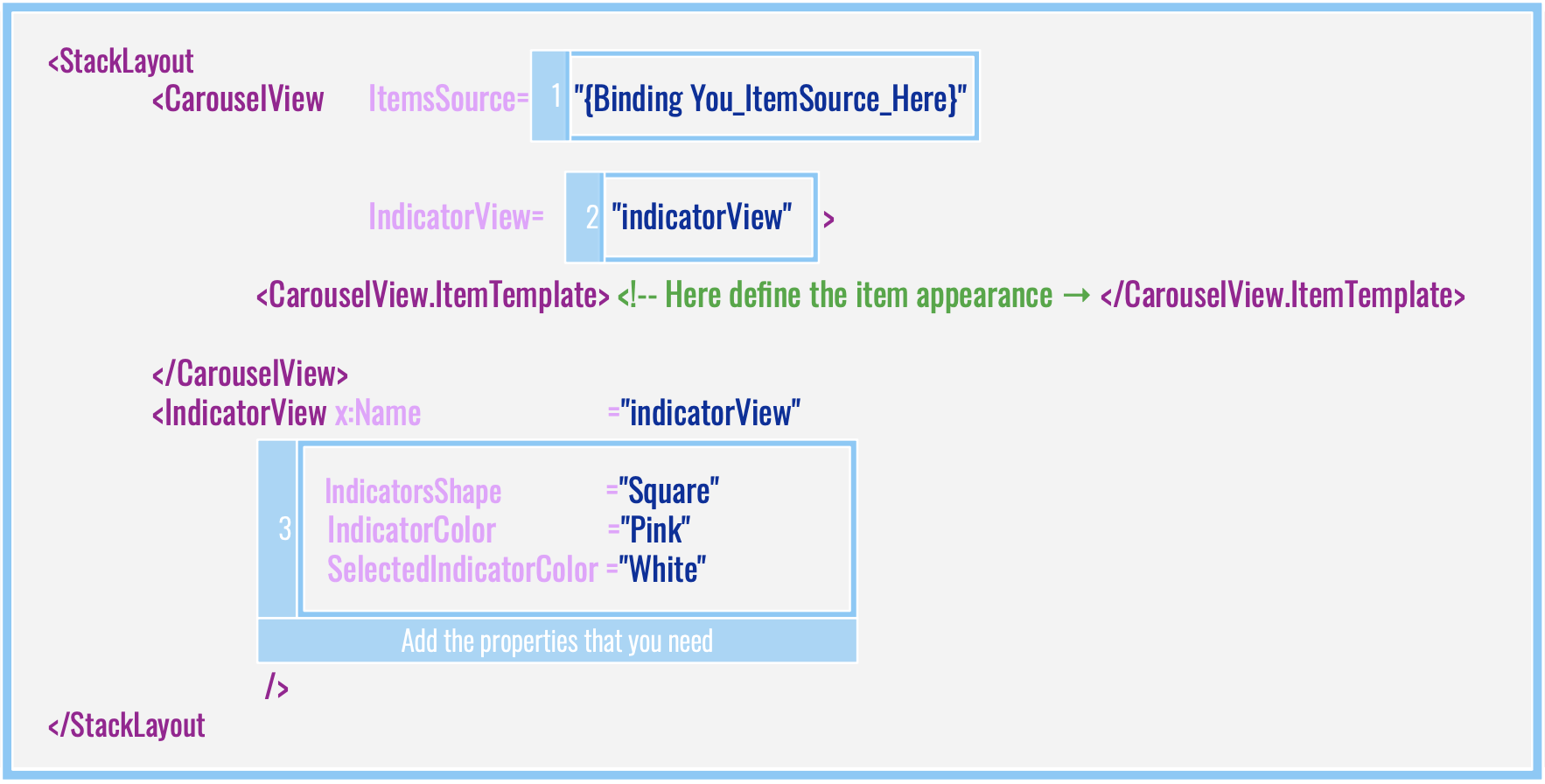
To start creating this control, it’s important to know about the structure required:

Code implementation:
<StackLayout>
    <CarouselView ItemsSource="{Binding Food}"
                  IndicatorView="indicatorView">
        <CarouselView.ItemTemplate>
            <!-- Here define the item appearance -->
        </CarouselView.ItemTemplate>
    </CarouselView>
    <IndicatorView x:Name="indicatorView"
                   IndicatorColor="LightGray"
                   SelectedIndicatorColor="DarkGray"
                   HorizontalOptions="Center" />
</StackLayout>
Let’s Learn Some of My Favorite Properties 💖
IndicatorView gives us a lot of properties that we can use to create amazing things. Let’s learn some of my favorites!
| No. | Property name | Description | Accepted values |
|---|---|---|---|
| 1 | IndicatorsShape | It allows us to change the shape of the elements of the indicator view. | ⚫ Circle (Default value) or ⬛ Square. |
| 2 | IndicatorSize | This property handles the indicator’s size in device-independent units. | Double (0.6 as default value) |
| 3 | MaximumVisible | It’s responsible for determining the maximum number of visible indicators. | Int |
| 4 | Position | It indicates the currently selected indicator index. | Int |
| 5 | IndicatorColor | It determines the color of the indicator. | Color |
| 6 | SelectedIndicatorColor | It’s the color of the indicator that represents the current item in the CarouselView. |
Color |
And finally, an example of adding these properties:
<IndicatorView x:Name="indicatorView"
               IndicatorColor="Pink"
               SelectedIndicatorColor="White"
               HorizontalOptions="Center"
               IndicatorsShape="Square"
               IndicatorSize="18"
               MaximumVisible="6"
               .... Here you can add all the properties that you need..../>
Let’s Define the Indicator Appearance
To define the indicator elements, you just have to set the IndicatorView.IndicatorTemplateproperty to a DataTemplate. You can learn more about DataTemplate here.
In the following sample, the default image was changed to another called Star.jpg.
  <IndicatorView.IndicatorTemplate>
                <DataTemplate>
                    <Image Source="Star.jpg" />
                </DataTemplate>
  </IndicatorView.IndicatorTemplate>
To achieve full implementation, just add the previous block into this:
<StackLayout>
    <CarouselView ItemsSource="{Binding Food}"
                  IndicatorView="indicatorView">
        <CarouselView.ItemTemplate>
            <!-- DataTemplate that defines item appearance -->
        </CarouselView.ItemTemplate>
    </CarouselView>
    <IndicatorView x:Name="indicatorView"
                   IndicatorColor="LightGray"
                   SelectedIndicatorColor="Black"
                   HorizontalOptions="Center">

        <!-- Here add the block explained above-->
     </IndicatorView>
</StackLayout>
Let’s Add Visual States
Visual States are very important—they help us to graphically identify any change made by a certain action. For example, in our Indicator View, we can highlight when an item is selected, either by means of a color or a size different from the others. This allows us to quickly identify where we are.
To develop this example, let’s explain step by step:
1. Create a style.
    <Style x:Key="IndicatorsStyle"
           TargetType="Label">
        <Setter Property="VisualStateManager.VisualStateGroups">
            <VisualStateGroupList>
                <VisualStateGroup x:Name="CommonStates">
                    <VisualState x:Name="Normal">
                        <VisualState.Setters>
                            <Setter Property="TextColor"
                                    Value="Pink" />
                        </VisualState.Setters>
                    </VisualState>
                    <VisualState x:Name="Selected">
                        <VisualState.Setters>
                            <Setter Property="TextColor"
                                    Value="Blue" />
                        </VisualState.Setters>
                    </VisualState>
                </VisualStateGroup>
            </VisualStateGroupList>
        </Setter>
    </Style>
2. Once you create the style, you just have to add a simple style, as in the same basic structure explained below:
    <IndicatorView x:Name="indicatorView"
                   Margin="0,0,0,40"
                   IndicatorColor="Transparent"
                   SelectedIndicatorColor="Transparent"
                   HorizontalOptions="Center">
        <IndicatorView.IndicatorTemplate>
            <DataTemplate>
                   <Label Text="-" Style="{StaticResource IndicatorsStyle}" />
            </DataTemplate>
        </IndicatorView.IndicatorTemplate>
    </IndicatorView>
And Done! ✅
I hope this article has been helpful and that you apply what you have learned! 😍
Thanks for reading my article! 💚💕
References:
https://docs.microsoft.com/en-us/xamarin/xamarin-forms/user-interface/indicatorview

Leomaris Reyes
Leomaris Reyes is a software engineer from the Dominican Republic specializing in mobile development. She is a 7-time Microsoft MVP and actively builds mobile applications while sharing practical knowledge through technical articles and developer-focused content.
Through her work, she explains programming concepts, developer tools and real-world development practices to help developers grow in their careers.
You can follow her on Instagram and TikTok at @leomarisreyes.dev, read her articles on AskXammy, and connect with her on LinkedIn, where she shares tutorials, insights and resources for developers.
