Getting Started with RadSideDrawer for Xamarin Forms

Summarize with AI:
Today, I am going to talk about RadSideDrawer for Xamarin Forms. This control fits perfectly in app scenarios that require navigation. I will create a simple multi-page application which utilizes the control and the Xamarin Forms NavigationPage with its navigation API. Let’s get started.
Design
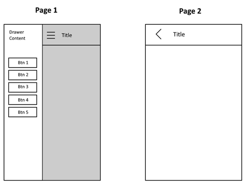
The application will have a two pages—a Home page and a details page. From Home to the details page we will navigate thanks to the SideDrawer, showing different content in the details page depending on the option we choose from the SideDrawer. The SideDrawer itself will contain buttons as options to choose from.
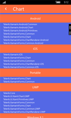
Regarding the content itself, from the SideDrawer the end-user will be able to select a UI for Xamarin control and the details page will display which assemblies are needed for this control to run. This information is taken from the Telerik UI for Xamarin Documentation in the respective Required Assemblies Article (e.g. Calendar).

Creating the Solution
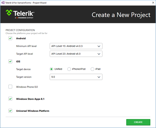
I will create the solution using Visual Studio and our Project Wizard. I will check iOS, Android, Windows Store Apps 8.1 and Universal Windows Platform. I will leave Windows Phone 8.0 project unchecked, because the RadSideDrawer is not available for that platform.
If you are on a MAC, hence using Xamarin Studio, you can just use the application template provided by Xamarin Studio and manually add all references required by the RadSideDrawer and RadListView components. These are the Telerik components that I am going to use in this project.
Creating the First Page
According to the design, the first (Home) page should host the SideDrawer. Therefore, in the MainContent we should create a custom navigation bar. This bar can be created with a simple Grid hosting a Label and an Image (the dots at top-right in the first sketch image). Customers should be able to open the DrawerContent using the image as a button.
To do this, I will use yet another Grid with fixed size which will hold the Image itself. This additional Grid is needed so that I can add a TapGestureRecognizer to it. This recognizer will allow me to attach an event handler which will be invoked when the grid (and respectively the image inside it) is tapped. Here is how this can be done:
<?xml version="1.0" encoding="utf-8" ?><ContentPage xmlns="http://xamarin.com/schemas/2014/forms" xmlns:telerikPrimitives="clr-namespace:Telerik.XamarinForms.Primitives;assembly=Telerik.XamarinForms.Primitives" xmlns:telerikDataControls="clr-namespace:Telerik.XamarinForms.DataControls;assembly=Telerik.XamarinForms.DataControls" xmlns:telerikListView="clr-namespace:Telerik.XamarinForms.DataControls.ListView;assembly=Telerik.XamarinForms.DataControls" x:Class="Portable.StartPage"> <telerikPrimitives:RadSideDrawer x:Name="Drawer" DrawerLength="200"> <telerikPrimitives:RadSideDrawer.MainContent> <Grid Grid.RowSpacing="0"> <Grid.RowDefinitions> <RowDefinition Height="56"/> <RowDefinition Height="*"/> </Grid.RowDefinitions> <StackLayout BackgroundColor="#FF6E40" Padding="0, 0, 16, 0" Spacing="10" Orientation="Horizontal" > <Grid x:Name="ImageHolder" HeightRequest="56" WidthRequest="56" BackgroundColor="Transparent"> <Image Aspect="AspectFit" VerticalOptions="Center" HorizontalOptions="Center"> <Image.Source> <OnPlatform x:TypeArguments="ImageSource" iOS="hamburgerBtn" Android="hamburgerBtn" WinPhone="Assets\hamburgerBtn.png"/> </Image.Source> </Image> </Grid> <Label x:Name="AssemblyNameHolder" HorizontalOptions="Fill" VerticalOptions="Center" FontSize="20" TextColor="White"/> </StackLayout> </Grid> </telerikPrimitives:RadSideDrawer.MainContent> </telerikPrimitives:RadSideDrawer></ContentPage>using System;using Xamarin.Forms;namespace Portable{ public partial class StartPage : ContentPage { public StartPage() { InitializeComponent(); var tap = new TapGestureRecognizer(); tap.Tapped += HamburgetBtnPressed; this.ImageHolder.GestureRecognizers.Add(tap); this.AssemblyNameHolder.Text = "Home"; } private void HamburgetBtnPressed(object sender, EventArgs e) { this.Drawer.IsOpen = true; } }}In addition to the navigation bar, the main content should invite the customers to use the navigation. I will do this with a simple Label placed in the second row of the Grid:
<Grid Grid.Row="1" BackgroundColor="#5468E5" Padding="16, 48, 16, 0"> <Label Text="Use the buttons in the drawer content to navigate to different pages." TextColor="White"/></Grid>
Continuing with the design, the drawer content should host buttons that will trigger the navigation. In order to arrange the buttons, I will use a StackLayout like this:
<telerikPrimitives:RadSideDrawer.DrawerContent> <StackLayout> <Button Text="Calendar" Clicked="Calendar_Clicked"/> <Button Text="Chart" Clicked="Chart_Clicked"/> <Button Text="DataForm" Clicked="DataForm_Clicked"/> <Button Text="ListView" Clicked="ListView_Clicked"/> <Button Text="SideDrawer" Clicked="SideDrawer_Clicked"/> </StackLayout></telerikPrimitives:RadSideDrawer.DrawerContent>In the code behind the event handlers should be created:
private void Calendar_Clicked(object sender, EventArgs e){}private void Chart_Clicked(object sender, EventArgs e){}private void DataForm_Clicked(object sender, EventArgs e){}private void ListView_Clicked(object sender, EventArgs e){}private void SideDrawer_Clicked(object sender, EventArgs e){}And with this I am ready with the first page.
Creating the Second Page
The second page is similar to the first one and again features a navigation bar. This is why I will use the same structure as in the first page.
<?xml version="1.0" encoding="utf-8" ?><ContentPage xmlns="http://xamarin.com/schemas/2014/forms" xmlns:telerikListView="clr-namespace:Telerik.XamarinForms.DataControls.ListView;assembly=Telerik.XamarinForms.DataControls" xmlns:telerikPrimitives="clr-namespace:Telerik.XamarinForms.Primitives;assembly=Telerik.XamarinForms.Primitives" xmlns:telerikDataControls="clr-namespace:Telerik.XamarinForms.DataControls;assembly=Telerik.XamarinForms.DataControls" x:Class="Portable.SecondPage"> <telerikPrimitives:RadSideDrawer x:Name="Drawer" DrawerLength="200"> <telerikPrimitives:RadSideDrawer.MainContent> <Grid BackgroundColor="#5468E5"> <Grid.RowDefinitions> <RowDefinition Height="40"/> <RowDefinition Height="*"/> </Grid.RowDefinitions> <Grid BackgroundColor="#FF6E40"> <Grid.ColumnDefinitions> <ColumnDefinition Width="56"/> <ColumnDefinition /> </Grid.ColumnDefinitions> <Grid x:Name="BackBtnHolder" BackgroundColor="Transparent"> <Image Aspect="AspectFit" VerticalOptions="Center" HorizontalOptions="Center"> <Image.Source> <OnPlatform x:TypeArguments="ImageSource" iOS="back_btn.png" Android="back_btn.png" WinPhone="Assets\back_btn.png"/> </Image.Source> </Image> </Grid> <Label Grid.Column="1" x:Name="Header" TextColor="White" FontSize="Medium" VerticalOptions="Center" HorizontalOptions="Start"/> </Grid> </Grid> </telerikPrimitives:RadSideDrawer.MainContent> <telerikPrimitives:RadSideDrawer.DrawerContent> <StackLayout> <Button Text="Calendar" Clicked="Calendar_Clicked"/> <Button Text="Chart" Clicked="Chart_Clicked"/> <Button Text="DataForm" Clicked="DataForm_Clicked"/> <Button Text="ListView" Clicked="ListView_Clicked"/> <Button Text="SideDrawer" Clicked="SideDrawer_Clicked"/> </StackLayout> </telerikPrimitives:RadSideDrawer.DrawerContent> </telerikPrimitives:RadSideDrawer></ContentPage>With this the second page is almost ready. In the second row of the Grid I will use the RadListView to visualize the required assemblies grouped by the platform name. Here is how the final configuration of the control looks:
<telerikDataControls:RadListView ItemsSource="{Binding BinariesList}" Grid.Row="1"> <telerikDataControls:RadListView.ItemTemplate> <DataTemplate> <telerikListView:ListViewTemplateCell> <telerikListView:ListViewTemplateCell.View> <Grid BackgroundColor="#5468E5"> <Label Text="{Binding BinaryName}" Margin="16,0,0,0" HorizontalOptions="Fill" TextColor="White" > <Label.FontSize> <OnPlatform x:TypeArguments="x:Double" iOS="12" Android="18" WinPhone="11"/> </Label.FontSize> </Label> </Grid> </telerikListView:ListViewTemplateCell.View> </telerikListView:ListViewTemplateCell> </DataTemplate> </telerikDataControls:RadListView.ItemTemplate> <telerikDataControls:RadListView.GroupDescriptors> <telerikListView:PropertyGroupDescriptor PropertyName="Platform"/> </telerikDataControls:RadListView.GroupDescriptors> <telerikDataControls:RadListView.GroupHeaderTemplate> <DataTemplate> <Grid BackgroundColor="#FF6E40" HeightRequest="40"> <Label Text="{Binding }" TextColor="White" VerticalOptions="Center" HorizontalOptions="Center"> <Label.FontSize> <OnPlatform x:TypeArguments="x:Double" iOS="16" Android="16" WinPhone="14"/> </Label.FontSize> </Label> </Grid> </DataTemplate> </telerikDataControls:RadListView.GroupHeaderTemplate></telerikDataControls:RadListView>Supplying the Content
To fill the page with the assemblies data, I will use a collection of custom objects. This will allow me to use the grouping feature of the RadListView. The object should contain two strings, the name of one binary and the name of the platform this binary is part of.
public class DataObject{ public DataObject(string platformName, string binaryName) { this.Platform = platformName; this.BinaryName = binaryName; } public string Platform { get; set; } public string BinaryName { get; set; }}To share the collection between multiple pages, I will use a base class holding the collection and several other classes deriving from the base which will fill different information into the collection. The class hierarchy will look like this:
public class ViewModel public List<DataObject> BinariesList { get; set; }
}public class CalendarViewModel : ViewModel public CalendarViewModel() { this.BinariesList = this.GetCalendarBinariesList(); } public class ChartViewModel: ViewModel public CalendarViewModel()
{ this.BinariesList = this.GetChartBinariesList();
}public class DataFormViewModel: ViewModel
{public CalendarViewModel() { this.BinariesList = this.GetDataFormtBinariesList(); }
}public class ListViewViewModel: ViewModel
{public CalendarViewModel() { this.BinariesList = this.GetListViewBinariesList(); }
}public class SideDrawerViewModel: ViewModel
{ public CalendarViewModel() { this.BinariesList = this.GetSideDrawerBinariesList(); }
}Each ViewModels’ constructor will fill the BinariesList collection with specific information. This info is taken from the Required Telerik Assemblies documentation article of each control. In order to keep this post as short as possible, I will not share that particular code. You can find it in the GitHub repository link at the end of this article.
Utilizing Xamarin Forms Navigation
The next step is to take advantage of the Xamarin Forms navigation. In order to do this, I need to use the NavitaionPage as a root page of my app. This requires changing the App.cs file in the portable project as follows:
public class App : Application{ public App() { var start = new StartPage(); NavigationPage.SetHasNavigationBar(start, false); MainPage = new NavigationPage(start); }}I do not need the native navigation bar since I already created my custom one. This is why I am getting rid of the native one. Now I am able to use the NavigationPage.PushAsync() and NavigationPage.PopAsync() methods in my application.
Configuring the Second Page
Since all ViewModels are prepared I will create a constructor of the second page that will allow me to pass the respective ViewModel and control name. Based on these parameters the page will be initialized.
public SecondPage(ViewModel viewModel, string header){ InitializeComponent(); this.BindingContext = viewModel; this.Header.Text = header;}
Configuring the Navigation Between the Page
Each of the click handlers of the navigation buttons should navigate to the second page with different parameters. To shorten the post, I will share only one handler. The rest are available at the GitHub repository given at the end of this article:
private void Calendar_Clicked(object sender, EventArgs e){ this.Drawer.IsOpen = false; var calendarPage = new SecondPage(new CalendarViewModel(), "Calendar"); NavigationPage.SetHasNavigationBar(calendarPage, false); Navigation.PushAsync(calendarPage);}For the backwards navigation I will use the TapGestureRecognizer of the Grid in the second page.
public SecondPage(ViewModel viewModel, string header){ InitializeComponent(); this.BindingContext = viewModel; this.Header.Text = header; var tap = new TapGestureRecognizer(); tap.Tapped += BackBtnPressed; this.BackBtnHolder.GestureRecognizers.Add(tap);}private void BackBtnPressed(object sender, EventArgs e){ Navigation.PopAsync();}With this final adjustment the application is ready.
Final Look
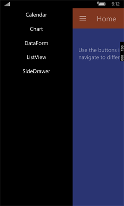
The final result looks like this in Android. You can check what the rest of the platforms look like as well.
 |
 |
Project Source Code
The source code of the app that I just built is available at this GitHub repository. Please go ahead and play around with the code yourself. If you have any feedback or questions, let us know in the comments below.


