
Using Animations in Vue.js

Summarize with AI:
Let’s take a look at how to enhance the UX of your Vue app with animations.
Adding animations to a website can be a great way to enhance user experience since they can make websites look livelier and more interactive. In this article, we will cover how to create animations in Vue.js—one of the most popular JavaScript frameworks for creating user interfaces.
You can find the full code example in this GitHub repo. Below you can also find an interactive CodeSandbox example.
Project Setup
We are going to use Vite to quickly scaffold a new Vue project. If you haven’t heard about Vite before, you might want to check out my articles about it: What Is Vite: The Guide to Modern and Super-Fast Project Tooling.
Run the command below in your terminal to create a new Vue project.
$ npm init vite vue-animations -- --template vue
After the project creation is complete, run the following commands to get into the project directory and install all dependencies.
$ cd vue-animations && npm install
Finally, you can start the development server by running the npm run dev command. You should see the project running upon visiting localhost:3000 in your browser. That’s it for the setup.
Animations in Vue
There are multiple ways to add animations in Vue.js. We can use pure JavaScript or CSS for that. However, Vue also offers two components that are specifically designed for animations—Transition and Transition-Group. The
former can be used to animate a single element, while the latter for a group of elements. Let’s have a look at how we can use both of these components.
Animating Opacity and Position
The GIF below shows the animation we are going to implement.
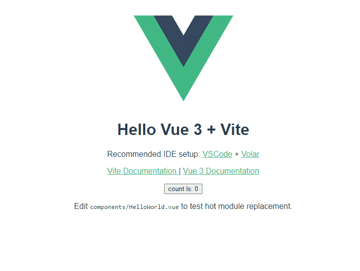
In the project we just scaffolded, we have the App.vue component with a Vue logo and some text. Let’s use the Transition component to animate the opacity and position of App component’s content.
src/App.vue
<script setup>
import { Transition } from "vue";
import HelloWorld from "./components/HelloWorld.vue";
</script>

<template>
  <Transition appear>
    <div>
      <img width="200" height="200" alt="Vue logo" src="./assets/logo.png" />
      <HelloWorld msg="Hello Vue 3 + Vite" />
    </div>
  </Transition>
</template>

<style>
#app {
  font-family: Avenir, Helvetica, Arial, sans-serif;
  -webkit-font-smoothing: antialiased;
  -moz-osx-font-smoothing: grayscale;
  text-align: center;
  color: #2c3e50;
  margin-top: 60px;
}

.v-enter-active,
.v-leave-active {
  transition: opacity 2s ease, transform 1s ease-in-out;
  transform: translateY(0px);
}

.v-enter-from,
.v-leave-to {
  opacity: 0;
  transform: translateY(100px);
}
</style>
The Transition components should have only one child. In this example, we pass the appear prop to the Transition component since we want the animation to start immediately when the component is mounted. In the style block, we have new classes:
v-enter-active– the state to which an element is animated upon enteringv-leave-active– the state to which an element is animated upon leavingv-enter-from– the state from which an element will enterv-leave-to– the state to which an element will leave to
These classes are used by the Transition component if the name prop was not passed. However, it means they will be used by all Transition components. That’s not the best because if we had another Transition component somewhere else in the code, the animation classes would collide. Let’s solve this problem by passing the name prop. Here’s the updated code.
src/App.vue
<script setup>
// This starter template is using Vue 3 <script setup> SFCs
// Check out https://v3.vuejs.org/api/sfc-script-setup.html#sfc-script-setup
import { Transition } from "vue";
import HelloWorld from "./components/HelloWorld.vue";
</script>

<template>
  <Transition name="fade-slide" appear>
    <div>
      <img width="200" height="200" alt="Vue logo" src="./assets/logo.png" />
      <HelloWorld msg="Hello Vue 3 + Vite" />
    </div>
  </Transition>
</template>

<style>
#app {
  font-family: Avenir, Helvetica, Arial, sans-serif;
  -webkit-font-smoothing: antialiased;
  -moz-osx-font-smoothing: grayscale;
  text-align: center;
  color: #2c3e50;
  margin-top: 60px;
}

.fade-slide-enter-active,
.fade-slide-leave-active {
  transition: opacity 2s ease, transform 1s ease-in-out;
  transform: translateY(0px);
}

.fade-slide-enter-from,
.fade-slide-leave-to {
  opacity: 0;
  transform: translateY(100px);
}
</style>
The .v- prefix is replaced with the string we passed to the name prop. We passed fade-slide, so the class names changed to .fade-slide-*.
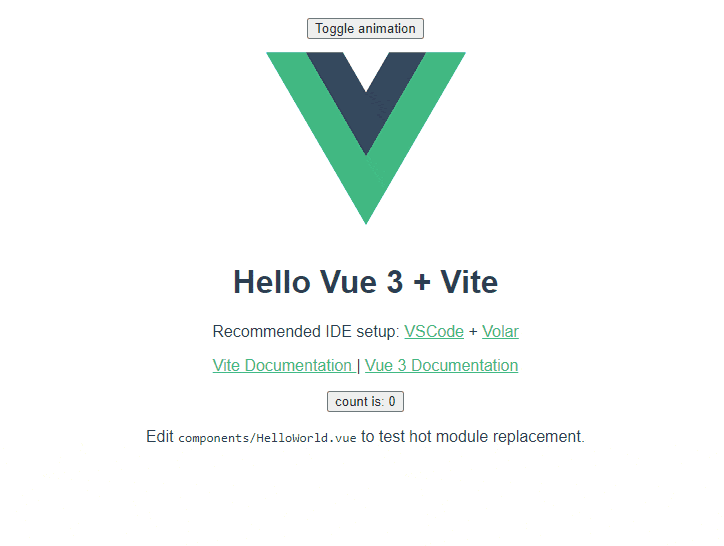
Toggling Animations
At the moment, the content is animated once when it enters, and it stays that way. However, it’s possible to toggle animations by changing the visibility of a child element. Let’s add a button and a ref to control the visibility of the div element that is a direct child of the Transition component.
src/App.vue
<script setup>
import { Transition, ref } from "vue";
import HelloWorld from "./components/HelloWorld.vue";
const show = ref(true);
</script>

<template>
  <button @click="show = !show">Toggle animation</button>
  <Transition name="fade-slide" appear>
    <div v-show="show">
      <img width="200" height="200" alt="Vue logo" src="./assets/logo.png" />
      <HelloWorld msg="Hello Vue 3 + Vite" />
    </div>
  </Transition>
</template>

<style>
#app {
  font-family: Avenir, Helvetica, Arial, sans-serif;
  -webkit-font-smoothing: antialiased;
  -moz-osx-font-smoothing: grayscale;
  text-align: center;
  color: #2c3e50;
  margin-top: 60px;
}

.fade-slide-enter-active,
.fade-slide-leave-active {
  transition: opacity 2s ease, transform 1s ease-in-out;
  transform: translateY(0px);
}

.fade-slide-enter-from,
.fade-slide-leave-to {
  opacity: 0;
  transform: translateY(100px);
}
</style>
Start clicking on the Toggle animation button to animate the content in and out. The GIF below shows what it looks like.
Extracting Transitions Into Components
It’s not uncommon to use the same animation in multiple places. Therefore, it’s a good idea to extract them into their own components to keep things DRY. Let’s move the Transition component and fade-slide classes
into a new component called FadeSlideTransition.
src/components/FadeSlideTransition.vue
<template>
  <div>
    <Transition name="fade-slide" appear>
      <slot />
    </Transition>
  </div>
</template>
<script setup>
import { Transition } from "vue";
</script>
<style scoped>
.fade-slide-enter-active,
.fade-slide-leave-active {
  transition: opacity 2s ease, transform 1s ease-in-out;
  transform: translateY(0px);
}

.fade-slide-enter-from,
.fade-slide-leave-to {
  opacity: 0;
  transform: translateY(100px);
}
</style>
Now we can update the App component to use our newly created component.
src/App.vue
<script setup>
import { ref } from "vue";
import HelloWorld from "./components/HelloWorld.vue";
import FadeSlideTransition from "./components/FadeSlideTransition.vue";

const show = ref(true);
</script>

<template>
  <button @click="show = !show">Toggle animation</button>
  <FadeSlideTransition>
    <div v-show="show">
      <img width="200" height="200" alt="Vue logo" src="./assets/logo.png" />
      <HelloWorld msg="Hello Vue 3 + Vite" />
    </div>
  </FadeSlideTransition>
</template>

<style>
#app {
  font-family: Avenir, Helvetica, Arial, sans-serif;
  -webkit-font-smoothing: antialiased;
  -moz-osx-font-smoothing: grayscale;
  text-align: center;
  color: #2c3e50;
  margin-top: 60px;
}
</style>
The animation should work just like it did before. The difference, however, is that now we can easily reuse the FadeSlideTransition component.
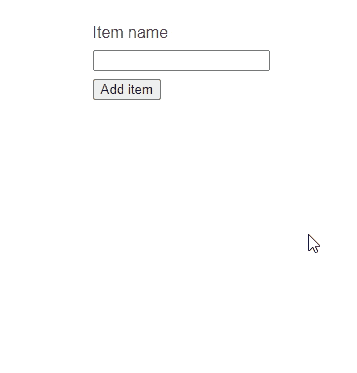
Animating a List of Items
So far we have covered how to animate one element using the Transition component. Vue also provides the TransitionGroup component that can be used to animate multiple items. Here’s an example of how we can use the TransitionGroup component to slide in items in a list.
src/components/AnimatingList.vue
<template>
  <div>
    <div class="form-block">
      <label>Item name</label>
      <input type="text" v-model="itemName" />
      <button @click="addItem">Add item</button>
    </div>
    <div>
      <TransitionGroup name="slide" tag="ul" appear class="list">
        <li v-for="item of items" :key="item">
          {{ item }}
        </li>
      </TransitionGroup>
    </div>
  </div>
</template>
<script setup>
import { TransitionGroup, ref } from "vue";
const items = ref([]);
const itemName = ref("");
const addItem = () => {
  items.value.push(itemName.value);
  itemName.value = "";
};
</script>
<style scoped>
.form-block {
  display: inline-flex;
  align-items: flex-start;
  flex-direction: column;
  margin: 0 auto;
}

.form-block :is(label, input) {
  margin-bottom: 0.5rem;
}

.list {
  list-style-type: none;
  padding: 0;
}

.list li {
  margin-bottom: 0.5rem;
}

.slide-enter-active,
.slide-leave-active {
  transition: all 0.5s ease;
}
.slide-enter-from,
.slide-leave-to {
  opacity: 0;
  transform: translateX(30px);
}
</style>
The input field is used to enter the name of new items, which will be added to the list. The TransitionGroup component receives slide as a value for the name prop. Therefore, it will use the slide-enter-* and slide-leave-* classes. The animation will make the items fade and slide in from the right side.
Now, let’s add the AnimatingList component in the App.vue file.
src/App.vue
<script setup>
import { ref } from "vue";
import HelloWorld from "./components/HelloWorld.vue";
import FadeSlideTransition from "./components/FadeSlideTransition.vue";
import AnimatingList from "./components/AnimatingList.vue";

const show = ref(true);
</script>

<template>
  <AnimatingList />
  <button @click="show = !show">Toggle animation</button>
  <FadeSlideTransition>
    <div v-show="show">
      <img width="200" height="200" alt="Vue logo" src="./assets/logo.png" />
      <HelloWorld msg="Hello Vue 3 + Vite" />
    </div>
  </FadeSlideTransition>
</template>

<style>
#app {
  font-family: Avenir, Helvetica, Arial, sans-serif;
  -webkit-font-smoothing: antialiased;
  -moz-osx-font-smoothing: grayscale;
  text-align: center;
  color: #2c3e50;
  margin-top: 60px;
}
</style>
The GIF below shows what the animation looks like.
State-Driven Animations
We have used the Transition and TransitionGroup components to create animations in Vue. However, we don’t necessarily have to use them. We can actually use Vue’s reactive state to animate elements. Here is an example
of how we can create a circle that will follow the cursor.
src/components/StateDrivenAnimation.vue
<template>
  <div :class="$style.circle"></div>
</template>
<script setup>
import { ref, onUnmounted } from "vue";
const pos = ref({
  x: 0,
  y: 0,
});

const onMouseMove = e => {
  console.log("mousemove", e.clientX, e.clientY);
  pos.value.x = `${e.clientX}px`;
  pos.value.y = `${e.clientY}px`;
};

window.addEventListener("mousemove", onMouseMove, {
  passive: true,
});

onUnmounted(() => {
  window.removeEventListener("mousemove", onMouseMove);
});
</script>
<style module>
.circle {
  width: 10px;
  height: 10px;
  background: orange;
  border-radius: 50%;
  position: fixed;
  top: v-bind(pos.y);
  left: v-bind(pos.x);
}
</style>
We have one div element that receives some styles that will make it look like a circle. It uses position: fixed so it can be placed anywhere on the screen. The top and left values are updated whenever
the pos ref changes. v-bind in the styles is one of the features introduced in Vue 3 that allows syncing style values with Vue’s reactive state.
Let’s update the App.vue and include our new component.
src/App.vue
<script setup>
import { ref } from "vue";
import HelloWorld from "./components/HelloWorld.vue";
import FadeSlideTransition from "./components/FadeSlideTransition.vue";
import StateDrivenAnimation from "./components/StateDrivenAnimation.vue";
import AnimatingList from "./components/AnimatingList.vue";

const show = ref(true);
</script>

<template>
  <StateDrivenAnimation />
  <AnimatingList />
  <button @click="show = !show">Toggle animation</button>
  <FadeSlideTransition>
    <div v-show="show">
      <img width="200" height="200" alt="Vue logo" src="./assets/logo.png" />
      <HelloWorld msg="Hello Vue 3 + Vite" />
    </div>
  </FadeSlideTransition>
</template>

<style>
#app {
  font-family: Avenir, Helvetica, Arial, sans-serif;
  -webkit-font-smoothing: antialiased;
  -moz-osx-font-smoothing: grayscale;
  text-align: center;
  color: #2c3e50;
  margin-top: 60px;
}
</style>
The GIF below shows how the circle follows the mouse cursor.

Wrap-up
There are multiple ways of adding animations in Vue.js—starting with the built-in Transition and TransitionGroup components and ending with native CSS or pure JavaScript animations. If you want to create more complex animations,
you might consider using a library with animation controls baked in, such as Kendo UI for Vue. It’s a feature-rich UI kit that, besides the animations
package, also provides 90+ ready-made components for building modern applications.

Thomas Findlay
Thomas Findlay is a 5-star rated mentor, full-stack developer, consultant, technical writer and the author of “React - The Road To Enterprise” and “Vue - The Road To Enterprise.” He works with many different technologies such as JavaScript, Vue, React, React Native, Node.js, Python, PHP and more. Thomas has worked with developers and teams from beginner to advanced and helped them build and scale their applications and products. Check out his Codementor page, and you can also find him on Twitter.
Related Posts
Comments
All articles
Topics
Web MobileMobile
Desktop
Design
Productivity
People
