How To Trap Focus in a Modal in Vue 3

Summarize with AI:
Making websites accessible can be very helpful to many users, especially those with disabilities. In this article, you will learn how to create an animated modal with trapped focus using Vue 3.
Making websites accessible can be critical for users, especially those who might be using only a keyboard or a screen reader to navigate.
One functionality keyboard users might rely on is tabbing through website elements, as they might not be able to use a mouse for that. This could be the case for users who are visually impaired or blind or who would struggle with moving a mouse.
Tabbing functionality might not work as expected when using popups such as modals, dialogs or tooltips. For example, when a user opens a modal and starts tabbing through the modal elements, the focus should stay in the context of the modal. If this is not handled correctly, then even though a modal is open, a user would be able to tab to the elements outside of the modal.
In this article, we are going to cover how to create a modal component and trap focus inside of it. Here is a summary of what we are going to cover:
- How to quickly set up a project with Vite
- How to create a modal component
- How to add animation to the modal
- How to trap focus using a custom
useFocusTrapcomposable - How to trap focus using the focus-trap library
You can find full code in this GitHub repo and an interactive example in the CodeSandbox below.
Project Setup
First, we need to set up a new Vue project. We will use Vite for it. In your terminal, cd into the directory where you want to create the project and run one of the commands below:
# npm 7+, extra double-dash is needed:
$ npm init vite@latest vue-modal-focus-trap -- --template vue

# yarn
$ yarn create vite vue-modal-focus-trap --template vue
Then just follow the prompts until the project is set up. After that, cd into the project and install packages:
$ cd vue-modal-focus-trap
$ npm install // or yarn
That’s it for the setup.
Creating a Simple Modal
Let’s start by creating a simple login form modal. Inside of the modal, we will have two input fields and buttons, as we need a few elements to tab through.
src/components/Modal.vue
<script setup>
defineEmits(['close']);
defineProps({
  isModalOpen: Boolean,
});

const submitForm = () => {
  alert('Form submitted!');
};
</script>

<template>
  <div v-if="isModalOpen" :class="$style.overlay"></div>
  <div v-if="isModalOpen" :class="$style.modalContainer">
    <div :class="$style.modal" role="dialog">
      <header :class="$style.formHeadline">Login</header>
      <main>
        <form>
          <div :class="$style.formRow">
            <label for="email">Email</label>
            <input type="email" name="email" id="email" />
          </div>
          <div :class="$style.formRow">
            <label for="password">Password</label>
            <input type="password" name="password" id="password" />
          </div>

          <div :class="$style.formActions">
            <button @click.prevent="$emit('close')">Cancel</button>
            <button @click.prevent="submitForm">Submit form</button>
          </div>
        </form>
      </main>
    </div>
  </div>
</template>

<style module>
.overlay {
  background: rgba(0, 0, 0, 0.3);
  position: fixed;
  inset: 0;
}

.modalContainer {
  position: fixed;
  inset: 0;
  z-index: 10;
  display: flex;
  align-items: center;
  justify-content: center;
}

.modal {
  width: 25rem;
  margin: 0 auto;
  padding: 2rem;
  z-index: 10;
  background-color: white;
  transform: translateY(-2rem);
}

.formHeadline {
  font-size: 1.6rem;
  margin-bottom: 2rem;
}

.formRow {
  display: flex;
  flex-direction: row;
  flex-wrap: wrap;
  margin-bottom: 1.5rem;
}

.formRow label {
  margin-bottom: 0.5rem;
  display: block;
  width: 100%;
  text-align: left;
  flex-basis: 100%;
}

.formRow input {
  flex-basis: 100%;
  padding: 0.5rem 0.75rem;
}

.formActions {
  display: flex;
  align-items: center;
  justify-content: flex-end;
  gap: 1rem;
}
</style>
As you can see in the example above, we use one of Vue 3’s latest features—script setup. If this is your first time seeing it, I recommend going through script setup documentation. In a nutshell, script setup is a compile-time syntactic sugar for using Composition API and makes the code more succinct.
The modal receives one prop—isModalOpen and emits the close event, which indicates that the modal should be closed. The component renders a modal with a login form and an overlay that will be displayed behind the modal, so users can’t click on anything outside.
Next, we need to update the App.vue component, as we need to render the Modal component. Besides that, we also need to add a button that will be used to open the modal.
src/App.vue
<script setup>
import { ref } from "vue";
import Modal from "./components/Modal.vue";

const isModalOpen = ref(false);
</script>

<template>
  <button @click.prevent="isModalOpen = true">Open modal</button>
  <Modal :isModalOpen="isModalOpen" @close="isModalOpen = false" />
</template>

<style>
#app {
  font-family: Avenir, Helvetica, Arial, sans-serif;
  -webkit-font-smoothing: antialiased;
  -moz-osx-font-smoothing: grayscale;
  text-align: center;
  color: #2c3e50;
  margin-top: 60px;
}
</style>
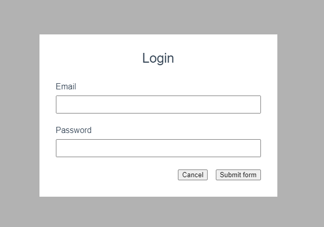
On the image below, you can see how the modal should look.

Animating the Modal
At the moment, the modal and overlay just appear immediately on the screen. Let’s add two new transitions—one on the overlay, so it nicely fades in, and another one on the modal to make it fade in and slide up. We will take advantage of the transition component. Below you can see the code for it.
src/components/Modal.vue
<script setup>
defineEmits(['close']);
defineProps({
  isModalOpen: Boolean,
});

const submitForm = () => {
  alert('Form submitted!');
};
</script>

<template>
  <transition name="fade">
    <div v-if="isModalOpen" :class="$style.overlay"></div>
  </transition>
  <transition name="slide-fade">
    <div
      v-if="isModalOpen"
      :class="$style.modalContainer"
      @keyup.esc="$emit('close')"
    >
      <div :class="$style.modal" role="dialog">
        <header :class="$style.formHeadline">Login</header>
        <main>
          <form :class="$style.form">
            <div :class="$style.formRow">
              <label for="email">Email</label>
              <input type="email" name="email" id="email" />
            </div>
            <div :class="$style.formRow">
              <label for="password">Password</label>
              <input type="password" name="password" id="password" />
            </div>

            <div :class="$style.formActions">
              <button @click.prevent="$emit('close')">Cancel</button>
              <button @click.prevent="submitForm">Submit form</button>
            </div>
          </form>
        </main>
      </div>
    </div>
  </transition>
</template>

<style scoped>
.fade-enter-active,
.fade-leave-active {
  transition: opacity 0.5s ease-in-out;
}

.fade-enter-from,
.fade-leave-to {
  opacity: 0;
}

.slide-fade-enter-active,
.slide-fade-leave-active {
  transition: all 0.5s ease-in-out;
}

.slide-fade-enter-from,
.slide-fade-leave-to {
  transform: translateY(2rem);
  opacity: 0;
}
</style>
<style module>
	/* Modal styles */
</style>
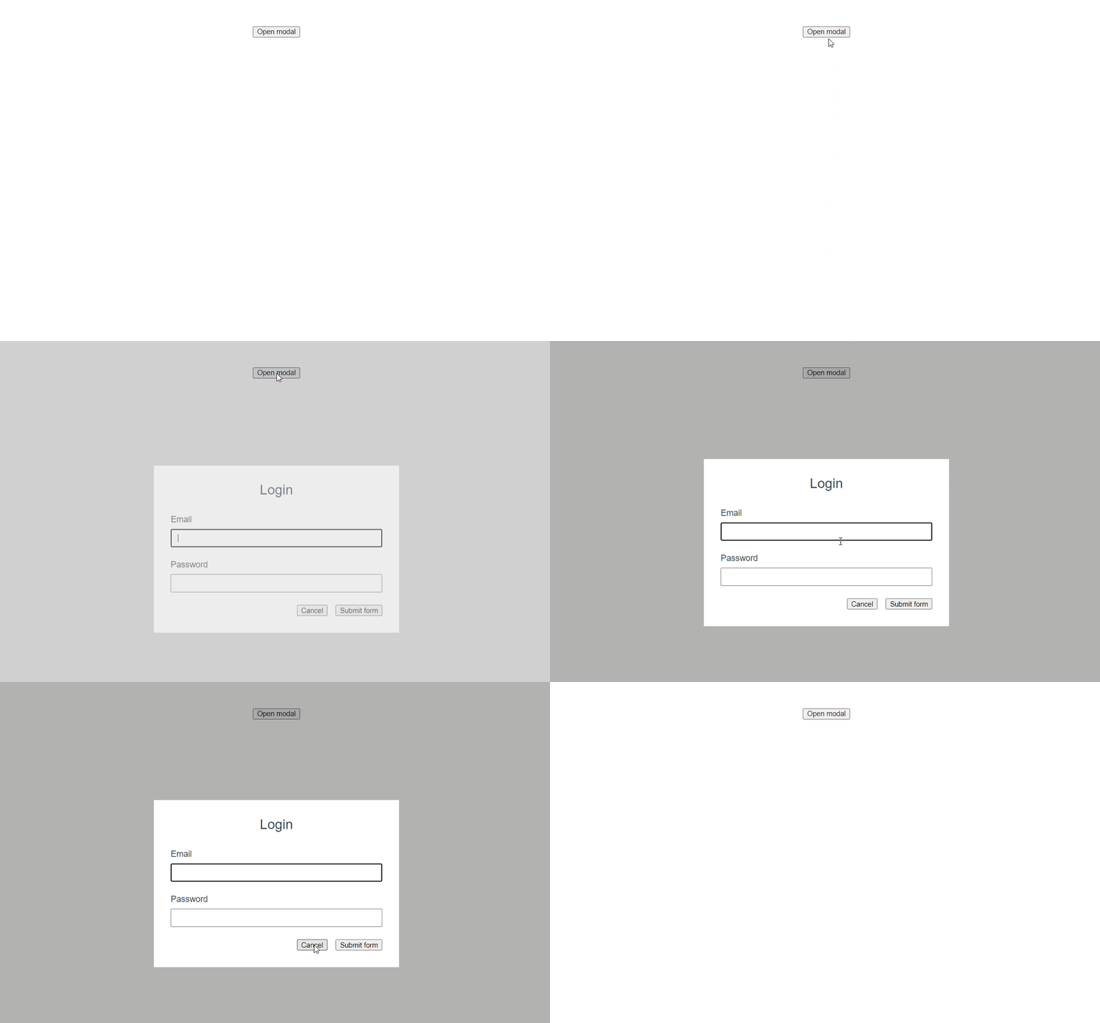
As you can see, we have wrapped the overlay and modal with Transition components. The overlay transition utilizes the fade classes, while the modal transition slide-fade. The gif below shows how opening and closing the modal should look now.

Trapping Focus in the Modal
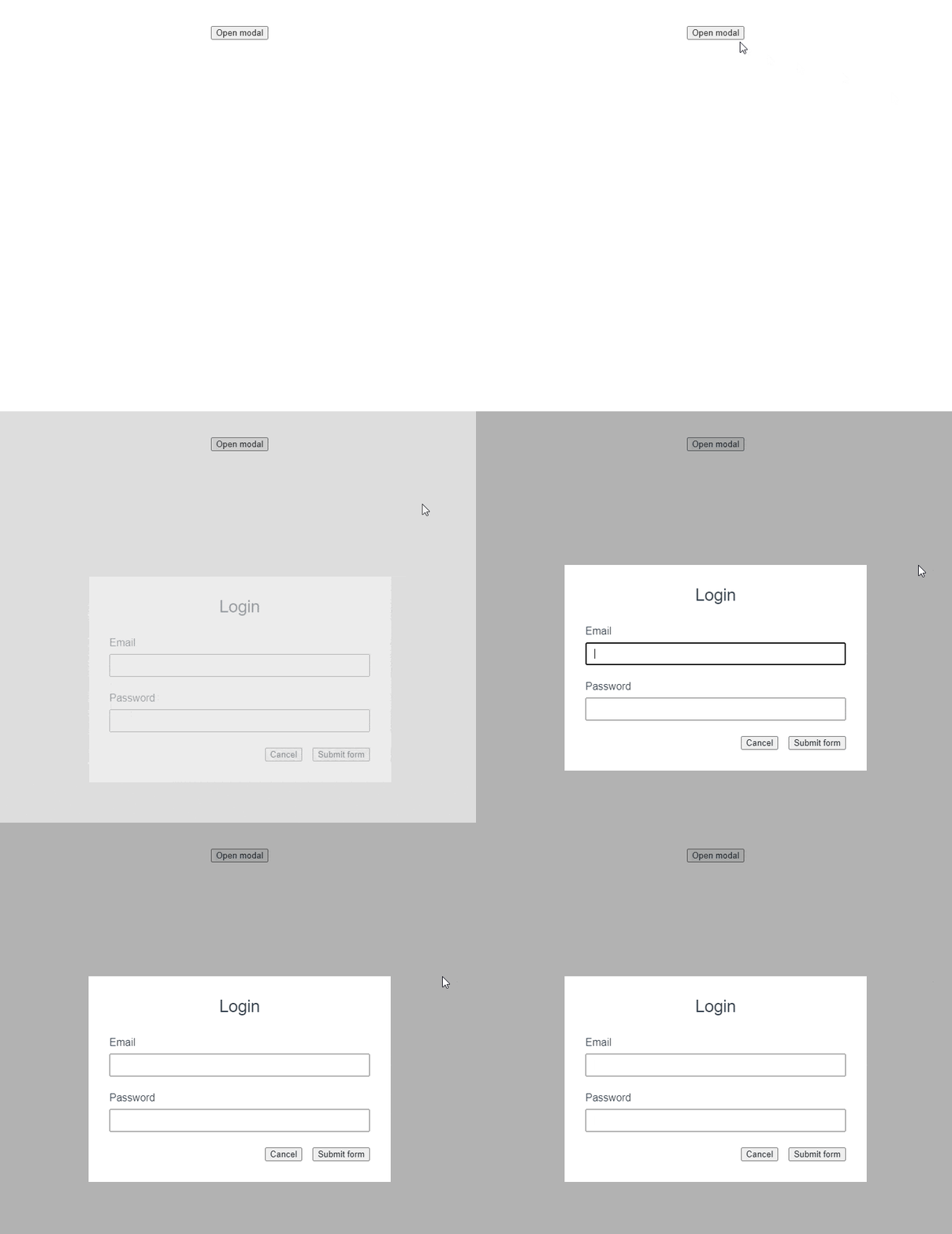
We have a working modal with some nice animations. That’s cool, but we still have a focus problem. Have a look at the gif below.

When we tab through modal elements with tab or shift + tab, the focus goes outside of the modal’s context. For example, on back-tabbing from the email input, the focus changed to the Open modal button, which should be inaccessible to the users.
Let’s fix it by creating a custom composable called useFocusTrap that will keep the focus inside the modal’s context.
src/composables/useFocusTrap.js
import { customRef } from "vue";

const focusableElementsSelector =
  'button, [href], input, select, textarea, [tabindex]:not([tabindex="-1"])';

const useFocusTrap = () => {
  let focusableElements = [];
  let $firstFocusable;
  let $lastFocusable;
  const trapRef = customRef((track, trigger) => {
    let $trapEl = null;
    return {
      get() {
        track();
        return $trapEl;
      },
      set(value) {
        $trapEl = value;
        value ? initFocusTrap() : clearFocusTrap();
        trigger();
      },
    };
  });

  function keyHandler(e) {
    const isTabPressed = e.key === "Tab";

    if (!isTabPressed) return;

    if (e.shiftKey) {
      if (document.activeElement === $firstFocusable) {
        $lastFocusable.focus();
        e.preventDefault();
      }
    } else {
      if (document.activeElement === $lastFocusable) {
        $firstFocusable.focus();
        e.preventDefault();
      }
    }
  }

  function initFocusTrap() {
    // Bail out if there is no value
    if (!trapRef.value) return;
    focusableElements = trapRef.value.querySelectorAll(
      focusableElementsSelector
    );
    $firstFocusable = focusableElements[0];
    $lastFocusable = focusableElements[focusableElements.length - 1];
    document.addEventListener("keydown", keyHandler);
    $firstFocusable.focus();
  }

  function clearFocusTrap() {
    document.removeEventListener("keydown", keyHandler);
  }

  return {
    trapRef,
    initFocusTrap,
    clearFocusTrap,
  };
};

export default useFocusTrap;
Let’s digest what’s happening in the useFocusTrap composable. First, we need a ref to store an HTML element inside which we want to trap the focus. We don’t use a normal ref, but a customRef instead. Using a customRef gives us more control than a normal ref. It allows us to automatically initialize the focus trap when an HTML element is set as a value. When an element that had a ref assigned is removed from the DOM, the value of the ref is automatically set to null. We take advantage of that to deactivate the focus trap.
The keyHandler method checks which key was pressed while the trap is active. If the key pressed was not the tab key, then it will bail out. Otherwise, if the shift + tab keys were pressed, and the user is currently on the first focusable element, the last element will be focused. If only the tab key was pressed and the user is on the last focusable element, then the first focusable element will be focused.
The initFocusTrap queries all focusable elements inside of the HTML element that is stored in the trapRef. The first and last focusable elements are stored in the $firstFocusable and $lastFocusable variables. Both of these are used in the keyHandler, which we covered a moment ago. Finally, the keydown event listener is initialized, and the $firstFocusable element is focused.
Last but not least, the clearFocusTrap method is used to remove the keydown event listener. It’s always important to clean up event listeners, as otherwise they might lead to memory leaks. If you would like to learn more about how to handle the clean up in Vue and React apps, check out my other article—How to Clean Up after Yourself and Why It’s Important (Vue/React).
Let’s add the useFocusTrap to the Modal component.
src/components/Modal.vue
<script setup>
import useFocusTrap from "../composables/useFocusTrap";

defineEmits(["close"]);
defineProps({
  isModalOpen: Boolean,
});

const { trapRef } = useFocusTrap();

const submitForm = () => {
  alert("Form submitted!");
};
</script>

<template>
  <transition name="fade">
    <div v-if="isModalOpen" :class="$style.overlay"></div>
  </transition>
  <transition name="slide-fade">
    <div
      v-if="isModalOpen"
      :class="$style.modalContainer"
    >
      <div :class="$style.modal" ref="trapRef" role="dialog">
        <header :class="$style.formHeadline">Login</header>
        <main>
          <form :class="$style.form">
            <div :class="$style.formRow">
              <label for="email">Email</label>
              <input type="email" name="email" id="email" />
            </div>
            <div :class="$style.formRow">
              <label for="password">Password</label>
              <input type="password" name="password" id="password" />
            </div>

            <div :class="$style.formActions">
              <button @click.prevent="$emit('close')">Cancel</button>
              <button @click.prevent="submitForm">Submit form</button>
            </div>
          </form>
        </main>
      </div>
    </div>
  </transition>
</template>

<style scoped>
/* Transition styles */
</style>
<style module>
/* Modal styles
</style>
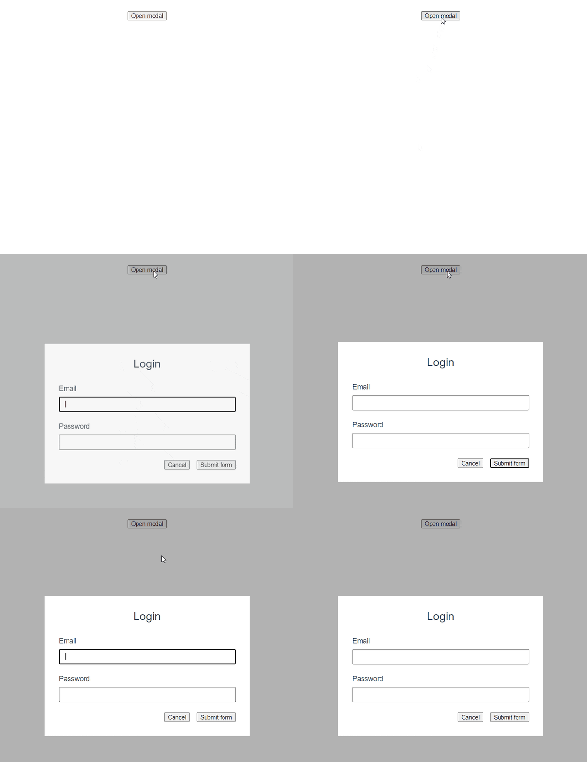
As you can see, we didn’t have to do much here. We only had to import and initialize the useFocusTrap composable and then pass the trapRef to one of the modal elements: <div :class="$style.modal" ref="trapRef" role="dialog">. If you open the modal again, the focus should stay inside of it, as shown on the gif below.

Focus-Trap Library
We have implemented a simple way to trap focus inside of a modal. It works, but there are scenarios in which our current solutions would not be enough. For instance, what if we had two modals displayed, one on top of another? In such a scenario, we would need to handle these cases:
- When the first modal is open, it has an active focus trap.
- When the second modal is open, it has an active focus trap, and the focus trap for the first modal is deactivated.
- When the second modal is closed, its focus trap is deactivated, and the focus trap for the first modal is activated.
Fortunately, we don’t have to reinvent the wheel, as there is a library that can help us handle this scenario and more. We are going to update the useFocusTrap to take advantage of the focus-trap library. Here is an updated code for the composable.
src/composables/useFocusTrap.js
import { customRef } from "vue";
import { createFocusTrap } from "focus-trap";

const useFocusTrap = focusTrapArgs => {
  const trapRef = customRef((track, trigger) => {
    let $trapEl = null;
    return {
      get() {
        track();
        return $trapEl;
      },
      set(value) {
        $trapEl = value;
        value ? initFocusTrap(focusTrapArgs) : clearFocusTrap();
        trigger();
      },
    };
  });

  let trap = null;
  const initFocusTrap = focusTrapArgs => {
    if (!trapRef.value) return;
    trap = createFocusTrap(trapRef.value, focusTrapArgs);
    trap.activate();
  };

  const clearFocusTrap = () => {
    trap?.deactivate();
    trap = null;
  };

  return {
    trapRef,
    initFocusTrap,
    clearFocusTrap,
  };
};

export default useFocusTrap;
The useFocusComposable and initFocusTrap now accept an argument that is forwarded to the createFocusTrap method, which is used to create a focus trap. After the trap creation, we activate it. In the clearFocusTrap, we just deactivate the trap and set the trap variable to null, so the trap object that was created with the createFocusTrap method can be garbage collected.
Summary
That’s it! Accessibility is an important part of every web application, and we have just covered how to make modals more accessible. We created an animated modal in Vue and explored two different solutions to trap focus inside it. First, we created our own custom composable called useFocusTrap and then modified it to take advantage of the focus-trap library.
Before we finish, let me note that there is one more solution that can be used to trap focus in modals. The VueUse library provides its own useFocusTrap composable, so you can take advantage of it if you are using VueUse already.

Thomas Findlay
Thomas Findlay is a 5-star rated mentor, full-stack developer, consultant, technical writer and the author of “React - The Road To Enterprise” and “Vue - The Road To Enterprise.” He works with many different technologies such as JavaScript, Vue, React, React Native, Node.js, Python, PHP and more. Thomas has worked with developers and teams from beginner to advanced and helped them build and scale their applications and products. Check out his Codementor page, and you can also find him on Twitter.
