Typographic Hierarchy Tips for Creating More Visually Appealing and Readable Text

Summarize with AI:
Do you have a process for creating the typographic hierarchy on your websites and apps? If not, then keep reading. In this post, we’ll explore the three steps needed to identify your text levels and components, size and scale them, and style as needed.
As a writer, I factor in hierarchy whenever I create new content. No one is going to read every word I’ve written and there are plenty of eye-tracking studies to back this up. So that’s why typographic hierarchy is so important.
The only thing is, we writers can only do so much with it. When I write content for a webpage, blog post or ecommerce product page in Google Docs, I can do some basic styling. I use different heading levels to organize my content. I add bolding or italics to style quotes or captions. That sort of thing.
However, there’s more that needs to be done before my content and recommended hierarchical structure can be published to the web. That’s where you as a web designer or developer comes into play.
In this post, we’ll look at what typographic hierarchy is, why it’s important and a basic process you can use to establish a unique typographic hierarchy for each website you build.
Why Is Typographic Hierarchy Important?
Typographic hierarchy refers to the way text is organized and styled. The goal is to improve the scanning and reading experience for users by designing different types of text in a unique yet consistent manner.
This is an example from a recent blog post entitled “Perfecting Collection Management with the .NET MAUI CollectionView.” On the left is a screenshot of the first five paragraphs from the post along with the first H2 heading. On the right is that same text without any styling applied to it:
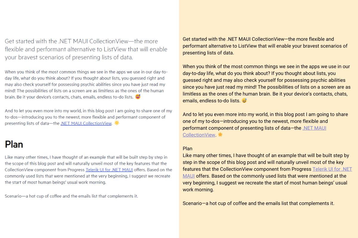
You can see how styling just two text elements makes a world of difference when reading this blog post. What looks like an endless wall of paragraphs on the right has been transformed into a better-organized page on the left.
Since the paragraph text makes up the bulk of the page, let’s use that as our baseline. The font is called Metric and the size of the text is 20px.
The summary text (the first paragraph at the top) uses the same font. However, it’s 28px. This size difference tells our eyes and brains to focus on the summary first. It’s bigger, so it must be more important or, at the very least, more valuable to read before we dig into the meat of the post.
The “Plan” H2 heading also uses the Metric font. It’s 45px, making it significantly larger than the other text elements on the page (besides the H1 title at the top). It also has unique styling applied to it, like a heavier weight and tighter spacing.
Most of us have been using the internet long enough that we naturally look for these visual cues. They make it easier to scan a page and get a high-level summary of what we’re looking at. But they wouldn’t be easy to find or read if designers didn’t give them special treatment like this.
How to Build Out the Typographic Hierarchy for Your Website
There are three basic steps that will help you create a unique typographic hierarchy for your website or app.
1. Determine How Many Levels You Need
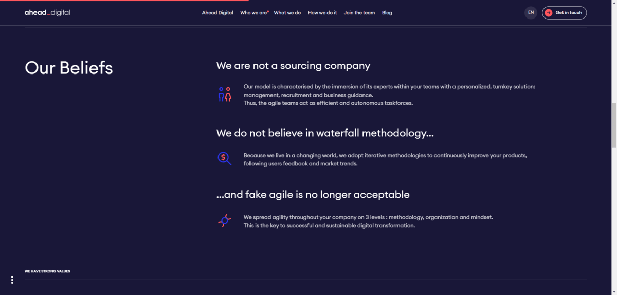
Typically, a website has a minimum of three levels of hierarchy. Let’s use Ahead Digital’s “Who we are” page to demonstrate what these essential levels are:
Level 1
The H1 and H2 headings are always part of the first level.
The H1 is typically the name of the page, product or blog post. Then there are usually several H2 headings throughout the page, signaling the start and end of major sections. The H2s help keep things organized while providing clues to people scanning the page for what the whole thing is about.
These are the most important bits of text on a page and, therefore, need to have the most pronounced design.
In the screenshot we’re looking at above, “Our Beliefs” on the left side of the section is the H2.
Level 2
The rest of your headings are in the second level.
We don’t usually go past the H3 and H4 unless the content is super complex and needs to be broken down into smaller and smaller categories. If H5 and H6 are present, it’s usually on an ecommerce page and in sections less relevant to the selling of the product (like product comparison tables and reviews sections).
These Level 2 headings are considered secondary text. They should have a more pronounced design than regular paragraph text, but less pronounced than the H1 and H2. We want people’s eyes to naturally start with the H1 and H2 and then move onto the H3 and H4.
In the example above, there are three H3 headings present:
- “We are not a sourcing company”
- “We do not believe in waterfall methodology…”
- “…and fake agile is no longer acceptable”
Level 3
The paragraph text is in the next level down.
This is the meat of the post. However, as we’ve seen in eye-tracking studies and what I’ve anecdotally witnessed with heatmap testing, many people scan down the left edge of a page, barely reading the text as they go along. At least in the first go round.
This is one of the reasons why typographic hierarchy is crucial. If website headings aren’t well-placed and prominently designed, some people may ditch out on the page entirely. Headings should provide a high-level summary of what’s on the page. If people can’t easily find the headings and read them, they might not find any reason to read further.
But the headings aren’t the only thing to concern yourself with when it comes to design. When people read a webpage, they expect it to be legible, readable and accessible. This means that everything from font size to color matters when you’re designing your Level 3.
Other Levels
For some websites, you might not need any more than Levels 1, 2 and 3. However, websites with a more complex array of data will likely need more. This is typical with blogs and ecommerce sites.
Take this recipe page on the Diamant website, for example.

The recipe category (“Backen”) and recipe name (“CANNELÉS AUS FRANKREICH”) are our Level 1. We don’t see the Level 2 until we scroll down to the recipe.
That said, we see a Level 3 paragraph description here as well as below the fold—and much more.
When your pages include other types of data and text, you’re going to have to decide how you want to level them. Here are some text elements to think about:
- Buttons
- Metadata
- Breadcrumbs
- Pull quotes
- Captions
- Subtitles
- Labels
The way you design these elements should dictate how important they are when compared to the rest of the text on the page. Or in the component or section they’re typically found in.
This doesn’t necessarily mean they need to be smaller than Level 3 text, especially if you’ve set your paragraph font to the minimum acceptable size of 16px. But you do need to decide how much stylization you want to use so that visitors can find the relevant information, but not be too distracted to focus on Level 1, 2 or even 3 content.
2. Create Your Font Size Scale
Font size is the primary way to distinguish the different types of text on your site. While you could use your content management system’s font size scale defaults, you might want to explore other options.
Spencer Mortensen has a helpful resource on this topic. In this post, he includes a variety of scales that provide a good amount of balance between text types.
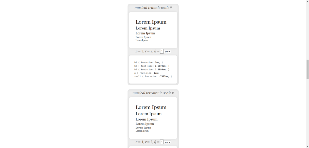
He includes scales based on music, the golden ratio as well as classic typography. The classic scale, for instance, looks like this:
- H1: 2em
- H2: 1.7411em
- H3: 1.5157em
- H4: 1.3195em
- H5: 1.1487em
- P: 1em
Here, em or rem is the ephemeral unit and represents the height of the font. The paragraph § usually serves as our root font, which is why it’s always assigned the value of 1em.
So, let’s say your paragraph font is 16px. That means that 1em = 16px. Rather than use pixel values for your headings and other text levels, use em to scale your headings according to the paragraph root.
Based on the classic scale above, this is what the font sizes would roughly come out to:
- H1: 32px
- H2: 28px
- H3: 24px
- H4: 21px
- H5: 18px
- P: 16px
When setting your scales, don’t forget to factor in all of the other kinds of text your site has. For example, when I inspect the Panavision website, I see that they have a scale consisting of 13 sizes as well as 4 weights.
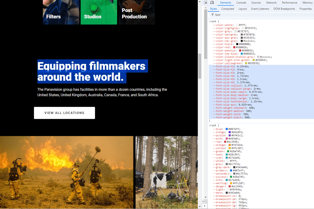
The text scale goes like this:
- H1: 4.25rem
- H2: 3rem
- H3: 2rem
- H4: 1.75rem
- H5: 1.5rem
- H6: 1.375rem
- Callout: 1.375rem
- Callout-large: 2rem
- Body-small: 0.875rem
- Body-medium: 1rem (root)
- Body-large: 1.5rem
- Testimonial: 1.25rem
- Aux: 0.625rem
Panavision doesn’t follow the classic typography scale. In fact, many of the websites I inspected—even ones that play it safer with typography choices like Payworks—deviate from the classic scale.

For example, the H2 is 40px and the body is 16px on this website. It’s close to the classic scale, but not exactly. And that’s okay. When setting your scale, you also have to consider what your brand is about and how that should be visually translated on the page.
Take, for instance, the Tourism Barrie website. The typographic scale looks like this:
- Large heading (H1): 124px
- Small heading (H1): 64px
- Paragraph: 16px
- Label (H2): 16px
- Featured card heading: 28px
- Text link: 18px
When you view it as a list of numbers, it looks a bit wacky. However, the scale makes sense when you look at how it was applied.
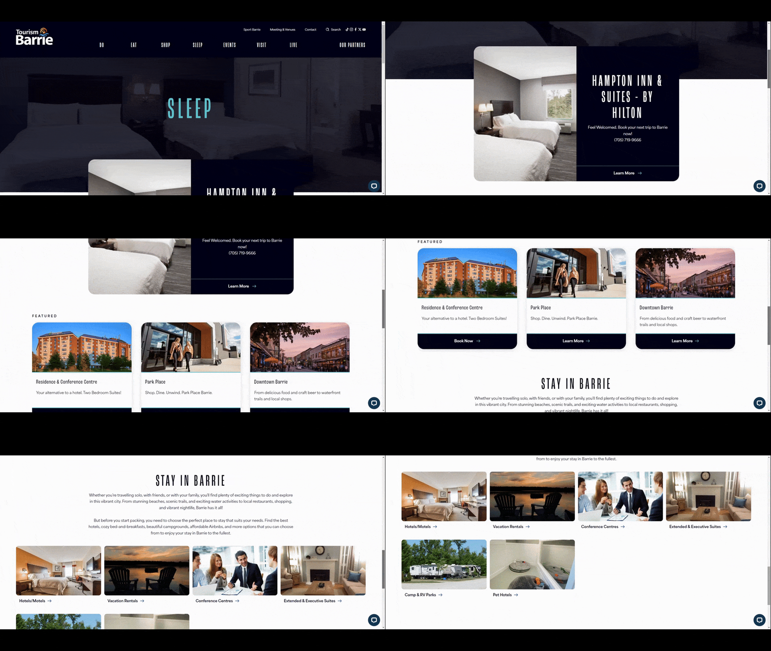
For instance, the Label and Featured card heading are part of their own section. Although the scale might seem odd in the grander scheme of things, the result looks good when you view it on the website.
What matters is that your size scale guides visitors’ eyes to information on the page in a logical manner. So you might not be able to follow the most conventional rules in order to achieve this effect. And you might have to create unique scales for different kinds of content on your pages—like in this Tourism Barrie example.
What I’d recommend is starting with one of the more classic typographic scale structures as presented by Spencer Mortensen. You can also use one of the following tools to generate your type scale:
Then, as you flesh out the brand identity and corresponding aesthetics of your site, you can adjust the scale as needed.
3. Style Your Hierarchy as Needed
Size isn’t the only way to differentiate one type of text from another. Let’s take a look at this online menu for P.F. Chang’s as an example:
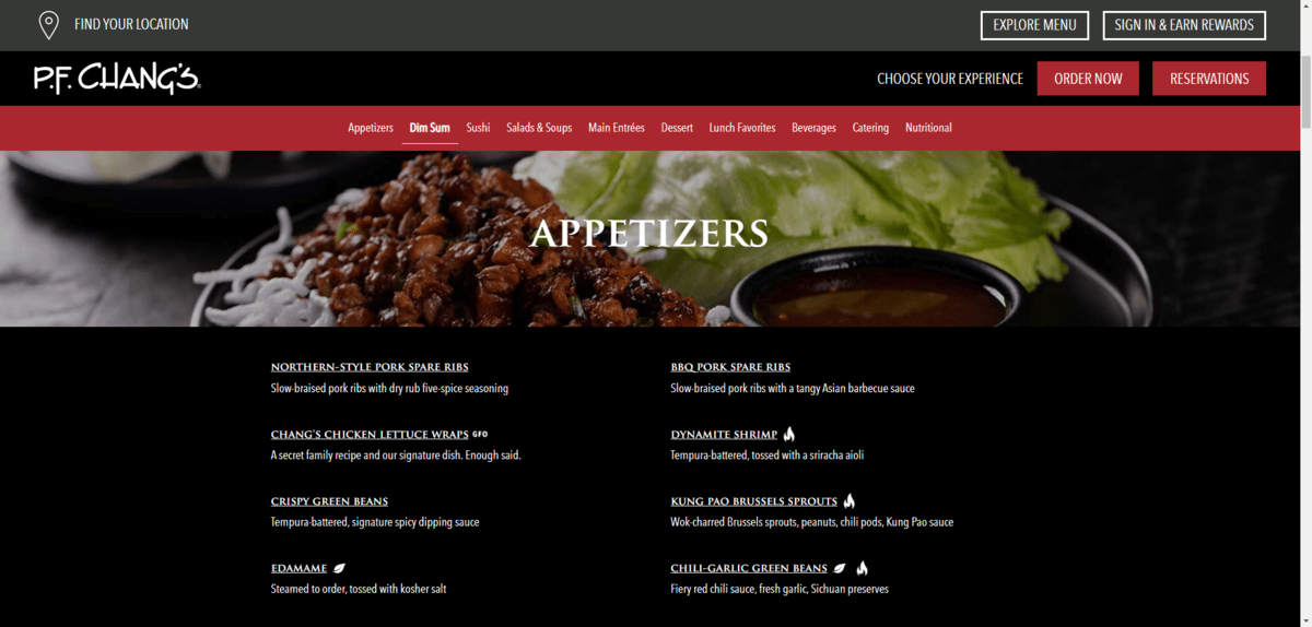
Focusing just on what we see on the page, here are the ways in which the designer has differentiated between the H2 food category heading, the menu item H3s and the descriptive text:
| Food Category | Food Items | Descriptors |
|---|---|---|
| Tag | H2 | H3 |
| Font | Trajan Pro | Trajan Pro Avenir |
| Weight | 500 | 500 |
| Color | #ffffff | #ffffff |
| Size | 1.75rem | 1rem |
| Line height | 1.2 | 1.2 |
| Alignment | center | left |
| Case | uppercase | uppercase |
| Decoration | none | underline |
The designer used the font type (Trajan Pro) and case (all-caps) to distinguish between the headings and paragraph text. This makes it easy for visitors to scan through the site and focus on the most important details. Even though the food item font size is the same as the paragraph, the unique styling—all uppercase and underlined—distinguishes these miniscule headings from the regular body text.
At the same time, the designer used identical alignment and size to isolate visitors’ focus to the food item and matching descriptor.
This is a great example of how to use variable styling but not to go overboard with it.
When styling your hierarchy, remember not to solely focus on the text on the page. Your hierarchical style choices can also impact the readability and usability of other sections on your website.
For instance:
- Headers
- Navigations
- Sidebars
- Footers
- Forms
For instance, let’s look at the mega menu navigation on the Tom Tailor ecommerce site:
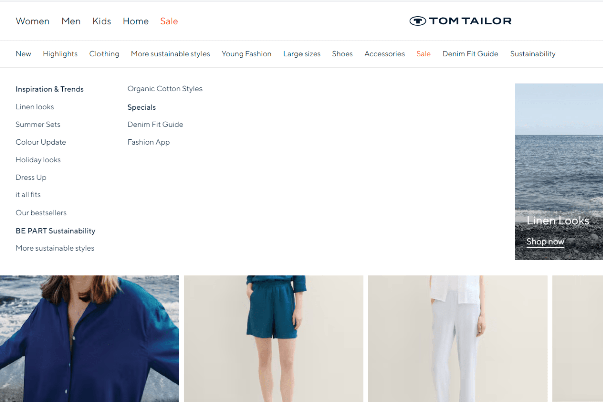
There are different types of hierarchy used here. For example, color sets the “Sale” categories apart from the rest. The size changes as the user explores sub-categories and sub-sub-categories beneath the primary one. And styling in the form of bolding organizes the sub-sub-category links.
As we’ve seen, though, there are other ways to differentiate between your text types:
- Font
- Size
- Weight
- Capitalization/case
- Line spacing
- Letter spacing
- Color
- Style
- Decoration
- Alignment
What’s nice about all these variations is that it keeps you from having to choose a lot of different fonts. Instead, you can use one font for all your headings, one font for your paragraphs, and then maybe an additional one for accent text. Then, you can mix styles to make each heading look distinct from the others.
Just be careful about overdoing it. One or two unique stylizations for each heading should be enough to let visitors know that they’ve encountered something new, be it a new heading level, a testimonial, an image caption, etc.
Wrapping Up
Typographic hierarchy is a critical part of web design these days. Even for smaller websites, a clear-cut hierarchy can significantly improve the readability and usability for visitors.
Although the process for fleshing out your typographic hierarchy isn’t very long, there is a lot to think about.
For starters, what kinds of text components does your website need? Some headings and paragraph text are a given. But what else? And have you taken into consideration secondary components, like sidebars, navigation dropdown menus and footers?
Next, how do you want to scale the sizes of your fonts? Should you keep it conservative, only moderately increasing the size of each heading from one to another? Or does your brand need a bolder approach when it comes to headings and other special areas of text?
Lastly, what more can you do to make your hierarchy clear to visitors? Is anything needed at all? Simple changes to case and weight can make a big difference, though you might want to try something that makes your brand stand out from the competition.
Whatever you end up doing, make sure it’s applied consistently across your website. Our eyes and brains are smart enough to pick up on the visual changes you apply to text on a website or app. However, they’ll quickly become overwhelmed if the typographic hierarchy established on one page changes on the next. So in addition to following an iron-clad strategy when designing your hierarchy, be sure your text rules are consistently implemented as well.

Suzanne Scacca
A former project manager and web design agency manager, Suzanne Scacca now writes about the changing landscape of design, development and software.

