Tips for Using a Typographic Hero vs. Hero Imagery

Summarize with AI:
This post will explore some use cases for typography-only heroes and how to style your typography for maximum effect.
Is imagery really necessary in the hero section of the home page? For some brands it might be. Product imagery or even the face of the founder or entrepreneur can instantly evoke a response that words alone might not. However, that’s not always the case.
These are some of the benefits to using text-only in the hero:
- Unlike imagery, which can sometimes be subjectively interpreted, a clearly written message that’s isolated from imagery won’t be.
- When you take imagery out of the equation, you have more room to play. You can experiment with size, white space, positioning, alignment and more when it’s just text.
- With hero images, you have to be careful which you use, since imagery may get cropped in a way where the subject is barely recognizable on mobile. Typographic heroes are much easier to make responsive.
Plus, if hero images are what people have come to expect to see when they enter a homepage, a typographic hero might be an interesting way to get them to pay more attention.
If you’re curious about how to create a typographic hero section that doesn’t underwhelm visitors, let’s look at some of the best use cases for this trend along with tips for nailing it.
Best Use Cases for Text-Only Heroes
Typography can be just as visually stimulating as images and videos are. If you think this is a trend that would work well for the brand you’re designing for, these are some of the best applications for it:
For creatives
Creative freelancers and agencies have been the ones leading the way with this design trend. And while you might expect it on websites for creatives that work with words for a living, it’s also a style that works
well for designers and other visual artists.
For websites otherwise dominated by visuals
When you’re designing a website with a heavy visual component—like a portfolio, restaurant or shop—having a hero section without imagery can offer visitors a respite before
jumping in.
It also gives brands a chance to briefly introduce themselves. This can start the relationship off on a good foot, as it feels more like a personal communication instead of just a sales pitch.
For brands that don’t like stock imagery but don’t have any of their own
Stock imagery has gotten a bad rap over the years—and sometimes deservedly so. While there are ways to find unique stock imagery that others
aren’t using, it can take some time to find them and it can be costly, too.
For brands that want to steer clear of stock images but don’t have any of their own to use, a bold typographic design might be the perfect solution.
For hero images that just aren’t working
There are a number of reasons why visitors might bounce from a home page in droves. However, if you’re sure that the website is properly optimized and marketed—i.e., the
external messaging matches the internal—then the issue might be the hero image.
A typography-only design could be a good way to test out this hypothesis.
Tips for Designing Above the Fold With Typography Only
Now that you have some good reasons and use cases for designing hero sections with typography, let’s look at some best practices and examples:
1. Use Visually Interesting Fonts
Typography, in general, should tell visitors a lot about the personality of a brand. When you have this much space to work with, though, you can get even crazier with your font selections—just make sure they’re still easy to read. You don’t want to trade creativity for legibility.
The typographic hero for Pittori di cinema is one I really like:
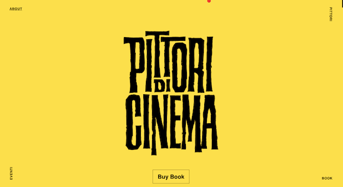
The site is promoting a book about cinema painters from the 1900s. These are the painters and illustrators who created the posters, playbills and other images used to promote movies.
The black scraggly-looking font is a great choice for this site as it gives it a raw, hand-drawn feel. No imagery is needed to elicit a response since the typography itself will do it.
San Diego Design Week is another example of how to use a visually interesting font in a type-only hero:
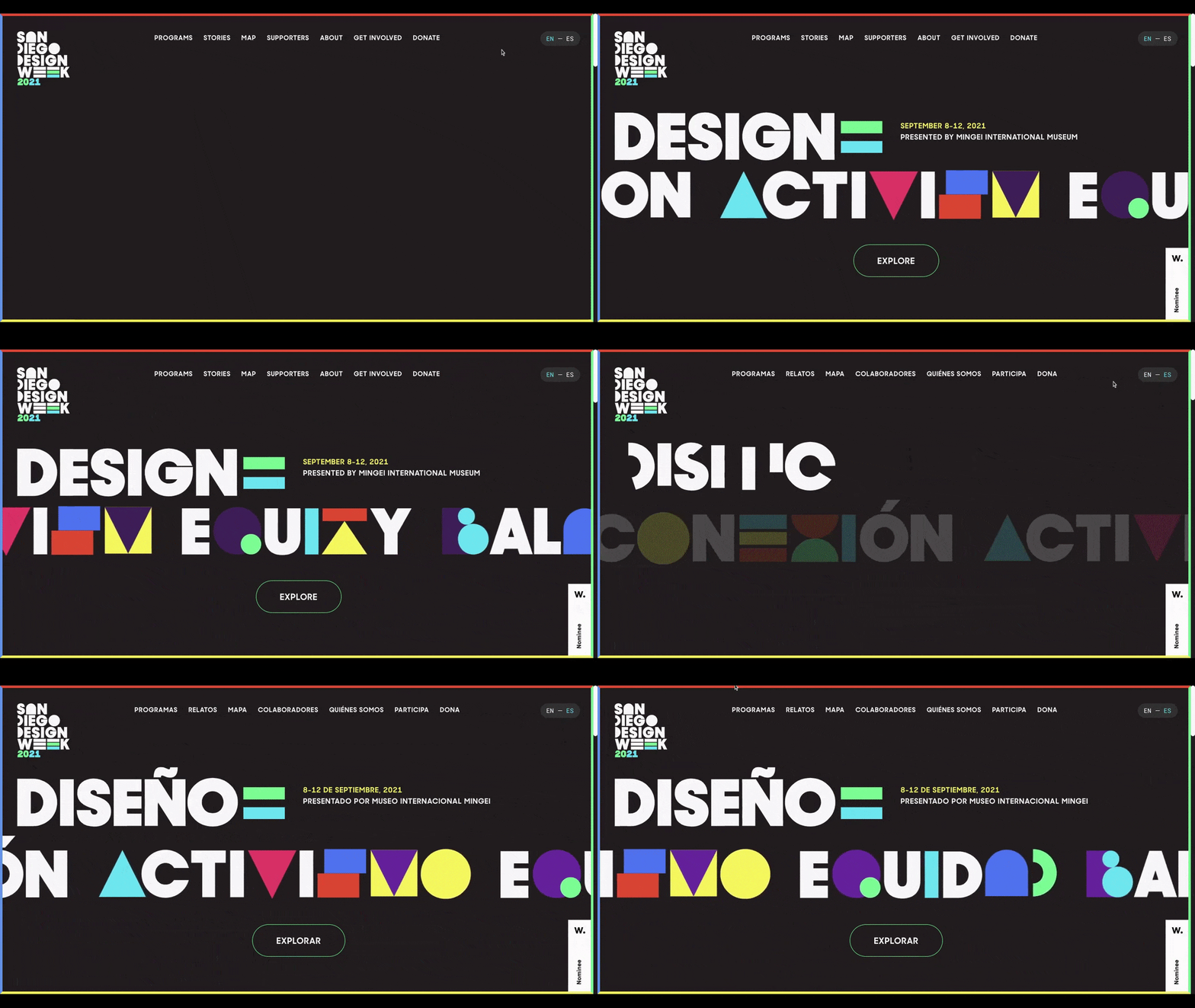
This is another hero that uses a font perfectly paired with the theme and personality of the website. Being as this is for San Diego Design Week, the big lettering combined with colorful symbols creates a fun, artsy vibe.
I’d just stress again to be careful when using certain fonts. Some visitors might have a hard time figuring out what the symbols here stand for at first, which might add undue frustration to their visit.
2. Go Extreme With Size
You have a lot of room to play with—from the bottom of the header to the screen fold—when you design only with typography. But that doesn’t mean you need to occupy every inch. In fact, I’d suggest going to extremes when it makes sense to do so.
One way to do this is by using an oversized font the way Lamanna’s Bakery does:
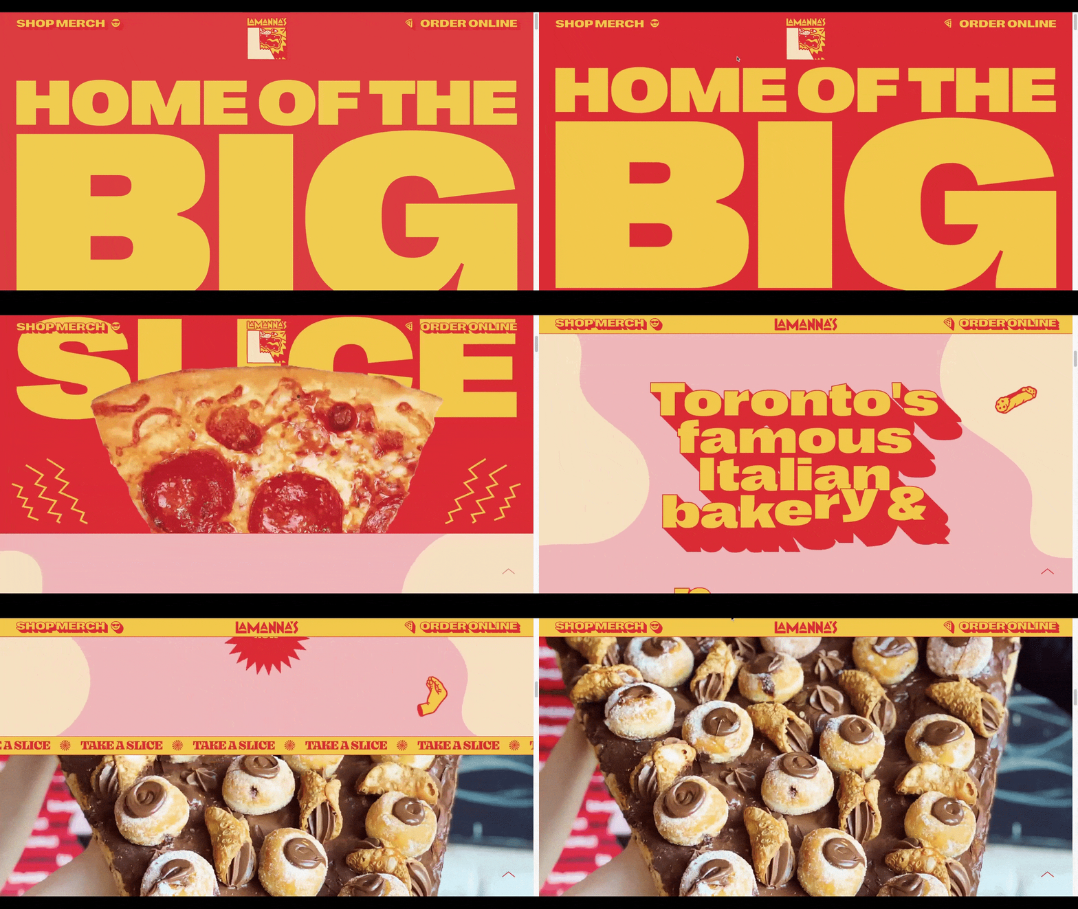
The hero text is so big that it covers most of the red background and requires visitors to scroll down to read all of the words. Considering the message reads “Home of the Big… Slice,” the excessively large type is a brilliant strategic choice.
That’s not going to work for most brands though. If you want to go in the opposite direction, look to Pandora for inspiration:
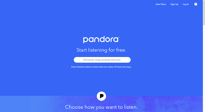
This hero section reminds me a lot of Google’s home page. You see the Pandora logo in the middle of the solid blue background. There’s an invitation to listen in the middle and a big white search bar just beneath it.
Pandora could’ve designed this hero with album covers and photos of popular artists. The only problem with a design like that is it might confuse or turn off some visitors.
For instance, a collage of photos of people like Ariana Grande, Dua Lipa and Machine Gun Kelly might be fine for younger music listeners. But what about someone who wants to find a platform to listen to political podcasts? Or to play oldies stations? By staying away from limiting imagery, Pandora has created a more inclusive hero section design and, by proxy, app.
3. Get Color Involved
A lot of times what I see in typographic design is white lettering on black or black lettering on white. I think that’s a good option if you’re going to use this kind of hero design for creatives. There’ll be plenty of time to inject the site with color as you show off portfolio samples.
For other use cases, though, I think there should be lots of color in a text-only hero. It doesn’t necessarily need to be neon colors, though that’s not a bad idea.
Antoine Wodniak is a developer who’s created an awesome hero section/one-page website with tons of color and excitement:

When the words “Senior Front-End Developer” fall into place in the hero section, visitors will quickly realize there’s something different here. The letters can actually be pushed, pulled, knocked over and thrown. It’s a fun design and provides a brief diversion before they jump into the good stuff (i.e., the samples of his work).
Then again, color doesn’t have to be outrageously bright or lettering interactive to create an exciting hero section. Check out Adele’s latest website hero:
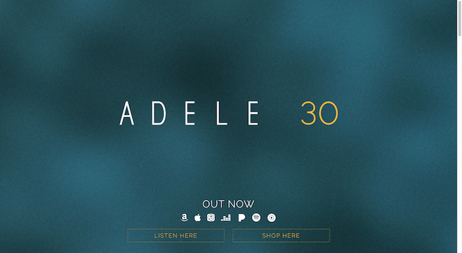
I had a feeling that one of these single-named artist’s would have a homepage hero like this, and I found it with Adele. You might not think there’s anything special about the colors used here, but it’s the gold color applied to the “30” that’s worth noting.
Adele’s albums are all named with numbers—they represent the age at which she recorded each album. Her fans are always begging for new music, so when her home page and hero section gets updated with a new number, that’s a huge deal for them. Making it the brightest color on the page is no mistake.
4. Add Emphasis to Specific Words or Phrases
Usually, I’d say hold the emphasis for the body of your pages—bolding, italics, outlined text, underlines, etc. Header text in a hero image doesn’t really need added emphasis when there’s already so much visual stimulation going on.
However, when all you’ve got to work with is text, adding emphasis to key words and phrases isn’t a bad idea.
One example that I find interesting is the 2021 Readymag round-up of “New tools and updates for more interactivity”:
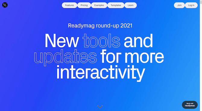
Typically, I consider outlined UI elements to be secondary—like ghost buttons vs. solid buttons. We give buttons a hollowed-out look when we want people to click on them but don’t want to emphasize the action over the primary one.
However, in Readymag’s hero design, the key words stand out because they use this outlined style. Despite going against the norm, I think this design decision works. It does what it’s supposed to in the context of a text-only hero: bring attention to the words that look different.
OddCommon takes a somewhat more traditional approach to highlighting specific words in its hero:
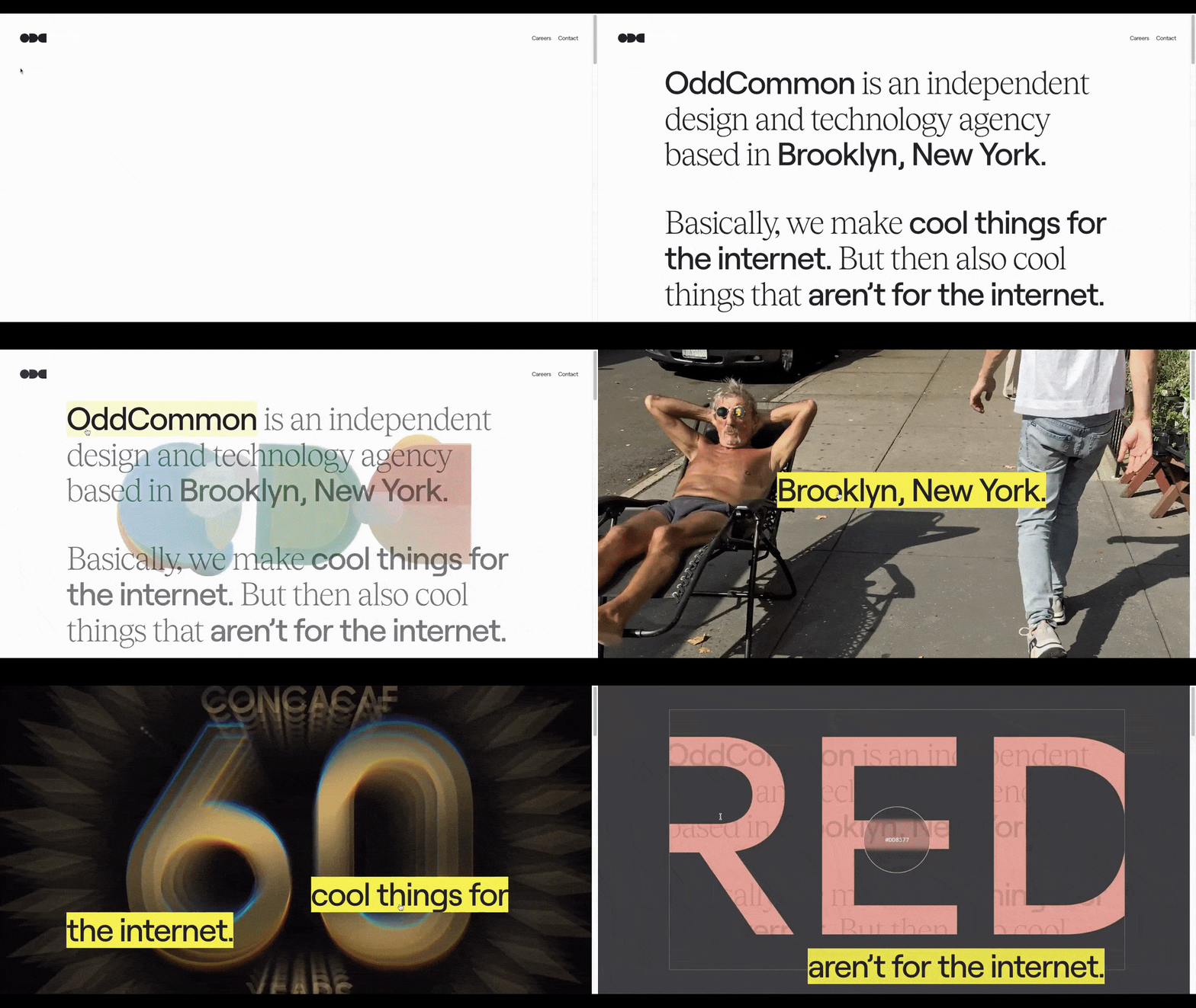
That said, the words aren’t just bolder than the rest. When the visitor hovers over each of the bold phrases in the two paragraphs, an image pops up. It’s a creative way of sneaking eye-catching imagery into a typographic hero.
5. Use Animation To Bring It to Life
One other thing you can do to spice up a text-only hero is to animate it. The words themselves don’t necessarily need to be animated though.
Take the home page for Kirifuda Inc:
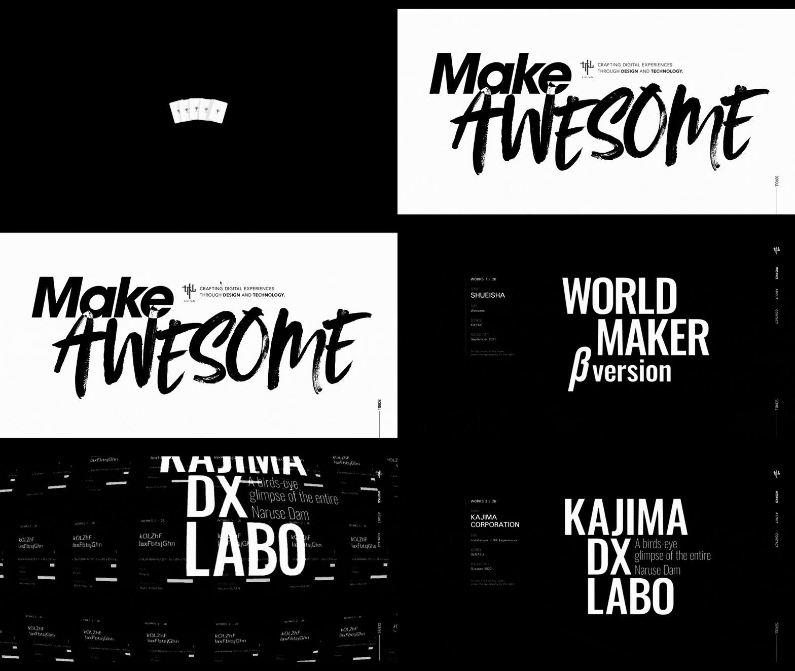
The hero section on its own looks really neat with the basic sans serif font and the brushed-style “Awesome” lettering layered over it. However, that’s not where the creativity ends.
When a visitor scrolls below the fold, the “Make Awesome” section falls away as if it were a towel or sheet. There are other eye-catching transition effects that make this predominantly typographic website a fun one to scroll through.
Meissl & Schadn Restaurant is another animated typographic example I like:
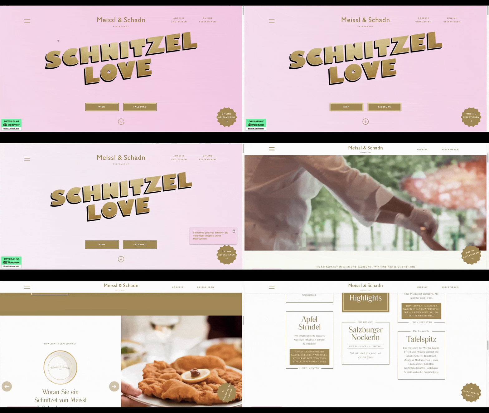
There’s a slight pulsation effect applied to the words “Schnitzel Love” and it’s set against a moving pink gradient background. That’s all this homepage really needs though. Like I mentioned earlier, if your website is going to be full of eye-catching imagery throughout, you don’t need even more imagery up top. Just let the words do the work.
Wrap-up
One of the reasons why it’s so common to use a combination of imagery and text above the fold is because it’s visually interesting. Today, we’ve seen some cool ways to add that same kind of excitement and intrigue to text alone. It won’t work for every website you design, but you now have some examples and use cases that can help you figure out which ones this design trend will work well for.
Suzanne Scacca
A former project manager and web design agency manager, Suzanne Scacca now writes about the changing landscape of design, development and software.

