My Favorite 15 Tailwind CSS Plugins and Resources

Summarize with AI:
Tailwind CSS makes styling and designing responsive pages easy. Check out the top 15 Tailwind CSS plugins and resources you need to know about if you are planning to try it out (or if you're already using it).
Usually, the talk is ALL about JavaScript frameworks: React, Vue, Svelte… But a few months ago, I started to become passionate about a sweet little CSS framework that made styling and designing my responsive pages fun and breezy. Introducing 🥳 Tailwind CSS!
I know there are countless articles about the subject, and I’m not here to bore you with yet another Tailwind CSS tutorial. 🙄
On the other hand, I’ll tell you exactly my process to quickly learn the ecosystem that surrounds a given tool. I Google the official awesome-list for this particular technology (i.e., for Tailwind CSS: Awesome TailwindCSS) and I take a look at almost every link. It usually takes a few hours, but when it’s done, the amount of value you get from following this practice is just colossal. 🧠 Seriously! #tremendous
Anyways… So, Tailwind CSS is still relatively new compared to other CSS frameworks. Nonetheless, there are some great plugins and resources you should know about if you are planning to play with it (or if it’s already part of your workflow). To save you time, I summarized my favorite ones in this article. 🤓
So without further ado, let’s get started! 👩🏫
1. Learn Tailwind Faster with a CheatSheet
Tailwind CSS utility classes are quite easy to learn. But at first glance, remembering all those classes can be a little tricky. A great tip I recommend (to save you the trouble of going back and forth to the documentation) is to rely on a cheat sheet.
Here are the best ones I could find:
📖 Resource no. 1: Tailwind Cheat Sheet by NerdCave.
📖 Resource no. 2: Tailwindcss cheatsheet by umeshmek.
📖 Resource no. 3: Tailwind.css Cheatsheet by LeCoupa.
😉 Feel free to bookmark the one you’re most comfortable with.
2. Implement a Dark Mode Theme for Your Application
Oyé, oyé, Dark Mode people! If you were looking for an easy way to include dark mode variants in Tailwind CSS, look no more! 🕵🏼♀
The following plugins will help you release different themes so your users can quickly change the colors of your interfaces. They are quite different in the way they work, so I suggest you take a few minutes before choosing one of these two:
📦 Plugin: tailwindcss-theming.
📦 Plugin: tailwindcss-dark-mode.
If you are looking for a simple solution with CSS variables, you can also take a look at the video 👇🏻below.
📺 Video: Dark Mode Theme Switcher - Tailwind CSS & Gridsome.
3. A Spinner Utility You Can Implement in a Snap

📦 Plugin: tailwindcss-spinner.
Every application needs a loader, 🤷🏻♀ that’s just a fact. Luckily, I found this extension that lets you implement and customize one of many beautiful spinners (in terms of color, size, border and speed) ⏱ in less than a minute. Then, you will be able to use it with just one single utility class. Personally, this is one of my favorite Tailwind extensions. 😻
4. Elevation Classes to Magnify Your Interface
📦 Plugin: tailwindcss-elevation.
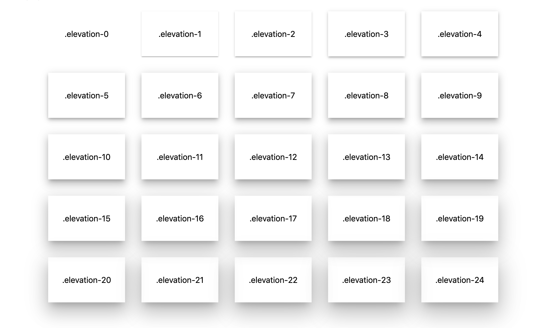
If you’ve already used Material Design, you’re probably familiar with these elevation effects.

The great news is that by switching to Tailwind, you will not have to redesign them all by yourself. This plugin comes with 25 classes .elevation-* 😱 that in my opinion are way more than enough to satisfy your need for elevation effects.
5. Left-To-Right (LTR) and Right-To-Left (RTL) Interfaces
📦 Plugin: tailwindcss-dir.
📦 Plugin: tailwindcss-rtl.
Depending on what you are trying to achieve, these two plugins will help you with building LTR and RTL layouts. You will be able to use a custom direction variant in your project and access smart utility classes like ps-*, ms-*, or start-*.
6. Responsive Aspect Ratio
If in the past you’ve tried to embed videos or specific objects with a strict aspect ratio, you might have had some issues with responsiveness.
1️⃣ This first plugin will help you define the different ratios you need in your configuration file and generate all the utility classes (as well as their responsive variants).
📦 Plugin: tailwindcss-aspect-ratio.
2️⃣ Going one step further, this last plugin (which is using the first one) will give you a few more classes that you can add to your embed elements to make them responsive.
📦 Plugin: tailwindcss-responsive-embed.
7. Beautiful Gradients with Tailwind

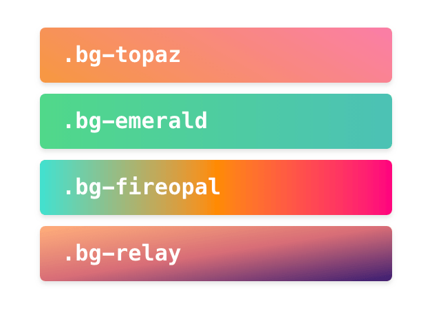
Here is a simple way to create mind-blowing gradients in Tailwind CSS! 🎊🤯🎉
📦 Plugin: tailwindcss-gradients.
📦 Plugin: tailwindcss-border-gradients.
Whether you are trying to generate some utility classes for your gradients or to implement beautiful border gradients, these two packages will solve both problems. 🤗 They are regularly updated, so I recommend you use them if you want to make fancy colorful interfaces.
☝🏼 Another tool you should take a look at is the Color Shades Generator.
🔧 Tool: Color Shades Generator.
Color Shades Generator not only provides you with names and variants for a given color but also the code to inject in your CSS configuration for the shades it generates. Isn’t that something?! 😜
8. Generate Classes to Easily Order Flex-Items
📦 Plugin: tailwindcss-flexbox-order.
With this extension, you will be able to configure and generate the flexbox order classes with all of their responsive variants.
By default, 👇here are the utility classes that are generated:
.-order-1 {
 order: -1;
}

.order-0 {
 order: 0;
}

.order-1 {
 order: 1;
}

.order-2 {
 order: 2;
}

.order-3 {
 order: 3;
}

.order-4 {
 order: 4;
}

.order-5 {
 order: 5;
}
9. Generate Typography Utilities and Text Style Components
If you have a lot of strict rules for your typography, you may be interested in this plugin 👇:
📦 Plugin: tailwindcss-typography.
You will be able to generate a lot of utility classes to customize the indentation, the text-shadow, the hyphens, the font-variant, and so on.
10. Use Hero Patterns Inside Your Application.
Probably my favorite Tailwind extension 😌:
📦 Plugin: tailwind-heropatterns.
If you are not familiar with Hero Patterns, it is a collection of repeatable SVG background patterns.

With this Tailwind plugin, you will get 80+ utility classes that will allow you to use ALL of them in your project.
11. Generate Truncate Multiline Utilities
📦 Plugin: tailwind-truncate-multiline.
This plugin will generate all the utility classes defined in your configuration file to truncate your text ✂️ to a given number of lines.
.truncate-[key]-lines {
  'overflow': 'hidden',
  'display': '-webkit-box',
  '-webkit-line-clamp': [value],
  '-webkit-box-orient': 'vertical',
}
12. Display the Current Breakpoint in Dev Mode
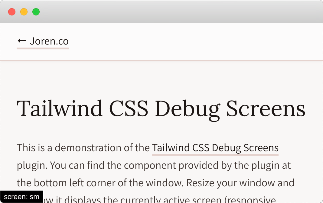
This component will show the currently active screen (sm, md, lg, xl, etc.) so you can create your responsive designs faster. 🤓 You just have to add the debug-screens class to your body tag when you are in development mode.
📦 Plugin: tailwindcss-debug-screens.

⚠️ If you are using Nuxt.js, I recommend using nuxt-breaky instead. 😉
📦 Plugin: nuxt-breaky.
13. Add CSS Scroll Snap Utilities
If you want to take full advantage of CSS Scroll Snap properties in Tailwind CSS, this plugin is the way to go.
📦 Plugin: tailwindcss-scroll-snap.
In case you’re not familiar with CSS Scroll Snap, 👩🏼🏫 it is a CSS property that makes the scroll behavior snap, locking the viewport at a specific point (that you indicate) with each scroll. As opposed to a linear scroll that moves anywhere on a page at the rate of the controller (mouse, touch gesture, or arrow keys).
CSS scroll snap properties are probably the handiest classes to quickly build a responsive slider. If you need to rely on them in one of your Tailwind projects, this extension will generate all the utility classes you will need: .snap-start, .snap-end, .snap-center, etc.
14. Generate Styles for CSS Based Triangle Arrows with Configurable Border and Background

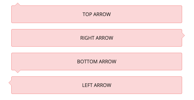
Could adding a quick arrow for your popover menus or your tooltips be any easier? 👅
📦 Plugin: tailwindcss-tooltip-arrow-after.
And by the way, you can customize almost everything in the config file (border-color, border-width, background, size, offset, etc.).
15. Converting an Existing Project into a Tailwind One
The first plugin will help you convert all your Bootstrap CSS code to Tailwind utility classes. The other is more generic and will work with almost any project.
📦 Plugin: tailwindo.
📦 Plugin: tailwind-shift.
🎶 It’s a kind of maaaaagic 🧙♀!
Bonus 1. Editor Extensions for VS Code Addicts
The first tool is a must-have. So simple yet so useful! 🤩 It will provide you with suggestions so you won’t have to remember and type all these CSS classes’ full names. Neat, right?
🔧 Tool: Tailwind CSS IntelliSense.
🔧 Tool: Headwind.
The last one will make you so much more productive. Let me explain.
I am a big fan of beautiful and tidy code, so you can guess that adding tons of CSS classes in Tailwind is a visual nightmare for me. 🤯
So imagine my delight 🥰 when I found this Tailwind CSS class sorter: Headwind, an opinionated VS Code Tailwind CSS class sorter that runs on save.
Bonus 2. Build Your Own Tailwind Plugin!
Do you have another issue that Tailwind’s ecosystem does not cover yet? Well, maybe it is time to build your plugin! 😇
If you are looking for some inspiration about how to do that, this repository will come in handy and will provide you with a few examples so you can quickly grasp the process.
That is all I’ve got for you today. So go ahead, code, enjoy, and stay awesome! 😜
And don’t forget to hit me up in the comments if you have something that you feel we should add to this list, or you can reach out to me on Twitter @RifkiNada. 🐦

Nada Rifki
Nada is a JavaScript developer who likes to play with UI components to create interfaces with great UX. She specializes in Vue/Nuxt, and loves sharing anything and everything that could help her fellow frontend web developers. Nada also dabbles in digital marketing, dance and Chinese. You can reach her on Twitter @RifkiNada or visit her website, nadarifki.com.
