Tips To Help You Master the Retro Web Design Trend

Summarize with AI:
Retro design is a popular trend for a reason. Nostalgia can transfer feel-good vibes from the bygone era to the brand itself. But which era should you design for and how far should you go with it? In this post, we’ll explore some strategies to help you make these decisions.
I was listening to the radio in an Uber recently when the DJ came on to announce the next oldie classic. It was a song I had listened to on repeat back in high school. How in the heck could something from 2000 already be considered an oldie?
It got me thinking about how the “good old days” that we reminisce about are different for all of us. And how difficult it can be to design a retro UI as a result.
I’d love to dedicate this post to the lightning-fast passage of time because, seriously, how is it 2022 right now? However, what I’m going to delve into today is retro web design and some strategies that can help designers figure out which era to draw inspiration from and how far to go with it.
Mastering the Retro Web Design Trend
Retro design can be a very powerful tool. It will allow you to transport users to a different time and place. It can evoke a more emotional and positive response from users. And it can visually set a brand apart in ways that some other design trends can’t.
But like I said, retro is a tricky thing to nail down. What’s nostalgic to one user might not be to another. How it’s implemented can also impact how well-received the retro design is.
Here are some things to think about when you consider whether you’ll go retro and, if so, which era you’ll draw inspiration from:
1. Match the Age of the Brand or Product to the Age of the Design
What’s retro seems to be a subjective matter, doesn’t it? For someone like me born in the ’80s, stuff from the ’80s and ’90s doesn’t seem archaic. It just feels like the recent past. For someone born in the late ’90s or early ’00s, however, the stuff I remember is from a bygone era they know little of.
So if nostalgia is tied to the eras we’ve lived through, you have to be careful about choosing the retro style you use. That doesn’t mean that retro designs are completely off limits if your website or app sells to Gen Zers. It just means finding a style that won’t make any of your users go, “Ick!”
Let’s start with a subtle example of retro design. This is the About page for the Stone Balloon website:
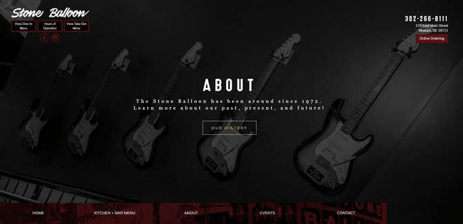
Now, when I went to the nearby university from 2001 to 2005, the Stone Balloon was a club and concert hall. When I look at this website with its rocker imagery, dark overlays and grungy header text, it reminds me of the many nights I spent in the dark club, dancing and drinking.
For people who went to school in the decades before me, this imagery and branding should also bring back fond memories. At one time, the Stone Balloon was host to acts like Bruce Springsteen and Metallica. I’m sure seeing the wall of mounted guitars and darkened overlays piques a different sort of nostalgia altogether.
Then, you have today’s Stone Balloon goers. For them, the Stone Balloon is a dimly lit ale house that serves brews and bites. The dark color palette of the website is sure to inspire some sort of emotion for them, even if it’s just hunger and thirst.
With something like the Stone Balloon, the goal is to evoke a sense of nostalgia and yearning. With a brand or organization that’s much older, you’re not going to get many people who feel connected to it because it’s so far in the past that few have actually lived through it. Instead, use retro elements to create an atmosphere.
Let’s look at the home page for the Mütter Museum:
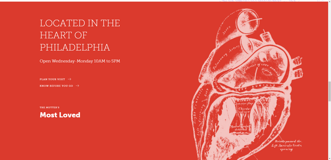
The Mütter Museum is a museum dedicated to medical history that was opened in Philadelphia in 1863. It’s not very big, but it’s stuffed to the brim with anatomical specimens, instruments, medical oddities and more.
Although the museum’s artifacts are housed in an authentic 19th-century setting, the content of its website is not. The design is beautiful, modern and minimal. The only exception can be found in the drawings scattered around the website. These sketches of the human body very much feel at home on this website, despite their inspiration from medical documentation created in the 1800s.
2. Retrofy Just a Few Subtle Details To Accentuate an Iconic Product
It’s only natural to get overly excited about retro design. After working on so many minimal and flat designs, retro can seem like a breath of fresh air.
That said, for brands with an iconic product that sells itself, a slight touch of retro is all you really need. In that case, you want the retrofied elements to be subtle, almost like when you go for a walk and catch a whiff of something in the air. One person might make an association with something from their past while another person might ignore the experience altogether (or not even smell it all). And it’s fine either way. The retro details are there just to add something extra.
I think the Liberty Hotel website is a good example of how to do this:
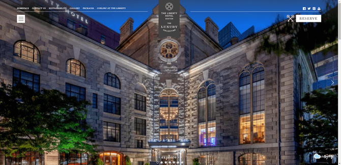
The hotel’s website feels just as luxurious as its lodgings. Some guests may look at this site and only see its lavish touches. For those that know about the hotel’s darker past, though, they’ll likely take notice of the retro visual elements.
The Liberty Hotel was opened in 2007. However, the building itself originally began life as the Charles Street Jail in 1851. That’s why you see key icons scattered throughout the UI—in prominent positions like the top-right corner next to the “Reserve” button as well as in hover-triggered reveals on the home page.
What’s more, the header font used on the home page is one called Essonnes. This font may be newly designed in 2015, but it draws inspiration from 19th-century typesetting fonts. It’s a small detail and likely to go unnoticed by most, but it does help set the tone for the building’s lengthy and storied history.
Another website that goes subtle on the retro is Tens Sunglasses:
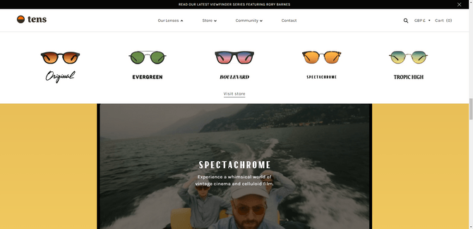
As you scroll through the site, you might just think, “Oh, this is a cute, colorful ecommerce site.” And it is. However, Tens is a company that makes sunglasses created by photographers. The two photographers who created the company got inspired while on a road trip and all the rich colors they applied to their photos from it. That’s how they came up with the sunglasses concept.
Some of the lens colors they’ve developed are inspired by previous eras:
- Original definitely has a California-cool kind of vibe that I associate with the ’90s, though some may associate it with the ’70s.
- Boulevard draws on inspiration from the Los Angeles early morning and late evening skies. When I see this, I think of moody films from the ’80s.
- Spectachrome is directly inspired by the film Moonrise Kingdom, which is set in the late ’60s and has that typical Wes Anderson anti-realism style.
Not only are the colors of the lenses and design of the frames retro-inspired, there are touches of these styles in the fonts that represent them on the site. Again, it’s a small injection of retro design into an otherwise modern website, but it looks really cool when you notice it.
3. Ensure That the Retro Elements Don’t Interfere With Usability or Accessibility
As you figure out how exactly you’re going to retrofy your website and app, keep your focus away from the navigation or grid. We never want to move backward in terms of usability, only in terms of aesthetics.
Nudie Jeans is a good example of how to encapsulate a retro design within a modern website shell:
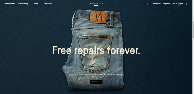
The sticky navigation is exactly where users would expect it to be. Interacting with it is also predictable as hovering over each link results in an underline appearing beneath the label. The symmetrical, grid-like layout of the web pages also ensures that usability remains intact.
The visual components of this site, however, are all about the retro look. Everything feels a little dusty and worn in, from the backgrounds to the product images—all thanks to subtly textured backgrounds and vintage-filtered imagery.
Hollister is another website that strikes a good balance between new and old:
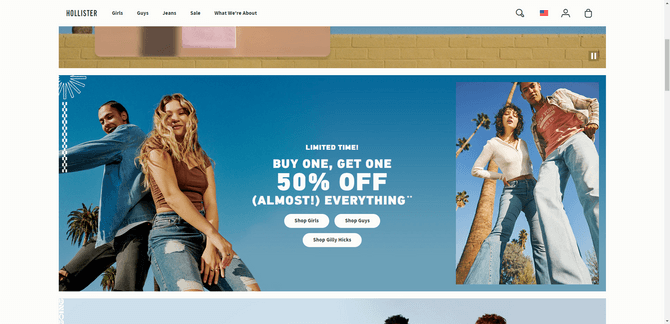
This ecommerce site may look like an old dELiA*s catalog from the ’90s, but the website’s structure and functionality are straight out of the 2020s. And thank goodness for that.
Again, we see how it’s possible to make a design look nostalgic but not antiquated. For example, the header font used is one called PF DIN MAX. The original DIN 1451 font was developed in the 1930s for practical use cases (like road signage) in Germany. Over the years, DIN has served as inspiration for more modern fonts—like this variable font which feels very much at home on this edgy, in-your-face retro design.
It’s also possible to strike this balance between retro and modern even when you’re pulling from a much older era. While there are some websites that go all in on making their website look vintage, certain aesthetic details are all you really need in order to create an old-timey look.
For example, this is the home page for Ciro’s Tampa:
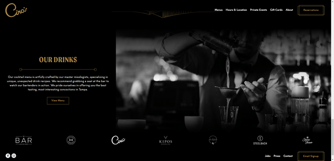
The dark theme works really nicely on this website and makes the white and gold text atop it stick out clearly. In addition, the theme, black-and-white imagery and contemporary fonts (Moret and Cocogoose Classic) set the right mood for this style of old Hollywood retro.
As you can see, there’s no need to create a design that’s so retro that it compromises usability or accessibility. Just some well-chosen visual accents related to colors, fonts and imagery can transform the vibe and era of a website.
4. Go All In When the Old-Timey Vibes are Built Into the Brand
Now that I’ve spoken on end about keeping the retro in your designs simple, let’s talk about why and when you might want to go all in on a retro website or app.
There should always be a clear and relevant reason why you’ve decided to use a retro design over a modern one. Not because your client is obsessed with the ’70s or thinks it would look cool to make the design vintage. And if you’re going to go all in on the retro look, it should be because the brand has some sort of ties to that era. Not only that, your users should naturally see how the brand and the retro design are connected.
Let’s look at the example of Reboot Dunedin:
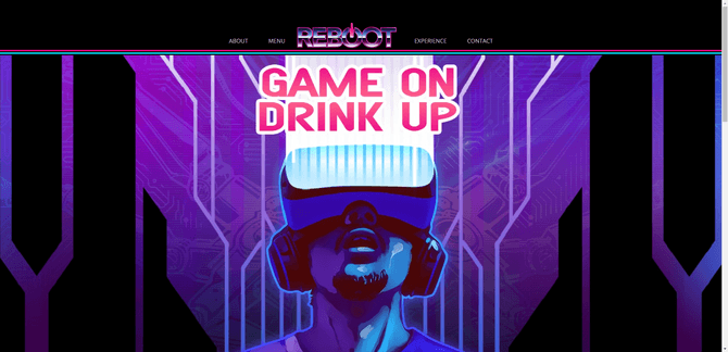
Reboot is a virtual reality arcade bar. While virtual reality is a technology we now have ready access to in the 2020s, it was a concept that heavily factored into ’80s and ’90s pop culture (think of Tron, Lawnmower Man and Hackers). Around that same time, arcade gaming was huge, too.
That’s why I think this illustrated retro design makes perfect sense for the Reboot website. Arcades and VR are both immersive experiences, so why not make a website that feels like you’re diving back into the ’80s?
Another website that fully embraces its retro heritage is the portfolio website for Quentin Dallaserra:
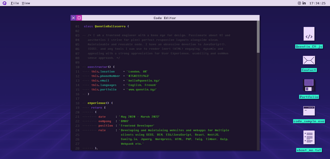
Are any of you old enough to remember booting up a computer only to see a screen like this and then using a command line interface to open applications and execute tasks? I’m not sure how old Quentin is, but the bootup screen mentions 1982. I’m wondering if that’s the frontend engineer’s date of birth—in which case this retro design makes perfect sense.
Regardless, I think the immersion into retro is a good choice. The website itself demonstrates the programmer’s experience as he’s created an OS of his own. What’s more, as much as I hate all the work involved in using computers back in the ’80s and ’90s, this site offers a good dose of nostalgia without all the annoying parts. I’m sure many of the middle-aged prospects and clients who visit his site feel the same way.
I think that companies trying to bring back or preserve old fashioned values could also benefit from a fully retro site, too. I haven’t seen a lot of examples of this, but it’s something to think about if you’re building a site or app for a company seeking to disrupt their industry by going back to what made it so great before (like a technology company or auto manufacturer).
Wrap-up
After reading this, you might decide to keep your designs in the present. That’s not a bad thing. There’s so much to consider when you go retro and what it will do to the brand’s vibe, message, product and future. Not to mention how users will perceive the retro design, especially if they have no memory or connection to that particular era.
Then again, no one said you have to go all in on a retro design. As we’ve seen above, even minor design choices related to typography or colors can add a subtle retro look to a product and get users (some of them anyway) thinking about the good ol’ days. There’s a lot of comfort to be found in nostalgia and there are plenty of ways for you to inject it into your work.

Suzanne Scacca
A former project manager and web design agency manager, Suzanne Scacca now writes about the changing landscape of design, development and software.

