To Tailwind or Not To Tailwind—That is the Question

Summarize with AI:
Beloved and despised, Tailwind CSS brings out strong opinions. Alyssa Nicoll plays around with it so you can see which side you’ll pick.
Tailwind CSS is arguably one of the most divisive dev tools I have run across. Either you love it or you hate it.
By its nature, Tailwind CSS defines CSS styles in reusable utility classes—the opposite of traditional CSS structuring beliefs around component-centered styles.
Love it or hate it, though, there is one thing we can all agree on—Tailwind’s docs be LIT. So outside of this list of topics I am going to cover today, I would highly encourage you to check out their docs.
Contents
- What Is Tailwind—Utility-First vs. Others
- Install & Getting Started
- Tailwind Basics
- Customizing Styles With Arbitrary Values
- Layouts in Tailwind & Responsive Design
- Tailwind Directives
- An Animated Tailwind
- Functions & Directives
- Production-Ready
- Wrap Up & When Tailwind Isn’t the Solution
What Is Tailwind?
Tailwind actually has two parts (maybe more—I know of the two): Tailwind UI and Tailwind CSS. Tailwind CSS is a free utility-based library you can add to your JS web apps to start styling your UI quickly. Tailwind UI is Tailwind’s UI component library that costs dollars. So, hence forth, in the article, when I say “Tailwind,” I am referring to Tailwind CSS.
Utility-First vs. Others
Tailwind does a wonderful job (as I mentioned before) of explaining the utility-first concept in their docs. However, I shall take a stab at my own tl;dr version of this concept. In your average JS app, on any given day, you might see styles such as this for a card:
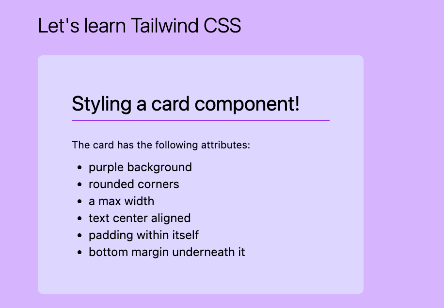
<div class="card">...</div>
.card {
  background: purple;
  border-radius: 6px;
  max-width: 320px;
  padding: 40px;
  margin-bottom: 20px;
}
Doing this same card in a utility-first manner would look like this:
<div class="bg-violet-200 rounded-md max-w-sm p-10 mb-5">...</div>
For someone who is extremely comfortable working in CSS files, thus far you will feel like Tailwind is nothing but pure blasphemy. Even their docs address the dismay that many have felt toward it initially. Only after trying this library will you understand its true charm.
“When you realize how productive you can be working exclusively in HTML with predefined utility classes, working any other way will feel like torture.” — TW Docs
Install Tailwind CSS
In order to start trying it out, you need to install Tailwind, and in some cases a dependency or two. I used the Angular Getting Started guide I found on their site and essentially had to do these two steps:
- npm install -D tailwindcss postcss autoprefixer
- npx tailwindcss init
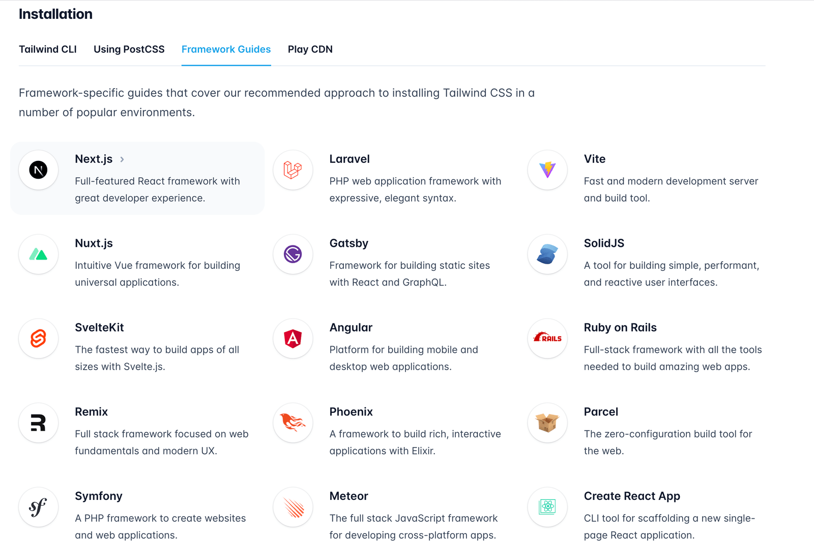
Getting Started
After installing, I was able to start using Tailwind—which first meant including these directives at the top of my global CSS file:
@tailwind base;
@tailwind components;
@tailwind utilities;
These, as they say, included Tailwind’s base styles—something called “pre-flight” that is a browser reset, their component styles and their utility class styles. If you ever get deep into Tailwind, I highly recommend watching this video about composing Tailwind utilities so that you can better understand what these include, order matters, and how the directive @layer can alleviate some issues regarding this
order.
Tailwind Basics
Styling in Tailwind is easy as pie (if you use the VS Code Extension). There are a couple unclear utilities (like m for margin and p for padding), but many of the selectors are very straightforward.
Here I have styled the inner elements of the card component even more with Tailwind fun:
<div class="bg-violet-200 rounded-md max-w-sm p-10 mb-5">
  <h1 class="text-2xl mb-1">Styling a card component!</h1>
  <div class="w-[100%] h-[1px] bg-purple-600"></div>
  <p class="text-xs mt-5 mb-2">The card has the following attributes:</p>
  <ul class="list-disc px-5 text-sm">
    <li>purple background</li>
    <li>rounded corners</li>
    <li>a max width</li>
    <li>text center aligned</li>
    <li>padding within itself</li>
    <li>bottom margin underneath it</li>
  </ul>
</div>
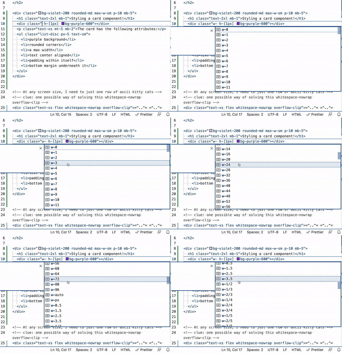
And here is a screenshot of what the VS Code extension does for you on hover:

So as you can see, mb-2 is a class giving the element 8px of margin on the bottom. You can further specify margin and padding with things like py-10 for top and bottom padding or px-10 for left and right padding.
As you saw above, you can even specify individual sides: t - top, r - right, b - bottom, l - left.
Customizing Tailwind Selectors With Arbitrary Values
I also gave the bottom border div below the title a width of 100% using square brackets. This is how you add custom properties in Tailwind (when their list of options just doesn’t suffice).
Layouts in Tailwind & Responsive Design
Things like flexbox and grid are, of course, built-in utils in Tailwind.
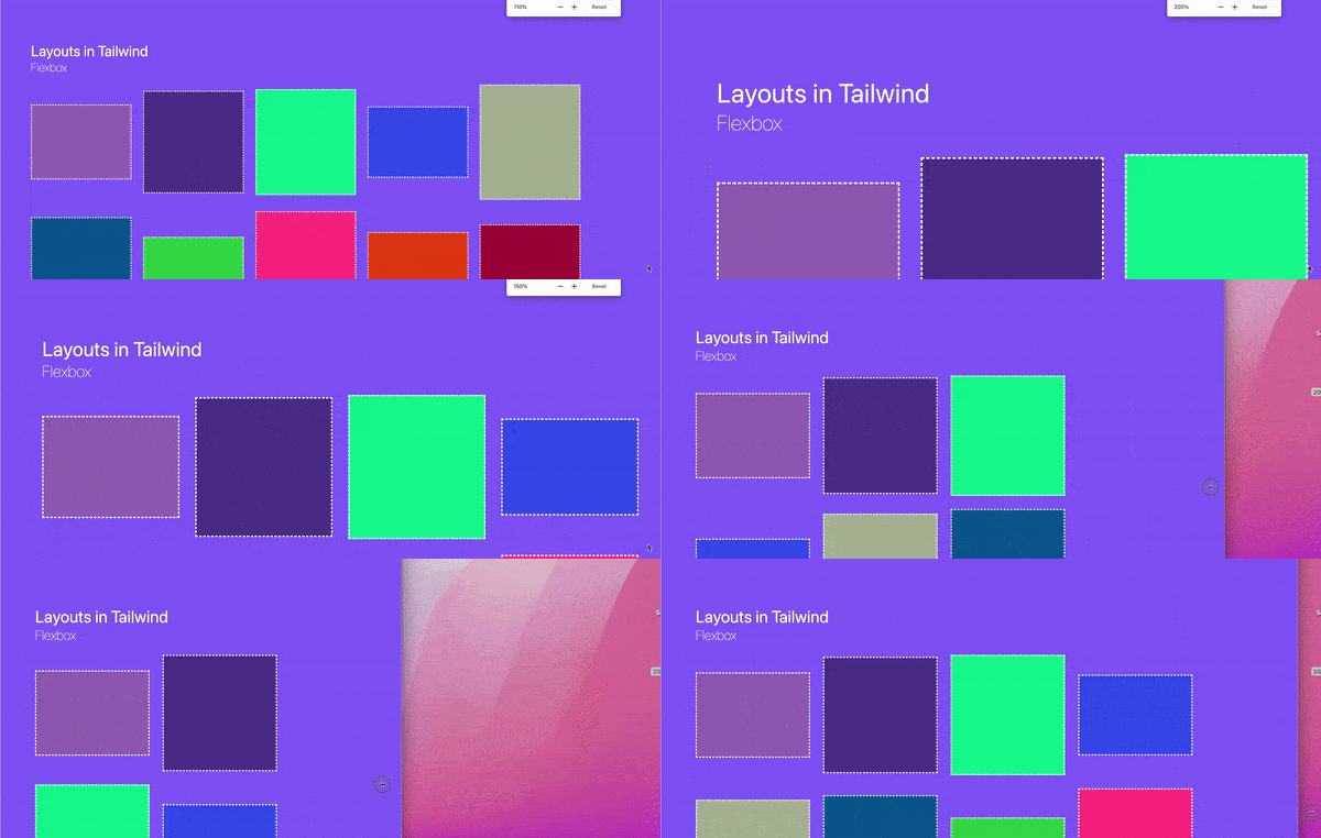
This responsive layout with differently sized cards was created by applying flex to the wrapper:
<div class="flex flex-wrap gap-5"> ... </div>
Whereas this more complex layout was created using a combination of flexbox and grid:
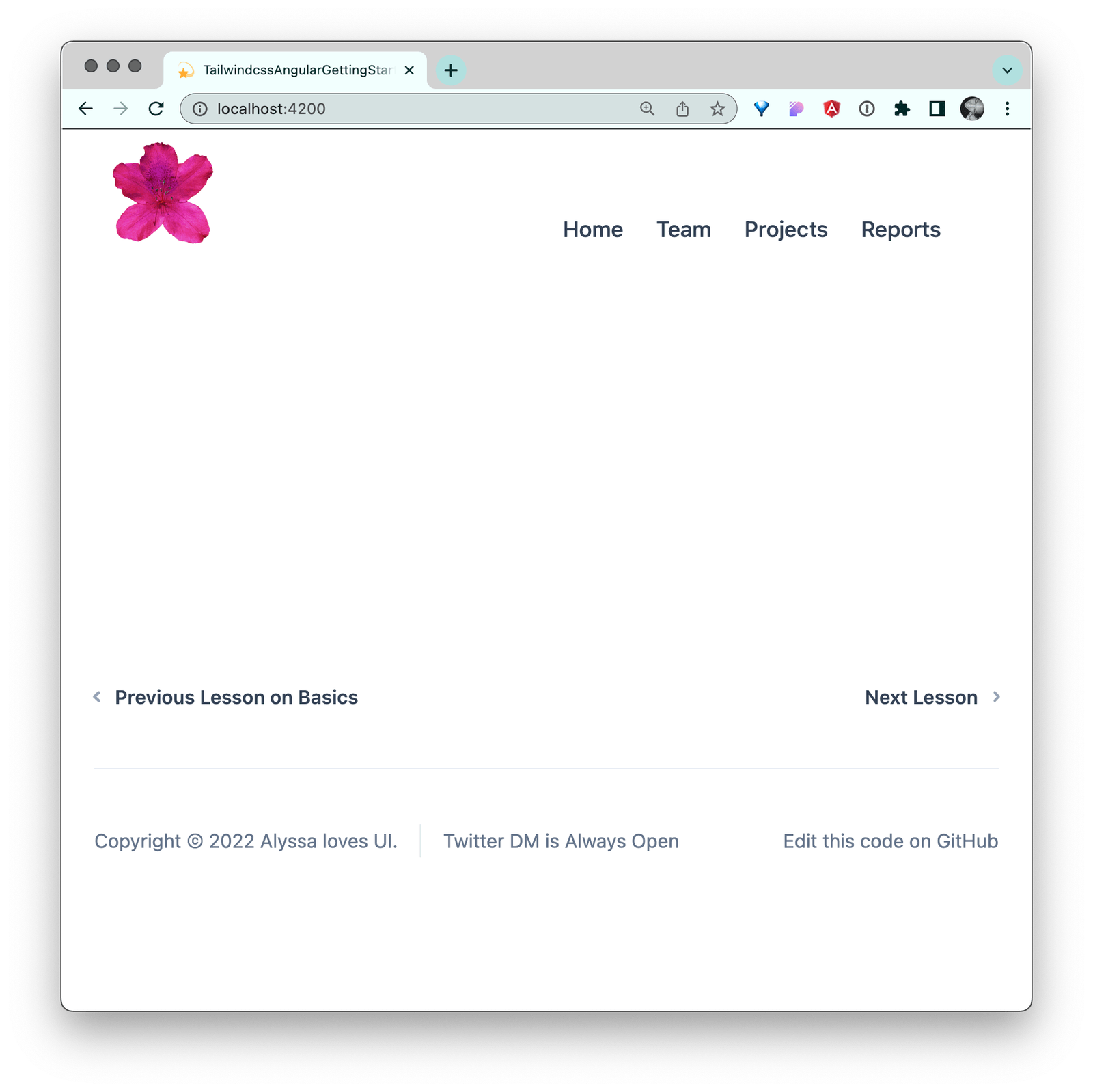
So no matter how much or little content there is, the footer stays on the bottom. (Thanks to the “main” content having flex-grow of 1 and the whole page being a flex column. Note that I am achieving this by using Angular’s
:host selector.)
Tailwind Directives
Here we are taking advantage of Tailwind’s @apply directive to add utility class in our CSS. This is useful for when repetitive selectors get lengthy in your HTML, or when trying to style something that doesn’t exist in the HTML
document (the host wrapper generated by Angular):
:host {
  @apply flex flex-col;
}
The header itself combines both flex and grid (because why not?!). Within the header, elements are stretching out horizontally in a CSS grid with two columns. Inside the left column lies the nav with a horizontal layout also, but this one is caused by a flex row.
<header class="grid grid-cols-2 items-end">
  <img src="..." alt="azalea flower logo" class="max-w-[100px] px-3 py-2">
  <nav class="flex flex-wrap justify-start">
    <a ... class="font-medium px-3 py-2 text-slate-700 rounded-lg hover:bg-slate-100 hover:text-slate-900">Home</a>
    <a ... class="font-medium px-3 py-2 text-slate-700 rounded-lg hover:bg-slate-100 hover:text-slate-900">Team</a>
    <a ... class="font-medium px-3 py-2 text-slate-700 rounded-lg hover:bg-slate-100 hover:text-slate-900">Projects</a>
    <a ... class="font-medium px-3 py-2 text-slate-700 rounded-lg hover:bg-slate-100 hover:text-slate-900">Reports</a>
  </nav>
</header>
I created this amalgamation to try to show you how many different routes there are to achieve the layouts of the modern web. There is no one “true” way. Luckily for us, Tailwind supports whichever route we choose for layout (even positioning, if that be your heart’s wish).
An Animated Tailwind
Animations in Tailwind consist of two main sections (as with CSS): Transitions on changing properties and keyframe animations for things needing more than two states. In this simple button animation example that I built out, I demonstrate a button that is using a transition for its hover state and one that is not:
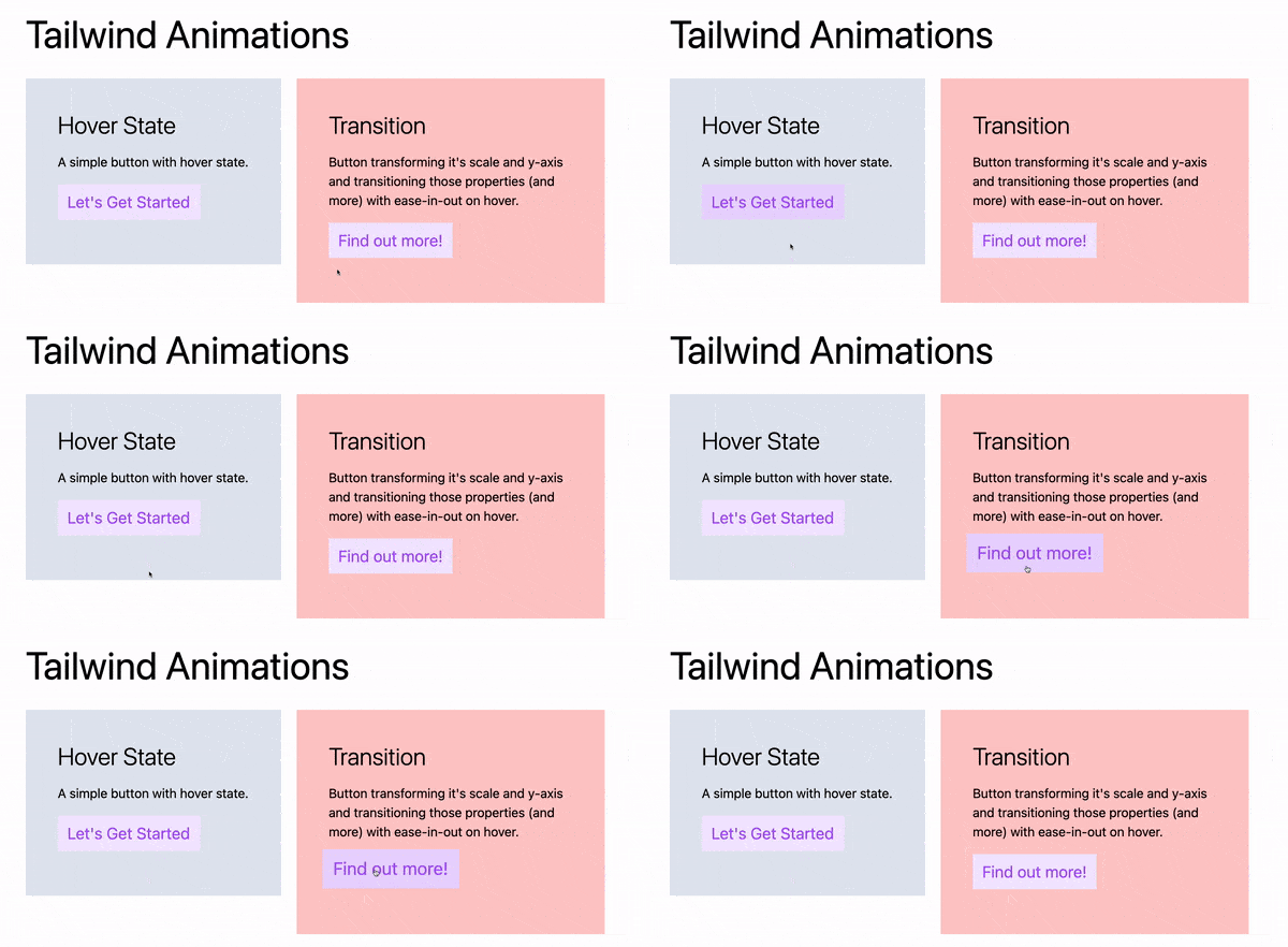
<button class="my-16 py-2 px-3 text-xl bg-purple-100 text-purple-500 hover:bg-purple-200">Let's Get Started</button>
<button class="my-16 py-2 px-3 text-xl bg-purple-100 text-purple-500 **hover:bg-purple-200 hover:-translate-y-1 hover:scale-110 transition ease-in-out delay-150 duration-300**">Find out more!</button>
Here, you can see we are using hover: to apply additional classes while the button is being hovered on. These are called states in CSS and there are many others (like active and focus) which Tailwind also supports. On hover, for the second button we are:
- changing the background-color to a darker purple:
hover:bg-purple-200 - moving the button up by one pixel:
hover:-translate-y-1 - enlarging the button by 10%:
hover:scale-110 - and adding a transition with specified timing function, delay and duration:
transition ease-in-out delay-150 duration-300
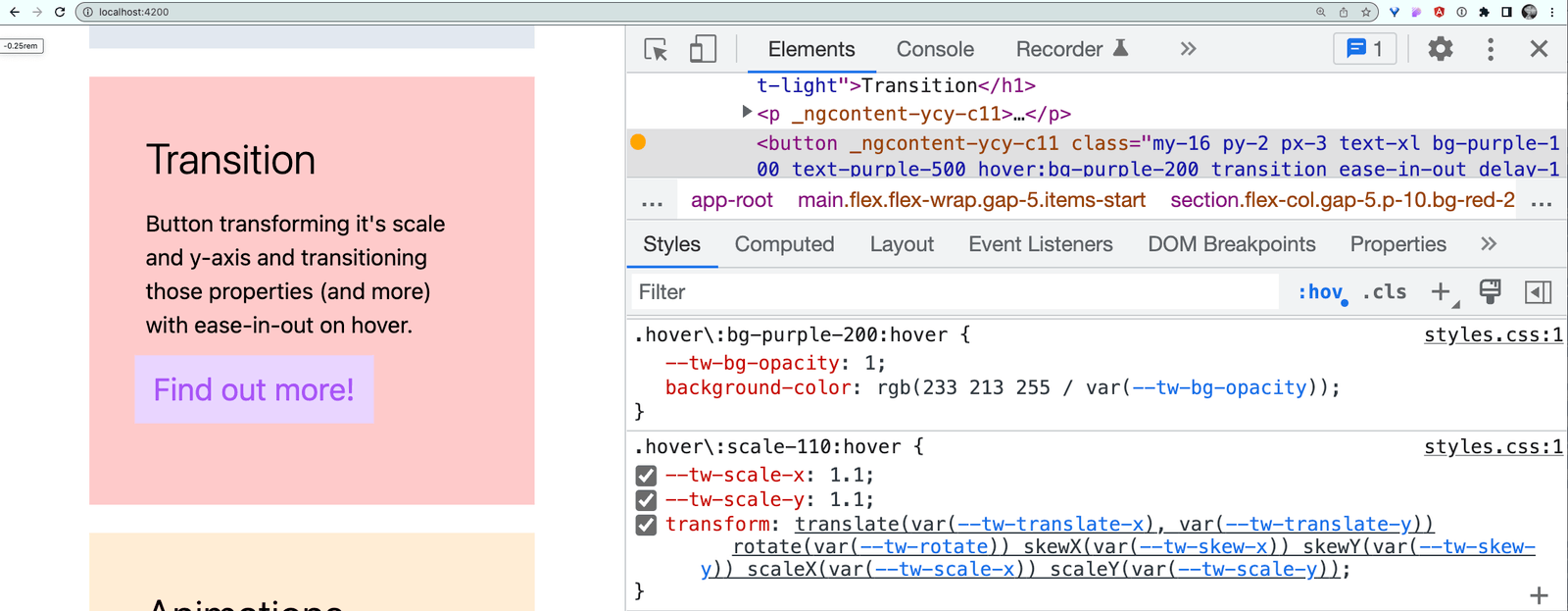
These utility classes turn into this CSS:
As far as more in-depth animations, Tailwind has a few built in, like spin—which is animating this semi-circle to indicate loading:
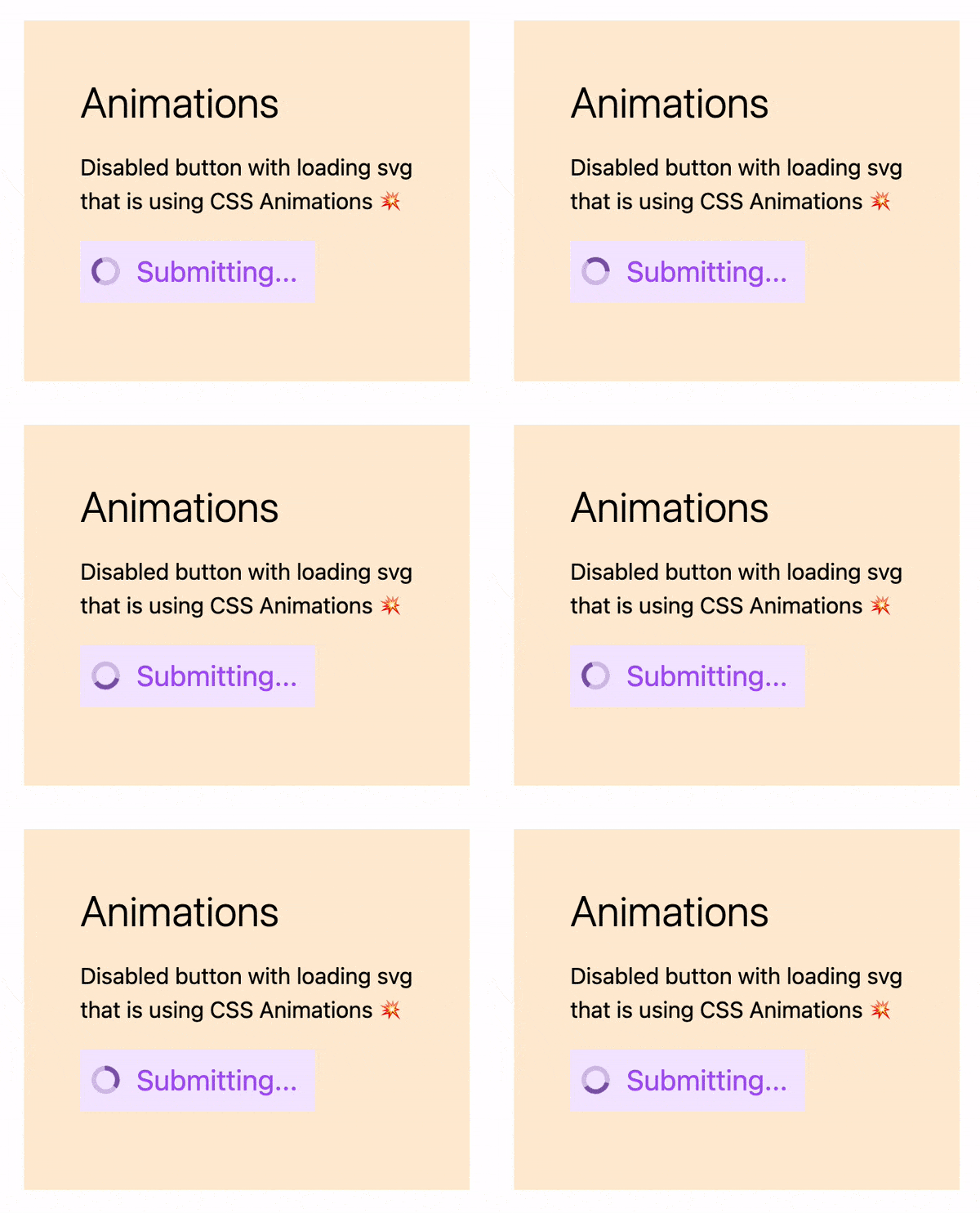
You can read more about animate-spin in the docs, along with other built-in animations (like ping and pulse) here: https://tailwindcss.com/docs/animation#basic-usage.
Tailwind Functions & Directives
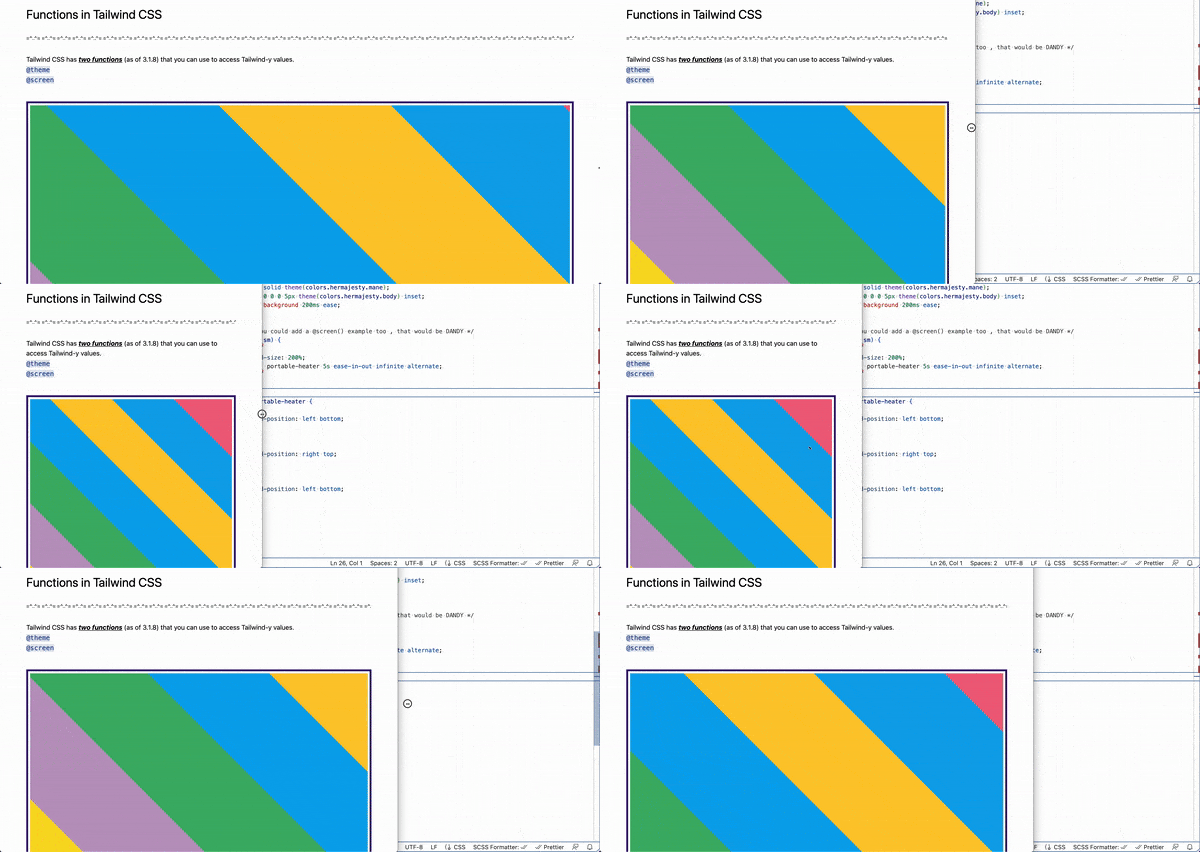
There are two custom functions in Tailwind. Here I am using screen(), a media query
function that you can use to wrap styles that will be applied when that screen size requirement is met:
@media screen(sm) {
  main {
    background-size: 200%;
    animation: portable-heater 5s ease-in-out infinite alternate;
  }
}
@keyframes portable-heater {
  0% {
    background-position: left bottom;
  }
  50% {
    background-position: right top;
  }
  100% {
    background-position: left bottom;
  }
}
You can read more about the Tailwind functions here.
Production-Ready
Being production-ready in Tailwind used to come with a lot more work in Angular. With the latest version of Tailwind, all you need is to minify during build:
npx tailwindcss -o build.css --minify
When Tailwind Isn’t the Solution
Tailwind really was a lot of fun to work with and it makes scaffolding out your vision so incredibly quick. It is also a wonderful tool to create more consistency throughout your styles.
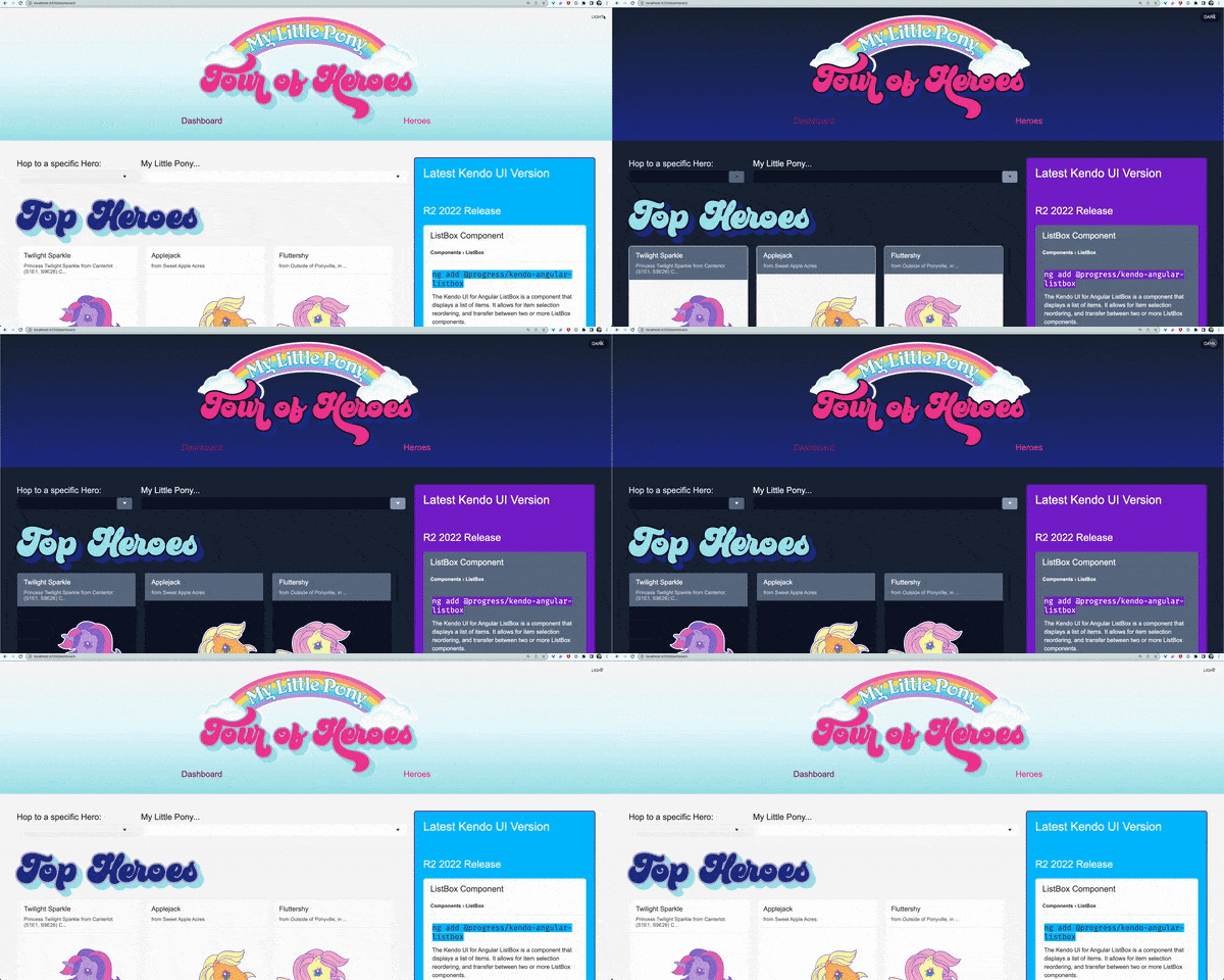
I integrated it with an Angular project that was is using Kendo UI components to give the app a dark mode. They both played really nicely together and I had no issues integrating Tailwind into an Angular app already utilizing a component library.
I think Tailwind is great for your team of full-stack developers with a lot on their plates who may already be experiencing inconsistency issues in UI and the inability to move quickly building out the user interface.
I think Tailwind is not great for frontend developers who love to build out mock-ups pixel perfect and are required to do a lot of custom CSS and UI work. Tailwind will just get in that developer’s way, as they have already mastered the ins and outs of CSS and use it quickly to their full advantage. It would be like saying to a master chef, “I want you to use this recipe book to cook your most favorite dish you have memorized by heart and made a hundred times.” The chef would throw the book in your face as they donned their well-worn apron. (As will the frontend dev who truly loves writing CSS.)
All in all, as a person who rather enjoys writing CSS herself, I had a wonderful time using this utility library and I think anyone can too, if they go at it with an open mind.

Alyssa Nicoll
Alyssa is an Angular Developer Advocate & GDE. Her two degrees (Web Design & Development and Psychology) feed her speaking career. She has spoken at over 30 conferences internationally, specializing in motivational soft talks, enjoys gaming on Xbox and scuba diving in her spare time. Her DM is always open, come talk sometime.

