
Say Hello to Panda CSS—The New CSS-in-JS Library with Zero Runtime

Summarize with AI:
Discover Panda CSS, the new type-safe CSS-in-JS library with zero runtime, multi-variant support and RSC compatibility! In this article we will cover how to add Panda CSS to a new project and what kind of features it offers.
Panda CSS is a new contender that just landed in the world of CSS-in-JS. It’s a type-safe solution with no runtime overhead that offers multi-variant support and compatibility with React Server Components.
But why should you even bother with it? Let’s have a look at what CSS-in-JS is, what’s so great about Panda CSS and how it can be used to style applications.
What is CSS-in-JS?
Years ago, not many people entertained the idea of writing styles purely in JavaScript. The idea seemed far-fetched and even absurd to a lot of web developers. However, the world of web development continued to evolve, and innovation has no bounds, so developers started to come up with new CSS-in-JS solutions.
Nowadays, there are many CSS-in-JS libraries, each with unique features and benefits. Some of the most popular ones comprise Styled Components, Emotion, Stiches or Vanilla Extract, JSS and Aphrodite. While they may differ in syntax and how they work, they all aim to make JavaScript styling more manageable and maintainable.
Read more: Zero-Runtime CSS with Vanilla Extract
CSS-in-JS libraries changed the way we think about and approach styling websites and applications. They encourage component-based design, making it easier to manage and reuse styles.
They take advantage of JavaScript’s features, such as variables, conditional statements and functions, to create dynamic styles and adapt them to various situations. This results not only in a cleaner code but also offers new ways to create and manage dynamic styles and designs.
In addition, since CSS-in-JS solutions were adopted by many developers, there is a lot of good tooling and ecosystem around them.
Unfortunately, it’s not all sunshine and roses, as there are certain disadvantages to CSS-in-JS libraries. First of all, there is an additional learning curve, as each CSS-in-JS library might have its own way of writing styles, whether with template tags or objects. Runtime CSS-in-JS libraries generate styles on the fly and then update the DOM accordingly when an application runs. This introduces a performance overhead, which might not be acceptable for some applications.
What’s more, there are runtime solutions that don’t work well with server-side rendering (SSR) or don’t work at all. For example, most of the current CSS-in-JS libraries are incompatible with React Server Components (RSCs).
That’s where zero-runtime libraries come in. Instead of generating styles on the fly, they are created at build time. Good examples of that are Vanilla Extract, Linaria and the newly released Panda CSS, which we will focus on in this article.
Hello Panda CSS
Panda CSS was created by Segun Adebayo, who is also the author behind popular projects like Chakra UI and Zag. It’s a CSS-in-JS library that promises easy and type-safe styles. It has no runtime, as the styles are generated at build time and comes with multi-variant support.
If you’re a React developer, you might be interested in the fact that Panda CSS is compatible with React Server Components. Besides that, it can be used in many frameworks, such as React, Remix, Vue, Solid and Svelte.
You can find a full code example for this article in the following GitHub repository and an interactive StackBlitz example below.
Setting up Panda CSS
Adding Panda CSS to a project is quite straightforward. Let’s create a new React project with Vite and configure Panda CSS.
Create a New Vite Project
npm create vite@latest panda-css-app -- --template react-ts
cd panda-css-app
npm install
Install Panda CSS
npm install -D @pandacss/dev
npx panda init --postcss
Add Panda CSS Codegen Script
package.json
{
  "scripts": {
    "prepare": "panda codegen",
    "dev": "vite",
    "build": "tsc && vite build",
    "lint": "eslint src --ext ts,tsx --report-unused-disable-directives --max-warnings 0",
    "preview": "vite preview"
	},
}
Add a Config File
panda.config.ts
import { defineConfig } from "@pandacss/dev";

export default defineConfig({
  // Whether to use css reset
  preflight: true,

  // Where to look for your css declarations
  include: ["./src/**/*.{js,jsx,ts,tsx}", "./pages/**/*.{js,jsx,ts,tsx}"],

  // Files to exclude
  exclude: [],

  // The output directory for your css system
  outdir: "styled-system",
});
Configure the Entry CSS with Layers
src/index.css
@layer reset, base, tokens, recipes, utilities;
If you’re using TypeScript, it’s a good idea to also include the styled-system folder in the tsconfig.json file.
{
  "compilerOptions": {

  },
  "include": ["src", "styled-system"],
  "references": [{ "path": "./tsconfig.node.json" }]
}
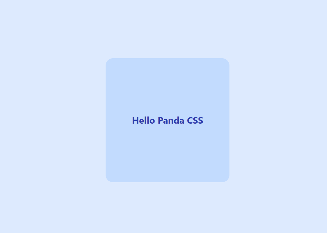
That’s it for the setup. Let’s try it out! To create styles with Panda CSS, we need to use the css method.
src/App.jsx
import "./App.css";
import { css } from "../styled-system/css";

function App() {
  return (
    <>
      <div
        className={css({
          minHeight: "100vh",
          backgroundColor: "blue.100",
          display: "flex",
          alignItems: "center",
          justifyContent: "center",
        })}
      >
        <div
          className={css({
            width: 400,
            height: 400,
            bg: "blue.200",
            display: "flex",
            alignItems: "center",
            justifyContent: "center",
            borderRadius: "3xl",
            padding: "10px 15px",
          })}
        >
          <h1
            className={css({
              fontSize: "3xl",
              fontWeight: "bold",
              color: "blue.800",
            })}
          >
            Hello Panda CSS
          </h1>
        </div>
      </div>
    </>
  );
}

export default App;
We have div and h1 elements that have the className prop with the result of the css method to which we pass an object with various styles.
Template Literals vs. Objects
Some CSS-in-JS libraries use template literals instead of objects to create styles. For instance, in Styled Components, styles could be created in this manner:
const styles = css`
	display: flex;
	justify-content: center;
	align-items: center;
`
At the time of writing, Panda CSS doesn’t support template literals, but the library author is working on adding the capability to use template literals instead of objects.
Tokens
Panda CSS offers a number of built-in tokens for colors, sizes, spacings and more. Those can be configured in the panda.config.ts file. We used blue.100 for the background, blue.800 for the text color, and 3xl for the font size. When we start typing values for the styles, we will automatically get useful type hints.
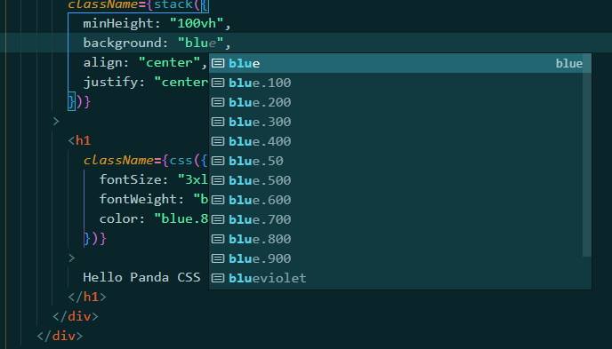
If you want to see all core tokens that are available by default, you can look into styled-system/tokens/tokens.d.ts file.
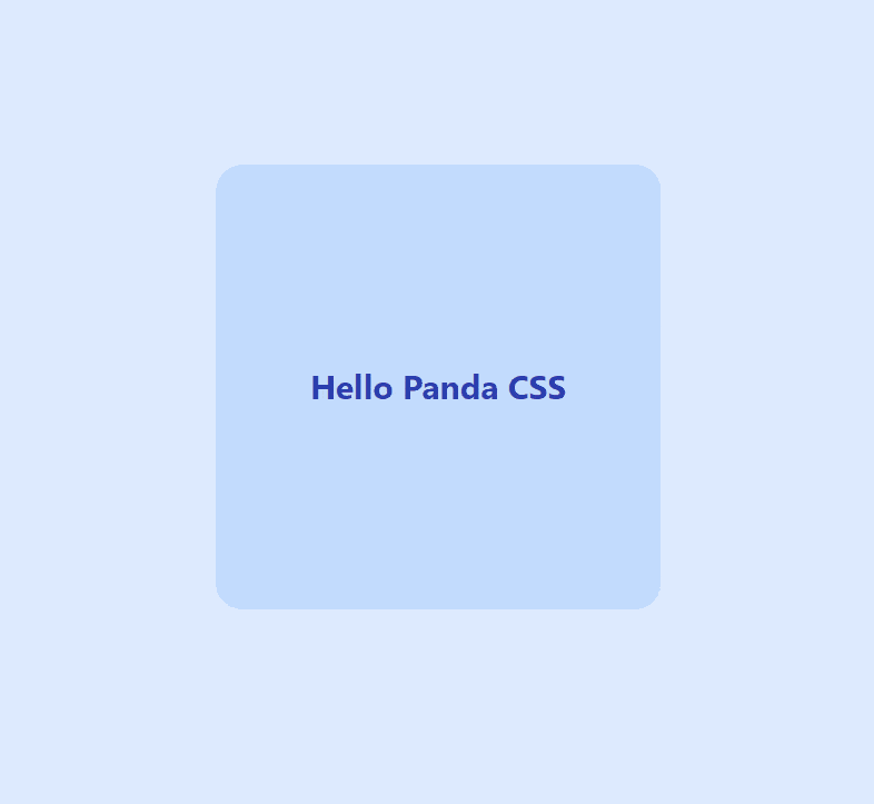
Writing full CSS property names can be a bit tedious, so Panda CSS supports shorthands that you might already know from other libraries. We can update the code above to the following:
import "./App.css";
import { css } from "../styled-system/css";

function App() {
  return (
    <>
      <div
        className={css({
          minH: "100vh",
          bg: "blue.100",
          display: "flex",
          alignItems: "center",
          justifyContent: "center",
        })}
      >
        <div
          className={css({
            w: 400,
            h: 400,
            bg: "blue.200",
            display: "flex",
            alignItems: "center",
            justifyContent: "center",
            rounded: "3xl",
            p: "10px 15px",
          })}
        >
          <h1
            className={css({
              fontSize: "3xl",
              fontWeight: "bold",
              color: "blue.800",
            })}
          >
            Hello Panda CSS
          </h1>
        </div>
      </div>
    </>
  );
}

export default App;
Instead of writing background-color, border-radius and padding, we can use bg, rounded and p.
Pseudo Elements
Panda CSS offers built-in pseudo-classes for hover, active, focus and disabled states. It also allows targeting first, last, odd and even children. All of these can be used by adding them as style properties with the _ prefix. For example, here’s how we can change text and background colors on hover.
{
  bg: {
    base: "blue.100",
    _hover: "blue.800"
  },
  color: {
    base: 'blue.800',
    _hover: 'blue.100'
  }
}
The base property specifies what should be the default value. The one defined for _hover property will be used when a user hovers over an element.
Here’s a full example:
src/App.tsx
import "./App.css";
import { css } from "../styled-system/css";

function App() {
  return (
    <>
      <div
        className={css({
          minH: "100vh",
          bg: "blue.100",
          display: "flex",
          alignItems: "center",
          justifyContent: "center",
        })}
      >
        <div
          className={`group ${css({
            w: 400,
            h: 400,
            bg: {
              base: "blue.200",
              _hover: "blue.900",
            },
            display: "flex",
            alignItems: "center",
            justifyContent: "center",
            rounded: "3xl",
            p: "10px 15px",
          })}`}
        >
          <h1
            className={css({
              fontSize: "3xl",
              fontWeight: "bold",
              color: {
                base: "blue.800",
                _groupHover: "blue.100",
              },
            })}
          >
            Hello Panda CSS
          </h1>
        </div>
      </div>
    </>
  );
}

export default App;
The GIF below shows what it looks like in action.
Response Design with Panda CSS
Creating responsive styles with Panda CSS that adapt to different screen sizes is very straightforward. Out of the box, Panda CSS provides five breakpoints that can be used to target various screen sizes.
const breakpoints = {
  sm: '640px',
  md: '768px',
  lg: '1024px',
  xl: '1280px',
  '2xl': '1536px'
}
These are good defaults, but if you would like to configure them or even add new ones, you can do so in the config file.
panda.config.ts
export default defineConfig({
  // ...
  theme: {
    extend: {
      breakpoints: {
        sm: '640px',
        md: '768px',
        lg: '1024px',
        xl: '1280px',
        '2xl': '1536px'
      }
    }
  }
})
Here’s how we can use breakpoints to create responsive styles.
src/App.tsx
import "./App.css";
import { css } from "../styled-system/css";

function App() {
  return (
    <>
      <div
        className={css({
          minH: "100vh",
          bg: "blue.100",
          display: "flex",
          alignItems: "center",
          justifyContent: "center",
        })}
      >
        <div
          className={`group ${css({
            w: {
              base: 250,
              sm: 300,
              md: 400,
              lg: 500,
            },
            h: {
              base: 250,
              sm: 300,
              md: 400,
              lg: 500,
            },
            bg: {
              base: "blue.200",
              _hover: "blue.800",
              md: "orange.200",
              lg: "red.200",
            },
            display: "flex",
            alignItems: "center",
            justifyContent: "center",
            rounded: "3xl",
            p: "10px 15px",
          })}`}
        >
          <h1
            className={css({
              fontSize: {
                base: "lg",
                sm: "xl",
                md: "2xl",
                lg: "3xl",
              },
              fontWeight: "bold",
              color: {
                base: "blue.800",
                _groupHover: "blue.200",
                md: "orange.800",
                lg: "red.800",
              },
            })}
          >
            Hello Panda CSS
          </h1>
        </div>
      </div>
    </>
  );
}

export default App;
The square container will change size and color based on the screen size. On very small screens, it will have a size of 250 pixels and the blue color, while on the largest the red color and the size of 400 pixels. The text color will also adapt accordingly.
Recipes
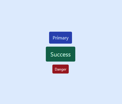
A very interesting feature offered by Panda CSS is support for multiple variants, which Panda CSS calls “Recipes.” You might have used variants before, as they are offered by many UI frameworks. For instance, a button could have a number of visual variants like primary, success and danger, as well as sizes, such as sm, md or lg.
<Button variant="primary" size="lg">Click me</Button>
Panda CSS provides a method called cva, which stands for Class Variance Authority. It allows the creation of multiple variants with a type-safe runtime API. Here’s an example of how we can create a recipe for a Button component.
src/components/Button.tsx
import { cva } from "../../styled-system/css";

const button = cva({
  base: {
    display: "flex",
    justifyContent: "center",
    rounded: "sm",
  },
  variants: {
    variant: {
      primary: {
        bg: "blue.800",
        color: "blue.100",
      },
      success: {
        bg: "green.800",
        color: "green.100",
      },
      danger: {
        bg: "red.800",
        color: "red.100",
      },
    },
    size: {
      sm: { padding: "6px 8px", fontSize: "12px" },
      md: { padding: "8px 12px", fontSize: "16px" },
      lg: { padding: "10px 16px", fontSize: "20px" },
    },
  },
});

type ButtonCVAProps = NonNullable<Parameters<typeof button>[0]>;

export type ButtonProps = {
  className?: string;
  children: React.ReactNode;
  variant?: ButtonCVAProps["variant"];
  size?: ButtonCVAProps["size"];
};

const Button = (props: ButtonProps) => {
  const { className, children, variant, size } = props;
  return (
    <button
      className={`${button({
        variant,
        size,
      })} ${className}`}
    >
      {children}
    </button>
  );
};

export default Button;
We have defined two different variants. The first one is called variant with primary, success and danger values, and it’s used to determine the text and background color. The second one is called size, and it can be set to sm, md or lg. Let’s add the buttons in the App component.
src/App.tsx
import "./App.css";
import { css } from "../styled-system/css";
import Button from "./components/Button";
import { vstack } from "../styled-system/patterns";

function App() {
  return (
    <div
      className={css({
        minH: "100vh",
        bg: "blue.100",
        display: "flex",
        alignItems: "center",
        justifyContent: "center",
      })}
    >
      <div className={vstack()}>
        <Button variant="primary" size="md">
          Primary
        </Button>
        <Button variant="success" size="lg">
          Success
        </Button>
        <Button variant="danger" size="sm">
          Danger
        </Button>
      </div>
    </div>
  );
}

export default App;
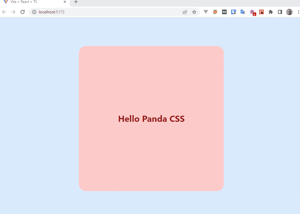
The App component will render three buttons with different variants, sizes and text. The image below shows what the buttons will look like.
Summary
CSS-in-JS is a popular approach to style web applications, and Panda CSS might become one of the staple choices in this area.
However, it’s essential to remember that these libraries are just tools in a developer’s toolbox. While they can offer significant benefits, it’s vital to evaluate each project’s needs and make an informed decision on whether to use a CSS-in-JS solution or a more traditional approach to styling.
Nevertheless, if you’ve never used CSS-in-JS, Panda CSS might be the one to convince you to give it a try. Note that we only covered a small subset of the features, so make sure to check out the documentation.

Thomas Findlay
Thomas Findlay is a 5-star rated mentor, full-stack developer, consultant, technical writer and the author of “React - The Road To Enterprise” and “Vue - The Road To Enterprise.” He works with many different technologies such as JavaScript, Vue, React, React Native, Node.js, Python, PHP and more. Thomas has worked with developers and teams from beginner to advanced and helped them build and scale their applications and products. Check out his Codementor page, and you can also find him on Twitter.
Related Posts
Comments
All articles
Topics
Web MobileMobile
Desktop
Design
Productivity
People
