New Chart features - Q1 2013 SP1
Summarize with AI:
Following customer demand we updated our chart for the Q1 2013 Service Pack release with several crucial features. These are:
Sharing an axis between two or more series requires a little trick because we can’t put a chart axis in the resources. If we do and then refer to it with {StaticResource resourceKey} Silverlight will crash because the axis will be inserted into the element tree twice. What the user has to do is to wrap the axis in an object or put it in a collection and then access the axis through the wrapper. For example here’s a custom collection that we can initialize in XAML.
Now we can use the collection and insert the axis like this:
Finally it’s all a matter of binding one of the axis properties of our series to the collection’s index at which the shared axis is located:
The new built-in annotations allow you to tell the chart, in its own language, to display something important at a certain point or band inside its plot area. There are several supported annotations which are divided in two broader groups and these are Cartesian annotations for the Cartesian chart and polar/radial annotations for the polar chart. Both categories have a plot band annotation, a grid line annotation and a custom annotation. This blog post will explain the general idea of the three types and the online help can serve as a reference for more detailed info and code examples. Below we’ll explain the three types of annotations in no particular order.
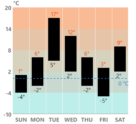
The first type of annotation is the GridLineAnnotation. It allows developers to draw a horizontal or vertical line across the chart (or around if it’s polar/radial). It can be used to denote a threshold for example.

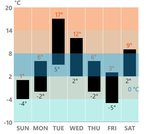
The second type is the PlotBandAnnotation. It is similar to the grid line in that it stretches over the whole chart along a given axis but instead covers an area from a min value to a max value specified by the From and To properties.

Finally, the last supported annotation type is the CustomAnnotation. It allows displaying any kind of indication on the chart area in the way that ContentControl allows any type of content. The custom annotation has Content and ContentTemplate properties and also HorizontalValue and VerticalValue (Polar/Radial value for the polar chart).
Our Examples app has been updated with new examples to highlight these features so be sure to check them out (and their source too).
If you have any questions or suggestions, we’d be glad to hear from you.

- Multiple axes
- Axis alignment
- Annotations
- Empty values.
Multiple Axes
This feature allows the chart to display more than two axes which includes sharing axes among the series. The way this works is that the chart itself still has its HorizontalAxis and VerticalAxis properties but the series have these properties as well. If you want to display a series in its own coordinate system you can do so with the series.HorizontalAxis and series.VerticalAxis properties. For example:<telerikChart:BarSeries> <telerikChart:BarSeries.HorizontalAxis> <telerikChart:CategoricalAxis/> </telerikChart:BarSeries.HorizontalAxis> <telerikChart:BarSeries.VerticalAxis> <telerikChart:LinearAxis/> </telerikChart:BarSeries.VerticalAxis></telerikChart:BarSeries>Sharing an axis between two or more series requires a little trick because we can’t put a chart axis in the resources. If we do and then refer to it with {StaticResource resourceKey} Silverlight will crash because the axis will be inserted into the element tree twice. What the user has to do is to wrap the axis in an object or put it in a collection and then access the axis through the wrapper. For example here’s a custom collection that we can initialize in XAML.
public class AxisCollection : Collection<Axis>{}Now we can use the collection and insert the axis like this:
<Grid.Resources> <local:AxisCollection x:Key="SharedAxes"> <telerikChart:CategoricalAxis/> </local:AxisCollection></Grid.Resources>Finally it’s all a matter of binding one of the axis properties of our series to the collection’s index at which the shared axis is located:
<telerikChart:BarSeries VerticalAxis="{Binding Source={StaticResource SharedAxes}, Path=[0]}"/>
Axis alignment
Each of the axes in the Cartesian chart can now be aligned to the left, right, top or bottom sides depending on whether the particular axis is vertical or horizontal. Each cartesian axis has VerticalLocation and HorizontalLocation properties which control the alignment. For example here is a horizontal axis aligned to the top:
<telerikChart:LinearAxis VerticalLocation="Top"/>Annotations
Another requested feature is a way to display annotations on the chart. With previous releases it was rather difficult because if you put some sort of decoration on top of the chart it will become irrelevant. As soon as the chart is zoomed or panned or if its axes changed, among other things, such an artificial decoration loses track of the chart state.The new built-in annotations allow you to tell the chart, in its own language, to display something important at a certain point or band inside its plot area. There are several supported annotations which are divided in two broader groups and these are Cartesian annotations for the Cartesian chart and polar/radial annotations for the polar chart. Both categories have a plot band annotation, a grid line annotation and a custom annotation. This blog post will explain the general idea of the three types and the online help can serve as a reference for more detailed info and code examples. Below we’ll explain the three types of annotations in no particular order.
The first type of annotation is the GridLineAnnotation. It allows developers to draw a horizontal or vertical line across the chart (or around if it’s polar/radial). It can be used to denote a threshold for example.
The second type is the PlotBandAnnotation. It is similar to the grid line in that it stretches over the whole chart along a given axis but instead covers an area from a min value to a max value specified by the From and To properties.
Finally, the last supported annotation type is the CustomAnnotation. It allows displaying any kind of indication on the chart area in the way that ContentControl allows any type of content. The custom annotation has Content and ContentTemplate properties and also HorizontalValue and VerticalValue (Polar/Radial value for the polar chart).
Empty values
The last thing worth mentioning is empty values support. Developers don't need to do anything special to take advantage of this. If the data objects, that the series are bound to, have null as values of their properties the chart will just draw itself accordingly by inserting gaps in the UI.Our Examples app has been updated with new examples to highlight these features so be sure to check them out (and their source too).
If you have any questions or suggestions, we’d be glad to hear from you.
About the Author
Viktor Skarlatov
Software Developer,
Windows Phone Team
Windows Phone Team
Comments
Comments are disabled in preview mode.
