Let's Put Some Makeup on the Telerik ListView for Xamarin
Summarize with AI:
There are millions of apps out there, but many of them are just clones of one another in terms of functionality. It's the UI and the UX that really make a first impression on your end-user and eventually can win them to your side. This is why we are building our components stacked with features and with extensibility in mind.
Today, we will demonstrate how you can change the look and the behavior of the Telerik ListView for Xamarin.Forms by employing the following features:
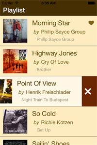
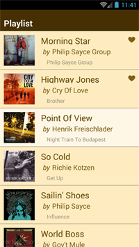
Here is what the final result should like on iOS and Android:
iOS:
Android:
Now let’s get the job done!
And a view model class that will be the binding context of our list view:

We'll use the ListViewTemplateCell to set a custom data template for the cells. Here is how we organize the elements and layouts in the cell template:
We have to enable the swipe gestures and specify the swipe distance.
The ItemSwipeContentTemplate is used to create the content that appears below the item when the user swipes. For this scenario we add a grid with two buttons.
That's it! Now the ListView is not just styled, but it allows for right and left item swipe behavior with actionable content underneath. Here is how this looks on iPhone:

You can get the complete source code of the application from our GitHub repo. Of course, you will need UI for Xamarin to run the app. Get a free trial here.
Today, we will demonstrate how you can change the look and the behavior of the Telerik ListView for Xamarin.Forms by employing the following features:
- Ability to customize the template of the items
- Predefined layouts
- Support for swipe content
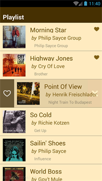
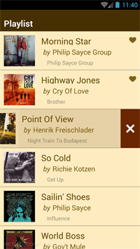
Here is what the final result should like on iOS and Android:
iOS:
 |
 |
 |
Android:
 |
 |
 |
Now let’s get the job done!
Data Class
To start, here is a simple data class that will hold some information about a song:using Telerik.XamarinForms.Common;namespace CustomizableListView{ public class Song : NotifyPropertyChangedBase { private bool isFavourite; public string Title { get; set; } public string Author { get; set; } public string Album { get; set; } public string AlbumArt { get; set; } public bool IsFavourite { get { return this.isFavourite; } set { if (this.isFavourite != value) { this.isFavourite = value; this.RaisePropertyCanged(); } } } }}using System;using System.Collections.ObjectModel;using Telerik.XamarinForms.Common;namespace CustomizableListView{ public class ViewModel : NotifyPropertyChangedBase { private ObservableCollection<Song> songs; public ViewModel() { this.Songs = this.GetData(); } public ObservableCollection<Song> Songs { get { return this.songs; } set { if (this.songs != value) { this.songs = value; this.RaisePropertyCanged(); } } } public void ReloadData() { this.Songs = this.GetData(); } private ObservableCollection<Song> GetData() { // get songs data } }}Item Template
This is the template of the elements in the ListView that we're after:
We'll use the ListViewTemplateCell to set a custom data template for the cells. Here is how we organize the elements and layouts in the cell template:
<telerikDataControls:RadListView.ItemTemplate> <DataTemplate> <telerikListView:ListViewTemplateCell> <telerikListView:ListViewTemplateCell.View> <Grid Padding="10"> <Grid.ColumnDefinitions> <ColumnDefinition Width="90"/> <ColumnDefinition Width="*"/> </Grid.ColumnDefinitions> <Image Source="{Binding AlbumArt}"/> <StackLayout Padding="10,0,0,0" Grid.Column="1"> <Grid> <Grid.ColumnDefinitions> <ColumnDefinition Width="*"/> <ColumnDefinition Width="Auto"/> </Grid.ColumnDefinitions> <Label Text="{Binding Title}" TextColor="#694A00" LineBreakMode="TailTruncation" FontSize="Large"/> <Image Source="{Binding IsFavourite, Converter={StaticResource FavouriteImageConverter}}" Grid.Column="1"/> </Grid> <StackLayout Orientation="Horizontal" Padding="5,0,0,0"> <Label TextColor="#806015" Text="by" FontAttributes="Italic" FontSize="Medium"/> <Label TextColor="#806015" Text="{Binding Author}" LineBreakMode="TailTruncation" FontSize="Medium"/> </StackLayout> <StackLayout Orientation="Horizontal" Padding="15,0,0,0"> <Label TextColor="#A0967D" Text="{Binding Album}" LineBreakMode="TailTruncation" FontSize="Small"/> </StackLayout> </StackLayout> </Grid> </telerikListView:ListViewTemplateCell.View> </telerikListView:ListViewTemplateCell> </DataTemplate></telerikDataControls:RadListView.ItemTemplate>Items State
Next come the item states. The ListView items are always in one of these states: selected, pressed or normal. There are style properties that customize the item's background and borders for each state.<telerikDataControls:RadListView.SelectedItemStyle> <telerikListView:ListViewItemStyle BackgroundColor="{StaticResource SelectedBackgroundColor}" BorderLocation="Bottom" BorderColor="#A0967D" BorderWidth="2"/></telerikDataControls:RadListView.SelectedItemStyle><telerikDataControls:RadListView.ItemStyle> <telerikListView:ListViewItemStyle BackgroundColor="{StaticResource BackgroundColor}" BorderLocation="Bottom" BorderColor="#A0967D" BorderWidth="2"/></telerikDataControls:RadListView.ItemStyle><telerikDataControls:RadListView.PressedItemStyle> <telerikListView:ListViewItemStyle BackgroundColor="{StaticResource BackgroundColor}" BorderLocation="Bottom" BorderColor="#A0967D" BorderWidth="2"/></telerikDataControls:RadListView.PressedItemStyle>Layout
The items can be arranged in different layouts, and each layout has properties that specify the length of the items and the distance between them. In this example we use a linear layout:<telerikDataControls:RadListView.LayoutDefinition> <telerikListView:ListViewLinearLayout ItemLength="100" /></telerikDataControls:RadListView.LayoutDefinition>Swipe Content
We also want to add a button at each side of the item that is revealed as the user swipes—one to mark the song as favorite and one to delete the song from the playlist.We have to enable the swipe gestures and specify the swipe distance.
<telerikDataControls:RadListView x:Name="listView" IsItemSwipeEnabled="True" SwipeOffset="50,0,50,0" ...><telerikDataControls:RadListView.ItemSwipeContentTemplate> <DataTemplate> <Grid> <Grid.ColumnDefinitions> <ColumnDefinition Width="Auto"/> <ColumnDefinition Width="*"/> <ColumnDefinition Width="Auto"/> </Grid.ColumnDefinitions> <Grid BackgroundColor="#33FFFFFF" Grid.Column="0"> <Button Image="{Binding IsFavourite, Converter={StaticResource FavouriteButtonConverter}}" Style="{StaticResource ButtonStyle}" Clicked="LoveButtonClick"/> </Grid> <Grid BackgroundColor="#33FF0000" Grid.Column="2"> <Button Image="trash.png" Style="{StaticResource ButtonStyle}" Clicked="DeleteButtonClick"/> </Grid> </Grid> </DataTemplate></telerikDataControls:RadListView.ItemSwipeContentTemplate>private void LoveButtonClick(object sender, EventArgs e){ var song = (sender as Button).BindingContext as Song; song.IsFavourite = !song.IsFavourite;}private void DeleteButtonClick(object sender, EventArgs e){ var song = (sender as Button).BindingContext as Song; this.viewModel.Songs.Remove(song);}
You can get the complete source code of the application from our GitHub repo. Of course, you will need UI for Xamarin to run the app. Get a free trial here.
Happy coding!
Update: Check out the newly released Telerik Tagit, a cross-platform native mobile Xamarin app. We give you source code and a six-part walkthrough of how it was created. Check out how we implemented the ListView control in that app, right here!

About the Author
Rositsa Topchiyska
Rosy started her career at Telerik as a junior support officer and changed her track to development. She is now a software developer and works on multiple products: Telerik UI for Windows Phone, Telerik UI for Windows Universal and Telerik UI for Xamarin Forms.
Related Posts
Comments
Comments are disabled in preview mode.
