
How to Migrate Your WPF Components to .NET MAUI

Summarize with AI:
When you’re ready to expand your trusty WPF desktop app to multiple platforms, .NET MAUI is an appealing choice. Here’s what that would look like with a DataGrid component as an example.
As you might have a long-standing, well-proven desktop application built with WPF that’s delivering a great user experience, you might have already planned to go beyond desktop and covering on all platforms. To align with the business goals and new objectives, your organization may be considering further adjustment to its business model. Consequently, you might be tasked with identifying how to adapt and support new capabilities to effectively reach a broader audience.
Born as an evolution of Xamarin and with desktop features throughout, the .NET MAUI platform came from Microsoft as a solid choice for migrating apps, enabling developers to create consistent experience across devices. With operating systems from a single project, .NET MAUI is positioned as a solid choice for building applications that run cross-platform, offering a cost-effective solution compared to maintaining separate native platform apps.
In this blog, I will provide some informed insights and discuss potential challenges posed by current limitations of the framework. Choosing the right UI toolkit to facilitate the process would bring another perspective. As an example, we can take advantage of the robust Progress Telerik UI for .NET MAUI library that helps to reduce development time and facilitates the creation of modern-looking, enterprise-ready applications with built-in performance optimizations.
So, the key question seems to be: What does it take to migrate a WPF app to .NET MAUI? To migrate the application to run not only on Windows desktop, but also natively on Android and iOS, .NET MAUI enables consistent experience across devices and operating systems, rendering it the ultimate solution in the case of applications that needs actual cross-platforming. A logical step would be to seek a cost-effective solution compared to maintaining separate native platform apps.
Explore the Case of Migrating a WPF One-Grid App
Let’s take a simple WPF app with a grid, bound to any data source and convert it to a Telerik .NET MAUI DataGrid. To get familiar with the initial steps on setting up the project, be sure to review the basic concepts already discussed in the other blog on Considerations When Porting a WPF App to .NET MAUI.
DataGrid API & Definitions
The DataGrid offers an extensive set of built-in features like Search as You Type, Load on Demand, plus the standard Filtering, Grouping, Selection, Scrolling, Sorting and Editing options.
Similar to its Telerik UI for WPF DataGrid cousin, the .NET MAUI version can autogenerate typed columns based on the types of the underlying data. Alternatively, you can manually define the needed columns, as various column types and properties are exposed for direct configuration. Columns Reordering is also supported.
To get started, you might find useful to refer to and compare the full Telerik UI for .NET MAUI DataGrid API to the Telerik UI for WPF GridView API (and similarly to all listed namespaces).
In addition to the standard ways to populate data, the .NET MAUI DataGrid supports binding to any type that implements the standard IDynamicMetaObjectProvider DLR interface, such as DynamicObject and ExpandObject. See more on .NET MAUI DataGrid - Dynamic Data.
Style the DataGrid and Its Elements
As an example, below is an illustration of how to define a DataGrid with a column and specify a custom CellContentStyle (CellStyle in WPF):
WPF Code
<telerik:RadGridView  ItemsSource="{Binding Clubs}"  AutoGenerateColumns="False"
    DataContext="{StaticResource ViewModel}"  >
    <telerik:RadGridView.Columns>
        <telerik:GridViewDataColumn DataMemberBinding="{Binding Name}" Header="Club Name">
<telerik: GridViewDataColumn .CellStyle>
<Setter Property="VerticalContentAlignment" Value="Top"/>
                      <Setter Property="Background" Value="#ffcc00"/>
</telerik: GridViewDataColumn .CellStyle>
    </telerik:RadGridView.Columns>
</telerik:RadGridView>
.NET MAUI Code
<telerik:RadDataGrid  ItemsSource="{Binding Clubs}" AutoGenerateColumns="False">
    <telerik:RadDataGrid.BindingContext>
        <local:ViewModel />
    </telerik:RadDataGrid.BindingContext>
    <telerik:RadDataGrid.Columns>
        <telerik:DataGridTextColumn PropertyName="Name"
                                    HeaderText="Name">
            <telerik:DataGridTextColumn.CellContentStyle>
                <Style TargetType="telerik:DataGridTextCellAppearance">
<Setter Property="VerticalTextAlignment Value="Top"/>
                      <Setter Property="BackgroundColor" Value="#ffcc00"/>
<Setter Property="TextMargin" Value="2" />
       	 <Setter Property="TextColor" Value="#000000" />
      	  <Setter Property="HoverTextColor" Value="#198679" />
       	 <Setter Property="SelectedTextColor" Value="#00796B" />
                </Style>
            </telerik:DataGridTextColumn.CellContentStyle>
        </telerik:DataGridTextColumn>
The .NET MAUI DataGrid column styling mechanism allows customizing the look and feel by exposing HeaderStyle, FooterStyle, CellDecorationStyle, CellEditorStyle and CellContentStyle. For example:
<telerik:DataGridTextColumn.FooterStyle>
    <Style TargetType="telerik:DataGridColumnFooterAppearance">
        <Setter Property="TextColor" Value="#FFFFFF" />
        <Setter Property="BackgroundColor" Value="#00796B" />
    </Style>
</telerik:DataGridTextColumn.FooterStyle>
Then, through the CellContentStyleSelector, you could conditionally configure text alignment settings (e.g., TextMargin, HorizontalTextAlignment,VerticalTextAlignment), font options (e.g., FontAttributes, FontFamily, FontSize) and the TextColor property.
Similar to our Telerik UI for WPF GridView control, the .NET MAUI DataGrid component exposes a conditional styling feature, including GroupHeaderStyleSelector and GroupFooterStyleSelector (GroupRowStyleSelector and GroupFooterRowStyleSelector in WPF). Keep in mind that ShowGroupFooters should be explicitly set to visualize the respective elements.
.NET MAUI Code
<telerik:RadDataGrid AutoGenerateColumns="False"
                     GroupHeaderStyleSelector="{StaticResource MyGroupSelector}"
                     ShowGroupFooters=”True”>
    <telerik:RadDataGrid.Columns>
        <telerik:DataGridTextColumn PropertyName="Capital"
               CellContentStyleSelector="{StaticResource MyCellContentStyleSelector}"> </>
    </telerik:RadDataGrid.Columns>
</telerik:RadDataGrid>
WPF Code
<telerik:RadGridView AutoGenerateColumns="False"
                       GroupRowStyleSelector="{StaticResource MyGroupSelector}"
 ShowGroupFooters=”True”>
    <telerik:RadGridView.Columns>
        <telerik: GridViewDataColumn PropertyName="Capital"
               CellStyleSelector="{StaticResource MyCellContentStyleSelector}"> </>
    </telerik:RadGridView.Columns>
</telerik:RadGridView>
Further details are covered in the associated documentation article: .NET MAUI DataGrid Documentation - Style Selectors.
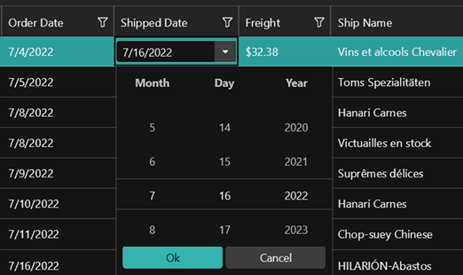
For actual settings and considerations, let’s take an example involving the display of Date values. While in WPF you need to manually specify a DatePicker editor, Telerik UI for .NET MAUI offers a nice ready-to-configure DateColumn built-in implementation, featuring a RadDatePicker control for value selection in edit mode.
.NET MAUI XAML
<telerik:DataGridDateColumn PropertyName="Established" HeaderText="Date Established"
                           CellContentFormat="{}{0: ddd-d-MMM-yyyy}">
</telerik:DataGridDateColumn>
While the CellContentFormat uses the format string provided by the framework by default, you could add custom options as explained in the Standard Date and Time Formatting and Custom Date and Time Formatting articles. And you can find more on how to utilize the Telerik .NET MAUI localization and globalization features here.
Theming Challenges & Support Resources
One key challenge in this migration is verifying that any existing WPF visuals will be rendered in the same, if not better, way in your .NET MAUI app across different platforms. It is worth mentioning the component suite adds value not only through controls but also by utilizing icons, scaffolding and other rich styling options, including a platform theme with light and dark variants. These resources can provide more details:
- Font Icons - Telerik UI for .NET MAUI
- Theming Overview - Telerik UI for .NET MAUI
- Visual Studio Integration Overview
- Visual Studio Code Integration
Telerik UI for .NET MAUI comes with a built-in theme that controls the visual appearance of the components, including colors, borders, backgrounds, size, layout, position and font size. The theme also offers multiple color variations to choose from. The next image shows an example of the basic differences and similarities between the Purple and Purple Dark swatch (variation) when applied to AutoComplete control.

Like the WPF suite, you have control over customizing the styles of specific controls or collections of controls, and you can modify the control-specific theme resources.
Exploring different theming options, you can get an idea on how the bound column would look like with the Telerik Turquoise Dark configured:
The Telerik .NET MAUI ControlsSamples App offers a convenient way to compare the built-in theme swatches. Just go to the Theming example of each of the various components and use the Change Theme button to switch between the theme swatches.
The ProgressTelerik channel on YouTube offers more video resources on Mastering the DataGrid.
Built-in Page Templates
To further enhance productivity, the Telerik UI for .NET MAUI Visual Studio extension lets you scaffold an app page (screen). This allows you to quickly add predefined pages and define control parameters through the UI. To display a scaffolded screen in your app, simply specify the page’s namespace and set the screen directly inside the xaml file.
Working with Documents
The built-in RichTextEditor and PDFViewer can display documents directly. Another benefit provided when using a library such as Telerik UI for .NET MAUI is the additional tooling such as the Telerik Document Processing Libraries that facilitate associated tasks such as required manipulation of the most used flow, fixed and spreadsheet document formats for .NET applications without relying on third party software (MS Office, Adobe Acrobat).
Migrating and modernizing existing applications to keep up with new business directives and to satisfy the complex demands of today’s bring-your-own-device (BYOD) environment is a challenging task that involves extensive investigation and careful planning.
Partnering with a reliable, knowledgeable technology partner such as Progress Telerik can make the task easier and simplify this process by providing a single source for UI tooling, developer-centric documentation and practical demo resources. We prioritize our customers’ user experience and security, building our products are on a strong foundation to better safeguard their data and operations. Plus, our enterprise-level support expedites the development of secure, compliant as well as accessible applications.
Explore the full Telerik DevCraft suite, which includes Telerik UI for WPF and UI for .NET MAUI.

Dimitrina Petrova
Dimi has many years of experience in the software industry both developing solutions and advising customers in broad range of technologies. She is passionate about finding the best match between the customer needs and the best of breed of what technology can offer. Dimi always strive for harnessing the power of numbers for optimizations and to deliver the best customer experience.
Related Posts
Comments
All articles
Topics
Web MobileMobile
Desktop
Design
Productivity
People
