Getting Started with UniformItemsLayout from the .NET MAUI Community Toolkit

Summarize with AI:
The .NET MAUI Community Toolkit offers some UI layouts. Let’s learn about the UniformItemsLayout and how to implement it.
Layouts are classes that facilitate the arrangement and grouping of UI components on the screen. Native .NET MAUI layouts include StackLayout, AbsoluteLayout, Grid and FlexLayout. The .NET MAUI Community Toolkit offers additional layouts for more design variety in our applications.
In this article, we will explore some of these layouts, focusing on the UniformItemsLayout and demonstrating its easy implementation. Let’s see!
What Is .NET MAUI Community Toolkit?
🧠 The .NET MAUI Community Toolkit is a curated collection of reusable components thoughtfully developed by the community. It encompasses a range of elements such as animations, converters and behaviors, all designed to accelerate app development. What’s more, it ensures seamless compatibility across iOS, Android, macOS and WinUI, all thanks to the power of .NET MAUI.
I’ve written more about it below.
Initial Setup
To correctly implement the UniformItemsLayout, ensure that the .NET MAUI Community Toolkit is properly configured in your app. Setting it up is straightforward, as outlined in the steps below:
- Installation: First, make sure to install the toolkit by adding the Community.Toolkit.Maui NuGet package.

2. Setup in MauiProgram.cs: After adding the NuGet package, navigate to MauiProgram.cs. Right below UseMauiApp<App>(), append:
.UseMauiCommunityToolkit()
3. Namespace Addition: Include the toolkit namespace in your page:
xmlns:toolkit="http://schemas.microsoft.com/dotnet/2022/maui/toolkit"
What Is the UniformItemsLayout?
UniformItemsLayout is a layout from the .NET MAUI Community Toolkit. It keeps the size consistent for all components in every row and column.
Exploring the Layout Structure

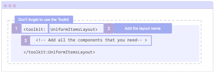
Let’s understand the image: To add the layout, you have to keep in mind the following elements:
➖ Step 1: You have to open/close the <toolkit:UniformItemsLayout> </toolkit:UniformItemsLayout> tags respectively, where “toolkit” is the namespace definition.
➖ Step 2: Finally, within these tags, add all the visual elements you need. For instance, a Button.
How Does It Work?
This layout lets you specify the maximum number of rows and columns in which the elements can be arranged. This is done using the following properties:
- MaxColumn: This property accepts an integer value and sets the maximum number of columns for your layout.
- MaxRows: This property also accepts an integer value and sets the maximum number of rows for your layout.
Let’s see a code sample:
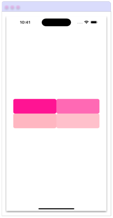
<toolkit:UniformItemsLayout MaxRows="2" MaxColumns="2" Padding="30,0" VerticalOptions="Center">
	<Button BackgroundColor="DeepPink" HeightRequest="70"/>
	<Button BackgroundColor="HotPink" HeightRequest="70"/>
	<Button BackgroundColor="LightPink" HeightRequest="70"/>
	<Button BackgroundColor="Pink" HeightRequest="70"/>
</toolkit:UniformItemsLayout>
You should expect a result similar to the one shown below:

What happens if I don’t specify the MaxColumn and MaxRows properties?
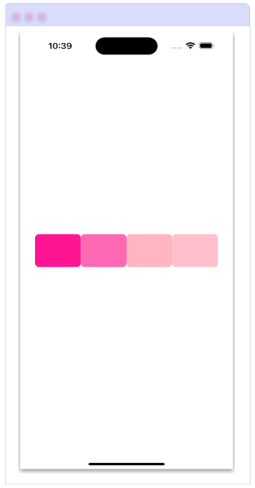
While the addition of these properties is not mandatory, not specifying them results in the automatic division of content within the layout. This division is based on the necessary number of rows and columns according to the elements within the layout.
💡 If we use the same code as in the previous example, but without specifying the maximum number of rows and columns, the result would be as follows:

🚫 Limitations
- When setting the maximum number of rows or columns, be mindful. If there are more elements than the assigned maximum, the excess elements won’t be displayed on the screen.
Conclusion
And done! In this quick and easy way you can start using UniformItemsLayout from .NET MAUI Community Toolkit in your daily use and continue exploring others! 💚💕
See you next time! 💁♀️
References
This article was based on the official documentation:

Leomaris Reyes
Leomaris Reyes is a software engineer from the Dominican Republic specializing in mobile development. She is a 7-time Microsoft MVP and actively builds mobile applications while sharing practical knowledge through technical articles and developer-focused content.
Through her work, she explains programming concepts, developer tools and real-world development practices to help developers grow in their careers.
You can follow her on Instagram and TikTok at @leomarisreyes.dev, read her articles on AskXammy, and connect with her on LinkedIn, where she shares tutorials, insights and resources for developers.

