Generating Charts based on Data in Your Kendo UI Grid

In this tutorial, see how you can easily generate a variety of Charts based on the data in your Kendo UI for Angular Grid.
A frequent question that pops up from people using Kendo UI for Angular is how they can work with the Grid and the Chart component together. This makes sense after all, the Grid can display the raw data and the chart is a nice way to visually consume said data. One particular scenario we are asked about often:
"How do I generate charts with the current selection in a Grid?"
Well, I'm here to say that it’s as easy as pie 🥧 and all you need is a Grid, a Chart, a Menu component and maybe a pie tin!
In this post I am going to be walking you through THIS KILLER DEMO and how you too can achieve such ✨ MAJESTY ✨ in your Kendo UI for Angular Grid! To easily follow along, grab the source code and see what we have done. I'm going to cover the important pieces for setting up this type of interaction between our components!
This gif was taken from one of our sample applications that you can find here: https://prgress.co/ChartsSampleApp. For those that want to follow along in the source code, here's a link to the GitHub repo: https://prgress.co/ChartsGitHub.
When you select a row on this Grid and right click it, you are offered a context menu. In this menu you’ll see all of the chart types you can generate with that data.
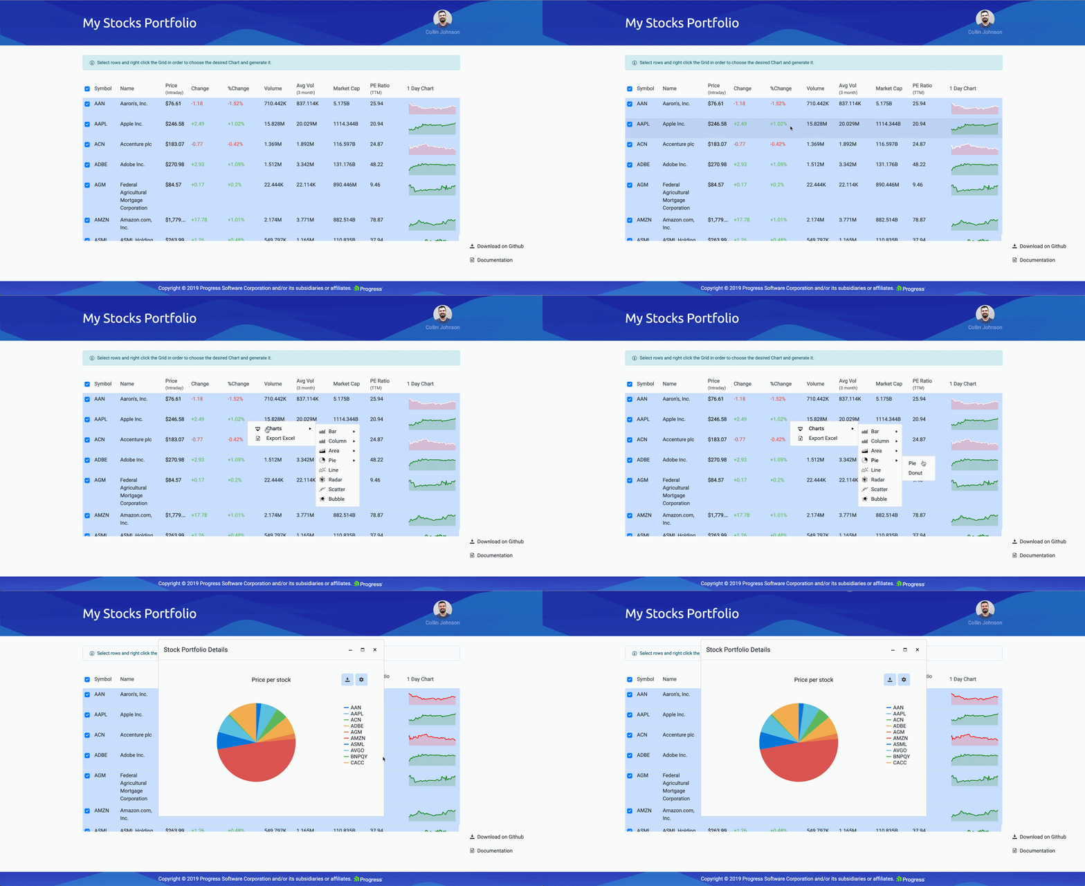
Once you choose a chart type, a dialog pops up with the chosen data displayed in chart form!
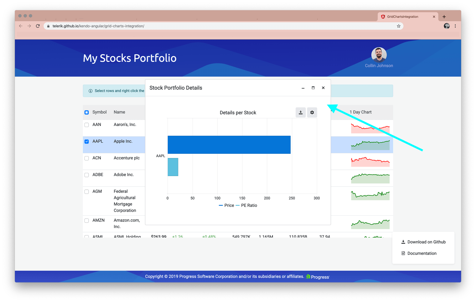
This article is going to walk through some of the steps it will take to create this workflow. We will start by adding in a menu for the chart types on right click. Then we will show you how to build out the different charts when they are selected. Let’s dive in and step through the sample app to see the kind of interaction the demo focuses on!
Building the Loveliest of Grids
The first step in this incredible Grid-to-Chart journey is, of course. the Grid. We have added a lot of items to this Grid: checkboxes for selectability, names and descriptions of course, lots of other data pieces, and a mini-Grid in the last column! You can further customize cells and columns of your Kendo UI Grid by specifying what template is used. Check out our Grid Template docs for more details.
Let’s go over the “bones” of our Grid to see how we have achieved this layout:

The Grid Itself
Firstly, we needed to create the Grid itself, the pie tin if you will, that will hold this gorgeous confection. Our data is public gridData:Stock[] = stocksInPortfolio; is coming from the data.ts file if you’d like to check out how it is formatted.

Selectable Settings
We are passing in SelectableSettings to allow users to select the Grid with or without arrow selection (so they can click on the row) and we are allowing multiple rows to be selected at once.
Persistent Selection
If you notice the kendoGridSelectBy binding, this is where we are linking in the stored items that we have selected. The selectedKeys is where we define the collection that is storing our selected items. I love this feature! Read more on our Persisting the Selection docs.
Note: An important piece to note here—when a user changes their selected items, the Grid emits a selectionChange event that we are using to call onSelectionChange(), which stores the new selected items for persistence! 🙌
The Columns of our Grid
Now let’s check out the other columns we created! The first one is to create checkboxes for select-ability. We are specificing showSelectAll to true so we have a select-all checkbox available in the header.

Next, we have the Symbol column for the acronym of the stock:

Then follows the name of the stock, as you would expect:

Our Kendo UI for Angular Grid is so flexible, as you can see here, the next column uses the Angular element ng-template (Angular templates not our own templates) to customize the look and feel! Many of the other columns do as well, as you’ll see below.
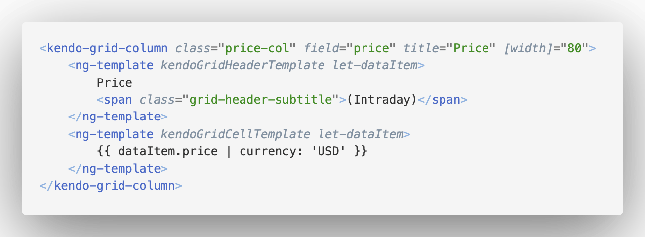
Check out the rest of the pieces of this Grid here in this gist I created for ease of viewing. (Or check out the full file here.) Expand the arrow below to see the full markup.
The inner pieces of our Grid
One cool note with these columns—the chart library is so flexible that we can even use it within smaller charts in the grid itself (see the last column and its mini-chart-action!).
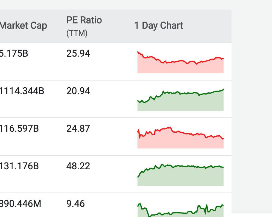
Some of you may have noticed that the context menu above also had an "Export to Excel" option. Did you know that Kendo UI for Angular has a client-side Excel framework that you can use to create Excel files on the fly? Well, not only that but it is also built-in to the Grid.
By default, if we enable this, the Grid will just export everything it can to an Excel file. However, we can specify exactly what we want the export to look like and what columns will actually be included in the export. This can be any field in the data, so even if we do not show it in the Kendo UI Grid, it can be exported. Also, fetchData allows us to specify where we can go to get ALL data to export, not just what is currently in the Grid (which may just be the current page). This is handy for scenarios where you want a light-weight frontend with less data loaded but still want to export the entire data set upon user request. Check it out:
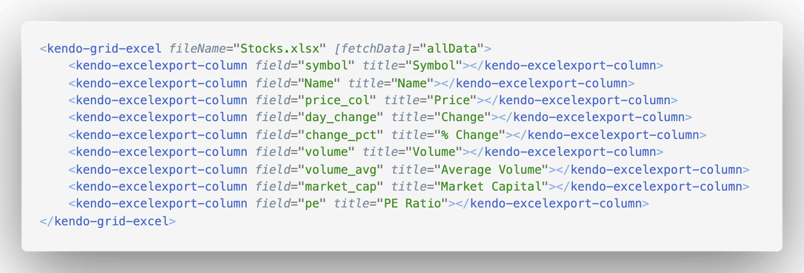
This is where you can customize what the export to excel looks like. Check out all your options here in our docs.
Now that we have our desired data in the loveliest of Grids, we are ready to get that data into Chart form! The first step will be creating a menu when certain chunks of data are selected and then right clicked on (as seen below).

Having a menu like this will allow us to select which type of Chart we would like to view our selected data rows in. So how do we do this?
Building a Context Menu
Capturing the click event with our grid is easy as pie! 🥧 Inside of our stock-list component, we can say this to capture click events on the grid cells:
public onCellClick(e: CellClickEvent): void {
  console.log(e.type, "I've been clicked! Rude!");
}
Using the cellClickEvent on the Grid Cells
With the grid cellClickEvent you have two types: click and contextmenu. The first one, click, will fire on single click (or enter from the keyboard). The contextmenu click event will fire on right-click. 🥳
We can now grab the click event (if it happened on right click) and build out a little pop-up menu to display our chart options!! 🥧 Pie, right?!
      public onCellClick(e: CellClickEvent): void {
            if (e.type === 'contextmenu') {
                const originalEvent = e.originalEvent;
                originalEvent.preventDefault();

            }
        }
Preventing the Default on Right Click
We also have access to the DOM click event that triggered the cellClick event (called originalEvent). If we log it out in the console, you can see everything we have access to off of this:
All of the properties on the click event!
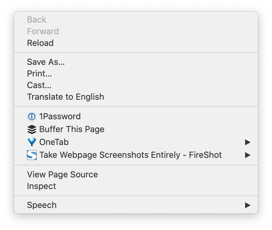
We are grabbing the originalEvent of the right click and preventing the default from happening. The default in this case would be the normal browser menu that pops-up on right click:
Note: If you’d like to follow along or fork the project yourself, check out the repo here!
Now that we have captured the right click and prevented the default, we are ready FOR THE THING YOU ALL HAVE BEEN WAITING FOR! The menu component!

Using @ViewChild to inject our gridMenu
First, we give our component access to the gridContextMenu. This context menu is using Kendo UI’s ContextMenuComponent.
@ViewChild('gridmenu') public gridContextMenu: ContextMenuComponent; Now, on right click, we need to position this BEAUTIFUL menu:
        public onCellClick(e: CellClickEvent): void {
            console.log(e.type, "I've been clicked! Rude!", e.originalEvent);
            if (e.type === 'contextmenu') {
                console.log(e.type);
                const originalEvent = e.originalEvent;
                originalEvent.preventDefault();
                this.gridContextMenu.show({
                    left: originalEvent.pageX, //position where right click happened on x-axis
                    top: originalEvent.pageY //position where right click happened on y-axis
                });
            }
        }
Building out the Menu’s Markup
Here is the kendo-contextmenu inside our stock-list componet’s HTML file:

We are declaratively defining this menu here in the markup and then using it when the right-click event happens. We have quite a few things we are doing with this menu, as you can see. We are toggling openOnClick so once the grid is right clicked, the context menu appears. Then we have an onSelect method that gets triggered on select. Check it out:
    public onSelect(e: ContextMenuSelectEvent): void {
        if (e.item.text === 'Charts' || e.item.items !== undefined) {
            return;
        }
        if (e.item.text === 'Export Excel') {
            this.grid.saveAsExcel();
        } else {
            this.chartConfiguration = {
                chartName: e.item.text,
                seriesType: getChartType(e.item.text),
                stack: getChartStack(e.item.text)
            };
            if (!this.opened) {
                this.opened = true;
            }
            this.gridContextMenu.hide();
        }
    }
Here, we are doing some magical things. We are returning (essentially not taking any action, not hiding the contextMenu if the item clicked on is Charts or undefined. If the item selected was Export Excel then we save the grid to an Excel file. Otherwise, we get to building out a magnificent Chart with the selected data and hiding the contextMenu!
How are we building out the items though, that populate this menu?
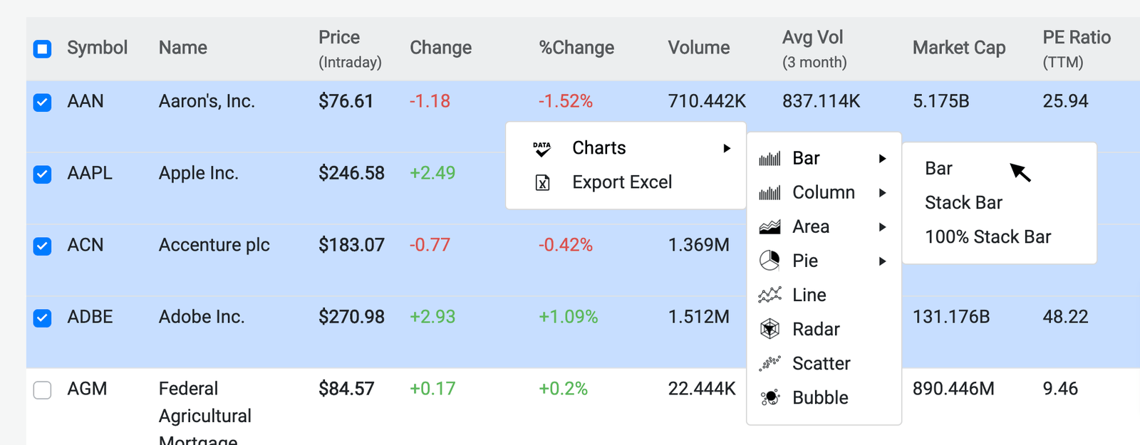
As for the menu items, we are getting the data to populate them from this data.ts file.
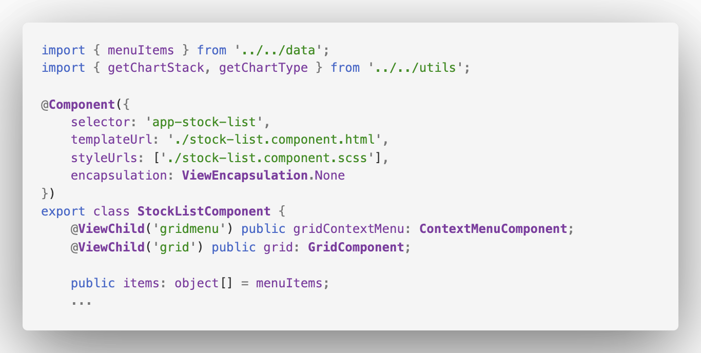
Which is of course how we are getting items to loop through and set the item.text with!

So let’s recap all of this grid-to-chart gloriousness! We have a powerful Grid that has selectable rows of data. Once you have the data you’re interested in selected, a right click will bring up a Kendo UI Context Menu that we’ve populated with all of the Chart options. You can then select a chart and see instantly in a pop-up window your data set in a beautiful and fully functional Kendo UI Chart. We also used the built-in excel framework to make any combination of data possible to export to Excel, all with a button click.
I encourage you to pull this project down and look deeper into the other neat details we didn’t cover in this article. I really love this demo that Tsvetomir and Svetlin worked hard to show off the power of multiple Kendo UI for Angular components combined.

- Docs for this Sample App: prgress.co/ChartsDocsSamples
- Sample App: prgress.co/ChartsSampleApp
- GitHub: prgress.co/ChartsGitHub
Alyssa is the Angular Developer Advocate for Kendo UI. If you're into Angular, React, Vue or jQuery and also happen to love beautiful and highly detailed components, check out the Kendo UI library here or just jump into a free 30 day trial today. Happy Coding!

Alyssa Nicoll
Alyssa is an Angular Developer Advocate & GDE. Her two degrees (Web Design & Development and Psychology) feed her speaking career. She has spoken at over 30 conferences internationally, specializing in motivational soft talks, enjoys gaming on Xbox and scuba diving in her spare time. Her DM is always open, come talk sometime.
