Customizable Scheduling Views with our Xamarin Calendar Control

Summarize with AI:
Need to customize the Calendar and Scheduling UI in your Xamarin app? With our latest Telerik UI for Xamarin release, we've made this easier than ever. Learn how easy it is to customize the scheduling views of our Calendar.
The Telerik Xamarin Calendar & Scheduling is designed to cover scenarios where users need to keep track of their schedule and manage their meetings. With the recently released Scheduling UIs app users can quickly create appointments as well as modify appointments' properties such as start/end time, recurrence rule and more.
As always, we have worked hard to make the scheduling views beautiful and user-friendly, still we are well aware the default look cannot fit to any application design. So, now, with R3 2020 we made the UIs available for customization, so that you can bring your own style to the UI. In this blog post I will get you familiar with the provided ways for customizing the scheduling views of the Calendar control. Let’s get started!
Intro to Scheduling Views
The Calendar & Scheduling control exposes nine different views used to create, modify and delete appointments, such as:
- AddAppointmentView - shows a form for editing appointments’ properties
- AppointmentSummaryView - shows brief information on the appointment with options to edit/delete it
- RepeatAppointmentView - provides predefined repeat options to choose from like Every Day, Every Month, etc.
And that's just to name a few. You can find the complete list in our documentation here: Scheduling UI Overview. Just setting the SchedulingUIEnabled property of the RadCalendar to "true" enables the functionality for your users:
<telerikInput:RadCalendar x:Name="calendar"
                SchedulingUiEnabled="True"
                ViewMode="Day" />
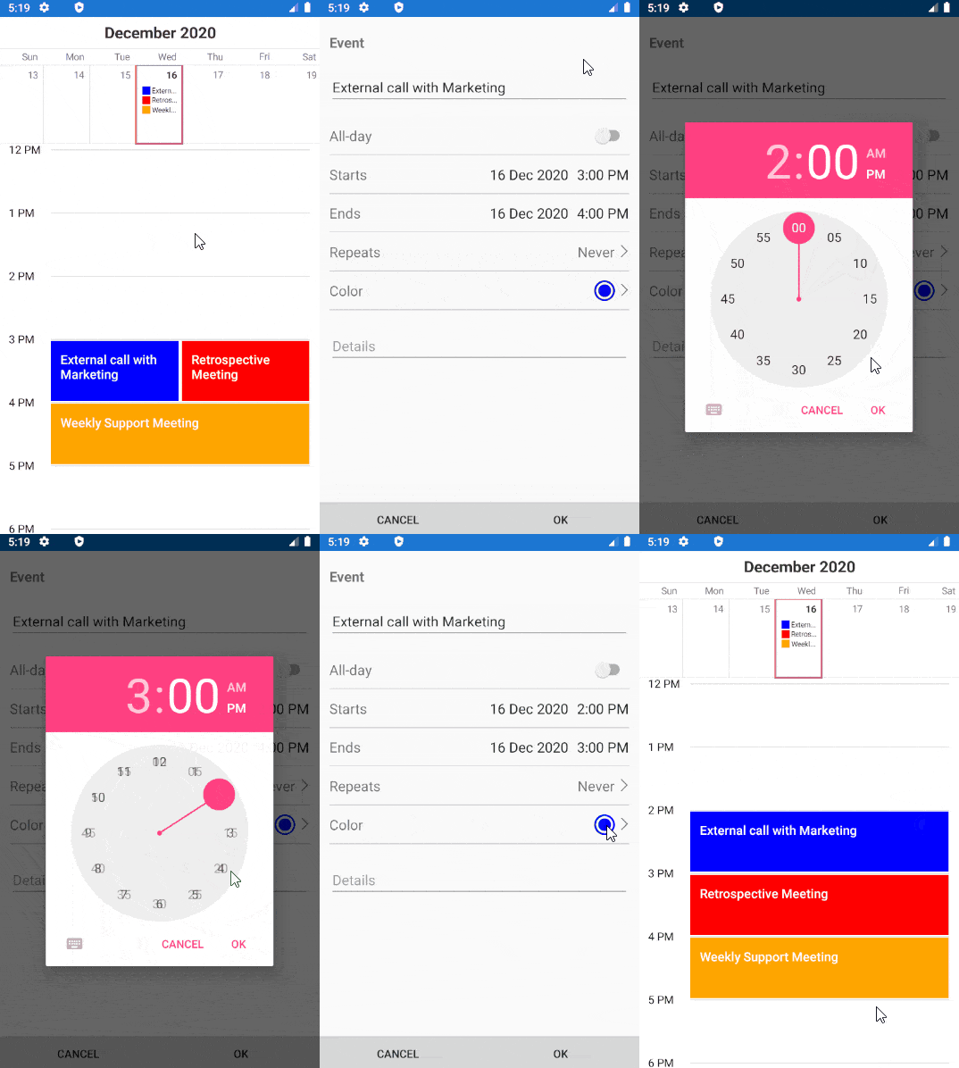
Here is a quick video showing the default AddAppointmentView which is displayed when the user taps on an empty time slot or chooses the “Edit” option from the AppointmentSummaryView in order to modify an existing appointment:

Scheduling UIs Styling Properties
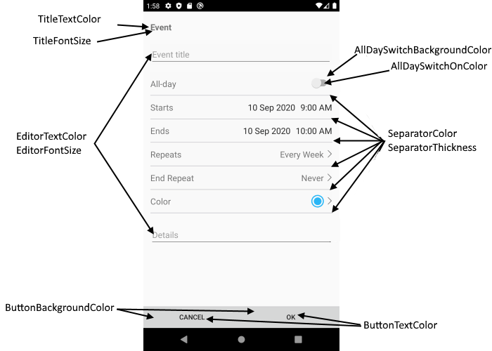
Each of the scheduling views provide a set of styling features, so you can adapt their appearance to the rest of the app. AddAppointmentView, for example, exposes text color and font size properties used to modify the labels and input controls inside the view. Check out the scheme below which shows exactly the available styling customizations of AddAppointmentView:

Let’s use some of these properties and see how the view will look. Just add a Style with TargetType set to AddAppointmentView inside the Resources section of your App.xaml:
<Style TargetType="telerikInput:AddAppointmentView">
    <Setter Property="BackgroundColor" Value="White"/>
    <Setter Property="TitleFontSize" Value="22" />
    <Setter Property="TitleTextColor" Value="#FF2124" />
    <Setter Property="EditorFontSize" Value="16" />
    <Setter Property="EditorTextColor" Value="#7F0000" />
    <Setter Property="ButtonTextColor" Value="#7F0000" />
    <Setter Property="SeparatorThickness" Value="0" />
</Style>
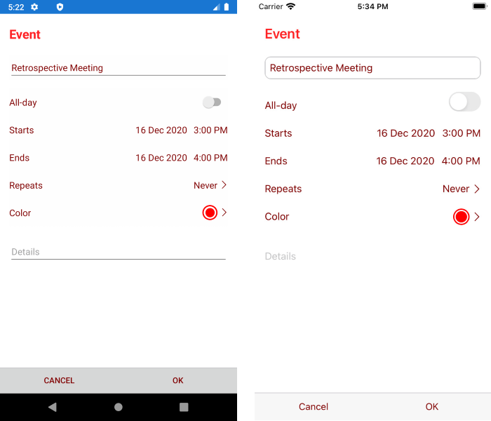
Here is the result both on Android and iOS:

Scheduling UIs Templates
Here I am going to show you how you can customize AddAppointmentView, but the same approach applies to the rest of the scheduling views.
As a start, take the default ControlTemplate as well as the referenced styles from our SDKBrowser github repo and copy them to the Resources section of you App.xaml file.
The easiest approach is to use the default template as a base and apply the needed changes directly in it, so that the view meets the design requirements you have. In this way you will ensure the functionality (editing appointment’s properties) will work as expected.
Check below some sample modifications to the AddAppointmentView ControlTemplate (moved the Ok/Cancel buttons at the top, removed the part for creating a recurrence rule, replaced the switch for All-day events with a checkbox):
<Application.Resources>
<telerikCommon:InvertedBooleanConverter x:Key="InvertedBooleanConverter"/>
<Style x:Key="EditorTitleLabelStyle" TargetType="Label">
<Setter Property="VerticalOptions" Value="Center" />
<Setter Property="FontSize" Value="{TemplateBinding EditorFontSize}" />
<Setter Property="TextColor" Value="{TemplateBinding EditorTextColor}" />
</Style>
<Style x:Key="EditorSeparatorStyle" TargetType="telerikPrimitives:RadBorder">
<Setter Property="BorderColor" Value="{TemplateBinding SeparatorColor}" />
<Setter Property="BorderThickness" Value="{TemplateBinding SeparatorThickness}" />
</Style>
<Style x:Key="EditorGridStyle" TargetType="Grid">
<Setter Property="HeightRequest" Value="{OnPlatform iOS=44, Default=48}" />
</Style>
<Style x:Key="DefaultButtonStyle" TargetType="Button">
<Setter Property="Margin" Value="0"/>
<Setter Property="CornerRadius" Value="0"/>
<Setter Property="BackgroundColor" Value="{TemplateBinding ButtonBackgroundColor}" />
<Setter Property="TextColor" Value="{TemplateBinding ButtonTextColor}" />
<Setter Property="HeightRequest" Value="44" />
</Style>
<ControlTemplate x:Key="AddAppointmentViewControlTemplate">
<Grid RowSpacing="0"
BackgroundColor="{TemplateBinding BackgroundColor}"
BindingContext="{TemplateBinding BindingContext}">
<telerikPrimitives:RadPopup.Popup>
<telerikPrimitives:RadPopup IsOpen="{Binding IsPopupOpen}"
Content="{Binding PopupContent}"
VerticalOffset="{Binding PopupVerticalOffset}"
Placement="Center"
AnimationType="Fade"
OutsideBackgroundColor="#6F000000">
</telerikPrimitives:RadPopup>
</telerikPrimitives:RadPopup.Popup>
<Grid.RowDefinitions>
<RowDefinition Height="Auto" />
<RowDefinition />
</Grid.RowDefinitions>
<telerikPrimitives:RadBorder BorderColor="#C8C7CC"
BorderThickness="0, 1, 0, 0" >
<Grid ColumnSpacing="0">
<Button Grid.Column="0"
Command="{Binding CancelCommand}"
Style="{StaticResource DefaultButtonStyle}"
Text="{telerikCommon:Localize Calendar_AppointmentCancelButton}" />
<Button Grid.Column="1"
Command="{Binding SaveAppointmentCommand}"
Style="{StaticResource DefaultButtonStyle}"
Text="{telerikCommon:Localize Calendar_AppointmentOKButton}" />
</Grid>
</telerikPrimitives:RadBorder>
<ScrollView Grid.Row="1">
<StackLayout Padding="16, 20, 16, 0"
Spacing="0">
<!--Appointment Title-->
<telerikPrimitives:RadBorder BorderColor="{TemplateBinding SeparatorColor}"
Margin="{OnPlatform iOS='0, 23, 0, 20', Default='0, 23, 0, 14'}"
BorderThickness="{OnPlatform iOS=1, Default=0}"
CornerRadius="{OnPlatform iOS=10}">
<Entry Text="{Binding Appointment.Title, Mode=TwoWay}"
FontSize="{TemplateBinding EditorFontSize}"
TextColor="{TemplateBinding EditorTextColor}"
Placeholder="{telerikCommon:Localize Calendar_AppointmentTitlePlaceholder}">
</Entry>
</telerikPrimitives:RadBorder>
<!--Appointment AllDay-->
<telerikPrimitives:RadBorder Style="{StaticResource EditorSeparatorStyle}">
<Grid Style="{StaticResource EditorGridStyle}">
<Label Text="{telerikCommon:Localize Calendar_AppointmentAllDay}"
Style="{StaticResource EditorTitleLabelStyle}" />
<CheckBox IsChecked="{Binding Appointment.IsAllDay}"
Color="{TemplateBinding AllDaySwitchOnColor}"
HorizontalOptions="End"/>
</Grid>
</telerikPrimitives:RadBorder>
<!--Appointment Start Date and Start Time-->
<telerikPrimitives:RadBorder Style="{StaticResource EditorSeparatorStyle}">
<Grid Style="{StaticResource EditorGridStyle}">
<Label Text="{telerikCommon:Localize Calendar_AppointmentStarts}"
Style="{StaticResource EditorTitleLabelStyle}" />
<StackLayout Orientation="Horizontal"
HorizontalOptions="End"
VerticalOptions="Center">
<DatePicker Date="{Binding StartDate}"
FontSize="{TemplateBinding EditorFontSize}"
TextColor="{TemplateBinding EditorTextColor}"
Format="dd MMM yyyy"
Margin="0, 0, 5, 0">
<DatePicker.Effects>
<telerikCommon:PickerRemoveBorderEffect />
</DatePicker.Effects>
</DatePicker>
<TimePicker Time="{Binding StartTime}"
FontSize="{TemplateBinding EditorFontSize}"
TextColor="{TemplateBinding EditorTextColor}"
IsVisible="{Binding Appointment.IsAllDay, Converter={StaticResource InvertedBooleanConverter}}">
<TimePicker.Effects>
<telerikCommon:PickerRemoveBorderEffect />
</TimePicker.Effects>
</TimePicker>
</StackLayout>
</Grid>
</telerikPrimitives:RadBorder>
<!--Appointment End Date and End Time-->
<telerikPrimitives:RadBorder Style="{StaticResource EditorSeparatorStyle}">
<Grid Style="{StaticResource EditorGridStyle}">
<Label Text="{telerikCommon:Localize Calendar_AppointmentEnds}"
Style="{StaticResource EditorTitleLabelStyle}" />
<StackLayout Orientation="Horizontal"
HorizontalOptions="End"
VerticalOptions="Center">
<DatePicker Date="{Binding EndDate}"
FontSize="{TemplateBinding EditorFontSize}"
TextColor="{TemplateBinding EditorTextColor}"
Format="dd MMM yyyy"
Margin="0, 0, 5, 0"
HorizontalOptions="End">
<DatePicker.Effects>
<telerikCommon:PickerRemoveBorderEffect />
</DatePicker.Effects>
</DatePicker>
<TimePicker Time="{Binding EndTime}"
FontSize="{TemplateBinding EditorFontSize}"
TextColor="{TemplateBinding EditorTextColor}"
IsVisible="{Binding Appointment.IsAllDay, Converter={StaticResource InvertedBooleanConverter}}"
HorizontalOptions="End">
<TimePicker.Effects>
<telerikCommon:PickerRemoveBorderEffect />
</TimePicker.Effects>
</TimePicker>
</StackLayout>
</Grid>
</telerikPrimitives:RadBorder>
<!--Appointment Color-->
<telerikPrimitives:RadBorder Style="{StaticResource EditorSeparatorStyle}">
<Grid Style="{StaticResource EditorGridStyle}">
<Label Text="{telerikCommon:Localize Calendar_AppointmentColor}"
Style="{StaticResource EditorTitleLabelStyle}" />
<Grid HorizontalOptions="End">
<Grid.ColumnDefinitions>
<ColumnDefinition Width="Auto" />
<ColumnDefinition Width="Auto" />
</Grid.ColumnDefinitions>
<Grid.GestureRecognizers>
<TapGestureRecognizer Command="{Binding ShowColorPickerViewCommand}" />
</Grid.GestureRecognizers>
<telerikPrimitives:RadBorder VerticalOptions="Center"
HorizontalOptions="End"
Grid.Column="0"
HeightRequest="26"
WidthRequest="26"
CornerRadius="13"
Margin="0"
BorderColor="{Binding Appointment.Color, Mode=TwoWay}"
BackgroundColor="Transparent"
BorderThickness="2">
<telerikPrimitives:RadBorder VerticalOptions="Center"
HorizontalOptions="Center"
CornerRadius="9"
HeightRequest="18"
WidthRequest="18"
Margin="1, 0, 0, 0"
BackgroundColor="{Binding Appointment.Color, Mode=TwoWay}"/>
</telerikPrimitives:RadBorder>
<Label telerikCommon:TelerikFont.UseEmbeddedFont="True"
Grid.Column="1"
Margin="2"
VerticalOptions="Center"
FontSize="{TemplateBinding EditorFontSize}"
TextColor="{TemplateBinding EditorTextColor}"
Text="" />
</Grid>
</Grid>
</telerikPrimitives:RadBorder>
</StackLayout>
</ScrollView>
</Grid>
</ControlTemplate>
<Style TargetType="telerikInput:AddAppointmentView">
<Setter Property="BackgroundColor" Value="White"/>
<Setter Property="TitleFontSize" Value="20" />
<Setter Property="TitleTextColor" Value="#FF2124" />
<Setter Property="EditorFontSize" Value="16" />
<Setter Property="EditorTextColor" Value="#7F0000" />
<Setter Property="ButtonTextColor" Value="#7F0000" />
<Setter Property="ButtonBackgroundColor" Value="White" />
<Setter Property="SeparatorThickness" Value="0" />
<Setter Property="AllDaySwitchOnColor" Value="#7F0000" />
<Setter Property="ControlTemplate" Value="{StaticResource AddAppointmentViewControlTemplate}" />
</Style>
</Application.Resources>
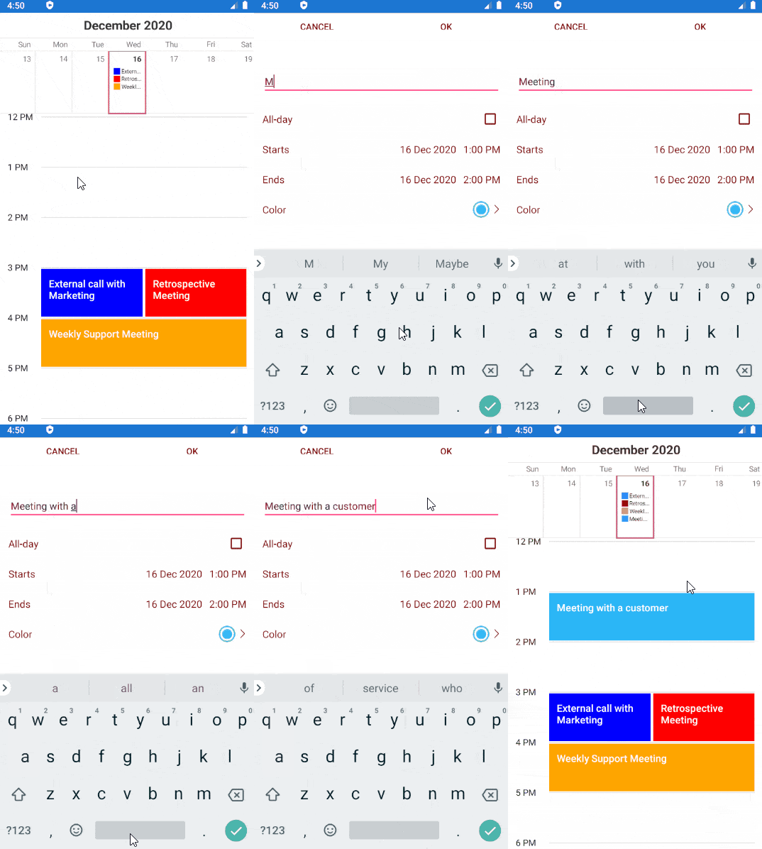
And this is how it looks on an Android emulator:

Let Us Know What You Think
Your feedback on our Xamarin controls is more than welcome. If you have any ideas for features to add, do not hesitate to share this information with us on our Telerik UI for Xamarin Feedback portal.
Don’t forget to check out the various demos of the control in our SDK Sample Browser and the Telerik UI for Xamarin Demos application.
If you have not yet tried the Telerik UI for Xamarin suite, take it out for a spin with a 30-day free trial, offering all the functionalities and controls at your disposal at zero cost.

Yana Kerpecheva
Yana Kerpecheva is a Senior Technical Support Engineer on the Telerik UI for Xamarin team. She has been working with Telerik products since 2008, when she joined the company. Apart from work, she likes skiing and travelling to new places.
