Custom Angular Animations in Our Kendo UI To-Do App

Summarize with AI:
So far in the Kendo UI and Angular Unite series, we've built a to-do app that is functional, but what's missing in the UX is motion! Learn how to add animations that are both snazzy and useful to our users.
Welcome back to Angular and Kendo UI Unite. If you are new to the series, I suggest checking out the first post or watching the video series these posts are based on!
At this point, the to-do app we've built is functional with the ability to add and remove to-do items to the to-do list. We are using Kendo UI buttons and a textbox input to make this UI happen & it’s looking pretty good with our custom styles easily modifying the Kendo UI components. The only thing that is missing in the UX is motion! Some animations would really snazzify our app while providing useful feedback as well as a spatial mental model to our users. Let’s do this!
This is the animations post of our series. In this article we're going to add some custom Angular Animations to the to-do app that we built last post, which I'm so super pumped about. Let's dive in!
Follow along with the code found here.
So as a reminder, what we built in the last post was just this simple to-do list. If you click an item from the list, it removes it. If you add a new item, it adds it in, as you would expect.
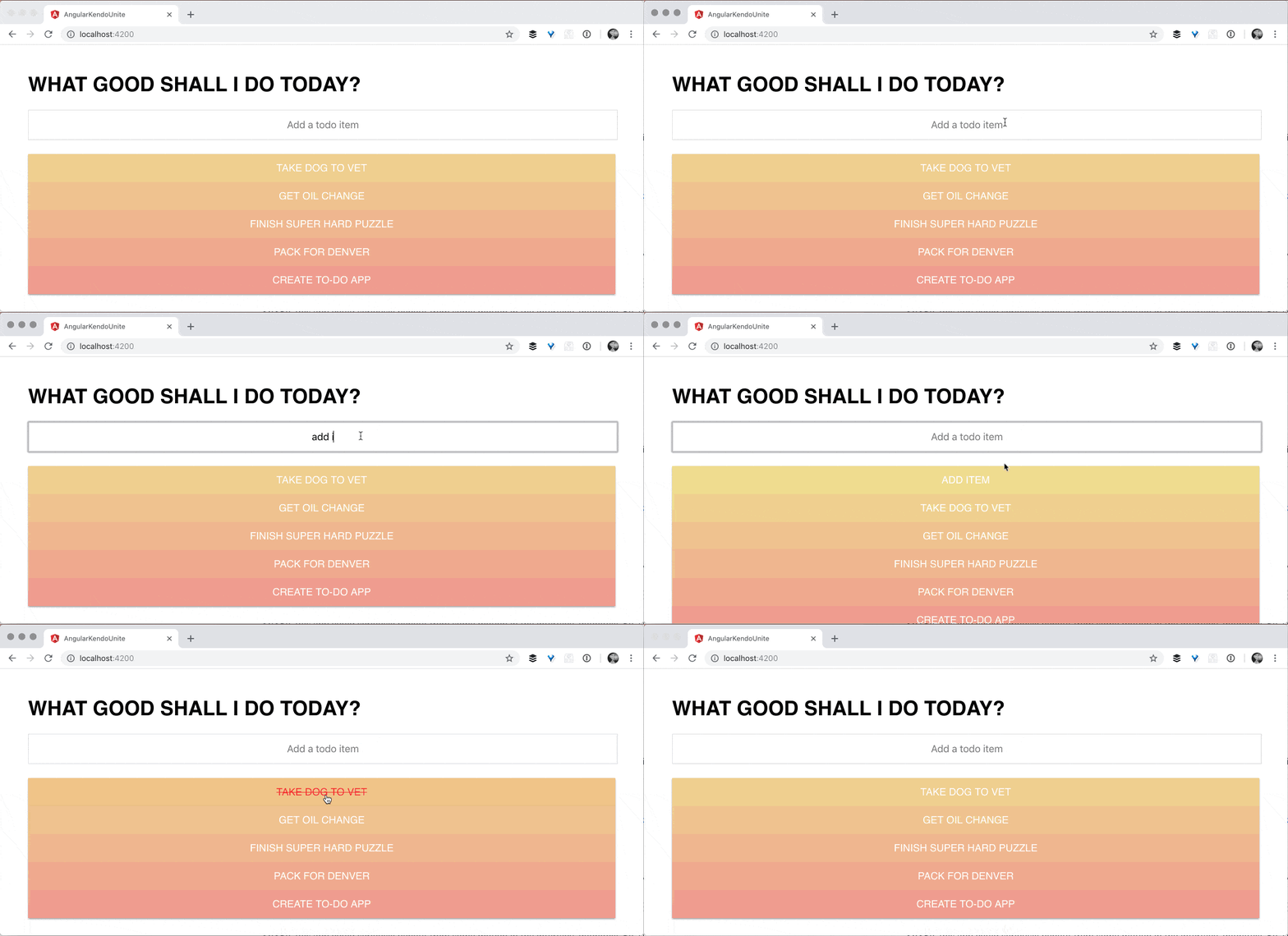
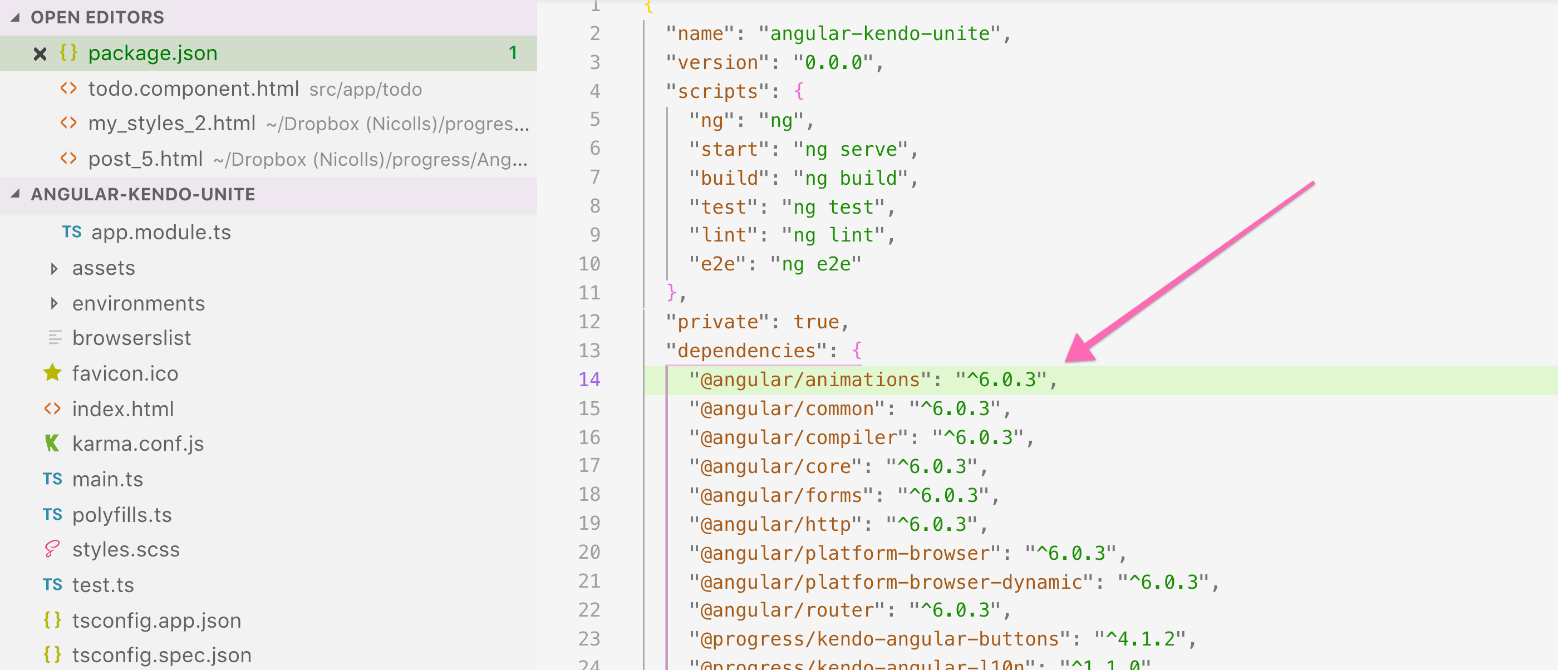
So, this app could seriously benefit from some motion in the interface. So, I'm going to dive right into adding animations to this. Now from the get go, the Angular Animations package is included in our app. And that's because Kendo UI uses Angular Animations. So we don't need to go ahead and include that, it's already there.
Now inside of our component we're going to add a metadata property, called animations, and it's going to take an array. Inside of this is where the magic happens. We're going to first start off by using some snippets that I've made. The first snippet is for to-do items:
// todo.component.ts

import { Component, ViewEncapsulation } from '@angular/core';
import { trigger, transition, animation, style, animate, keyframes } from '@angular/animations';
@Component({
  selector: 'todo',
  encapsulation: ViewEncapsulation.None,
  templateUrl: './todo.component.html',
  styleUrls: ['./todo.component.scss'],
  animations: [
    trigger('todoItem', [
      transition(':enter', [
        animate('0.5s cubic-bezier(.88,-0.19,.26,1.27)', keyframes([
          style({
            height: 0,
            opacity: 0,
            transform: 'translateX(-100%)'
          }),
          style({
            height: '50px',
          }),
          style({
            opacity: 1,
            transform: 'translateX(0)'
          })
        ]))
      ]),
      transition(':leave', [
        style({ backgroundColor: '#df3920' }),
        animate('0.5s cubic-bezier(.88,-0.19,.26,1.27)', keyframes([
          style({
            height: '50px',
            opacity: 1,
            transform: 'translateX(0)'
          }),
          style({
            opacity: 0,
            transform: 'translateX(-100%)'
          }),
          style({
            height: 0
          }),
        ])),
      ]),
    ])
})
export class TodoComponent {
…
}
Essentially an animation is composed of a trigger, and then inside of that you will see the animate tag and the style tag being used in conjunction. We got a little fancy and used two keyframes on this first one, but it's obviously not necessary to be as fancy as we're being.
In order to use this animation, we need to add a trigger to an HTML element. So what we're going to do is add a @todoItem, and that's going to attach that animation to that element (you can attach this to any element).
We are saying transition on :enter. :enter is an alias, you could use the longer version if you wished: void => default.
Alias State transition
| :enter | void => default |
| :leave | default => void |
We're also animating over .5 seconds (you can also say 500, which would be short for milliseconds) and using an ease in, and then our key frame which will happen one step at a time. This first step here:
// todo.component.ts

style({
  height: 0,
  opacity: 0,
  transform: 'translateX(-100%)'
}),
So this first style chunk, it's starting off our styles with a height of zero, opacity of zero, and a transform translate X of -100. So if you haven't guessed it yet, this means that it's going to be off and to the left of our screen, all the way off the screen and invisible.
// todo.component.ts

style({
  height: '50px',
}),
Next up, we're going to give these a height of 50 pixels.
// todo.component.ts

style({
  opacity: 1,
  transform: 'translateX(0)'
})
And then finally set opacity to one and transform translate X to 0. So that's moving it onto the screen. You might be wondering, well, why are we changing the height on the middle step? This is so that the list of to-do items makes room for the new to-do item, before it starts budging on over. It just makes a little bit more sense.
So this is a glorified slide in animation, very lengthy. And next we'll create another animation that does the exact opposite, as you might anticipate. This is the slide out animation, and of course we're doing it on leave:
// todo.component.ts

transition(':leave', [
  style({ backgroundColor: '#df3920' }),
  animate('0.5s cubic-bezier(.88,-0.19,.26,1.27)', keyframes([
    style({
      height: '50px',
      opacity: 1,
      transform: 'translateX(0)'
    }),
    style({
      opacity: 0,
      transform: 'translateX(-100%)'
    }),
    style({
      height: 0
    }),
  ])),
]),
If we go over now, and we click on these todo items, you should see them all sliding out quite nicely as we remove them.

And then if we add in a new todo item, you see that as I said, the list will actually expand down, making room for the new item before it slides over into the center of the page. Which is exactly what we wanted.

However, these slide in and slide out animations are not very reusable. What do I mean by that? Well, if we wanted to make, for instance, our header or our input or something else use one of these animations, we would just have to write all of this again.
Let's try doing this in a better way - we'll start creating our super wonderful reusable animations by creating an animations.ts file.
Inside this file is where the magic happens. This is where we’ll create a reusable animation. We'll call it slideIn, set it equal to an animation. Inside this is where we are going to put our slideIn animation that we just built out:
// animations.ts

export let slideIn = animation([
  animate('0.5s ease-in', keyframes([
    style({
      height: 0,
      opacity: 0,
      transform: 'translateX(-100%)'
    }),
    style({
      height: '50px',
    }),
    style({
      opacity: 1,
      transform: 'translateX(0)'
    })
  ]))
]);
We need to also remember to import these things from Angular Animations in the new file:
// animations.ts

import { animation, style, animate, keyframes } from "@angular/animations";
Now we can use this reusable animation here in our todo component:
// todo.component.ts

import { slideIn, moveDown, slideOut } from './../animations';
import { trigger, transition, useAnimation } from '@angular/animations';
…

    trigger('todoItem', [
      transition(':enter', [
        useAnimation(slideIn),
      ]),
     …
    ])
We can do the same thing with the slideOut animation!
// todo.component.ts

import { slideIn, moveDown, slideOut } from './../animations';
import { trigger, transition, useAnimation } from '@angular/animations';

@Component({
  selector: 'todo',
  encapsulation: ViewEncapsulation.None,
  templateUrl: './todo.component.html',
  styleUrls: ['./todo.component.scss'],
  animations: [
    trigger('todoItem', [
      transition(':enter', [
        useAnimation(slideIn),
      ]),
      transition(':leave', [
        useAnimation(slideOut)
      ]),
    ])
  ]
})
If we test these out in the browser now, we see that the todos are still sliding in and out! Now that we have Angular Animations pretty much under our belts, and reusable animations under our belts, I wanted to introduce Query.
Inside of our todo component, in the animations, I’m going to add another animation.
// todo.component.ts

import { trigger, transition, useAnimation, stagger, animateChild, query, group } from '@angular/animations';
…
    trigger(‘todoAnimations', [
      transition(':enter', [
        group([
          query('h1', [
            useAnimation(moveDown)
          ]),
          query('input', [
            useAnimation(moveDown)
          ]),
          query('@todoItem',
            stagger(100, animateChild()))
        ])
      ])
    ]),
todoAnimations is using a couple extra things that we've not imported yet. So we're going to go ahead and import, stagger, animateChild, query, and group . And I'm going to walk you through this amazingness.
We have created a trigger for to-do animations. As promised in the last post, we have a div wrapper around all of our to-do HTML that we aren't using. Well now is that little div's time to shine. We are going to put the @todoAnimations trigger on it!

So you can create a trigger like this wrapper, for instance. And then inside of this wrapper we can query any of these elements, like h1, or input, which I actually am doing, and give them an animation.
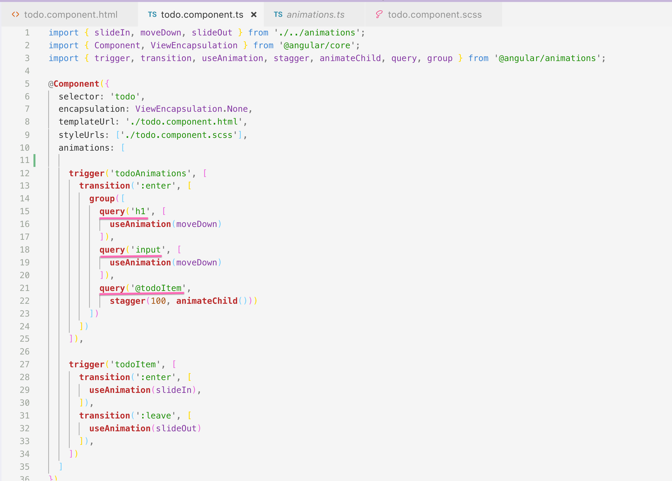
As you see in the animation, you can actually query other things outside of just HTML tags. Here is a list of optional query selectors:
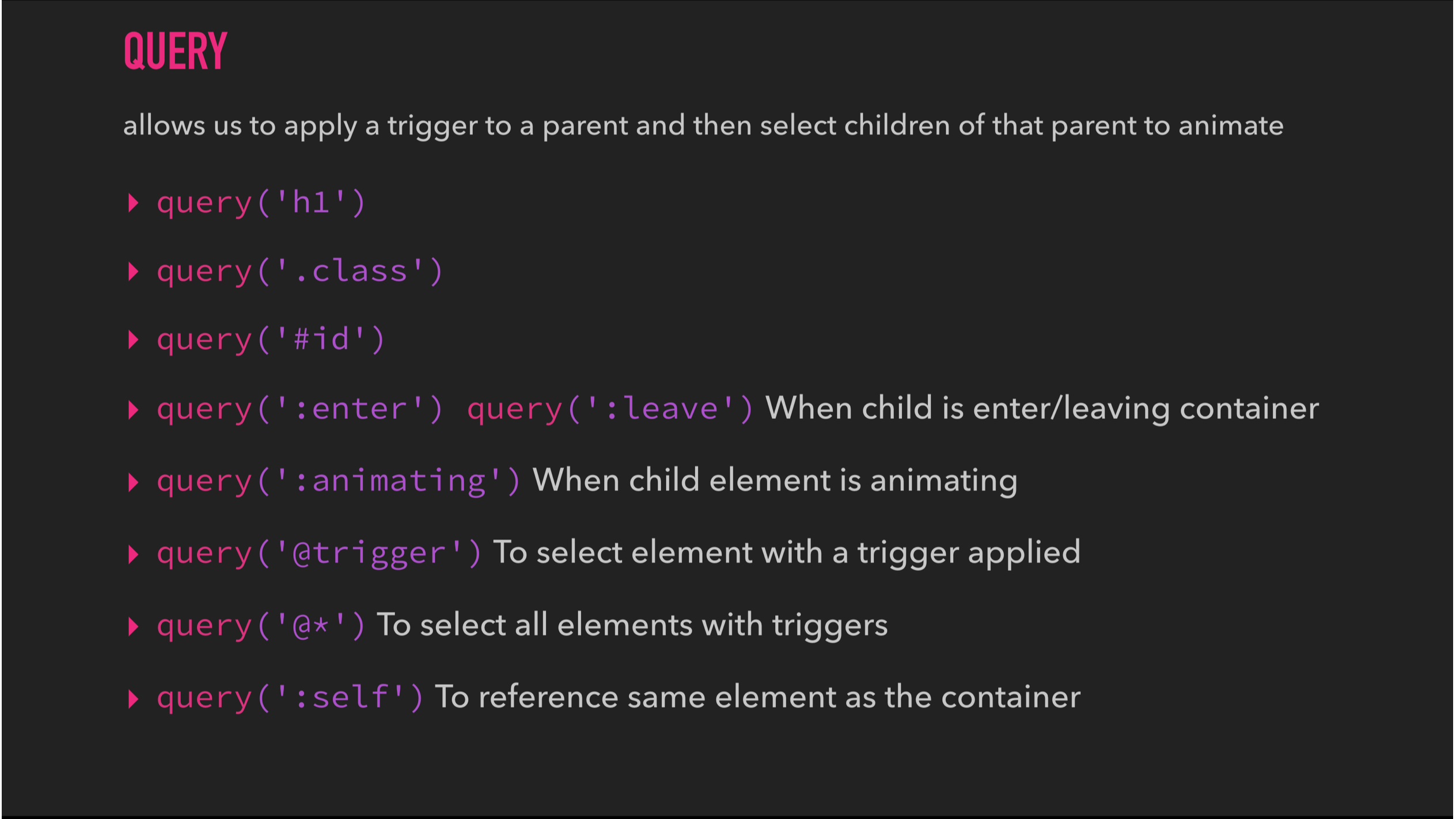
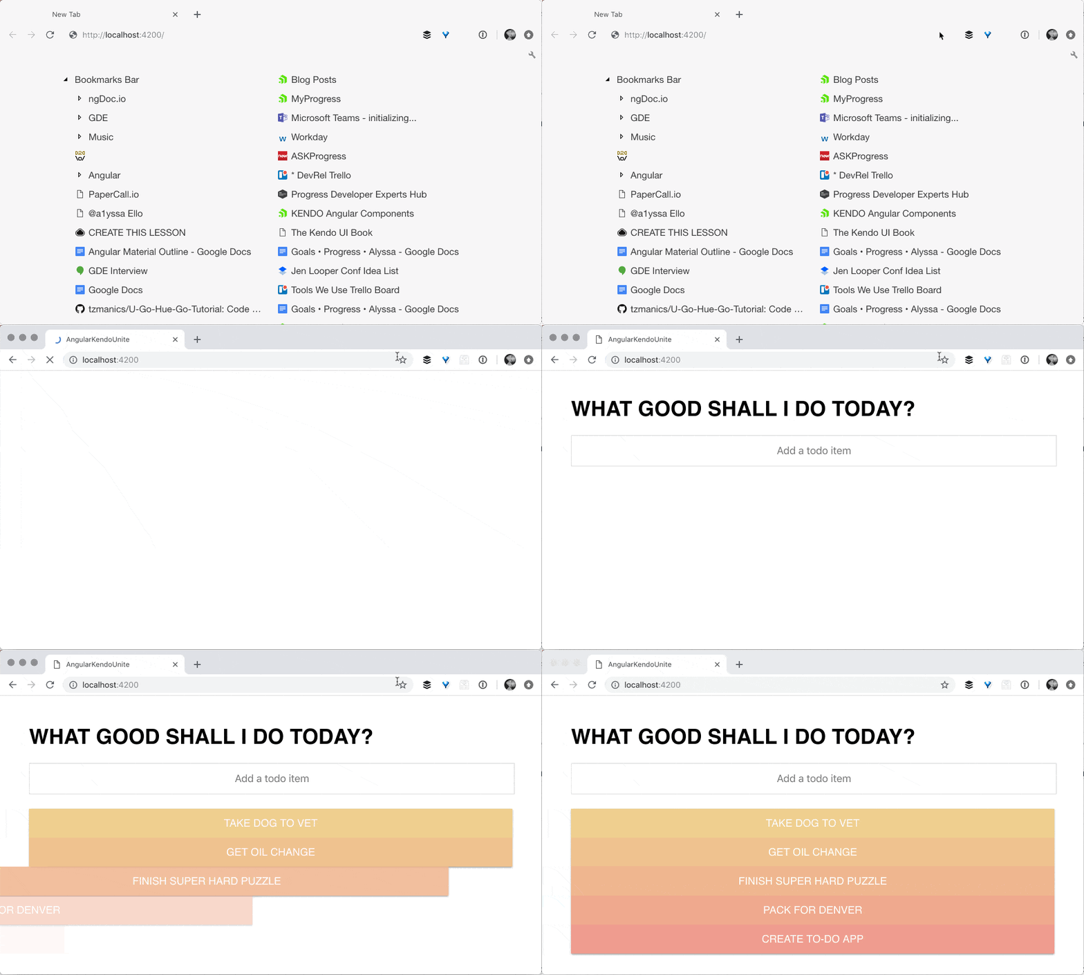
And so, on transition enter, I'm saying to this group, hey group, I want you to do a couple things on enter. The first one is I want you to move the h1 down. The second one is, I want you to move the input down. Okay? Pretty simple, pretty happy. The final one is my absolute favorite, and it is querying the to-do items which we already have on the screen (using @todoItem), and we're staggering them by 100 milliseconds. And so, instead of the todo items slamming onto the page together, they're going to come in one at a time, using stagger!
The last step to this gloriousness is that we actually need to create the moveDown animation that the H1 and Input are both using.
// animations.ts

export let moveDown = animation([
  style({ transform: 'translateY(-20px)' }),
  animate(200)
]);
We're now using move down inside of our query for the H1 and the Input. Then we're using stagger for our to do items, to stagger their animation, that's being given on :enter.
I really hope that you've enjoyed diving into Angular Animations and adding some custom ones on top of our Kendo UI and Angular To-Do app. In the next post we have some fun time picker stuff. Because what's a to-do item really, without a time due date on it? So, thank you so much for watching and I hope you're learning a lot. And happy coding to you.
If you're new to Kendo UI for Angular, you can learn more here or just jump into a free 30 day trial today.

Alyssa Nicoll
Alyssa is an Angular Developer Advocate & GDE. Her two degrees (Web Design & Development and Psychology) feed her speaking career. She has spoken at over 30 conferences internationally, specializing in motivational soft talks, enjoys gaming on Xbox and scuba diving in her spare time. Her DM is always open, come talk sometime.
