
Getting Started with Angular & Kendo UI

Summarize with AI:
A quick overview to help you get started developing your apps with Angular and Kendo UI. Check out the full video series for more.
Last month, I did a video series explaining how to get started with many of our nifty Kendo UI for Angular components. This post will cover highlights from the first video, Getting Started with Angular & Kendo UI. All the source code produced in this series can be found here on Github.
To kick the series off, we're going to create our Angular application and we're also going to install and use our first Kendo UI component, which is the button. To create the application we're going to use the Angular CLI.
Install the CLI
Go ahead and open up terminal, and if you've never used this CLI before we're going need to install it:
npm install -g @angular/cli
Create a New Angular App with CLI
Next let’s create the app using the ng new command. We’ll call our app Angular-Kendo-Unite: ng new Angular-Kendo-Unite.
I started this project without scss, because I assume most projects aren’t generated off the bat with the —scss flag. So in order to use our themes, here is how to easily get scss into your project. [of course this is not required, but without scss, you won’t be able to take advantage of the css variables to custom the styles easily for you app.
Update your angular.json file:
      ...
      build: {
        ...
        options: {
          styles:{
            "src/styles.scss"
          }
        }
We have a smattering of things to get through in this series, so in this first part, I simply want to get our app created along with our first component that will be using a Kendo UI component. Now, inside our app, we're going to open it in VS Code.
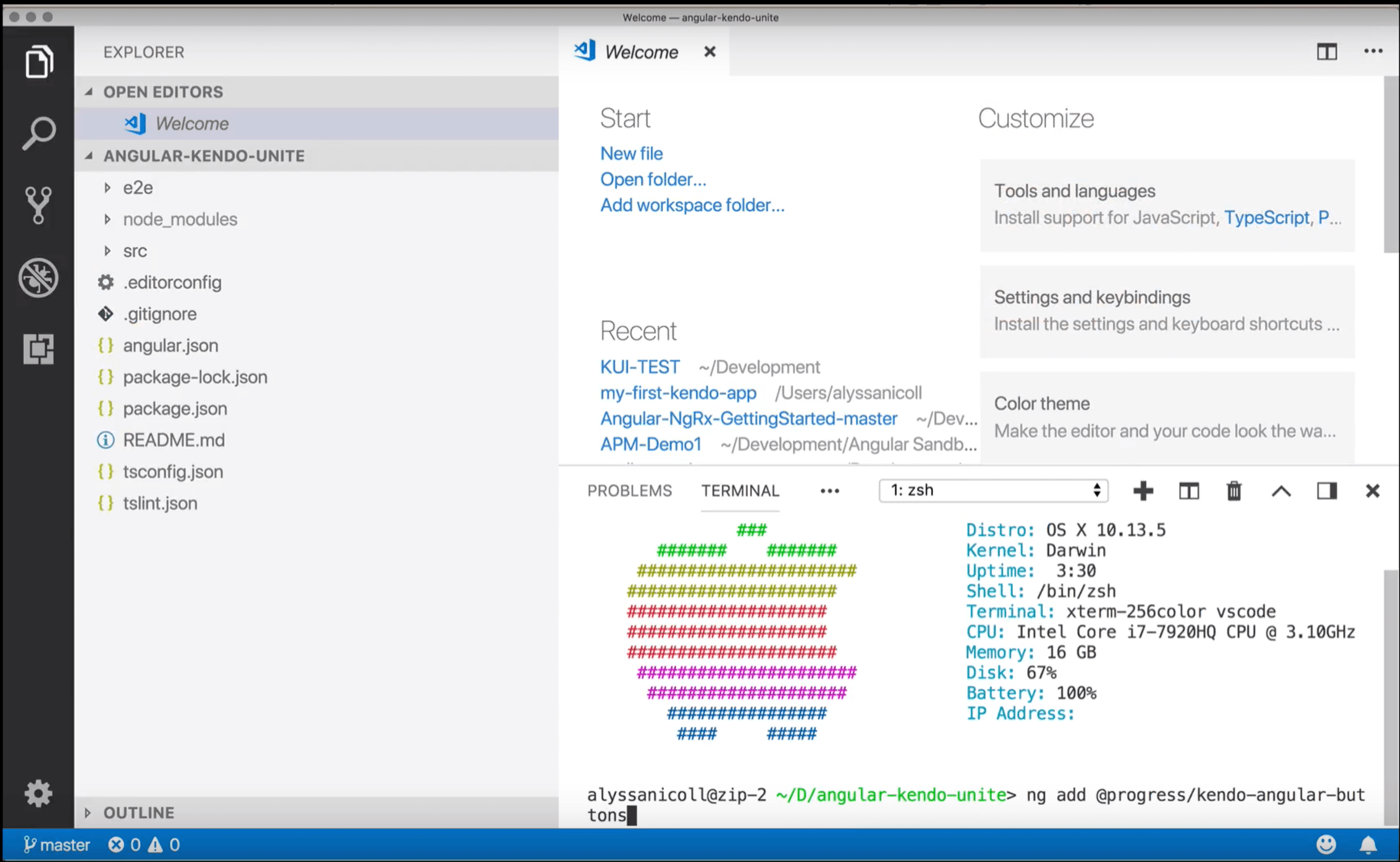
Add Kendo Angular Buttons to Our App
So, inside the terminal in VS Code, let’s use the ng add command to add Kendo UI to our Angular app:
ng add @progress/kendo-angular-buttons
Generate a Component
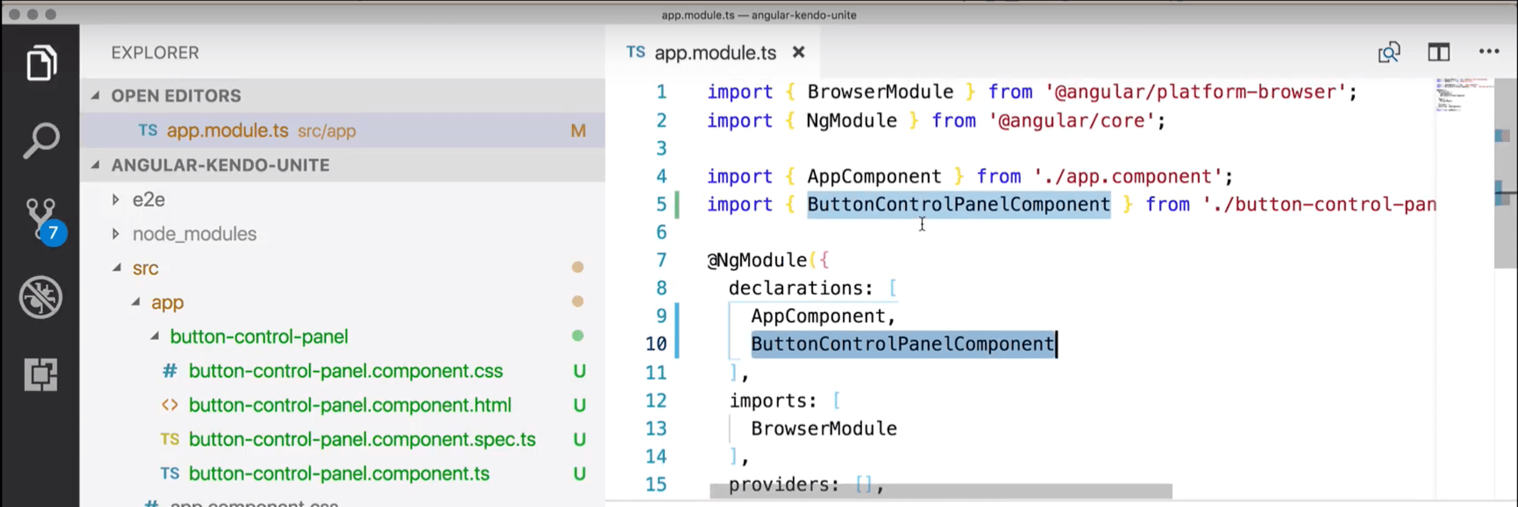
Next we're going to generate a component to put our button, or buttons, in with the ng generate component
command from the CLI. And we're going to name it button-control-panel.
ng g c button-control-panel
So, now, over here you can see that we've generated the button control panel which has the CSS, HTML, and TypeScript files that we will need for this sort of endeavor. And, you can also tell that the app.module.ts file has been modified because the button control panel has been added to the declarations, as well as imported at the top. Everything that we should expect at this point.
Add Button to New Empty Component
So, in order to use our first button, which we just installed, I'm going to create a div wrapper and then a button
inside the wrapper. In our button, we want to give it a camel-cased attribute of kendoButton, we're also
going to give it a look of, and I know, it sounds super boring, but we're gonna go with default for now. We'll get
fancier in a second. Then I'm just going to make it say ‘Default Button’ for us to view what that looks like.
    <div class="k-block">
      <button kendoButton [look]="'default'">Default Button</button>
    </div>
Add Button Control Panel Component to View
Now we need to add our button-panel-component to our app.component.html file. (By default the selector for it was
prefixed with app, however, for simplicity’s sake, I removed that.)
<button-control-panel></button-control-panel>
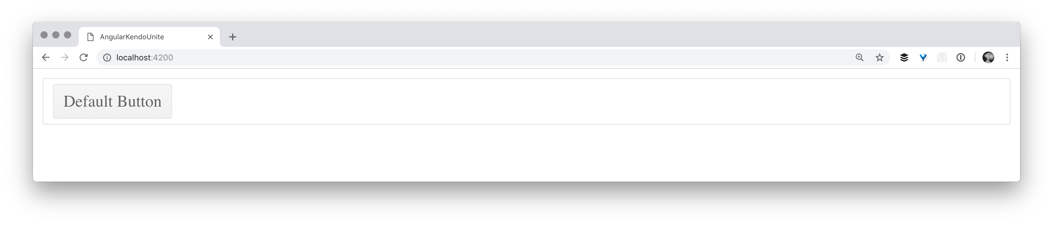
Serving up Our App 🥘
With our button control panel ready to go, we are finally able to go ahead and serve up our app, and check out our
button. We can serve up our application from the root of the app in terminal with ng serve and open
localhost:4000 in the browser of our choice and see the button we have created!
Additional Appearance Options
We have other appearance options for our buttons (as seen here in our docs) that I will demo as well here:
   <div class="k-block">
    <button kendoButton [look]="'default'">Default Button</button>
    <button kendoButton [look]="'outline'">Outline Button</button>
    <button kendoButton [look]="'bare'">Bare Button</button>
    <button kendoButton>Button</button>
  </div>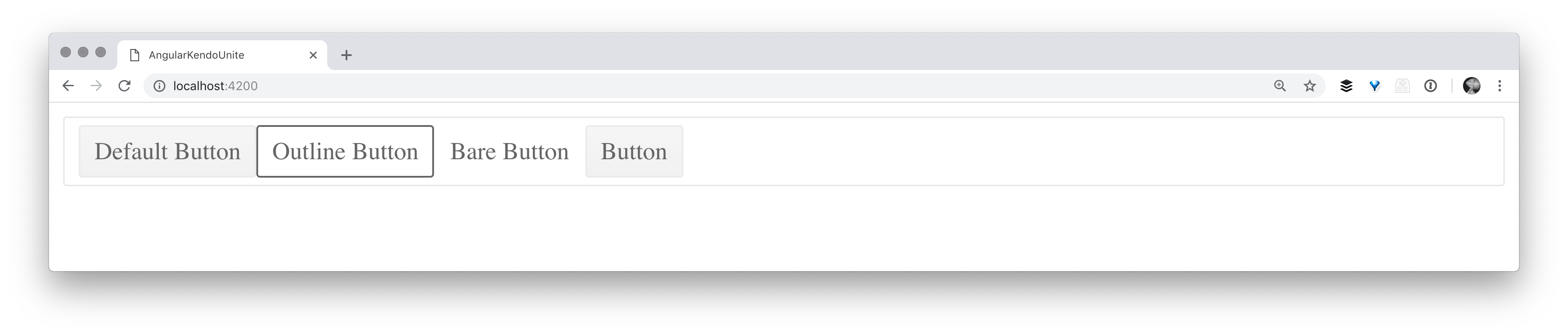
Hopefully you’ve enjoyed this first part in the Angular & Kendo UI Unite series! There are 7 more parts to come and each will build on the last, get a bit more complicated, and use ever more Kendo UI components as we build!
If you're new to Kendo UI for Angular, you can learn more here or just jump into a free 30 day trial today.

Alyssa Nicoll
Alyssa is an Angular Developer Advocate & GDE. Her two degrees (Web Design & Development and Psychology) feed her speaking career. She has spoken at over 30 conferences internationally, specializing in motivational soft talks, enjoys gaming on Xbox and scuba diving in her spare time. Her DM is always open, come talk sometime.