Creating a Web Editor Using Kendo UI and Vue

Summarize with AI:
In this article, we’ll look at how we can create a rich content editor using Kendo UI’s component and Vue.
Kendo UI is a library used for developing applications at a relatively quick pace. It provides UI components for libraries like jQuery, Angular, React and Vue, and comes packed with over 20 components for creating charts, data tables and draggable pages, to mention a few.
Vue is a frontend development framework for developing a range of applications on different platforms. Alongside its simple integration, detailed documentation and flexibility, Vue lets you extend the template language with your components. Vue also provides libraries for routing and state management, and we’ll be utilizing the latter in this article.
We’ll be using Kendo UI’s editor component to create a web rich editor application. With this application, users can directly convert text to markup.
To follow this tutorial, you need a basic understanding of Vue and Node.js. Ensure that you have Node installed before you get started.
If you have no prior knowledge of Vue, kindly follow the official documentation here. Come back and finish after going through the documentation.
We’ll be building the application using the following tools:
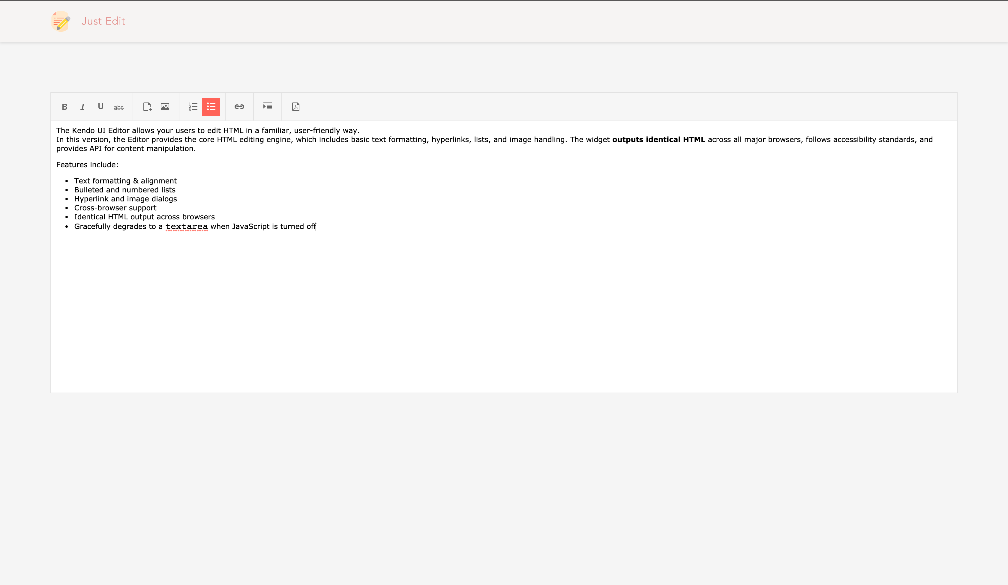
Here’s a screenshot of the application we’ll be building:
Initializing Application and Installing Dependencies
To get started, we’ll use the vue-cli to bootstrap our application. First, we’ll install the CLI by running npm install -g @vue/cli in a terminal.
To create a Vue project using the CLI, we’ll run the following command:
vue create vue-editor
After running this command, rather than selecting the default configuration, we’ll opt for the manual setup. We do this because we want to add a CSS pre-processor in our application. Follow the screenshot below:
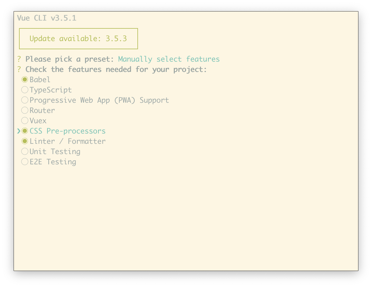
The rest of the prompts can be set up as it best suits you.
Next, run the following commands in the root folder of the project to install dependencies.
npm install @progress/kendo-ui @progress/kendo-theme-default @progress/kendo-editor-vue-wrapper
Start the app dev server by running npm run serve in a terminal within the root folder of your project.
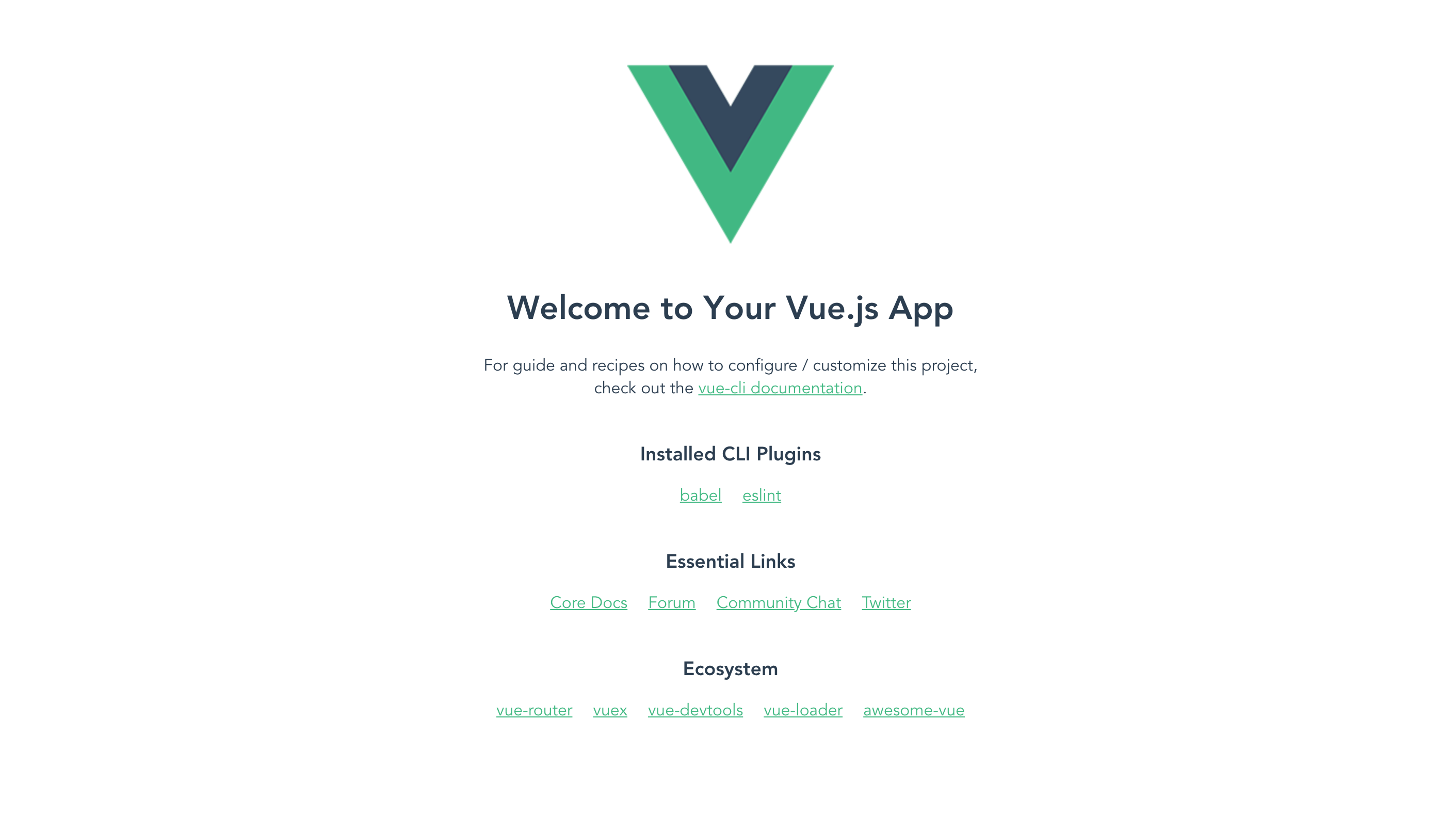
A browser tab should open on http://localhost:8080. The screenshot below should be similar to what you see in your browser:
Header Component
The header component displays the application logo and very little information. This component is mostly a display component. Create a file called Header.vue. This file contains the Header component. Open the file and follow the steps below to update the component:
<!-- src/app/components/Header.vue -->
<template>
  <header>
      <div class="brand">
      <img src="../assets/document.svg" alt="avatar">
      <h5>Just Edit</h5>
    </div>
  </header>
</template>
Note: Image asset used can be found here in the GitHub repository. The logo was found on https://flaticon.com.
Next, we’ll style the header. Add the styles below to the styles section of the component:
<!-- src/app/components/Header.vue -->
<template>
  ...
</template>

<style lang="css" scoped>
header {
  display: flex;
  background-color: white;
  margin: 0;
  padding: 17px 5%;
  color: whitesmoke;
  box-shadow: 0 2px 4px 0 rgba(0, 0, 0, 0.1);
  background: #fbf3f259;
  .brand {
    flex: 1;
    display: flex;
    align-items: center;
    img {
      height: 35px;
      border-radius: 50%;
      margin-right: 17px;
    }
    h5 {
      font-size: 18px;
      margin: 0;
      font-weight: normal;
      letter-spacing: 0.4px;
      color: #d8625e;
      opacity: 0.7;
      text-transform: capitalize;
    }
  }
}
</style>
Finally, the script section. Add the script section below the style and copy the code below into it:
<!-- src/app/components/Header.vue -->

<template>
  ...
</template>

<style lang="css" scoped>
  ...
</style>

<script>
export default {
  name: "Header"
};
</script>
Here, we’ve added a couple of styles to beautify the header. Next, we’ll render the header component in the App.vue file, open the file and update the sections following the snippet below:
// src/App.vue

<template>
  <div id="app">
    <Header/>
  </div>
</template>

<script>
import Header from "./components/Header";
export default {
  name: "app",
  components: {
    Header,
  }
};
</script>

<style lang="scss">
#app {
  font-family: "Avenir", Helvetica, Arial, sans-serif;
  -webkit-font-smoothing: antialiased;
  -moz-osx-font-smoothing: grayscale;
  text-align: center;
  color: #2c3e50;
}
body,
html {
  margin: 0;
  padding: 0;
  background-color: whitesmoke;
}
.k-editor {
  height: 600px;
}
</style>
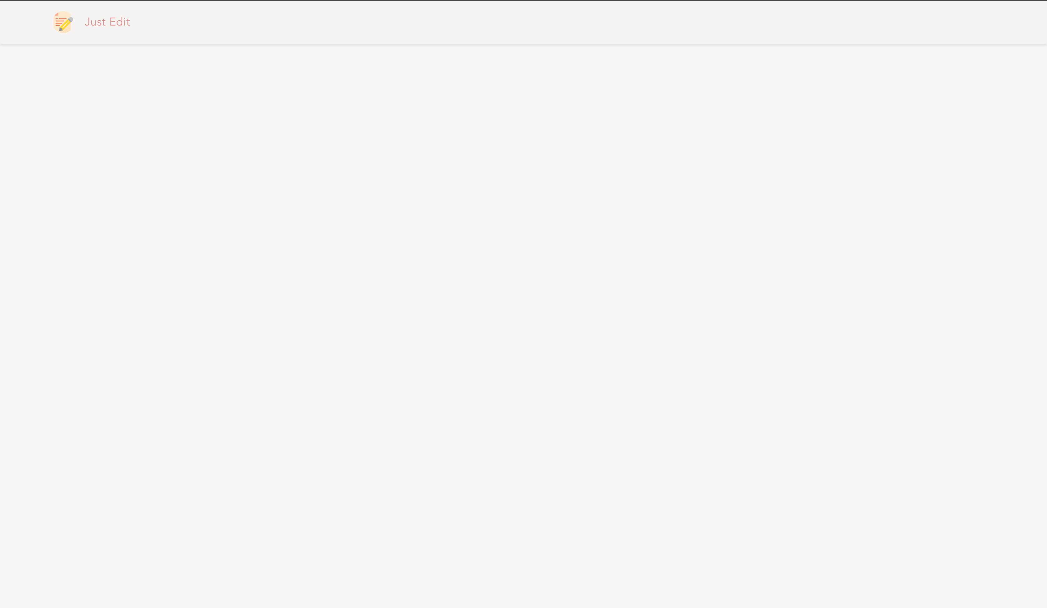
If you navigate to http://localhost:3000, you’ll see the current view of the page after rendering the header component:
Next, we’ll create the editor component to enable users to create and export rich textual content.
Editor Component
Kendo UI provides a component that is useful for creating content using a simple WYSIWYG interface. The component features a rich set of controls for generating markup language elements.
Since we’ve already installed the @progress/kendo-vue-editor package, we’ll install the package as a plugin in our application.
Open the main.js file and use the EditorInstaller:
import Vue from 'vue'
import '@progress/kendo-ui'
import '@progress/kendo-theme-default/dist/all.css'
import { EditorInstaller } from '@progress/kendo-editor-vue-wrapper';
import App from './App.vue'

Vue.use(EditorInstaller)
Vue.config.productionTip = false

new Vue({
  render: h => h(App),
}).$mount('#app')
In the snippet above, we import the base Kendo UI package, the base stylesheet and the plugin from the wrapper package. Next, we install the plugin by calling Vue.use on the plugin.
The next step is to create an editor component that renders the component from Kendo UI. Create a file named Editor.vue in the src/components folder, then open the file and update the contents following the steps below:
First the template section:
<!-- src/components/Editor.vue -->
<template>
  <section>
    <div>
      <kendo-editor :value="value" style="height:500px" :pdf="pdf" :tools="tools">
      </kendo-editor>
    </div>
  </section>
</template>
The template renders the editor component from Kendo UI and a set of editor tools for managing the content within the editor. Usually, Kendo UI provides a default tool set if the tools prop isn’t available, but since we need a tool that isn’t available in the default tool set, we have to define ours.
There are tool sets for editing the content and also one for exporting the content as pdf. The button triggers a download, and the contents of the pdf are similar to that of the editor.
Next, we’ll add some styles to the component, open the file and update it with the snippet below:
// src/app/editor/editor.component.scss

<template>
  ...
</template>

<script>
import { Editor } from "@progress/kendo-editor-vue-wrapper";
export default {
  name: "Editor",
  data() {
    return {
      value: "",
      tools: ['format','bold', 'italic', 'underline', 'strikethrough', 'insertFile','insertImage','insertOrderedList', 'insertUnorderedList','createLink','indent', 'pdf'],
      pdf: {
        fileName: "editor.pdf",
        proxyURL: "https://demos.telerik.com/kendo-ui/service/export",
        paperSize: "a4",
        margin: {
          bottom: 20,
          left: 20,
          right: 20,
          top: 20
        }
      }
    };
  },
};
</script>

<style lang="scss" scoped>
section {
  width: 90%;
  margin: 5% auto 0;
  display: flex;
}
</style>
To configure the PDF export settings, use the pdf attribute. You can specify the file name and details about the margins, paper size and font. You can also set the file name for the export. Also, we have the tools array that defines the buttons on the toolbar.
Next, we’ll render the editor component in the main component file. Open the App.vue file and render the editor component:
<template>
  <div id="app">
    <Header/>
    <Editor/>
  </div>
</template>

<script>
import Editor from "./components/Editor";
import Header from "./components/Header";
export default {
  name: "app",
  components: {
    Header,
    Editor
  }
 };
</script>

<style>
  ...
</style>
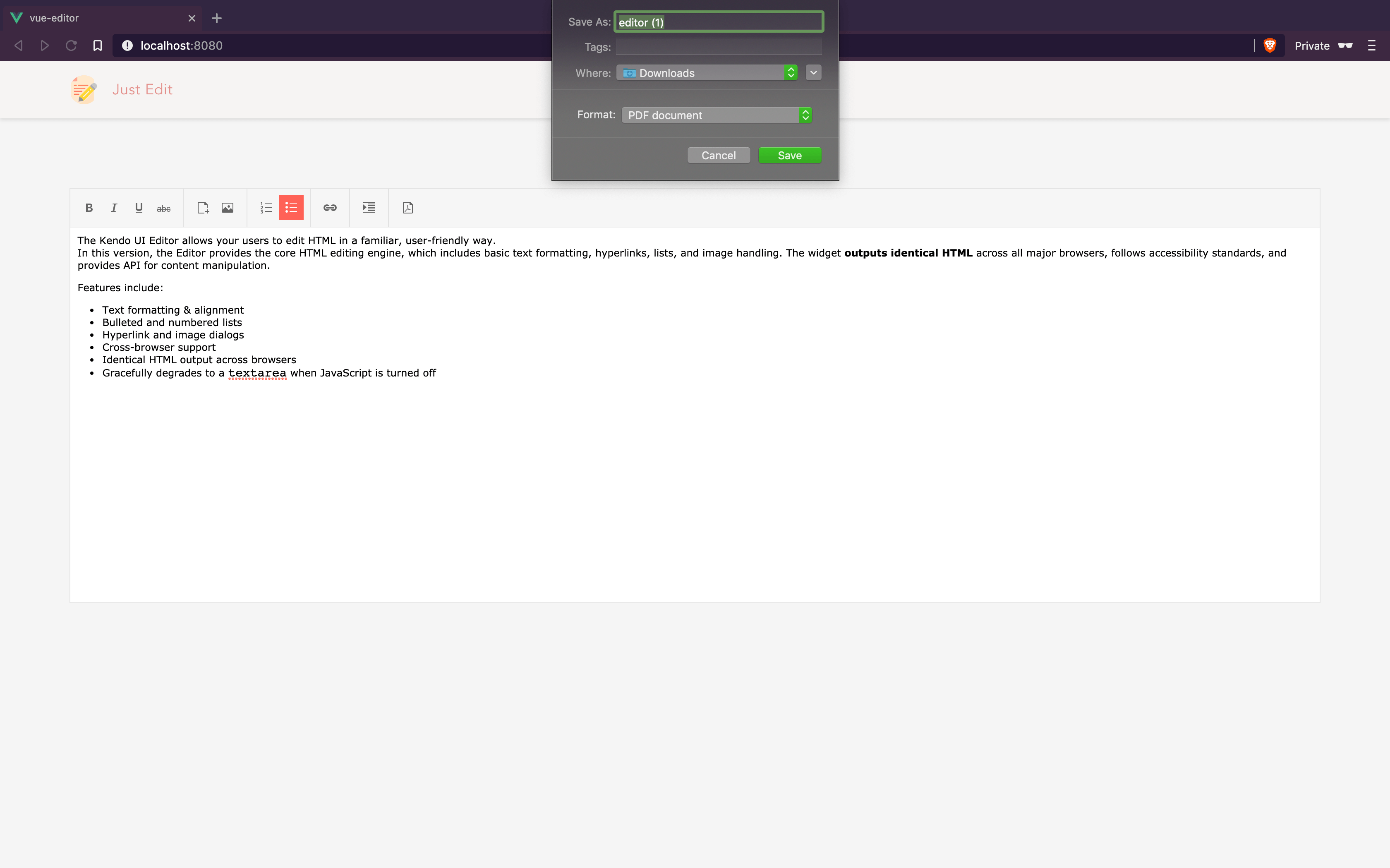
Now if you visit http://localhost:4200, you should see the editor displayed and also, clicking on the pdf icon triggers a download dialog to save the editor’s contents as a pdf.
Conclusion
In this article, we saw how we could utilize one of Kendo UI’s robust component collection to create a rich content WYSIWYG editor. Alongside this component, Kendo UI also provides components that can be easily integrated into any application, like DatePickers, DropDown components, Chat interface, Dialogs, Grids and a load of other components. Visit their official documentation page to get started. You can find the source code for the demo here.

Christian Nwamba
Chris Nwamba is a Senior Developer Advocate at AWS focusing on AWS Amplify. He is also a teacher with years of experience building products and communities.
