
Creating a Responsive Design in React With KendoReact GridLayout & StackLayout

Summarize with AI:
Let’s look at how to design a responsive blog page for a React app using KendoReact GridLayout and StackLayout components.
Can you imagine that there was no such thing as a responsive website back in the old days of web development? Nowadays, more users visit websites online via handheld devices rather than desktop PCs or laptops. Therefore, responsive websites are ubiquitous nowadays. Most of the time, it’s a must-have, as otherwise a website wouldn’t be accessible and easy to use for mobile and tablet users.
In this article, I want to show you how to implement a responsive design for a blog page using KendoReact’s GridLayout and StackLayout components. The blog will be comprised of recent and featured blog posts. Below you can see a short GIF of what we will create in this tutorial.
You can find full code example for this project in this GitHub repo as well as an interactive CodeSandbox example below:
Project Setup
We are going to use Vite to quickly scaffold a new React project. If you haven’t heard about Vite before, you might want to check out my article about it—What Is Vite: The Guide to Modern and Super-Fast Project Tooling.
Run the command below in your terminal to create a new react project.
$ npm init vite kendo-react-responsive-layouts -- --template react
Note: KendoReact is a commercial UI component library, and as a part of this you will need to provide a license key when you use the components in your React projects. You can snag a license key through a free trial or by owning a commercial license. For more information, you can head over to the KendoReact Licensing page.
After the project creation is complete, run the following commands to get into the project directory and install all dependencies.
$ cd kendo-react-responsive-layouts-form && npm install
Finally, you can start the development server by running the npm run dev command.
You should see the project running upon visiting localhost:3000 in your browser. Next, let’s install all KendoReact libraries we will need for this project.
$ npm install --save @progress/kendo-react-layout @progress/kendo-react-progressbars @progress/kendo-licensing @progress/kendo-react-intl @progress/kendo-theme-default
After the installation is complete, let’s clean up the App component and its styles file. We can start by renaming the App.css file to App.module.css and replacing its content with the code below.
src/App.module.css
.appContainer {
  max-width: 1180px;
  margin: 2rem auto;
  padding: 0 2rem;
}
We also need to update the App.jsx file.
src/App.jsx
import styles from "./App.module.css";
import BlogPosts from "./components/BlogPosts";

function App() {
  return (
    <div className={styles.appContainer}>
      <BlogPosts />
    </div>
  );
}

export default App;
In the App component, we’re importing the BlogPosts component, but it doesn’t exist yet, so let’s create it next.
src/components/BlogPosts.jsx
import { useState, useEffect } from "react";
import styles from "./BlogPosts.module.css";

const BlogPosts = props => {
  return (
    <div>
      <div>
        <h1>Welcome to my blog</h1>
      </div>
    </div>
  );
};

export default BlogPosts;
And here are the styles we will need soon.
src/components/BlogPosts.module.css
.postCard {
  padding: 1rem;
  border: 1px solid #e4e4e7;
  border-radius: 5px;
  text-align: left;
}

.postHeading {
  margin-top: 0;
}
Last but not least, we need to include the KendoReact Default theme.
src/main.jsx
import React from "react";
import ReactDOM from "react-dom";
import "@progress/kendo-theme-default/dist/all.css";
import "./index.css";
import App from "./App";

ReactDOM.render(
  <React.StrictMode>
    <App />
  </React.StrictMode>,
  document.getElementById("root")
);
That’s enough for the initial setup. Let’s have a look at how we can create a responsive grid layout with the GridLayout component.
GridLayout
Our blog website is supposed to have recent and featured posts. We will fetch them from the jsonplaceholder API.
src/components/BlogPosts.jsx
import { useState, useEffect } from "react";
import styles from "./BlogPosts.module.css";

const BlogPosts = props => {
  const [posts, setPosts] = useState([]);
  const [featuredPosts, setFeaturedPosts] = useState([]);

  useEffect(() => {
    (async () => {
      const response = await fetch(
        "https://jsonplaceholder.typicode.com/posts"
      );
      const data = await response.json();
      const featuredPosts = data.slice(0, 5);
      const posts = data.slice(5, 17);
      setPosts(posts);
      setFeaturedPosts(featuredPosts);
    })();
  }, []);

  return (
    <div>
      <div>
        <h1>Welcome to my blog</h1>
      </div>
    </div>
  );
};

export default BlogPosts;
You can use React DevTools or use console.log to check if the posts were fetched successfully. For the purpose of this tutorial, the first five posts will be “featured,” and the next 12 will be used as “recent”
posts.
Since we now have recent and featured posts, we can use the GridLayout component to create a grid for them. Let’s say the recent posts will be in the left column which will take about 70% of the screen width, while the right column
for featured posts will take 30%. Here’s how we can implement that.
src/components/BlogPosts.jsx
First, add a new import at the top of the file.
import {
  GridLayout,
  GridLayoutItem,
} from "@progress/kendo-react-layout";
Then, replace the JSX with the code below.
<div>
  <h1>Welcome to my blog</h1>
  <div>
    <GridLayout
      gap={{
        rows: 20,
          cols: 40,
      }}
      cols={[
        {
          width: "70%",
        },
        {
          width: "30%",
        },
      ]}
      >
      <GridLayoutItem row={1} col={1}>
        <h2>Recent posts</h2>
        <GridLayout
          gap={{ rows: 20, cols: 20 }}
          cols={[
            {
              width: "repeat(3, 1fr)",
            },
          ]}
          >
          {posts.map((post, idx) => {
            const row = Math.floor(idx / 3) + 1;
            return (
              <GridLayoutItem
                className={styles.postCard}
                key={post.id}
                row={row}
                col={(idx % 3) + 1}
                >
                <h3 className={styles.postHeading}>{post.title}</h3>
                <p className={styles.postBody}>{post.body}</p>
              </GridLayoutItem>
            );
          })}
        </GridLayout>
      </GridLayoutItem>
      <GridLayoutItem row={1} col={2}>
        <h2>Featured posts</h2>
        <div>
          {featuredPosts.map(featuredPost => {
            return (
              <div className={styles.postCard} key={featuredPost.id}>
                <h3 className={styles.postHeading}>{featuredPost.title}</h3>
                <p className={styles.postBody}>{featuredPost.body}</p>
              </div>
            );
          })}
        </div>
      </GridLayoutItem>
    </GridLayout>
  </div>
</div>
We have imported the GridLayout and GridLayoutItem components from the KendoReact library. The former is responsible for arranging children into rows and columns in a grid structure, while the latter is used to represent grid items. KendoReact’s
GridLayout is built on top of CSS Grid. In the code above, we use the GridLayout component twice. The first time it’s used to create a grid for the recent and featured posts.
<GridLayout
	gap={{
    rows: 20,
    cols: 40,
  }}
	cols={[
    {
      width: "70%",
    },
    {
      width: "30%",
    },
	]}
>
The GridLayout component here receives two props—gap and cols. The gap prop is used to specify the space between rows and columns, while the cols, as you can probably guess, for
structuring columns in the grid. In this case, there will be two columns with 70% and 30% width.
The second GridLayout is responsible for the blog posts grid. The grid will consist of three equally spread columns.
<GridLayout
	gap={{ rows: 20, cols: 20 }}
	cols={[
		{
			width: "repeat(3, 1fr)",
		},
	]}
>
We have passed only two props to the GridLayout component, but there are more that can be passed. You can find all the accepted props here.
The GridLayoutItem is used to specify where a grid item should be placed. For example, the grid item that holds the recent blog posts starts on the first row and column. On the other hand, the grid item that holds featured posts starts
on the first row but the second column.
{/* Recent blog posts grid item */}
<GridLayoutItem row={1} col={1}>

</GridLayoutItem>
{/* Featured blog posts grid item */}
<GridLayoutItem row={1} col={2}>

</GridLayoutItem>
We also use the GridLayoutItem for each of the blog posts. Since we want to have three blog posts in a row, we divide the post index to determine in which row each blog post should be placed. For the column, on the other hand, the modulo
operator is used.
{posts.map((post, idx) => {
  const row = Math.floor(idx / 3) + 1;
  const col = (idx % 3) + 1
  return (
    <GridLayoutItem
      className={styles.postCard}
      key={post.id}
      row={row}
      col={col}
      >
      <h3 className={styles.postHeading}>{post.title}</h3>
      <p className={styles.postBody}>{post.body}</p>
    </GridLayoutItem>
  );
})}
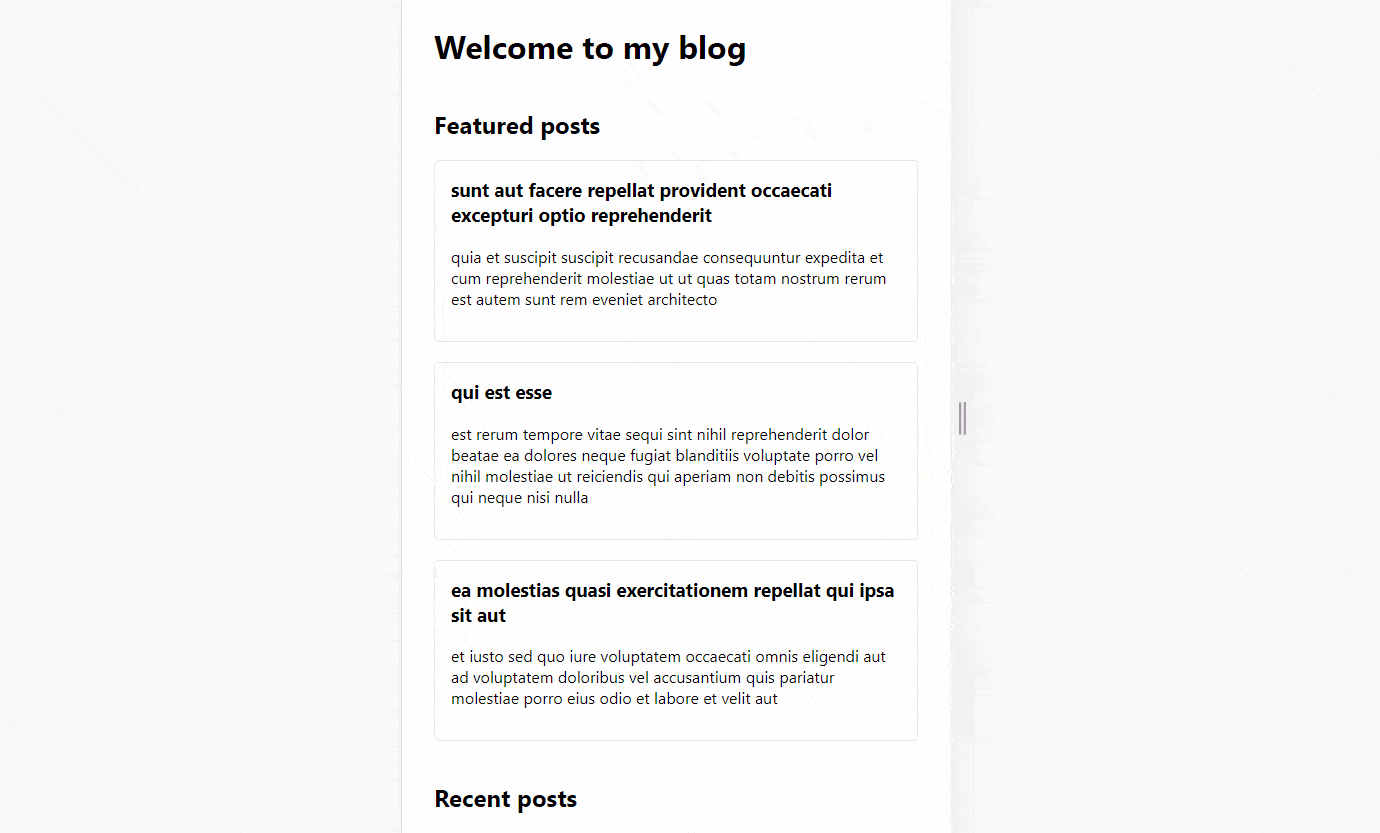
You can find more details about the GridLayoutItem component here. The image below shows what the UI should
look like at the moment.
We have the initial layout for the posts. However, there are still things that we need to do. For instance, the featured posts have no space in between, and the UI is not responsive at all. Let’s take care of these two problems next.
Stack Layout
Besides GridLayout, KendoReact also offers the StackLayout component. In comparison to GridLayout,
the StackLayout can only be used for horizontal and vertical layouts. We will use StackLayout to display featured posts vertically and add some space between them.
src/components/BlogPosts.jsx
First, update the imports to include the StackLayout component.
import {
  GridLayout,
  GridLayoutItem,
  StackLayout,
} from "@progress/kendo-react-layout";
Next, we need to update the JSX that is responsible for rendering featured posts.
<GridLayoutItem row={1} col={2}>
  <h2>Featured posts</h2>
  <StackLayout orientation="vertical" gap={20}>
    {featuredPosts.map(featuredPost => {
      return (
        <div className={styles.postCard} key={featuredPost.id}>
          <h3 className={styles.postHeading}>{featuredPost.title}</h3>
          <p className={styles.postBody}>{featuredPost.body}</p>
        </div>
      );
    })}
  </StackLayout>
</GridLayoutItem>
We replaced the div element with the StackLayout component that receives gap and orientation props. If you have a look at the UI again, the featured posts will still be displayed vertically,
but now there should be a gap between them.
You can read more about the StackLayout component here.
Making GridLayout and StackLayout Responsive
The GridLayout and StackLayout components do not accept any breakpoint props that would automatically change the columns and rows based on the screen size. However, we can just pass different props to these components
based on the screen size. To determine which props we should pass, we will take advantage of the use-breakpoint hook. First, we need to install
it.
$ npm install --save use-breakpoint
Next, we need to define screen breakpoints. We will have three—mobile, tablet and desktop.
src/constants/breakpoints.js
export const BREAKPOINTS = {
  mobile: 0,
  tablet: 768,
  desktop: 1280,
};
Here’s an interesting part. We need to provide different values based on the screen size. However, doing so inside of the JSX would very quickly become a massive mess with a lot of if/else if/else statements to pass appropriate
values. Instead, to keep the markup clean, we will create a config object that will contain all the grid values for different screen sizes. Below, you can see the GRID_CONFIG.
src/constants/gridConfig.js
export const GRID_CONFIG = {
  mobile: {
    outerGrid: {
      cols: [
        {
          width: "1fr",
        },
      ],
      rows: [
        {
          width: "repeat(2, 1fr)",
        },
      ],
    },
    mainContainer: {
      row: 2,
      col: 1,
    },
    featuredContainer: {
      row: 1,
      col: 1,
    },
    postsContainer: {
      cols: [
        {
          width: "1fr",
        },
      ],
    },
    postItem: {
      divider: 1,
    },
    featuredOrientation: "vertical",
  },
  tablet: {
    outerGrid: {
      cols: [
        {
          width: "100%",
        },
      ],
      rows: [
        {
          width: "repeat(2, 1fr)",
        },
      ],
    },
    mainContainer: {
      row: 2,
      col: 1,
    },
    featuredContainer: {
      row: 1,
      col: 1,
    },
    postsContainer: {
      cols: [
        {
          width: "1fr 1fr",
        },
      ],
    },
    postItem: {
      divider: 2,
    },
    featuredOrientation: "horizontal",
  },
  desktop: {
    outerGrid: {
      cols: [
        {
          width: "70%",
        },
        {
          width: "30%",
        },
      ],
      rows: [],
    },
    mainContainer: {
      row: 1,
      col: 1,
    },
    featuredContainer: {
      row: 1,
      col: 2,
    },
    postsContainer: {
      cols: [
        {
          width: "repeat(3, 1fr)",
        },
      ],
    },
    postItem: {
      divider: 3,
    },
    featuredOrientation: "vertical",
  },
};
Here’s the digest of the GRID_CONFIG and what it will do:
outerGrid– recent and featured posts will be in one column on mobile and tablet, but in two columns on desktop.mainContainer– the recent blog posts container will be on the second row on mobile and tablet, but on the first row on desktop.featuredContainer– the featured blog posts container will be placed in the first row and column on mobile and tablet, but in the second column on desktop.postsContainer– the recent blog posts grid will have one column on mobile, two columns on tablet and three columns on desktop.postItem– each recent blog post uses a different divider to calculate the row and column position—one for mobile, two for tablet and three for desktop.featuredOrientation– on mobile and desktop, the featured post will be in the vertical orientation but horizontal on a tablet.
Finally, we can use the GRID_CONFIG and BREAKPOINTS in the BlogPosts component.
src/components/BlogPosts.jsx
import { useState, useEffect } from "react";
import {
  GridLayout,
  GridLayoutItem,
  StackLayout,
} from "@progress/kendo-react-layout";
import useBreakpoint from "use-breakpoint";
import styles from "./BlogPosts.module.css";
import { GRID_CONFIG } from "../constants/gridConfig";
import { BREAKPOINTS } from "../constants/breakpoints";

const getGridConfig = (breakpoint, GRID_CONFIG) => GRID_CONFIG[breakpoint];

const BlogPosts = props => {
  const { breakpoint } = useBreakpoint(BREAKPOINTS, "desktop");
  const [posts, setPosts] = useState([]);
  const [featuredPosts, setFeaturedPosts] = useState([]);

  useEffect(() => {
    (async () => {
      const response = await fetch(
        "https://jsonplaceholder.typicode.com/posts"
      );
      const data = await response.json();
      const featuredPosts = data.slice(0, 5);
      const posts = data.slice(5, 17);
      setPosts(posts);
      setFeaturedPosts(featuredPosts);
    })();
  }, []);

  const {
    outerGrid,
    mainContainer,
    featuredContainer,
    postsContainer,
    postItem,
    featuredOrientation,
  } = getGridConfig(breakpoint, GRID_CONFIG);

  return (
    <div>
      <div>
        <h1>Welcome to my blog</h1>
        <div>
          <GridLayout
            gap={{
              rows: 20,
              cols: 40,
            }}
            rows={outerGrid.rows}
            cols={outerGrid.cols}
          >
            <GridLayoutItem row={mainContainer.row} col={mainContainer.col}>
              <h2>Recent posts</h2>
              <GridLayout
                gap={{ rows: 20, cols: 20 }}
                cols={postsContainer.cols}
              >
                {posts.map((post, idx) => {
                  const row = Math.floor(idx / postItem.divider) + 1;
                  return (
                    <GridLayoutItem
                      className={styles.postCard}
                      key={post.id}
                      row={row}
                      col={(idx % postItem.divider) + 1}
                    >
                      <h3 className={styles.postHeading}>{post.title}</h3>
                      <p className={styles.postBody}>{post.body}</p>
                    </GridLayoutItem>
                  );
                })}
              </GridLayout>
            </GridLayoutItem>
            <GridLayoutItem
              row={featuredContainer.row}
              col={featuredContainer.col}
            >
              <h2>Featured posts</h2>
              <StackLayout orientation={featuredOrientation} gap={20}>
                {(breakpoint === "desktop"
                  ? featuredPosts
                  : featuredPosts.slice(0, 3)
                ).map(featuredPost => {
                  return (
                    <div className={styles.postCard} key={featuredPost.id}>
                      <h3 className={styles.postHeading}>
                        {featuredPost.title}
                      </h3>
                      <p className={styles.postBody}>{featuredPost.body}</p>
                    </div>
                  );
                })}
              </StackLayout>
            </GridLayoutItem>
          </GridLayout>
        </div>
      </div>
    </div>
  );
};

export default BlogPosts;
Let’s walk through the changes. First, we import useBreakpoint hook, and GRID_CONFIG and BREAKPOINTS constants.
Next, we have the getGridConfig function that returns config for the current screen size.
const getGridConfig = (breakpoint, GRID_CONFIG) => GRID_CONFIG[breakpoint];
The useBreakpoint hook is used to get the currently active breakpoint, one of mobile, tablet or desktop. Most of the props values passed to GridLayout, GridLayoutItem and StackLayout were replaced.
const { breakpoint } = useBreakpoint(BREAKPOINTS, "desktop");
Further, the getGridConfig function is executed, and config properties are destructured.
const {
    outerGrid,
    mainContainer,
    featuredContainer,
    postsContainer,
    postItem,
    featuredOrientation,
  } = getGridConfig(breakpoint, GRID_CONFIG);
Finally, props passed to GridLayout, GridLayoutItem and StackLayout components are updated to use the values from the GRID_CONFIG. What’s more, five featured posts are displayed on
the desktop, but only three on smaller screens.
{(breakpoint === "desktop"
  ? featuredPosts
  : featuredPosts.slice(0, 3)
 ).map(featuredPost => {
  return (
    <div className={styles.postCard} key={featuredPost.id}>
      <h3 className={styles.postHeading}>
        {featuredPost.title}
      </h3>
      <p className={styles.postBody}>{featuredPost.body}</p>
    </div>
  );
})}
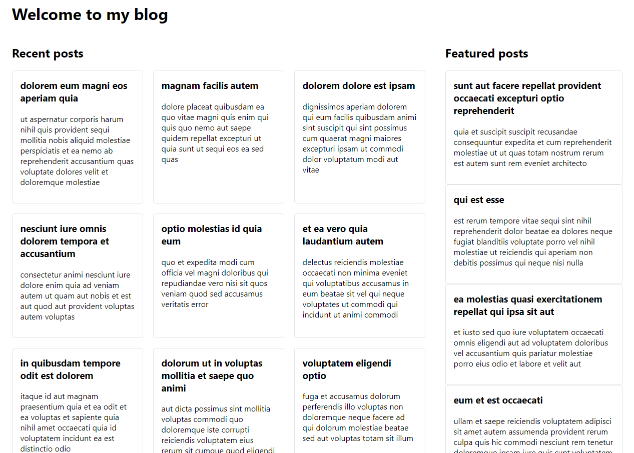
That’s it for the updates. If you have a look at the UI, you should see that it behaves exactly like on the GIF shown earlier.
Wrap-up
We have covered how to create a responsive UI that adapts to different screen sizes using GridLayout, GridLayoutItem and StackLayout components and combining them with the use-breakpoint library. Recent and feature blog posts are displayed in different places based on the current screen size.
KendoReact is a great tool for developing complex functionality. It provides a lot of feature-rich components out of the box and allows us to create sophisticated features quite easily and quickly. You can check out the entire functionality of the library with a , which also gives you access to technical support if you ever get stuck.

Thomas Findlay
Thomas Findlay is a 5-star rated mentor, full-stack developer, consultant, technical writer and the author of “React - The Road To Enterprise” and “Vue - The Road To Enterprise.” He works with many different technologies such as JavaScript, Vue, React, React Native, Node.js, Python, PHP and more. Thomas has worked with developers and teams from beginner to advanced and helped them build and scale their applications and products. Check out his Codementor page, and you can also find him on Twitter.
Related Posts
Comments
All articles
Topics
Web MobileMobile
Desktop
Design
Productivity
People
