
Creating a Music Player Application Using Kendo UI and Angular

Summarize with AI:
In this music player tutorial, we see how easy it is to get started using Kendo UI components for Angular, and how easy it is to define the structure of your application using the Splitter component. The components are easy to use and configure.
Kendo UI is a library used for building applications at a faster pace. Kendo UI provides UI components for libraries like jQuery, Angular, React and Vue, and it comes packed with an extensive set of components for creating charts, data tables and drag-and-drop pages.
Kendo UI is customizable. It provides a set of themes for Material UI, Bootstrap, etc., and it comes packed with an icon set and a color palette. Kendo UI components are distributed as multiple NPM packages, so there’s no fear of bloating your application with unnecessary components and increasing your build bundle.
Angular is a JavaScript framework for creating a web application. It offers the best practices and tools to ease the development of applications. Angular uses declarative templates, dependency injection and Observables to power applications that can be run on several platforms.
Kendo UI provides Angular-specific components for ease of development, and we’ll be using some of the components to build a simple music player application. The application will be using Spotify’s API to get tracks and albums, and Kendo UI for creating grids and defining icons.
To follow this tutorial, you need a basic understanding of Angular. Ensure that you have Node and NPM installed before you get started.
If you have no prior knowledge of Angular, kindly follow the official tutorial here. You can return to the article when you’re done.
We’ll be building the application using the following tools:
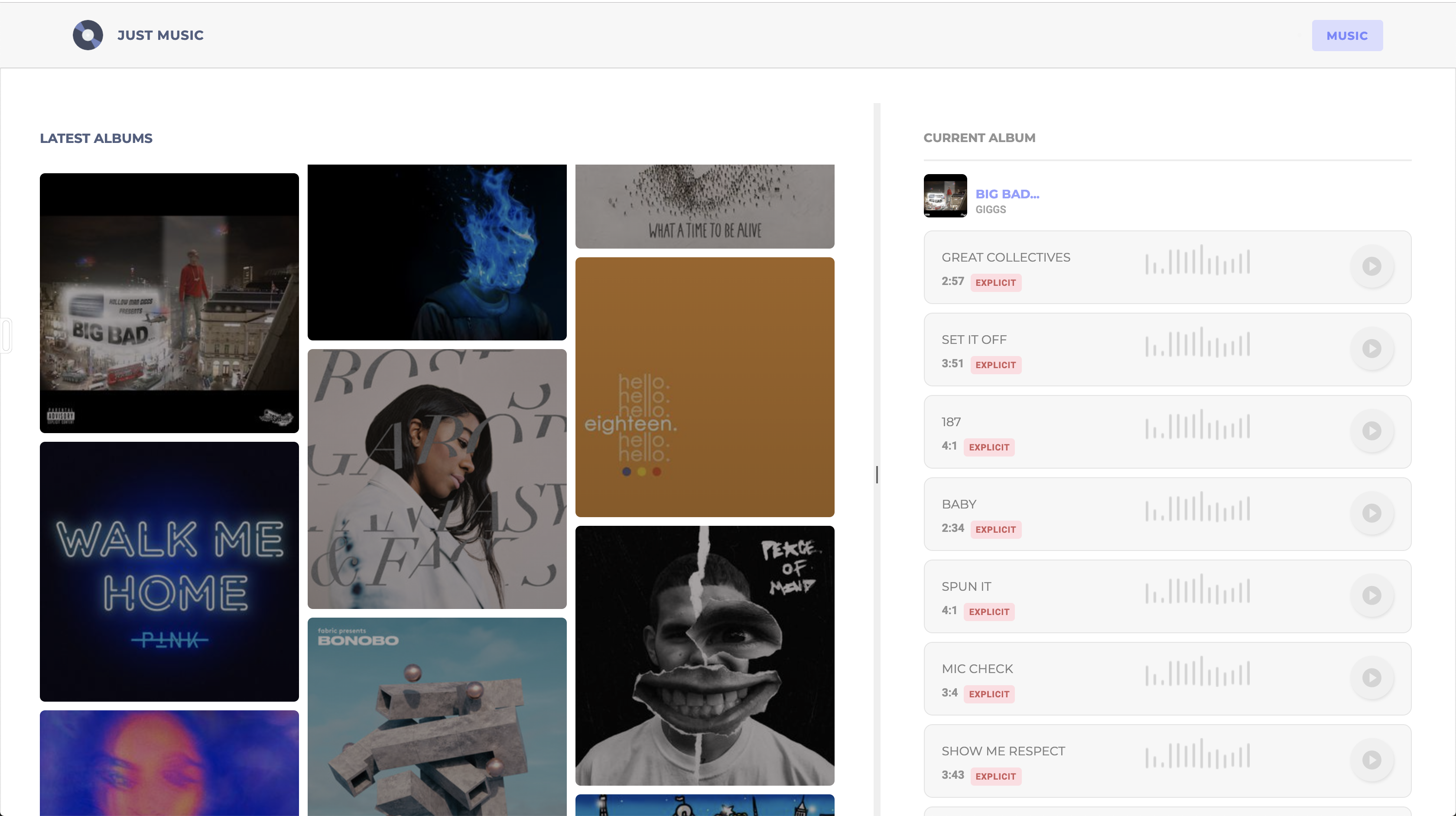
Here’s a screenshot of the application we’ll be building:
Creating an Application and Obtaining Spotify Keys
To get access to the Spotify API, you’ll need to create an application in the developer dashboard. Head over to the developer dashboard, and log in using your Spotify credentials. After logging in, you should the screenshot below:
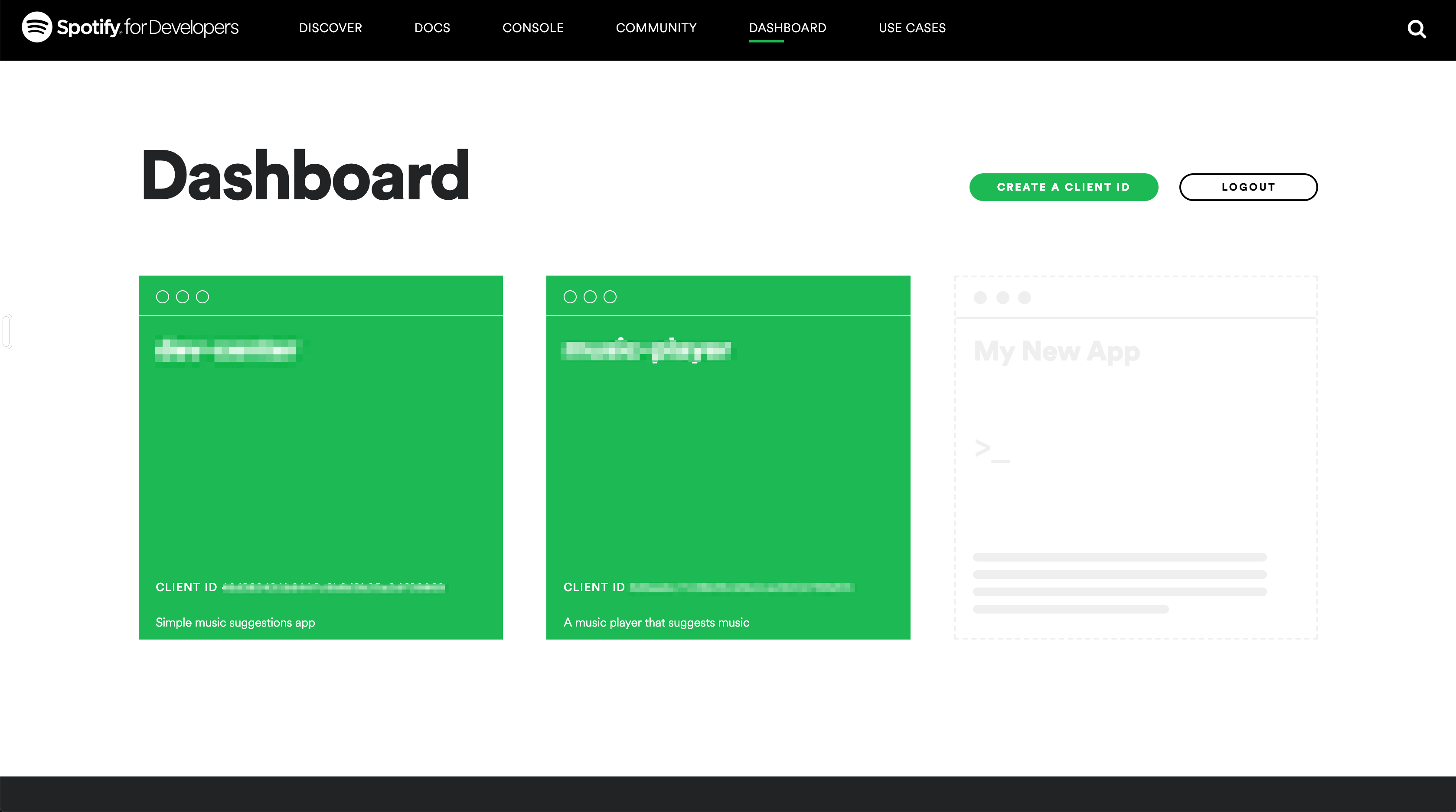
You can see that I have existing applications. If you don’t, click the empty card to create a new application, and fill in the required details to get started.
Since we won’t be setting up OAuth for users of the application, we’ll have to get access tokens from the Spotify developer console. The tokens expire after a couple of requests, but you can always extend the application to get access tokens from logged-in users.
To get a token, head over to the console, select the endpoint you wish to explore, and at the bottom of the page you should see a button titled Get Token. Click the button to get a new token and test the endpoint to view sample responses.
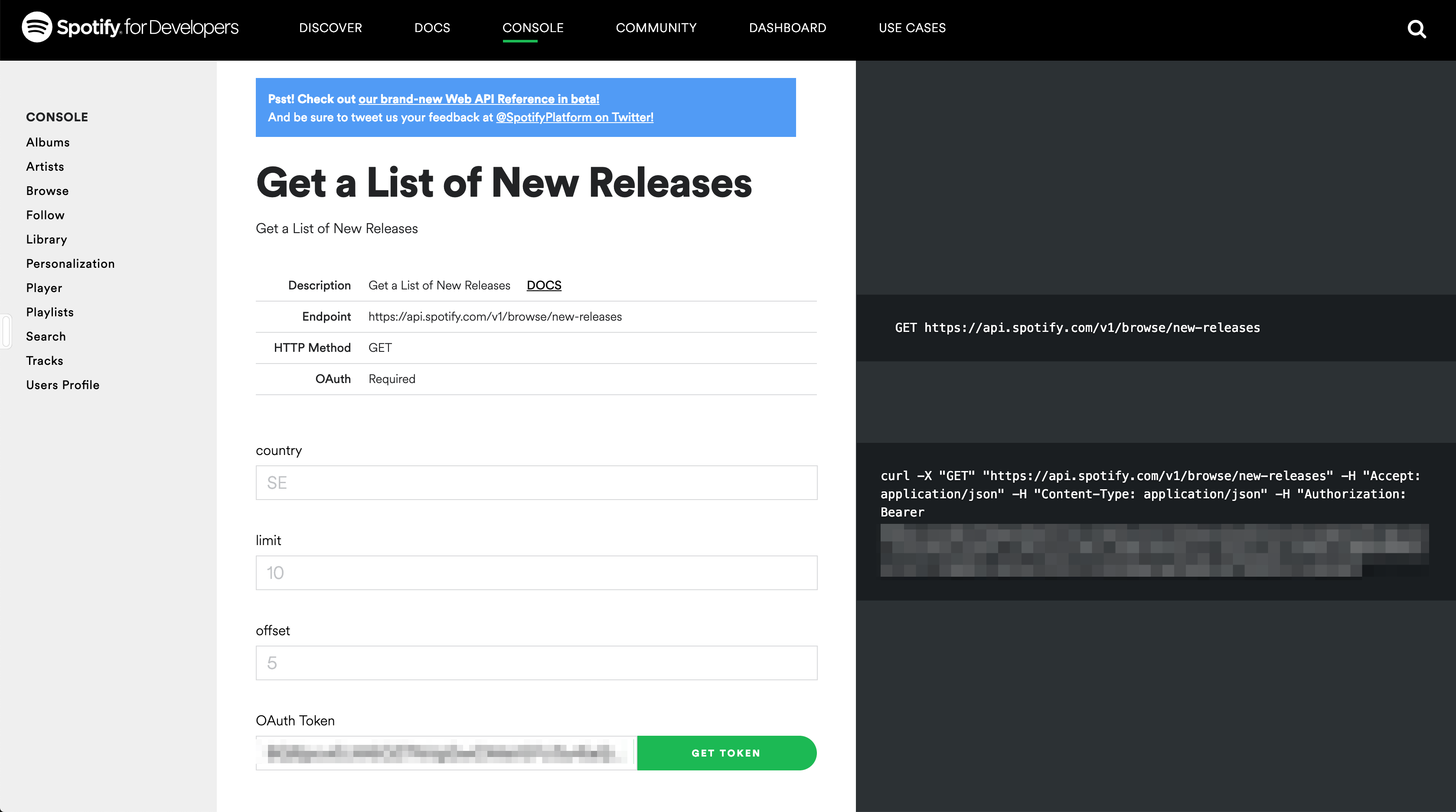
Copy the generated token, we’ll be using this later in the article.
Initializing Application and Installing Dependencies
To get started, we will use the CLI (command line interface) provided by the Angular team to initialize our project.
First, install the CLI by running npm install -g @angular/cli. NPM is a package manager used for installing packages. It will be available on your PC if you have Node installed; if not, download Node here.
To create a new Angular project using the CLI, open a terminal and run:
ng new kendo-music-player --style=scssThis command is used to initialize a new Angular project; the project will be using SCSS as the pre-processor.
Next, run the following command in the root folder of the project to install dependencies:
ng add @progress/kendo-angular-buttons @progress/kendo-angular-layout
Start the Angular development server by running ng serve in a terminal in the root folder of your project.
Home View
To get started, we’ll define the views for the application, starting from the home page. The home page will house the grid displaying tracks and albums and the header. The default App component will house the home page of the application. Open the app.component.html file and update the file to get started:
   <main>
      <!-- header component will come here -->
      <section>
        <kendo-splitter style="width: 100%; height: 100%; padding: 40px 0 ">
          <kendo-splitter-pane size="60%" min="40%">
            <!-- albums grid here -->
          </kendo-splitter-pane>
          <kendo-splitter-pane min="30%">
            <! album tracks list here -->
          </kendo-splitter-pane>
        </kendo-splitter>
      </section>
    </main>
First, we define the structure of our application using Kendo UI’s layout component. The layout package provides a splitter component that can be used to split the webpage into different sections. The splitter component allows the user to control the size of each section by dragging and resizing.
The kendo-splitter can be displayed in two orientations — vertical and horizontal. Just provide an orientation directive on the component. Within the kendo-splitter component, there are two kendo-splitter-pane components. These are used for creating columns similar to the .col elements in Bootstrap.
These pane components are resizable columns, so first we provide the size directive, which defines the width of the column similar to col-8 in Bootstrap. The min directive is used on resizable columns to restrict the resizing to a minimum width. In the example above, the first column can’t be resized past 40% and the second 30%.
Next, we’ll include the external assets the application will be using. We’ll be using the Montserrat and Roboto fonts. Also, we’ll update style.scss file to include the Kendo UI component stylesheets and application-wide styles.
Open the index.html file and include the link to the external fonts:
  <!doctype html>
    <html lang="en">
    <head>
      <meta charset="utf-8">
      <title>KendoMusicPlayer</title>
      <base href="/">

      <meta name="viewport" content="width=device-width, initial-scale=1">
      <link rel="icon" type="image/x-icon" href="favicon.ico">
      <link href="https://fonts.googleapis.com/css?family=Montserrat:400,700|Roboto:400,500,700,900" rel="stylesheet">
    </head>
    <body>
      <app-root></app-root>
    </body>
    </html>
Also, we’ll be overriding the default color scheme of Kendo UI’s theme. The first step is to create a file to hold the variables. Create a folder in the src/app directory called scss-partials and create a partials file called _variables.scss within the folder. Open the file and update it with the following variables:
    // src/app/scss-partials/_variables.scss

    $accent: #7B84FF;
    $accent-light: #DBDDFF;
    $border-radius: 5px;
    $base-text: #525F7F;
Then open the style.scss file next and import the variables file and component stylesheets next:
    // styles.scss
    @import "app/scss-partials/variables";
    @import "~@progress/kendo-theme-default/scss/button";
    @import "~@progress/kendo-theme-default/scss/splitter";
    body, html {
      margin: 0;
      padding: 0;
      font-family: 'Roboto', sans-serif;
      background: #F7F7F7;
    }
    body,html,main, section{
      height: 100%;
    }
Header Component
The header component will display the application logo and very little information. This component is mostly a display component.
Run the following command to create the header component:
ng generate component headerNext, open the src/app/header/header.component.html file and update it to look like the code below:
   <!-- src/app/header/header.component.html -->

    <header>
      <div class="brand">
        <img src="/assets/images/logo.png">
        <h5>Just Music</h5>
      </div>
      <div class="nav-items">
        <ul class="nav-items">
          <li class="nav-item">
            <span>Music</span>
          </li>
        </ul>
      </div>
    </header>
Note: Image asset used can be found here in the GitHub repository. The logo was obtained from https://flaticon.com.
Next, we’ll style the header. Open the header.component.scss file and update it with the snippet below:
 @import "../scss-partials/variables";
    header {
      display: flex;
      background-color: #F7F7F7;
      align-items: center;
      font-family: 'Montserrat', sans-serif;
      margin: 0;
      padding: 20px 5%;
      color: whitesmoke;
      box-shadow: 0 1px 2px 0 rgba(0, 0, 0, 0.1);
      .brand {
        flex: 1;
        display: flex;
        align-items: center;
        img {
          height: 35px;
          border-radius: 50%;
          margin-right: 17px;
        }
        h5 {
          font-size: 15px;
          margin: 0;
          text-transform: uppercase;
          letter-spacing: 0.5px;
          font-weight: 600;
          color: $base-text;
        }
      }
      .nav-items {
        margin: 0;
        .nav-item {
          span {
            text-transform: uppercase;
            font-size: 13px;
            font-weight: bold;
            letter-spacing: 0.7px;
            padding: 10px 17px;
            border-radius: 4px;
            background-color: $accent-light;
            color: $accent;
            border: none;
            margin: 0;
          }
        }
      }
    }
Just a couple of styles to beautify the header.
If you visit http://localhost:4200, you should see the latest view of the application. The header and the splitter are visible, you can play around with the resizable columns but remember to come back and finish the article. Ensure the Angular dev server is running before testing.
Next, we’ll create a service to fetch the latest releases and tracks from Spotify.
Fetching Tracks and Albums
To handle fetching of the latest releases and tracks, we’ll be using a service. Services are recommended to be used for side effects like HTTP requests in your application. Services are reusable and can easily abstract processes like these from components, thus making components less bloated and easier to manage.
To create a service using the CLI, run the following command:
ng generate service album
This should generate file named album.service.ts in the src/app directory. Open the file and update it to include new methods for fetching data:
  import {Injectable} from '@angular/core';
    import {HttpClient, HttpHeaders} from '@angular/common/http';
    import {environment} from '../environments/environment';
    @Injectable({
      providedIn: 'root'
    })
    export class AlbumService {
      constructor(private http: HttpClient) {
      }
      get headers() {
        return new HttpHeaders({'Content-Type': 'application/json', 'Authorization': `Bearer ${environment.spotifySecret}`});
      }
      getAlbums() {
        return this.http.get('https://api.spotify.com/v1/browse/new-releases?limit=10&country=GB', {
          headers: this.headers
        });
      }
      getAlbumTracks(id: string) {
        return this.http.get(`https://api.spotify.com/v1/albums/${id}/tracks`, {
          headers: this.headers
        });
      }
    }
First, we’ll import the HttpClient, which will be used for making HTTP requests. The HttpHeaders is useful for creating headers that can be attached to requests since the Spotify endpoints require Authorization headers.
The headers getter method generates headers using the HttpHeaders class and provides a Bearer token stored in the environment file. We’ll get to creating this spotifySecret property in the environment.ts file.
The next method is the getAlbums method that returns an Http request observable made to the new-releases endpoint. This endpoint returns the latest albums and tracks released on Spotify. You can view the responses from this endpoint in the console here.
Finally, the getAlbumTracks method takes an id parameter and calls the album/${id}/tracks endpoint. This endpoint simply returns the tracks contained in an album.
Next, we’ll update the environment.ts file with the token we obtained from the console. If your token has expired, you can get a fresh one here.
Open the environment.ts file and add a new property called spotifySecret to the object:
  export const environment = {
      production: false,
      spotifySecret: '<ACCESS_TOKEN>',
    };
Replace the placeholder string <ACCESS_TOKEN> with your actual access token obtained from the console.
To use the HttpClient class, you have to include the HttpClientModule import in the app.module.ts file. Open the file and add the import:
 import { BrowserModule } from '@angular/platform-browser';
    import { NgModule } from '@angular/core';
    ...
    import {HttpClientModule} from '@angular/common/http';
    @NgModule({
      declarations: [
        ...
      ],
      imports: [
        ...,
      HttpClientModule
      ],
      providers: [],
      bootstrap: [AppComponent]
    })
    export class AppModule { }
Next, we’ll create the components to display the latest albums from the new releases endpoint.
Creating the Album List View
Run the following commands to generate components for the product item and product list:
ng generate component album
And for the product list, run:
ng generate component album-list
Open the album.component.html file in the src/app/album directory and update with the code below:
    <div class="album" (click)="onAlbumClick($event)">
      <div [ngStyle]="albumCover">
        <div class="details">
          <h3>{{album.name}}</h3>
          <h4>{{getArtiste(album).name}}</h4>
        </div>
      </div>
    </div>
The album has a click event listener to load the tracks of the selected album. Next, let’s add some styles to the component to give it some life. Open the album.component.scss file and add the following styles to it:
    .album div {
      width: 100%;
      height: 300px;
      border-radius: 6px;
      margin: 10px 0;
      background-blend-mode: multiply, normal;
      background-size: contain;
      display: flex;
      align-items: flex-start;
      overflow: hidden;
      cursor: pointer;
      &:hover {
        h3 {
          transition: 0.3s ease-in;
          transform: translateY(0);
        }
        h4 {
          transition: 0.3s ease-in;
          transform: translateY(0);
        }
      }
      .details{
        display: flex;
        flex-direction: column;
      }
      h3 {
        font-size: 17px;
        font-family: 'Montserrat', sans-serif;
        text-transform: uppercase;
        letter-spacing: 0.7px;
        font-weight: 600;
        text-align: left;
        color: white;
        opacity: 0.9;
        margin-left: 15px;
        margin-top: 30px;
        transform: translateY(-50px);
      }
      h4 {
        font-size: 14px;
        text-transform: uppercase;
        letter-spacing: 0.7px;
        font-weight: 500;
        text-align: left;
        color: whitesmoke;
        opacity: 0.6;
        margin-left: 15px;
        margin-top: 6px;
        transform: translateY(-70px);
      }
    }
Next, we’ll update the album.component.ts file to create the handler for the click event. Open the file and update it with the variables and methods used in the HTML file:
    import {Component, EventEmitter, Input, OnInit, Output} from '@angular/core';
    @Component({
      selector: 'app-album',
      templateUrl: './album.component.html',
      styleUrls: ['./album.component.scss']
    })
    export class AlbumComponent implements OnInit {
      @Input() album: { images: Array<any> };
      @Output() albumSelected = new EventEmitter<Object>();
      albumCover: {};
      getArtiste(album) {
        const {artists} = album;
        const [artist] = artists;
        return artist;
      }
      onAlbumClick(e) {
        this.albumSelected.emit(this.album);
      }

      ngOnInit() {
        const {images} = this.album;
        const [, image] = images;
        this.albumCover = {background: `linear-gradient(0deg, #989494, #aba6a6), url(${image.url}), no-repeat`};
      }
    }
In the component, we have Input and Output bindings for component interaction. The component will take an Input named album. This will be sent by the album list component. The component also emits events using the Output binding coupled with the EventEmitter observable.
The component has two methods. The getArtiste method gets the album’s artist off the album input object. The next method is the event handler onAlbumClick; the method emits the album clicked to the parent component.
Finally, there’s the ngOnInit lifecycle. In here, we obtain the album image from the album object, then, using the image, we generate a background image using the linear-gradient function.
After setting up the album component, we’ll head over to the album-list component, open the album-list.component.html file and update it with the code below:
    <section class="album-section">
      <div>
        <h4>Latest Albums</h4>
      </div>
      <div class="album-list">
        <app-album *ngFor="let album of albums" [album]="album" (albumSelected)="onAlbumSelected($event)"></app-album>
      </div>
    </section>
Here, we loop through the array of albums using the *ngFor directive and rendering them using the album component. You’ll also notice the (albumSelected) event emitter created in the album component.
Next, open the album-list.component.scss file and update it with the styles below:
    @import "../scss-partials/variables";
    .album-section {
      padding: 30px 45px;
      h4 {
        font-size: 15px;
        color: $base-text;
        text-transform: uppercase;
        font-family: 'Montserrat', sans-serif;
        font-weight: 600;
        margin: 0 0 20px;
      }
    }
    .album-list {
      line-height: 0;
      column-count: 3;
      column-gap: 10px;

    }
    @media (max-width: 1200px) {
      .album-list {
        column-count: 4;
      }
    }
    @media (max-width: 1000px) {
      .album-list {
        column-count: 3;
      }
    }
    @media (max-width: 800px) {
      .album-list {
        column-count: 2;
      }
    }
    @media (max-width: 400px) {
      .album-list {
        column-count: 1;
      }
    }
The following styles are used to define a simple grid that presents the images in a random order within the grid.
Next, open the album-list.component.ts file to create the event handler for the events emitted from the album component.
    import {Component, EventEmitter, Input, OnInit, Output} from '@angular/core';
    @Component({
      selector: 'app-album-list',
      templateUrl: './album-list.component.html',
      styleUrls: ['./album-list.component.scss']
    })
    export class AlbumListComponent implements OnInit {
      constructor() {
      }
      @Input() albums: [] = [];
      @Output() albumSelected = new EventEmitter<object>();
      onAlbumSelected(album) {
        this.albumSelected.emit(album);
      }
      ngOnInit() {
      }
    }
In the component, we define Input and Output bindings to receive data from the home component and to emit the selected album. The onAlbumSelected is the event handler for receiving data from the album component.
Next, we’ll render the album list component in the app.component.html and also fetch the latest albums using the album service.
Open the app.component.html file and update it to be similar to the snippet below:
    <main>
      <app-header></app-header>
      <section>
        <kendo-splitter style="width: 100%; height: 100%; padding: 40px 0 ">
          <kendo-splitter-pane size="60%" min="40%">
            <app-album-list [albums]="albums" (albumSelected)="onAlbumChange($event)"></app-album-list>
          </kendo-splitter-pane>
          <kendo-splitter-pane min="30%">
            <! -- track list here -->
          </kendo-splitter-pane>
        </kendo-splitter>
      </section>
    </main>
After rendering the album list, update the App component to fetch albums and assign them to a variable. Also, we’ll create an event handler to receive the clicked album.
Open the app.component.ts file and update it to declare the variables used and to fetch the albums:
    import {Component, OnInit} from '@angular/core';
    import {AlbumService} from './album.service';
    @Component({
      selector: 'app-root',
      templateUrl: './app.component.html',
      styleUrls: ['./app.component.scss']
    })
    export class AppComponent implements OnInit {
      constructor(private albumService: AlbumService) {
      }
      albums = [];
      currentAlbum: any = {};
      tracks = [];
      currentAlbumTracks(id) {
        this.albumService.getAlbumTracks(id).subscribe((response: any) => {
          const {items} = response;
          this.tracks = items;
        });
      }
      onAlbumChange(album: any) {
        const {id} = album;
        this.currentAlbum = album;
        this.currentAlbumTracks(id);
      }
      ngOnInit() {
        this.albumService.getAlbums().subscribe((response: any) => {
          const {albums} = response;
          const {items} = albums;
          this.currentAlbum = items[0];
          this.albums = items;
          this.currentAlbumTracks(this.currentAlbum.id);
        });
      }
    }
First, we import the AlbumService, then in the OnInit lifecycle, we fetch the albums using the service. When the request is complete, we get the items from the response using object restructuring. Then we set the first album in the list as the currentAlbum.
The currentAlbumTracks method is for fetching the tracks within an album; the method takes a single parameter id and uses the AlbumService to fetch the data.
The onAlbumChange method is an event handler that is called when an album is clicked. The method gets the id of the selected album and calls the currentAlbumTracks method to fetch its tracks. The selected album is assigned to the currentAlbum property.
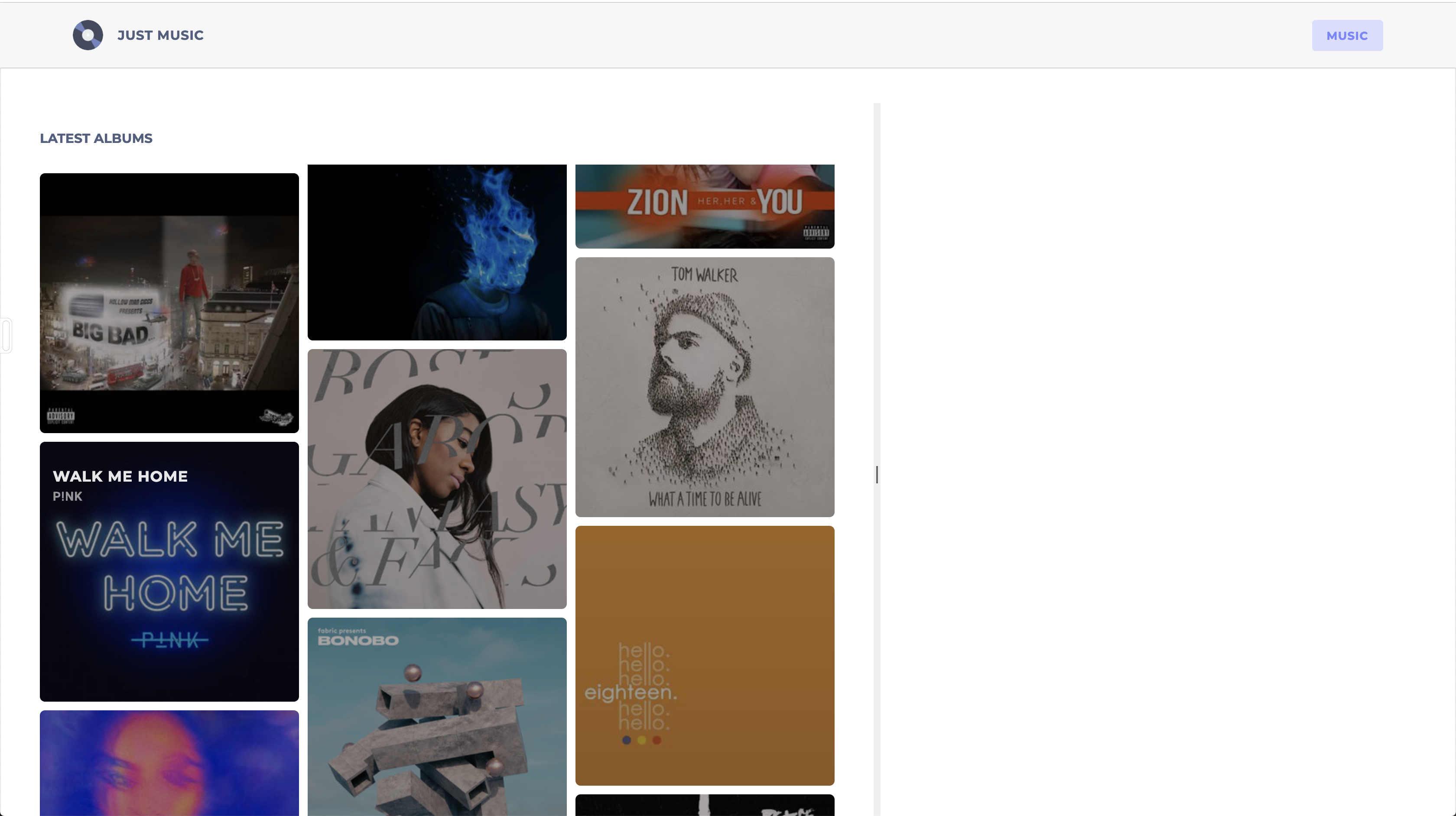
After these updates, if we visit the application on the browser on http://localhost:4200/, we should see the albums listed, and it should be similar to the screenshot below. Ensure that the token hasn’t expired. Get a new one if it has.
Next, we’ll create the tracklist and track components. Stay tuned.
Creating the Tracks List View
Run the following commands to generate components for the song item and songs list:
ng generate component song-item
And for the product list run:
ng generate component song-list
Open the song-item.component.html file in the src/app/song-item directory and update with the code below:
    <div class="track">
      <div class="track-info">
        <div class="track-info__name"><h4>{{track.name}}</h4></div>
        <div class="track-info__meta">
          <span class="track-info__meta-duration">
            {{songDuration}}
          </span>
          <div class="track-info__meta-tags">
            <span *ngIf="track.explicit" class="">
              Explicit
            </span>
          </div>
        </div>
      </div>
      <div class="track-playing__indicator">
        <img src="/assets/images/short-waves.png" class="bland" alt="">
        <img src="/assets/images/player-waves-colored.png" class="colored">
      </div>
      <div class="track-actions">
        <button class="track-actions__play"><span class="k-icon k-i-video-external"></span></button>
      </div>
    </div>
Note: All image assets used can be found in a GitHub repository here.
In this component, we’ll display the track name, and we’ll display a tag if the track is explicit. We also used Kendo UI’s icon set to define the play button. Kendo UI has a rich set of icons that can be found here. They are easy to configure and customize.
Let’s apply some styles to the component. Open the song-item.component.scss file and update it with the following:
    @import "../scss-partials/variables";
    .track {
      padding: 15px 20px;
      display: flex;
      justify-content: space-between;
      background: #F7F7F7;
      border: 1px solid rgba(0, 0, 0, 0.08);
      border-radius: 10px;
      margin: 10px 0;
      &:hover {
        background: white;
        transform: scale(1.06);
        box-shadow: 0 2px 4px 0 rgba(0, 0, 0, 0.09);
        .track {
          &-playing__indicator {
            .colored {
              display: block;
            }
            .bland {
              display: none;
            }
          }
          &-actions {
            &__play {
              background: $accent;
              .k-icon {
                color: white;
              }
            }
          }
        }
      }
      &-info {
        flex-grow: 1;
        flex-basis: 0;
        &__name {
          margin-bottom: 8px;
          h4 {
            font-family: 'Montserrat', sans-serif;
            opacity: 0.8;
            font-size: 14px;
            font-weight: 400;
            margin: 5px 0;
          }
        }
        &__meta {
          display: flex;
          align-items: center;
          &-duration {
            font-size: 13px;
            font-weight: 600;
            opacity: 0.7;
          }
          &-tags {
            margin-left: 7px;
            span {
              background: #ffdde2;
              color: indianred;
              border-radius: 4px;
              font-size: 10px;
              text-transform: uppercase;
              font-weight: 600;
              padding: 5px 6px;
              letter-spacing: 0.6px;
            }
          }
        }
      }
      &-playing__indicator {
        flex-grow: 1;
        flex-basis: 0;
        .colored {
          display: none;
        }
      }
      &-actions {
        &__play {
          height: 50px;
          width: 50px;
          border-radius: 50%;
          border: none;
          background: #F0F0F0;
          display: flex;
          justify-content: center;
          align-items: center;
          box-shadow: 1px 2px 4px 0 rgba(0, 0, 0, 0.09);
          cursor: pointer;
          .k-icon {
            font-size: 22px;
            color: #D4D4D4;
          }
        }
      }
    }
After applying the styles, the next step is to update the component file to declare the variables used in the view template. Open the song-item.component.ts file and update it like the snippet below:
    import {Component, Input, OnInit} from '@angular/core';
    @Component({
      selector: 'app-song-item',
      templateUrl: './song-item.component.html',
      styleUrls: ['./song-item.component.scss']
    })
    export class SongItemComponent implements OnInit {
      constructor() {
      }
      @Input() track = {duration_ms: 0};
      get songDuration() {
        const {duration_ms} = this.track;
        const songInSeconds = Math.ceil(duration_ms / 1000);
        const getMinutes = Math.floor(songInSeconds / 60);
        const getSecondsRemainder = songInSeconds % 60;
        return `${getMinutes}:${getSecondsRemainder}`;
      }
      ngOnInit() {
      }
    }
First, we declare an Input binding to receive the track data from the parent component, then we declare a getter function songDuration. This method takes the duration_ms property, which contains the length of the track in milliseconds and converts it to a minutes:seconds format seen in most music player applications.
After setting up the song-item component, we’ll head over to the song-list component, open the song-list.component.html file, and update it with the code below:
    <div class="song-list">
      <div>
        <h3>Current Album</h3>
        <hr>
        <div class="album-info">
          <div class="album-info__image">
            <img [src]="albumCover.url" [alt]="currentAlbum.name">
          </div>
          <div class="album-info__name">
            <h4>{{currentAlbum.name}}</h4>
            <p>{{albumArtiste.name}}</p>
          </div>
        </div>
      </div>
      <app-song-item *ngFor="let track of tracks" [track]="track"></app-song-item>
    </div>
Here we loop through the array of tracks using the *ngFor directive and rendering them using the song-item component. Also, we display the name of the album and the album cover above the track list. The track list is songs within the album.
Next, open the album-list.component.scss file and update it with the styles below:
    .song-list {
      padding: 30px 50px;
      h3 {
        font-size: 14px;
        font-weight: 600;
        opacity: 0.7;
        text-transform: uppercase;
        font-family: 'Montserrat', sans-serif;
        margin: 0 0 15px;
      }
      hr{
        border-color: rgba(0,0,0,0.07);
        margin-bottom: 15px;
      }
      .album-info {
        display: flex;
        align-items: flex-end;
        &__image {
          img {
            width: 50px;
            height: 50px;
            border-radius: 6px;
          }
        }
        &__name {
          h4 {
            font-family: 'Montserrat', sans-serif;
            text-transform: uppercase;
            font-size: 14px;
            color: #7B84FF;
            font-weight: 600;
            opacity: 0.8;
            margin: 0 0 0 10px;
          }
          p{
            text-transform: uppercase;
            font-size: 12px;
            font-weight: 500;
            opacity: 0.6;
            margin: 0 0 5px 10px;
          }
        }
      }
    }
The following styles are used to define the list of tracks to be displayed.
The song-list component receives Input bindings from the parent component, so open the song-list.component.ts file to declare the Input variables and other variables used in the view template:
    import {Component, Input, OnInit} from '@angular/core';
    @Component({
      selector: 'app-song-list',
      templateUrl: './song-list.component.html',
      styleUrls: ['./song-list.component.scss']
    })
    export class SongListComponent implements OnInit {
      constructor() {
      }
      @Input() tracks: [];
      @Input() currentAlbum: any;
      get albumCover() {
        const {images} = this.currentAlbum;
        const [image] = images;
        return image;
      }
      get albumArtiste() {
        const {artists} = this.currentAlbum;
        const [artist] = artists;
        return artist;
      }
      ngOnInit() {
      }
    }
In the component, we define the bindings to be received by the component; also, we declare two getter methods albumCover and albumArtiste. The method names are pretty self-explanatory, but we’ll still walk through it. The albumCover method retrieves the image from the currentAlbum object, and the albumArtiste method retrieves the album’s artist.
Like we did with the album-list component, we’ll render the component in the app.component.html.
Open the app.component.html file and update it to be similar to the snippet below:
    <main>
      <app-header></app-header>
      <section>
        <kendo-splitter style="width: 100%; height: 100%; padding: 40px 0 ">
          <kendo-splitter-pane size="60%" min="40%">
            <app-album-list [albums]="albums" (albumSelected)="onAlbumChange($event)"></app-album-list>
          </kendo-splitter-pane>
          <kendo-splitter-pane min="30%">
            <app-song-list [tracks]="tracks" [currentAlbum]="currentAlbum"></app-song-list>
          </kendo-splitter-pane>
        </kendo-splitter>
      </section>
    </main>
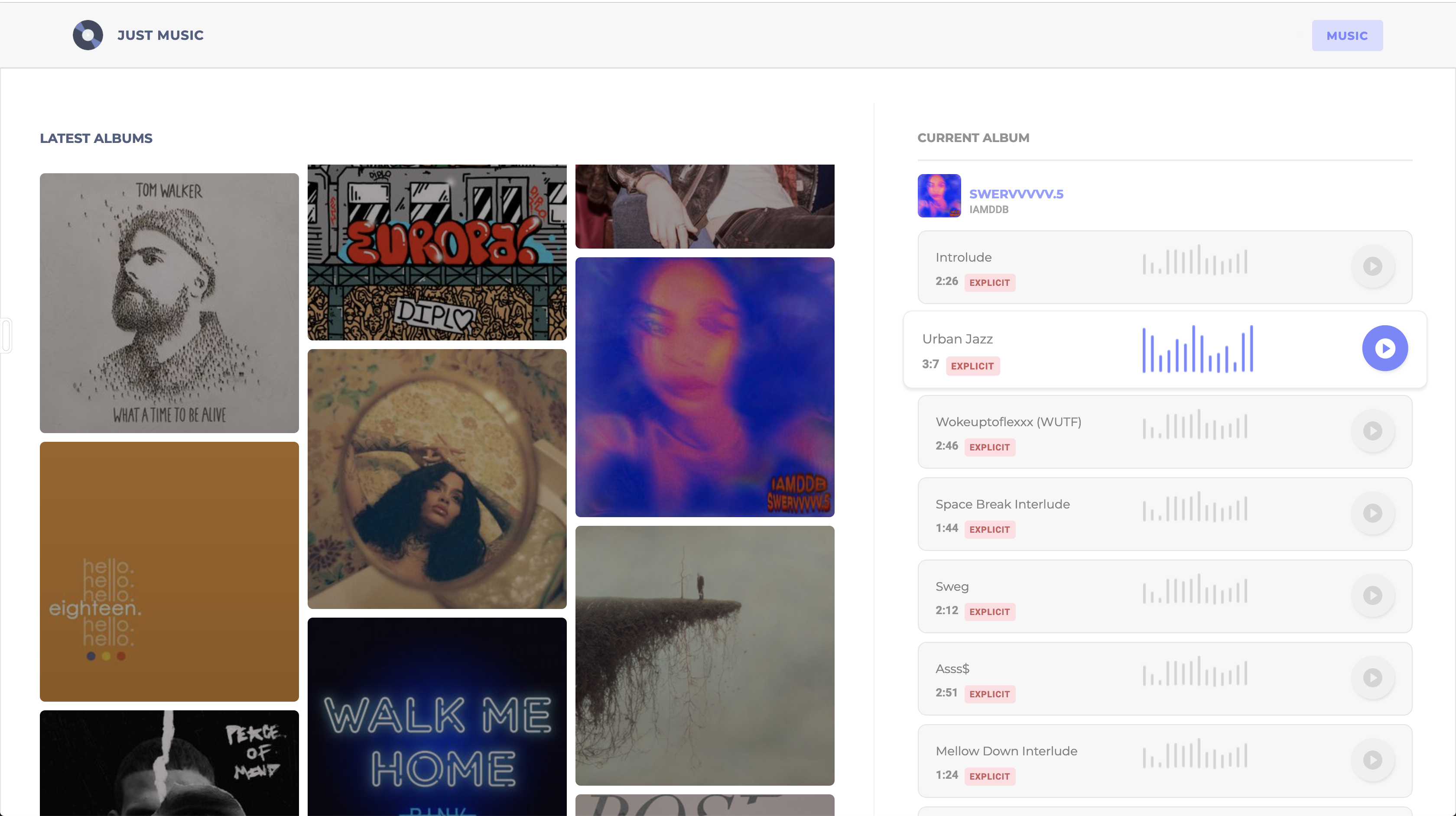
After rendering the list of tracks, if we visit the application on the browser on http://localhost:4200/, we should see both the albums listed and the tracks. If an album is clicked, it will load the tracks within the track list section. Check it out below:
Conclusion
In this tutorial, we’ve seen how easy it is to get started using Kendo UI components for Angular. We’ve seen how easy it is to define the structure of your application using the Splitter component from Kendo UI. The components were easy to use and configure. You can extend this demo application to play each track listed. The Spotify API provides a preview_url for their tracks and an audio element can be used to play these tracks.
You can find the source code for this demo application here. Happy coding.
This blog has been brought to you by Kendo UI
Want to learn more about creating great web apps? It all starts out with Kendo UI - the complete UI component library that allows you to quickly build high-quality, responsive apps. It includes everything you need, from grids and charts to dropdowns and gauges.


Christian Nwamba
Chris Nwamba is a Senior Developer Advocate at AWS focusing on AWS Amplify. He is also a teacher with years of experience building products and communities.