Building a Design System with Kendo UI

Summarize with AI:
Explore how to create a design system using the Progress ThemeBuilder and KendoReact for consistent components, colors and theming across your project.
Read an updated version of this post here: How to Create a Design System with ThemeBuilder.
To ensure UI and component behavioral consistency across a project, any medium- to large-scale application should incorporate some kind of a design system. In this tutorial, we will cover what a design system is, why it’s useful, and how to incorporate one using Kendo UI.
What Is a Design System?
In simple terms, a design system is a set of principles, guidelines and rules with information about how different elements and components in your application should look and behave. For example, a design system could cover things like:
- Font family and sizing for typography, such as headings, body paragraphs or labels
- Brand and palette colors
- Icons
- Behavior and look of components, such as form fields
- And more
The whole point of a design system is that, no matter how many developers or teams are working on a product, it will have a consistent UI and behavior, as all members are using the same guidelines and components. Questions like “What color should I use?” or “What font-size should this heading be?” are already answered, and developers only have to pick one from the design system.
Popular Design Systems
If you would like to see some of the most popular design systems, you can check these out:
- Material by Google
- Human Interface Guidelines by Apple
- Fluent Design System by Microsoft
- Carbon Design System by IBM
- Polaris by Shopify
What Is Kendo UI?
Kendo UI is a comprehensive collection of JavaScript UI components that can help speed up the process of building web applications. It has ready-made and flexible components for many different use cases, such as forms, editors, charts, layout, popups and more. Kendo UI offers kit libraries for jQuery, Angular, React and Vue, so even if your teams use different frameworks, they can still create products with consistent looking UI and behavior.
How to customize and build a Kendo theme?
- Default theme – available via the @progress/kendo-theme-default npm module
- Boostrap theme – available via the @progress/kendo-theme-bootstrap npm module
- Material theme – available via the @progress/kendo-theme-material npm module
All of them provide great-looking UI elements out of the box. However, if you would like to customize those themes or even create your own, Kendo UI allows you to do that. You can find respective theme styling documentation under these links:
The styling section describes how to install, use, customize the default themes or even create your own. First, we will have a look at how to create your own custom theme.
Progress also offers additional design-to-development tools: Figma kits and Unite UX. If you want to learn more about them, this blog post provides a nice introduction.
Progress Sass ThemeBuilder
One way to create your own theme is by using Progress ThemeBuilder.
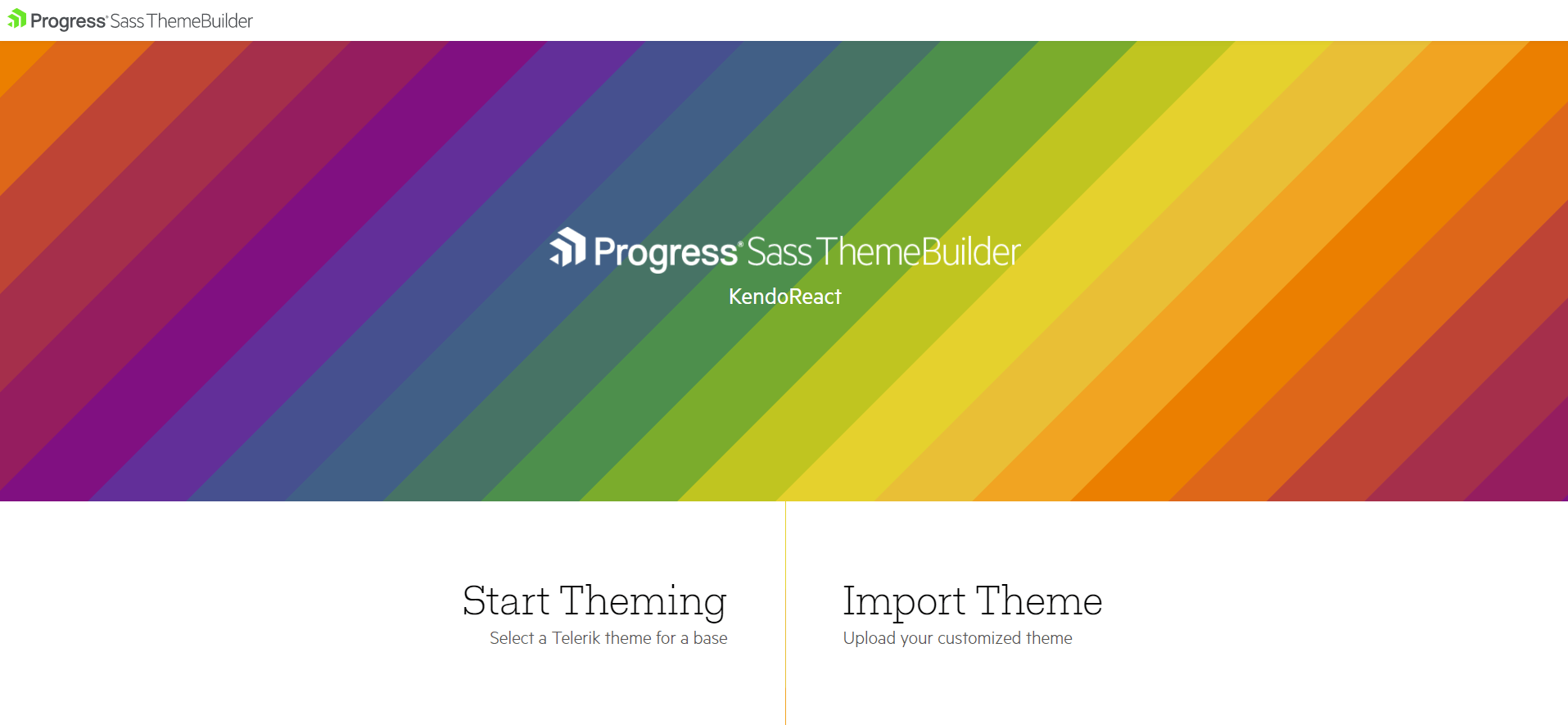
After choosing one of the available products, e.g. Kendo React, there are two options you can choose from: “Start Theming” or “Import Theme.” If you have a pre-existing Kendo theme, you can import an SCSS file with Kendo-specific variables. If it’s your first time, then you can go with the “Start Theming” option.
You will need to select the base theme, which will be used as the starting point. You can choose between “Default,” “Bootstrap” and “Material.” After that, you can specify which components you want to style. If you want your configuration to affect all components, just select all of them and then click on the “Create” button.
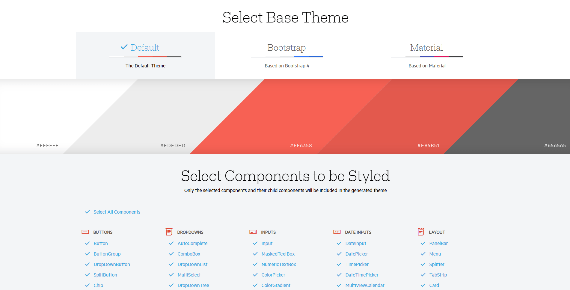
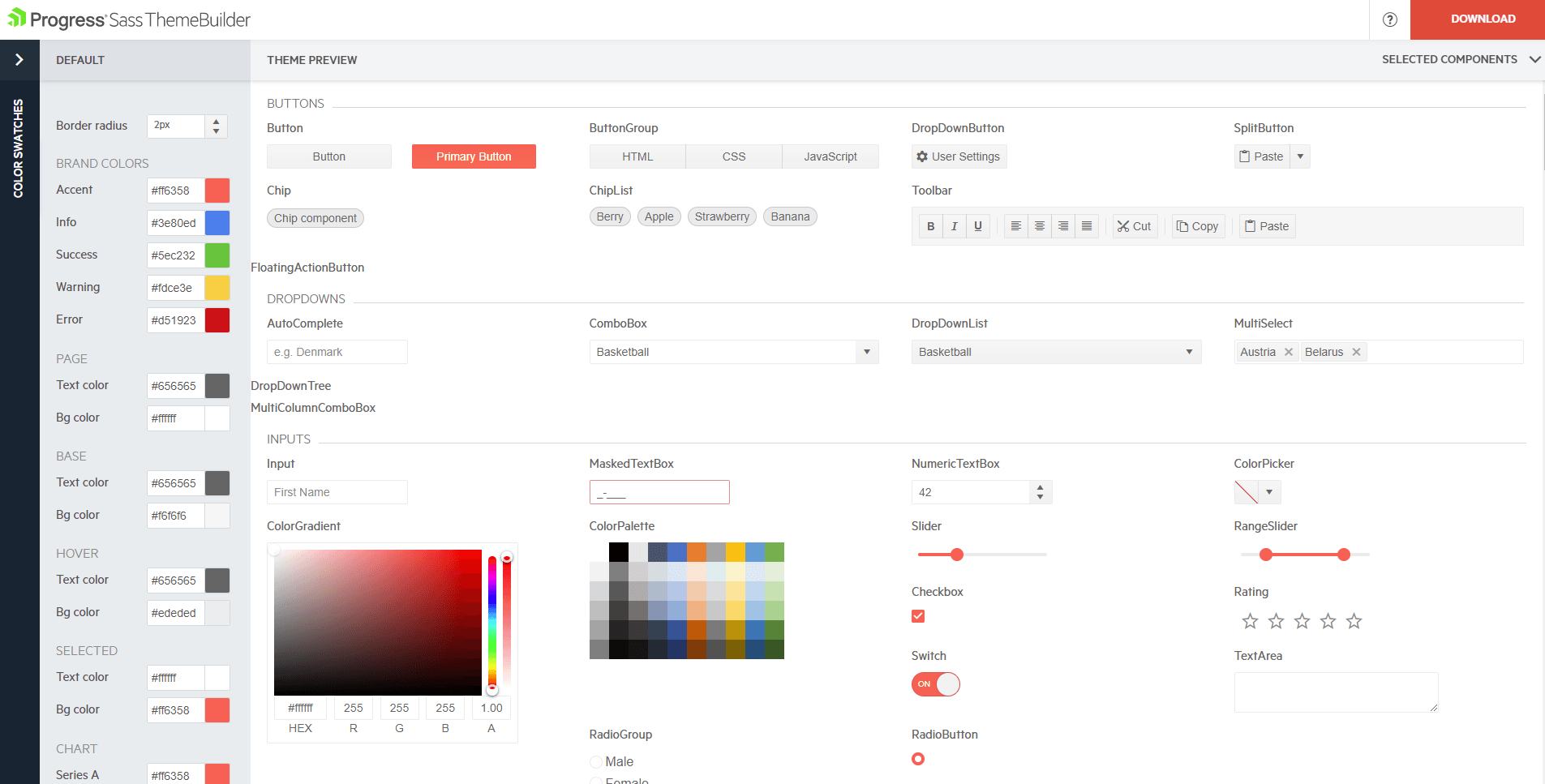
After creating the initial theme setup, you should see a page with all of the components, as well as the sidebar that contains a list of inputs for configuring brand and component colors. The big advantage of the ThemeBuilder is the fact that you can see how all components will look with the chosen theme colors.
What’s more, if you look closely on the left side, you will see that there is also a panel with predefined color swatches you can choose a theme from.
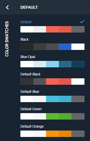
If you don’t like any of these, you can provide your own colors.
When you’re ready, you can click on the Download button, which you can find in the top-right corner of the page. It will download a Zip file containing two files:
- YourThemeName.css
- variables.scss
If you want to change your theme later on, you can modify the variables directly. However, if you want to use the same visual theme builder, you can do so by importing the variables.scss file that you downloaded previously. It’s as simple as that.
Modifying Kendo Theme via SCSS Variables
Kendo UI provides theme customization capabilities via SCSS variables. For this example, I am going to use the KendoReact kit. Below, you can find an interactive example showcasing customized headings, buttons and a form using KendoReact.
If you would like to try it out locally, you can clone this repository, or you can create a fresh React project.
You will need to install sass as well as one of the three themes provided by Kendo UI. To install the Default theme, you can run npm install sass @progress/kendo-theme-default or yarn add sass @progress/kendo-theme-default.
If you prefer Bootstrap or Material, then just replace the @progress/kendo-theme-default with respective packages.
Other packages you can install are:
- @progress/kendo-react-buttons
- @progress/kendo-react-form
- @progress/kendo-react-inputs
- @progress/kendo-react-labels
In the App.js file, you can add this code:
src/App.js
import React from "react";
import { Button } from "@progress/kendo-react-buttons";
import { Form, Field, FormElement } from "@progress/kendo-react-form";
import { Error } from "@progress/kendo-react-labels";
import { Input } from "@progress/kendo-react-inputs";

const emailRegex = new RegExp(/\S+@\S+\.\S+/);
const emailValidator = value =>
  emailRegex.test(value) ? "" : "Please enter a valid email.";
const EmailInput = fieldRenderProps => {
  const { validationMessage, visited, ...others } = fieldRenderProps;
  return (
    <div>
      <Input {...others} />
      {visited && validationMessage && <Error>{validationMessage}</Error>}
    </div>
  );
};

export default function App() {
  const handleSubmit = dataItem => alert(JSON.stringify(dataItem, null, 2));
  return (
    <div>
      <fieldset className="k-mb-4">
        <legend>Headings</legend>
        <h1 className="k-h1">Typography</h1>
        <h2 className="k-h2">Typography</h2>
        <h3 className="k-h3">Typography</h3>
        <h4 className="k-h4">Typography</h4>
        <h5 className="k-h5">Typography</h5>
        <h6 className="k-h6">Typography</h6>
      </fieldset>
      <fieldset className="k-mb-4">
        <legend>Buttons</legend>
        <div className="k-mb-4">
          <Button className="k-mr-4">Default</Button>
          <Button className="k-mr-4" disabled>
            Default disabled
          </Button>
        </div>
        <div>
          <Button className="k-mr-4" primary>
            Primary
          </Button>
          <Button primary disabled>
            Primary disabled
          </Button>
        </div>
      </fieldset>
      <fieldset className="k-mb-4">
        <legend>Form</legend>
        <Form
          onSubmit={handleSubmit}
          render={formRenderProps => (
            <FormElement style={{ maxWidth: 650 }}>
              <fieldset className={"k-form-fieldset"}>
                <legend className={"k-form-legend"}>
                  Please fill in the fields:
                </legend>
                <div className="mb-3">
                  <Field
                    name={"firstName"}
                    component={Input}
                    label={"First name"}
                  />
                </div>

                <div className="mb-3">
                  <Field
                    name={"lastName"}
                    component={Input}
                    label={"Last name"}
                  />
                </div>

                <div className="mb-3">
                  <Field
                    name={"email"}
                    type={"email"}
                    component={EmailInput}
                    label={"Email"}
                    validator={emailValidator}
                  />
                </div>
              </fieldset>
              <div className="k-form-buttons">
                <button
                  type={"submit"}
                  className="k-button"
                  disabled={!formRenderProps.allowSubmit}
                >
                  Submit
                </button>
              </div>
            </FormElement>
          )}
        />
      </fieldset>
    </div>
  );
}
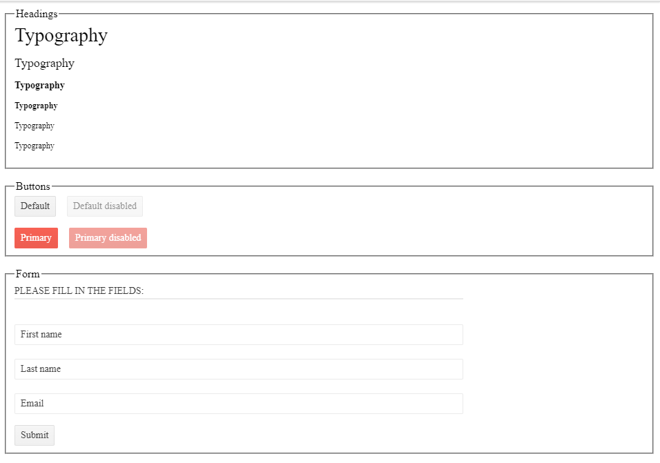
It will create three sections. The first one will contain headings, the middle one buttons, and the last one a form.
We also need to include the theme and add an .scss file, so we can add our own style overrides. For that, let’s create a new file called kendo-theme.scss.
src/styles/kendo-theme.scss
@import "~@progress/kendo-theme-default/dist/all.scss";
Besides that, we also need to import the kendo-theme.scss file in the index.js file.
src/index.js
import React from "react";
import ReactDOM from "react-dom";
import "./styles/kendo-theme.scss";
import App from "./App";

ReactDOM.render(<App />, document.getElementById("root"));
That’s it for the setup. The image below shows what you should see after running the project.
Now, let’s add a few overrides. To customize Kendo UI, we can create SCSS variables with our own values. For that, let’s modify the kendo-theme.scss file.
src/styles/kendo-theme.scss
// Common
$font-size: 18px;
$primary: #44e713;
$border-radius: 5px;

// Headings
$h1-font-size: 30px;
$h2-font-size: 26px;
$h3-font-size: 22px;
$h4-font-size: 18px;
$h5-font-size: 18px;
$h6-font-size: 18px;

// Button

$button-border-width: 3px;
$button-font-size: 14px;
$button-padding-x: 12px;
$button-padding-y: 8px;

@import "~@progress/kendo-theme-default/dist/all.scss";
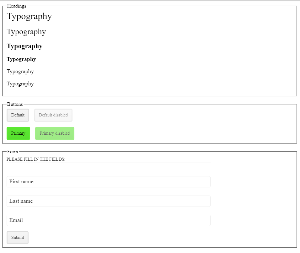
The variables need to be placed before importing the theme. As you can see, we provided our own values for the base font size of text and headings, and we changed primary color, base border radius, as well as a few button properties. Below is an image of how it should look now. You can also check the interactive example shown previously.
You can find the list of available SCSS variables for Kendo React in the Customization section.
Wrap-up
We have covered what a design system is, and how to create and customize one using Sass ThemeBuilder and KendoReact. A really great thing about using a UI kit like Kendo UI is the fact that you can reuse the components, colors, theming, etc. across your projects. It also helps to maintain consistent design and behavior, and if you need more flexibility, you can easily customize the theme and even build more complex component on top of Kendo UI.

Thomas Findlay
Thomas Findlay is a 5-star rated mentor, full-stack developer, consultant, technical writer and the author of “React - The Road To Enterprise” and “Vue - The Road To Enterprise.” He works with many different technologies such as JavaScript, Vue, React, React Native, Node.js, Python, PHP and more. Thomas has worked with developers and teams from beginner to advanced and helped them build and scale their applications and products. Check out his Codementor page, and you can also find him on Twitter.

