
Best Practices for Designing the Mobile App Login Screen

Summarize with AI:
While it might seem like the least of your worries in the scheme of things, the login screen is the gateway to your mobile app and needs to be designed with care. If you haven't designed it in a way that's easy to access and fast to get through, you could cause undue frustration with users where there doesn't need to be any. As you design your next mobile app, keep these best practices in mind.
Users don't see a login screen all that often. Sure, they may see it when first registering or every now and again if you force them to re-log in for security purposes. Regardless of how frequently they encounter the login screen, it's a crucial part of their experience with the app as a whole. One misstep in its design and you could wind up struggling just to get users just to log in to your app.
As a developer, your focus should be on tweaking and refining the app experience so as to retain more users. This means removing anything that gets in the way of them logging in in the first place.
In this article, I present five best practices to help you design the perfect mobile app login:
- Use a Distraction-Free Interface
- Make Filling Out the Form Easy
- Make Errors 100% Clear
- Include Login Shortcuts When It Makes Sense
- Be Smart About Designing Your Buttons
- Best Practices for Designing the Login Screen
Let's get started.
Use a Distraction-Free Interface
You might be tempted to design your login screen with the kinds of eye-catching elements that would otherwise be found inside the app. But, what's the point? You want users to engage with the actual app itself; not get distracted by the login page.
So, you have to decide how minimally you want to design the login screen. In other words, what's the best way to balance a distraction-free experience with creativity?
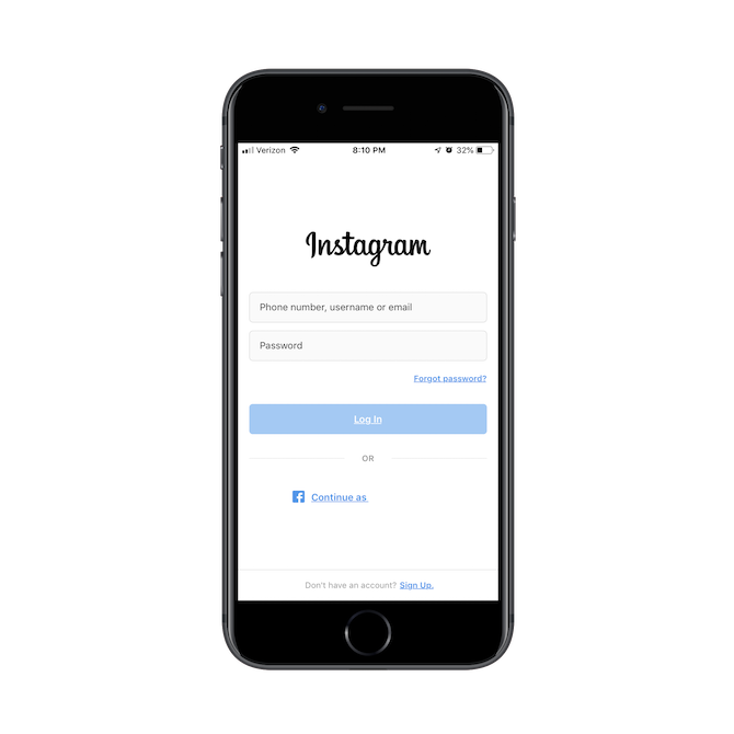
A solid background is the best way to go. In fact, you might want to take it all the way back to basics and use a solid white background as Instagram does:
If you're nervous that an all-white login page will be too boring or off-brand, you can always load a splash page before the login screen as Canva does:
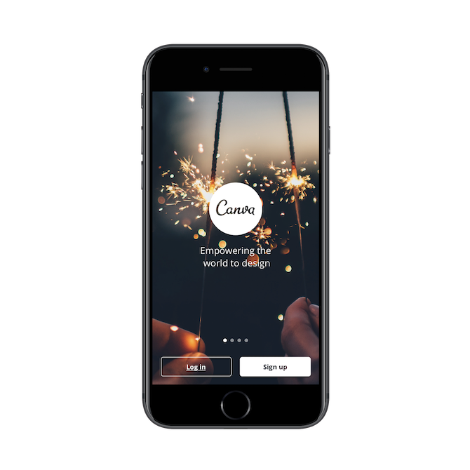
That way, the first impression is striking and memorable, while also creating a warmer welcome for brand new users.
Remember: You want to simplify the number of steps it takes to get a user into the app, so be careful how much content appears on your splash screen. Onboarding slides like the Canva example may be fine. However, something like this Bank of America example is definitely too much:
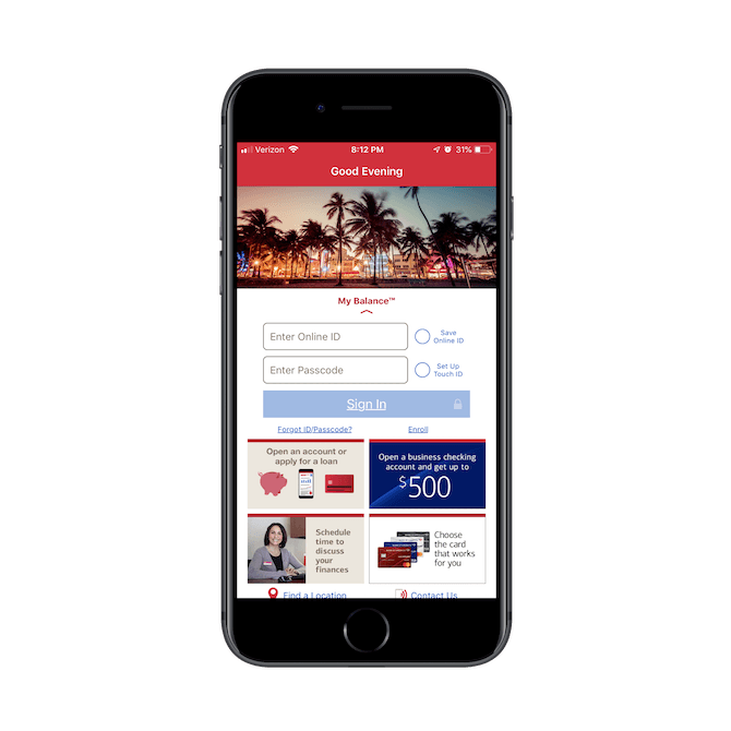
Keep the content on the inside of the app.
Make Filling Out the Form Easy
By now, I think most app developers recognize that only two fields are necessary on the login screen.
However, unlike websites that can afford to let users with full keyboards and a range of motion create usernames for their accounts, apps should keep it simple. The first field should ask for either the email address or telephone number.
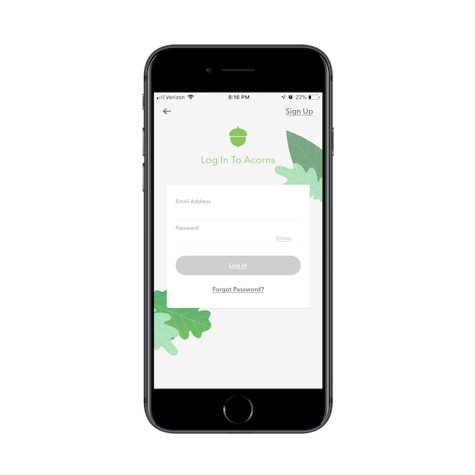
You also need to design the password field to be easy to populate. Specifically, there should be a built-in option to show the password while it's being typed. You can do this with an eyeball symbol in the right corner of the field or with the actual words "Show" as Acorns does so nicely:
And while you can't give users too much leniency in terms of what they set as a password, you can make it easy for them to retrieve a lost or forgotten one with a "Forgot password?" link.
One more thing to think about: the mobile keyboard should change to accommodate the kinds of letters, numbers and characters that your users type into the field. The less work they have to do to switch between keyboards and click on different fields, the quicker you'll get them inside the app.
Make Errors 100% Clear
You don't have a lot of room to play around on mobile apps, so displaying errors in the context of the form can be tricky. So, if you decide not to display error messages beside the fields in which they occurred, you have to find a clear way to display them for your users.
Let's start with what you shouldn't do.
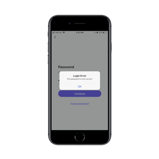
Here is how errors are reported on the SurveyMonkey login screen:
The pop-up is a good choice in terms of communicating the error without occupying space in the app to do it.
However, read the message. There's no information provided about what exactly went wrong. Was the username incorrect? Was the password wrong? Was the username even in the correct format to begin with (e.g. username vs. email address)? Does the user even exist in the system? Without clear guidance about what the error was, users could easily end up frustrated with the login page.
Instead, you can use the pop-up example from Asana to redesign your error messages:
This one clearly communicates to the user that the error was with the password field. That way, there's no need to try a new combination of username/password. If they don't know their password, they just click the password retrieval link to facilitate getting back inside the app.
Include Login Shortcuts When It Makes Sense
If you're thinking about bypassing the potential frustration caused by login forms and your users' memory limitations, you have a wide variety of options at your disposal today. The one you choose, however, should be dictated by the type of app you design.
For example, the Canva app includes two ways to log into an app besides the typical email/password combo:
Considering the types of users that gravitate towards an app like Canva, it makes sense that it would include logins through Facebook or Google.
Another alternate sign-in could look like this example from Zappos:
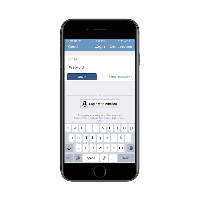
Because Zappos is an Amazon company, users can leverage the convenience of its one-click sign-in.
Just be cognizant of which logins you offer to users. Your login partners need to be recognizable and trusted names.
You also want to make the choice easy:
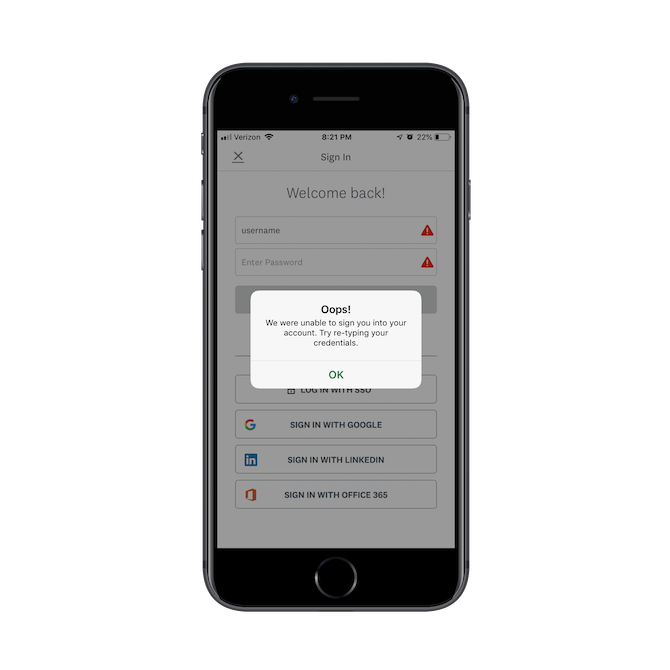
If we look at SurveyMonkey once more, you'll see that it has too many login options:
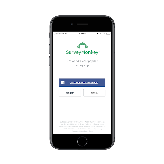
This first login screen offers the option to log in through Facebook. But then…
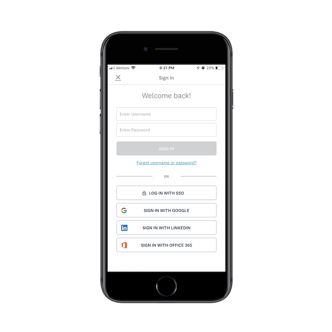
The second login screen includes options to log in with:
- Username
- Single Sign-On (SSO)
- Office 365
It might seem like you're trying to accommodate all users, but you're more likely to leave them feeling decision-fatigued while also increasing the chance that they encounter an error while logging in. Just pick one or two channels to pick from and leave it at that.
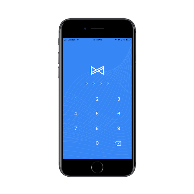
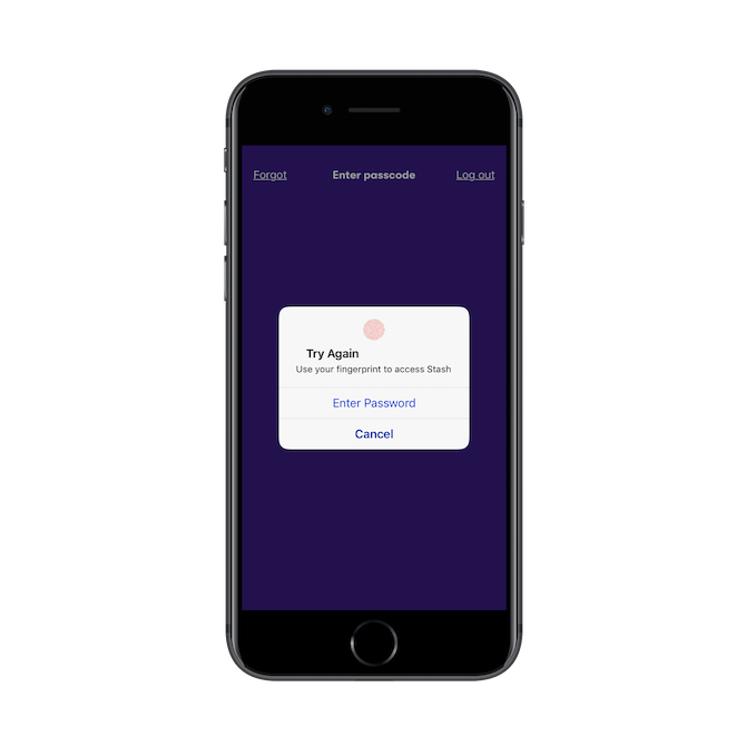
Or, another option to consider is using a secured (but still simplified) login.
Albert, for instance, locks down its app with a four-digit passcode:
Stash, on the other hand, uses fingerprint technology at login:
And then you have the Magic Link option like Slack uses:
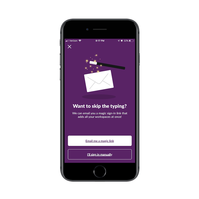
This is a good option if you have to ask users to do extra work to log in. For example, Slack's manual login has multiple pages since it has to ask users to type in their Slack workspace name along with their username and password. A MagicLink would greatly simplify all of that typing.
Be Smart About Designing Your Buttons
Whether you have to design a "Log In" button, a "Sign Up" button or one of the alternate options mentioned above, think about more than just the size, color and placement of it.
Decision fatigue is a big problem for users, which is why it's your job as a designer or developer to reduce how many choices they have to make. Or, at least, remove the distraction of choices that don't even apply to them.
Here's an example of what I'm talking about:
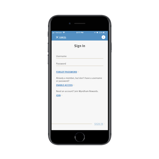
This is the login screen users can access when they're inside the Wyndham Hotels app.
First of all, there are no buttons. Just a bunch of text links that takes users to where they need to go. Worse, because they're consistently formatted, this is going to force users to actually read through each option to consider which is best for them.
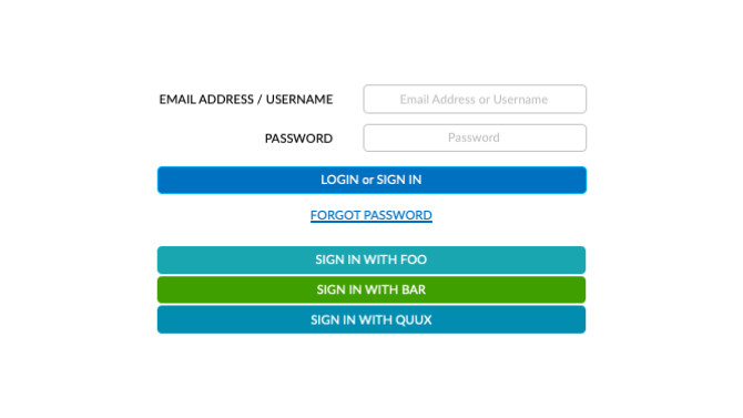
The decision should be clear and instantaneous, which is why most app login screens are designed with a more logical layout that position the most common options, from top-to-bottom:
You don't remember how to sign in? That's okay because we've included something to help you out:
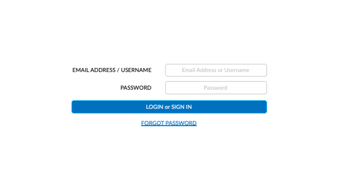
Oh, that's not it? Okay, how about you try signing in or signing up with one of these alternate options:
Another technique that works well for button/link design can be found in this example from Duolingo:
Notice how most of the interface is white, including the social login buttons. This style of ghost button design is always a good idea if you're going to include various buttons on the same page, but you primarily want users to take action on one.
In this case, the "Sign In" button is the only one with any shading to it. Even then, it won't actually fill with color until the form has been correctly filled in — which is a smart design choice if you want to prevent users from encountering an error that could easily be prevented.
Best Practices for Designing the Login Screen
As you design login screens for your apps, here are some things to think about:
- Is the design too overwhelming?
- Are the options presented overcomplicating things?
- Are there too many steps required to get into the app?
While you still want to design a login screen that's uniquely your own, you'd do best to adhere to these design practices when laying out the components on your login page.

Suzanne Scacca
A former project manager and web design agency manager, Suzanne Scacca now writes about the changing landscape of design, development and software.
Related Posts
Comments
All articles
Topics
Web MobileMobile
Desktop
Design
Productivity
People
