Back to School! 5 Ways You Can Improve Educational App Design This Year

Summarize with AI:
As the school year begins for students and educators, app designers/developers need to start thinking about how recent changes to the educational landscape will affect their work. In this post, we’ll look at how minimal design, tech-savviness, omnichannel UX, accessibility and ethics will all come into play.
It’s back-to-school time and you may find yourself getting inundated with requests to build or redesign apps for education, from pre-K to college and beyond.
With many schools still following remote or hybrid schooling models, “education” apps go beyond just digital blackboard, course hosting and homework apps. Even apps like Zoom and Google Forms have now become part of the educational experience.
When designing apps that are integral to the learning or teaching experience as a whole, there are a number of things to keep in mind. In this post, we’ll look at five of them.
5 Tips for Improving Educational Apps for Students and Teachers
This is totally going to date me, but who else remembers when teachers had tech-related issues in school? The one that really stands out to me is when the substitute teacher would roll the TV into the classroom and it would take 15 minutes and a call to tech support to get the movie up and running.
Or maybe it’s just sticking out because I recently saw this on the Nostalgia Instagram page:

Even if you don’t get this reference, I bet you’ve encountered something similar in your work as a designer or developer. For instance, I’d say that 1 out of every 10 website clients I’ve worked with couldn’t figure out how to get on a Zoom call.
There are just some people who aren’t tech-savvy, whether they’re students or teachers, and that’s something you’re going to have to account for when designing apps that cater to both types of users.
Tech-savviness isn’t the only obstacle you have to think about when designing educational apps either. Responsiveness. Ethics. Physical strain. Your users are likely going to spend hours in your apps every day, so these are all important things to factor into your work.
Here are some suggestions I have to help:
1. Minimize the UI
For those of you who work from home and online all day, you know how freaking hard it can be to stay focused on your tasks. Now imagine what that must be like for students—both in home and classroom settings.
Kappan Online has a graphic that shows the results of a study on how distractions impact students of all ages:
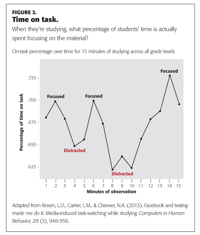
This is over the course of only 15 minutes! Notice how long it takes students to recover from those two media-induced distractions, too.
So, you really have to be mindful of how distracting your educational app may be.
Distractions may come from things like retargeting banner ads and excessive in-app alerts. Boredom in and of itself can lead students to get distracted, too. And the worst part about that is they’re not going to look within the app for relief from that boredom. They’re going to switch over to a social media or messenger app and it can be hard to re-engage them after that.
So, how do you design for this? The minimization of distracting elements is definitely a must. But you don’t want to go overboard with minimizing the UI.
Take Grammarly, for example:
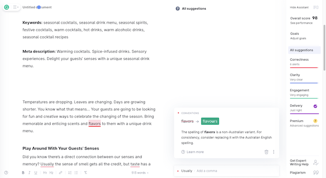
When the sidebar Assistant is hidden, this editing app has a distraction-free interface. However, when the Assistant is engaged, the writer (i.e. the student) will find themselves in a more engaging workspace. For starters, they’ll be able to see their writing score change over time, which can be helpful in terms of encouragement. The slight use of color and the inclusion of helpful suggestions as they work will also keep them focused on the task.
Every app is going to be different, though, so you’ll need to figure out where the balance lies for the one you’re designing. How do you create a minimal interface without boring your users to distraction?
2. Make It User-Friendly for Everyone Regardless of Their Tech-Savviness
One of the problems with building apps for a mixed audience is that you don’t want to simplify things to the point where it’s usable for some, but feels almost like you’re condescending to the rest.
But how do you do this? If you have apps that tech-savvy and non-tech-savvy people will be using, where’s the Goldilocks solution?
Here’s what I suggest:
Design the interface the way you would for a tech-savvy user. Then, go through and add helpers where they’re needed.
Let’s use Google Classroom as an example:
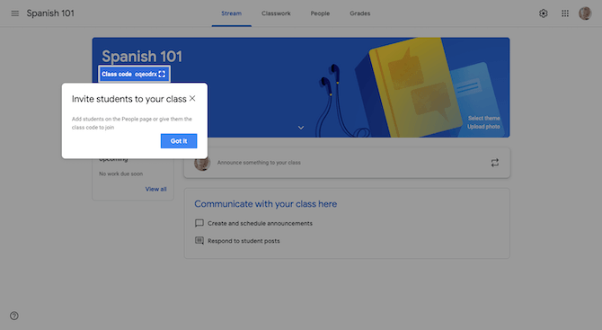
If a teacher doesn’t know what a QR code is or how it works, this tooltip will show them exactly where to go. Everyone else can just dismiss the notice.
Another way to make your app more helpful for non-tech-savvy users is to include instructions or suggestions like this:
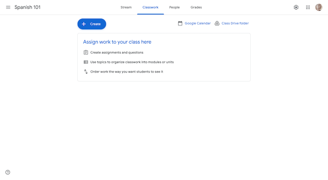
Once the teacher creates their first Assignment—using the big blue “+ Create” button, which is impossible to miss and a standard feature in all Google apps—this notice will go away. And, again, for those who don’t need the extra help, they can just ignore the notice and get to work in setting up classwork.
Tooltips and other dismissible suggestions are a good place to start. Here are some other things you can do:
- Make the layout predictable so you don’t add frustration on top of frustration.
- Always include text labels in your menu and for your action buttons.
- Keep complicated gestures out of the app experience.
Oh, and one more idea: Look at apps that everyone uses, like Facebook, Gmail and Netflix. Don’t be afraid to adapt the common features you find there. It’ll help reduce the learning curve for all your users.
3. Create Omnichannel Experiences
Omnichannel design is important regardless of what you build. That said, I’d argue it’s even more important when you’re developing educational web and mobile apps because you never know which devices students and educators will use or how many different devices they end up using.
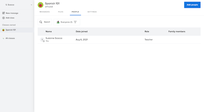
So, one thing you must do is make sure the interface is consistent regardless of where they use your app. The Remind web and mobile apps do a fantastic job of this.
Here’s what the navigation (and main dashboard) looks like in the web app:
And here’s what it looks like in Remind’s mobile app:
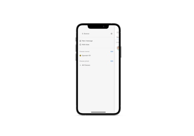
With a mobile-first menu design, users of this app will have an easy time switching from web to mobile, as well as laptop/desktop to smartphone/tablet.
Of course, not every feature can be built out the same way for every device. So it’s also important to build features based on the devices the users are on.
For instance, this is what a teacher has to go through in order to create a message in the Remind web app:
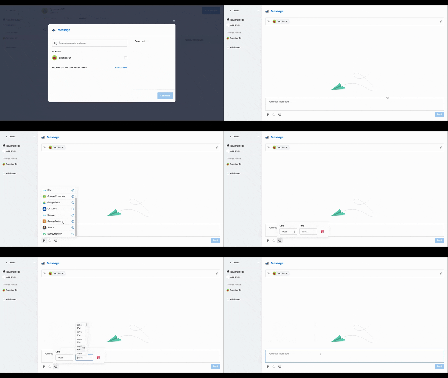
Creating a message and sending it to a specific group or mailing list is pretty standard functionality. But pay attention to the extras at the bottom of the Message interface.
Users can add attachments and import them from integrations with platforms like Box, OneDrive and Google Drive. They can also schedule a future date and time for their message to go out.
Now watch how those features look inside the Remind mobile app:
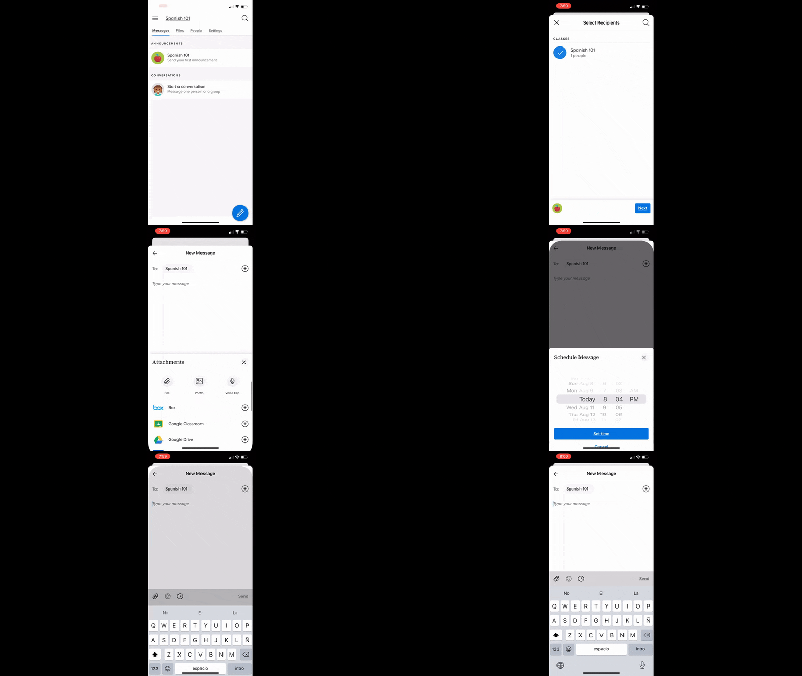
Most of the clicking takes place within the thumb zone, unlike on desktop where it takes place in different areas of the screen. The mobile app also leverages telephony features like the bottom scroller.
It’s obviously a delicate balancing act. In order to reduce the learning curve and increase your users’ confidence, a consistent experience is a must. Just keep in mind that what’s intuitive and usable on a desktop device might not be so on mobile.
4. Make Accessibility a Priority
When teachers and students don’t have the option for in-person education, they’re going to be dependent on apps to get the job done. That said, those who have access to in-person or hybrid education will probably still rely heavily on apps. Because, let’s face it, they can make education much easier and more convenient.
Take something like flashcards.
Back when I was in school, our parents had to buy pre-made packs of flashcards or a stack of notecards so we could create our own. The same was true for our teachers.
These days, though, there are apps like Chegg Prep that simplify the whole thing—and for free:
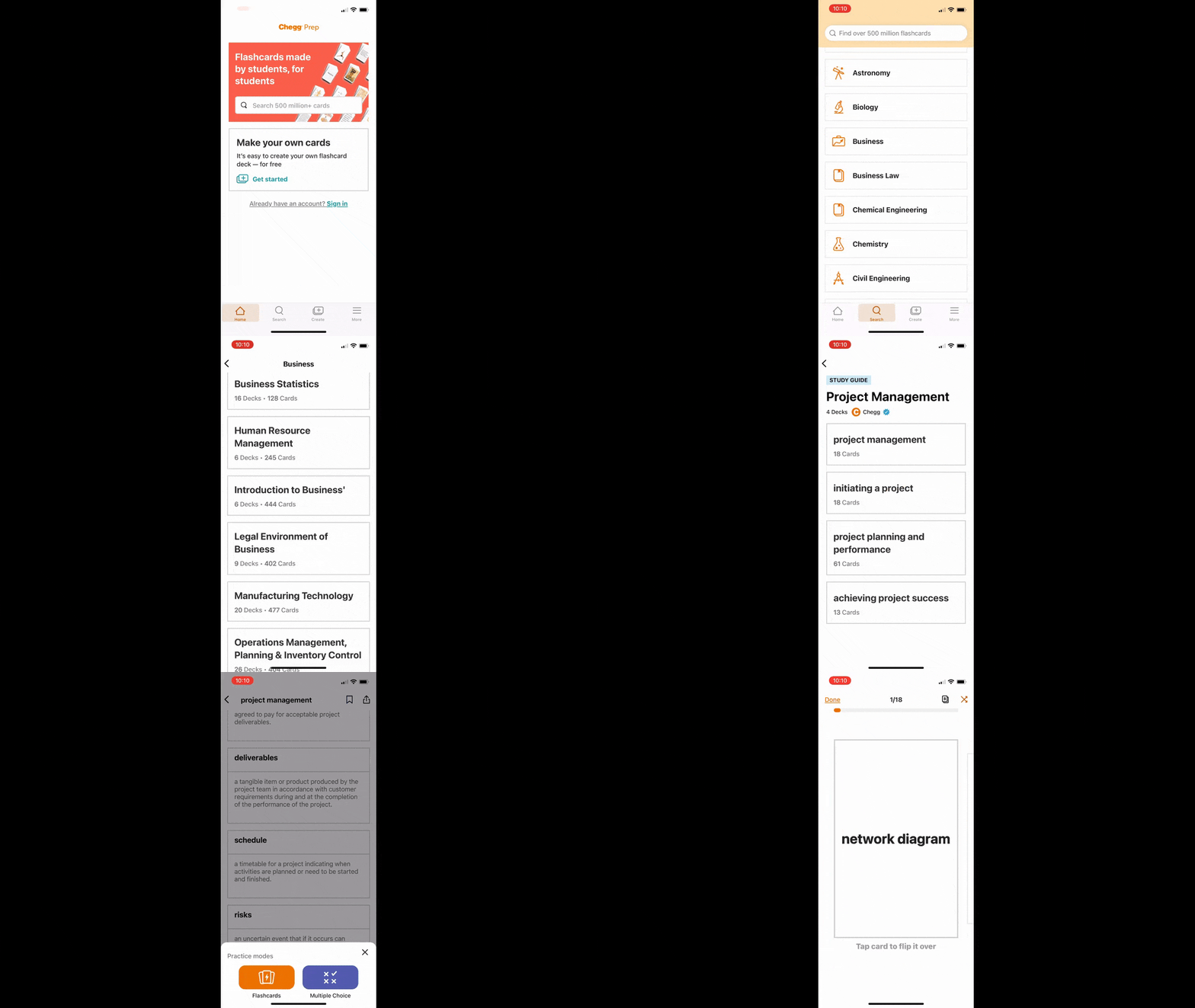
But it’s not just the convenience and lack of cost that makes educational apps like this one so popular. It’s the way they’re designed.
The interface is attractive and well-organized. It also prioritizes accessibility in terms of:
- Font types, styles and sizes
- Color contrast
- Button size
- Navigation labels
- Thumb zone placement
Chegg’s web app is just as accessible:
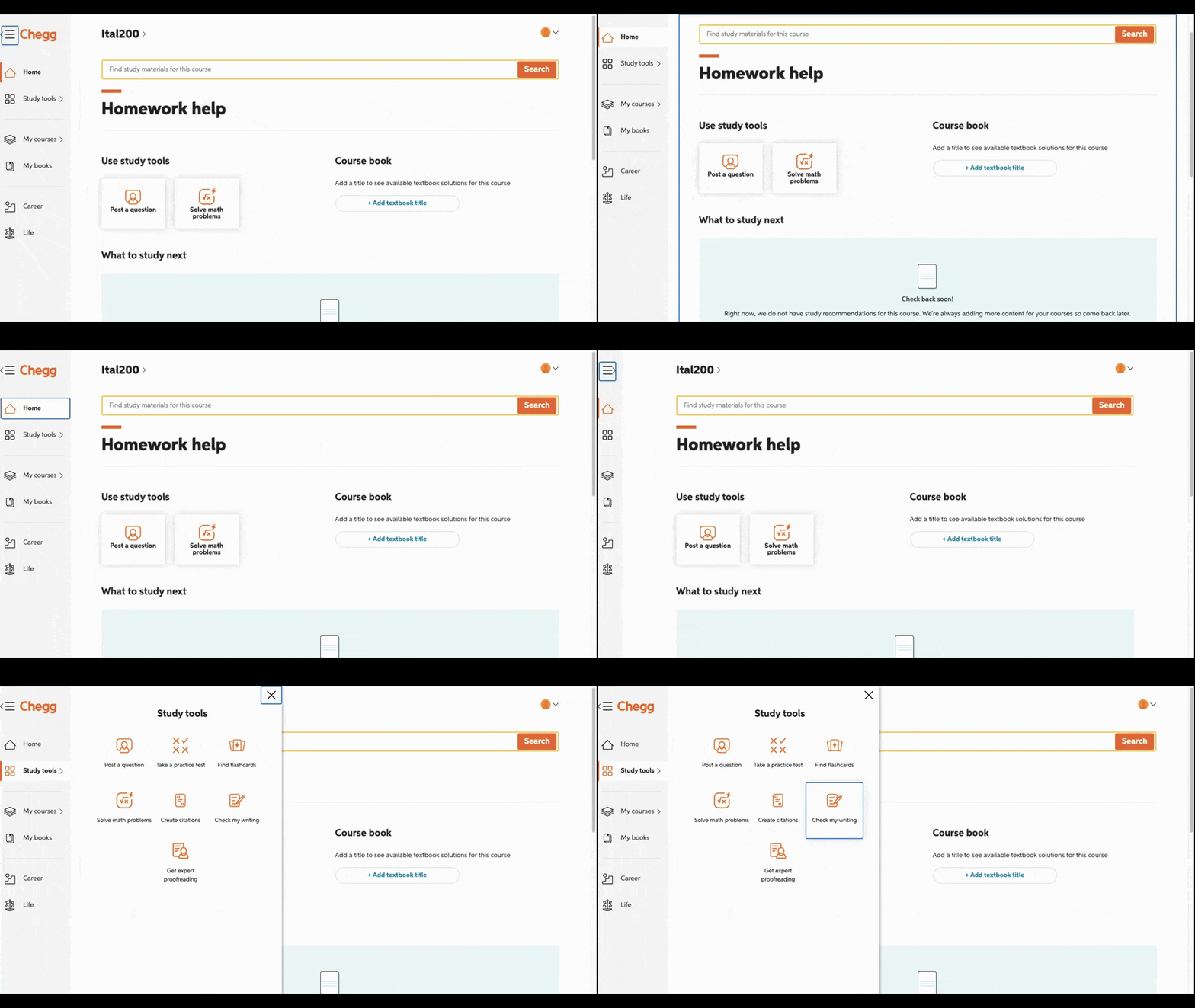
All of the things that make the mobile app accessible are present here. Also notice how easy it is for users to use their keyboard to tab through the app’s navigation and features.
If they want to jump right to the main content, they can do that. Or they can tab their way through the various features and tools included in the app. They can also minimize the navigation bar if it gets in their way.
Educational apps should be equally accessible for all. But accessibility comes in different forms—not just the features I noted above. Make sure you reference the WAI guidelines when designing any web or mobile app for education.
5. Make Ethical Design Part of It
Last but not least, let’s talk about ethics in educational design.
There are a number of ways in which an educational app can cause harm to its users. Here are some of the commonly documented issues associated with increased usage of the internet (and mobile apps):
- Eye strain
- Migraines
- Dexterity and other physical issues
- FOMO, anxiety and overwhelm
- Sleeplessness
Here are some thoughts on how you can addresses these types of issues:
In terms of things like eye strain and migraines:
Minimal, distraction-free and accessible interfaces will help. Offering a dark mode option may help, too—especially for educators and students who work in low-light settings later in the evening.
For physical matters like impaired dexterity, tennis elbow or carpal tunnel syndrome:
It depends on what the device is. There’s not a whole lot you can do to keep mobile users from gripping their smartphones the way they’re accustomed to.
However, for desktop and laptop users, minimizing the physical distance required to complete tasks—and repetitive ones at that—can surely help. Speaking from personal experience, those repetitive movements can do serious damage to the wrist, elbow and shoulder.
As for the emotional and mental issues that can arise:
Build in features that help keep them at bay. For instance:
Do students and educators need to check into the app for every notification they receive or is once a day enough? If so, allow them to configure their notification settings accordingly.
Or how about the gamification features? Does it make sense to pit students against one another or should the gamification encourage them to work on themselves and achieve their own goals?
Some educators and students won’t have the option of saying “no” to using educational apps. So, you’re going to have to be mindful of what the potential side effects are if they’re going to use your apps for extended periods of time every day.
Wrap-up
Things like distractions, tech-savviness (or lack thereof), omnichannel UX, accessibility and ethical design are all important considerations in app design these days. Even if things change tomorrow and in-home or hybrid learning models go away, we’ve now set the bar high for what the digital learning experience should look like. So, make sure you keep these priorities at the top of your app design list for the 2021-22 school year and beyond.

Suzanne Scacca
A former project manager and web design agency manager, Suzanne Scacca now writes about the changing landscape of design, development and software.
