5 Easy Steps Towards a Fast Chart
Summarize with AI:
Do you have a chart in your application? Yes, yes you do! Our RadChartView for WPF is already famous for its outstanding performance, but when thousands of items need to be displayed, performance is of the essence. Don't hesitate to try and optimize things. Here you will read about five steps you can take to get an even faster chart.

Before we get started, if you'd like you can download our sample project right here.
A series can display its items via default-visuals or point-templates. Let's say we are using a ScatterPointSeries. In this case the default-visual is a Path element with an EllipseGeometry. The series works directly with these Path elements—measuring, positioning, virtualizing and so on.
The moment you add a PointTemplate, the series no longer uses Paths. It now uses ContentPresenters with whatever visual elements you placed in the DataTemplate. Even if you use a single element in the template, there are now two visuals instead of one, because of the additional ContentPresenter. This means that more time is spent for laying out the items and more memory is used.
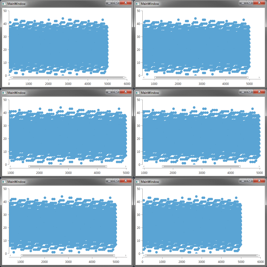
We tested a scatter chart with 5000 items and intense zooming. We made measurements on the following scenarios:
Scenario 1: Not using a PointTemplate

Scenario 2: Using a PointTemplate
Scenario 3: Using a PointTemplate with a complex brush and a tick in the middle
You are correct to think that there are 5000 visuals in the first case, 10000 in the second, and 20000 in the third. Here are our performance results:
You can see that if you are careless with the point template you can cut the performance of your chart in half. If you need only a few items to have a different appearance, you can use the DefaultVisualStyleSelector. You can even use a PointTemplateSelector where you can return null for the elements which do not require a different presentation.
Every series has a RenderOptions property that allows for some customization of the visual output.
We now get 75 frames per second for the same project.
Wait a minute—did we just get better rates for the Bitmap than the Direct2D? Well, yes, the bitmap only supports aliased rendering and this is why it's a bit faster.
In reality, the chart has a mechanism where the initial data binding is delayed up to the moment that the series has to be displayed. This means that if you are declaring it in XAML the series will avoid redundant rebinding automagically. Still, setting the ItemsSource last is a useful habit to acquire.
Well, there you go. What are you waiting for?
Start optimizing your charts in RadChartView for WPF today!

Before we get started, if you'd like you can download our sample project right here.
1. Avoid Point Templates
Use default visual styles insteadA series can display its items via default-visuals or point-templates. Let's say we are using a ScatterPointSeries. In this case the default-visual is a Path element with an EllipseGeometry. The series works directly with these Path elements—measuring, positioning, virtualizing and so on.
The moment you add a PointTemplate, the series no longer uses Paths. It now uses ContentPresenters with whatever visual elements you placed in the DataTemplate. Even if you use a single element in the template, there are now two visuals instead of one, because of the additional ContentPresenter. This means that more time is spent for laying out the items and more memory is used.
We tested a scatter chart with 5000 items and intense zooming. We made measurements on the following scenarios:
Scenario 1: Not using a PointTemplate

Scenario 2: Using a PointTemplate
<telerik:ScatterPointSeries.PointTemplate> <DataTemplate> <Ellipse Width="11" Height="11"> <Ellipse.Fill> <SolidColorBrush Color="#FF5AA4D4" PresentationOptions:Freeze="True" />Scenario 3: Using a PointTemplate with a complex brush and a tick in the middle
<telerik:ScatterPointSeries.PointTemplate> <DataTemplate> <Grid Width="11" Height="11"> <Ellipse> <Ellipse.Fill> <RadialGradientBrush GradientOrigin="0.75,0.25" PresentationOptions:Freeze="True"> <GradientStop Color="Yellow" Offset="0.0" /> <GradientStop Color="Orange" Offset="0.5" /> <GradientStop Color="Red" Offset="1.0" /> </RadialGradientBrush> </Ellipse.Fill> </Ellipse> <Rectangle Width="1" Fill="Black" />You are correct to think that there are 5000 visuals in the first case, 10000 in the second, and 20000 in the third. Here are our performance results:
| Scenario 1 | 50 frames per second |
| Scenario 2 | 35 frames per second |
| Scenario 3 | 25 frames per second |
You can see that if you are careless with the point template you can cut the performance of your chart in half. If you need only a few items to have a different appearance, you can use the DefaultVisualStyleSelector. You can even use a PointTemplateSelector where you can return null for the elements which do not require a different presentation.
2. Take Advantage of the Render Options
Every series has a RenderOptions property that allows for some customization of the visual output.2.1 Use a Batch Render Mode for the Default Visuals
A series can either plot its default-visuals with separate elements or plot them altogether at once. When you choose a batch render mode, the series draws all points in a way that eliminates some steps and calculations, resulting in a speedy chart.<telerik:ScatterPointSeries> <telerik:ScatterPointSeries.RenderOptions> <telerik:XamlRenderOptions DefaultVisualsRenderMode="Batch" />2.2 Use Direct2D or Bitmap
The RadChartView supports three different render options: XAML, Bitmap, and Direct2D. When dealing with the default XAML rendering the chart uses Path visuals, whereas the Bitmap and Direct2D use a drawing mechanism. Because there are no visuals when using a lighter rendering, everything happens faster. Although the light rendering has some limitations, it will undoubtedly get you better performance, so don't hesitate to try it out. Here are our results:| Bitmap Render Options | 112 frames per second |
| Direct2D Render Options | 75 frames per second |
Wait a minute—did we just get better rates for the Bitmap than the Direct2D? Well, yes, the bitmap only supports aliased rendering and this is why it's a bit faster.
2.3 Freeze the Brush
If you are using a more complex brush for the items, you may get better performance if you freeze it.3. Set the ItemsSource last
Once bound, the series is rebound every time you change the ItemsSource or any of the data point bindings (CategoryBinding, ValueBinding and so on). Make sure you set these bindings prior to setting the ItemsSource, so that you avoid unnecessary rebinding.series.ItemsSource = data;series.XValueBinding = ...;series.YValueBinding = ...;series.ItemsSource = data;4. Disable the Automation Peers
Automation peers may be helpful for accessibility, but we have found that touch devices may not handle automation peers that well. Use the AutomationMode property to disable the peers and see if there's a performance boost.AutomationManager.AutomationMode = AutomationMode.Disabled;5. Consider Using Sampling
If all the above options didn't get you the performance you were looking for, you may be trying to show all the data in the world—and all at once? Well, consider sampling the actual items source via the ChartDataSource. This will decrease the number of data points and respectively decrease the number of visuals. It will also make that chart a bit more readable.<telerik:ChartDataSource SamplingThreshold="1000" ItemsSource="{Binding Data}" />Well, there you go. What are you waiting for?
Start optimizing your charts in RadChartView for WPF today!
.NET, Chart, Performance, WPF

About the Author
Petar Marchev
Petar Marchev is a developer in the Telerik XAML Team. Petar has a passion for desktop and mobile application development, code optimizations and multithreaded programming. He is an audiophile and enjoys music from his full range speakers and tube amp.
Related Posts
Comments
Comments are disabled in preview mode.
