Prevent crowded grid lines in the Chart
Environment
| Product | Chart for Blazor |
Description
I have a Chart that has to visualize a big volume of data. This makes the grid lines clustered and the Chart hard to read and follow.
Solution
You can choose which grid lines to show (every n-th Step) and to Skip the first m through parameters on the respective grid line tag. Read more to see how to get to those tags and use the parameters.
The general approach to customize a Chart is to apply settings using nested tags. In the case of the grid lines the parent tag is
- for categorical charts: x-axis
<ChartCategoryAxis>and y-axis<ChartValueAxis>. - for numerical charts: x-axis
<ChartXAxis>and y-axis<ChartYAxis>.
You can control the MajorGridLines for both axes from their respective nested tags - <ChartCategoryAxisMajorGridLines /> (the vertical grid lines) and <ChartValueAxisMajorGridLines /> (the horizontal grid lines).
You can apply the following settings:
Step- skip the rendering of everyn-thline.Visible- toggle whether the grid lines are visible.Skip- skip the rendering of the firstnlines, wherenis thedoublenumber passed to the parameter.- You can also control other visual settings of the lines like their
Color,WidthandDashType.
You can do the same for the MinorGridLines too.
For a Date Axis Chart, you can set the BaseUnit parameter of the <ChartCategoryAxis> tag according to the data of your application to further control the granularity of the grid lines - this is what the number of categories and, thus, grid lines, depends on.
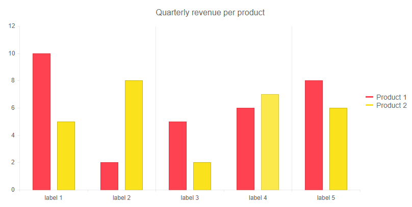
Declutter the grid lines of a Categorical Chart
@* This example shows how to render every second grid line for the category axis and disable the lines for the value axis *@

<TelerikChart>
    <ChartSeriesItems>
        <ChartSeries Type="ChartSeriesType.Column" Name="Product 1" Data="@series1Data">
        </ChartSeries>
        <ChartSeries Type="ChartSeriesType.Column" Name="Product 2" Data="@series2Data">
        </ChartSeries>
    </ChartSeriesItems>

    <ChartCategoryAxes>
        <ChartCategoryAxis Categories="@xAxisItems">
            <ChartCategoryAxisMajorGridLines Step="2" />
        </ChartCategoryAxis>
    </ChartCategoryAxes>

    <ChartValueAxes>
        <ChartValueAxis>
            <ChartValueAxisMajorGridLines Visible="false" />
        </ChartValueAxis>
    </ChartValueAxes>

    <ChartTitle Text="Quarterly revenue per product"></ChartTitle>

    <ChartLegend Position="ChartLegendPosition.Right">
    </ChartLegend>
</TelerikChart>

@code {
    public List<object> series1Data = new List<object>() { 10, 2, 5, 6, 8 };
    public List<object> series2Data = new List<object>() { 5, 8, 2, 7, 6 };
    public string[] xAxisItems = new string[5];

    protected override void OnInitialized()
    {
        for (int i = 0; i < 5; i++)
        {
            xAxisItems[i] = $"label {i + 1}";
        }
    }
}
The result from the code snippet above
Notes
You can also see the Knowledge base article regarding overlapping labels to further improve the layout of the Chart.