New to Telerik UI for Blazor? Start a free 30-day trial
Steps Labels
Updated on Jul 15, 2026
The Stepper component allows you to set labels for the corresponding step indicators. You can define the desired labels through the Label parameter the StepperStep exposes. If you don't set value to the Label parameter, no label will be rendered for the step indicator.
Stepper component with indicators and labels. The result from the snippet below.
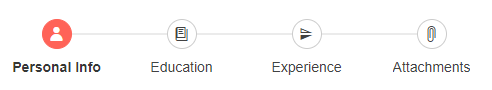
@* Stepper with icon indicators and labels *@

<div style="width:500px">
    <TelerikStepper>
        <StepperSteps>
            <StepperStep Label="Personal Info" Icon="@SvgIcon.User"></StepperStep>
            <StepperStep Label="Education" Icon="@SvgIcon.Book"></StepperStep>
            <StepperStep Label="Experience" Icon="@SvgIcon.FlipVertical"></StepperStep>
            <StepperStep Label="Attachments" Icon="@SvgIcon.Paperclip"></StepperStep>
        </StepperSteps>
    </TelerikStepper>
</div>
Stepper component with indicators and only a couple labels defined. The result from the snippet below.
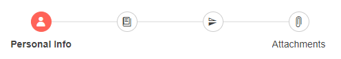
@* Stepper with icon indicators and only a couple labels *@

<div style="width:500px">
    <TelerikStepper>
        <StepperSteps>
            <StepperStep Label="Personal Info" Icon="@SvgIcon.User"></StepperStep>
            <StepperStep Icon="@SvgIcon.Book"></StepperStep>
            <StepperStep Icon="@SvgIcon.FlipVertical"></StepperStep>
            <StepperStep Label="Attachments" Icon="@SvgIcon.Paperclip"></StepperStep>
        </StepperSteps>
    </TelerikStepper>
</div>
Stepper component with only indicators and no labels. The result from the snippet below.

@* Stepper with only indicators and no labels *@

<div style="width:500px">
    <TelerikStepper>
        <StepperSteps>
            <StepperStep Icon="@SvgIcon.User"></StepperStep>
            <StepperStep Icon="@SvgIcon.Book"></StepperStep>
            <StepperStep Icon="@SvgIcon.FlipVertical"></StepperStep>
            <StepperStep Icon="@SvgIcon.Paperclip"></StepperStep>
        </StepperSteps>
    </TelerikStepper>
</div>