New to Telerik UI for Blazor? Start a free 30-day trial
Display Modes
Updated on Jun 24, 2026
This article explains the Display modes that the Stepper for Blazor provides.
You can configure the desired display mode through the StepType parameter of the Stepper. It takes a member of the StepperStepType enum:
Steps
The default Display mode of the Stepper is Steps. If labels are defined, with this setup the Stepper will render both indicators and labels.
Display mode: Steps, customize the Stepper to render indicators and labels.The result from the snippet.
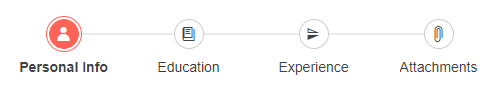
@* Stepper with both labels and indicators. *@

<div style="width:500px">
    <TelerikStepper StepType="StepperStepType.Steps">
        <StepperSteps>
            <StepperStep Label="Personal Info" Icon="@SvgIcon.User"></StepperStep>
            <StepperStep Label="Education" Icon="@SvgIcon.Book"></StepperStep>
            <StepperStep Label="Experience" Icon="@SvgIcon.FlipVertical"></StepperStep>
            <StepperStep Label="Attachments" Icon="@SvgIcon.Paperclip"></StepperStep>
        </StepperSteps>
    </TelerikStepper>
</div>
Labels
If you want to display only labels for the steps, set the StepType parameter of the Stepper to Labels.
Display mode: Labels, customize the Stepper to render only labels. The result from the snippet.
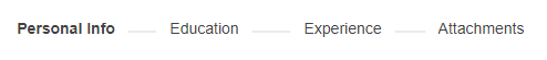
@* Stepper with only labels. *@

<div style="width:500px">
    <TelerikStepper StepType="StepperStepType.Labels">
        <StepperSteps>
            <StepperStep Label="Personal Info" Icon="@SvgIcon.User"></StepperStep>
            <StepperStep Label="Education" Icon="@SvgIcon.Book"></StepperStep>
            <StepperStep Label="Experience" Icon="@SvgIcon.FlipVertical"></StepperStep>
            <StepperStep Label="Attachments" Icon="@SvgIcon.Paperclip"></StepperStep>
        </StepperSteps>
    </TelerikStepper>
</div>