Items
You can control the items in the GridLayout with the parameters they expose:
Row
The Row parameter controls in which row the GridLayoutItem will reside. The row indexes in the component are 1-based. If no rows are defined, the items will be displayed in r = i / c rows, where:
-
ris the number of rows; -
iis the number of items; -
cis the number of columns;
Distribute the GridLayout items across the rows. The result from the code snippet below.
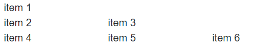
@* Distribute the GridLayout items across the rows in a custom manner. *@

<TelerikGridLayout>
    <GridLayoutRows>
        <GridLayoutRow></GridLayoutRow>
        <GridLayoutRow></GridLayoutRow>
        <GridLayoutRow></GridLayoutRow>
    </GridLayoutRows>
    <GridLayoutItems>
        <GridLayoutItem Row="1">
            <div>
                item 1
            </div>
        </GridLayoutItem>
        <GridLayoutItem Row="2">
            <div>
                item 2
            </div>
        </GridLayoutItem>
        <GridLayoutItem Row="2">
            <div>
                item 3
            </div>
        </GridLayoutItem>
        <GridLayoutItem Row="3">
            <div>
                item 4
            </div>
        </GridLayoutItem>
        <GridLayoutItem Row="3">
            <div>
                item 5
            </div>
        </GridLayoutItem>
        <GridLayoutItem Row="3">
            <div>
                item 6
            </div>
        </GridLayoutItem>
    </GridLayoutItems>
</TelerikGridLayout>
Column
The Column parameter controls in which column the GridLayoutItem will reside. The column indexes in the component are 1-based. If no columns are defined, the GridLayout items will be displayed in one column.
Distribute the GridLayout items across the columns. The result from the code snippet below.
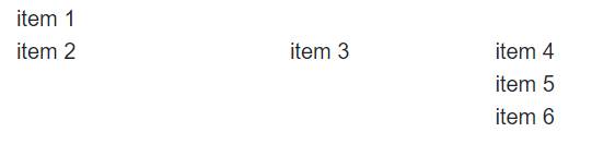
@* Distribute the GridLayout items across the columns in a custom manner. *@

<TelerikGridLayout>
    <GridLayoutColumns>
        <GridLayoutColumn Width="200px"></GridLayoutColumn>
        <GridLayoutColumn Width="150px"></GridLayoutColumn>
        <GridLayoutColumn Width="150px"></GridLayoutColumn>
    </GridLayoutColumns>
    <GridLayoutItems>
        <GridLayoutItem Column="1">
            <div>
                item 1
            </div>
        </GridLayoutItem>
        <GridLayoutItem Column="1">
            <div>
                item 2
            </div>
        </GridLayoutItem>
        <GridLayoutItem Column="2">
            <div>
                item 3
            </div>
        </GridLayoutItem>
        <GridLayoutItem Column="3">
            <div>
                item 4
            </div>
        </GridLayoutItem>
        <GridLayoutItem Column="3">
            <div>
                item 5
            </div>
        </GridLayoutItem>
        <GridLayoutItem Column="3">
            <div>
                item 6
            </div>
        </GridLayoutItem>
    </GridLayoutItems>
</TelerikGridLayout>
ColumnSpan
The ColumnSpan parameter defines the how many columns the item will occupy.
When you set the desired ColumnSpan, you should also set the Column parameter to specify the start position for the spanned item.
Change the column span of the first item with the numeric text box
@* Change the column span of the first item. *@

<TelerikNumericTextBox @bind-Value="@ColumnSpan" Max="3" Min="1" Width="200px"/>

<TelerikGridLayout>
    <GridLayoutColumns>
        <GridLayoutColumn Width="200px"></GridLayoutColumn>
        <GridLayoutColumn Width="200px"></GridLayoutColumn>
        <GridLayoutColumn Width="200px"></GridLayoutColumn>
    </GridLayoutColumns>
    <GridLayoutItems>
        <GridLayoutItem Column="1" ColumnSpan="@ColumnSpan">
            <div style="border:1px solid black">
                item 1
            </div>
        </GridLayoutItem>
        <GridLayoutItem Column="1">
            <div>
                item 2
            </div>
        </GridLayoutItem>
        <GridLayoutItem Column="2">
            <div>
                item 3
            </div>
        </GridLayoutItem>
        <GridLayoutItem Column="3">
            <div>
                item 4
            </div>
        </GridLayoutItem>
    </GridLayoutItems>
</TelerikGridLayout>

@code {
    private int? ColumnSpan { get; set; } = 1;
}
RowSpan
The RowSpan parameter defines how many rows the item will occupy.
When you set the desired RowSpan, you should also set the Row parameter to specify the start position for the spanned item.
Change the row span of the first item with the numeric text box
@* Change the row span of the first item. *@

<TelerikNumericTextBox @bind-Value="@RowSpan" Max="3" Min="1" Width="200px"/>

<TelerikGridLayout>
    <GridLayoutRows>
        <GridLayoutRow></GridLayoutRow>
        <GridLayoutRow></GridLayoutRow>
        <GridLayoutRow></GridLayoutRow>
    </GridLayoutRows>
    <GridLayoutColumns>
        <GridLayoutColumn Width="200px"></GridLayoutColumn>
        <GridLayoutColumn Width="200px"></GridLayoutColumn>
    </GridLayoutColumns>
    <GridLayoutItems>
        <GridLayoutItem Column="1" Row="1" RowSpan="@RowSpan">
            <div style="border:1px solid black; height:100%">
                item 1
            </div>
        </GridLayoutItem>
        <GridLayoutItem Column="2">
            <div>
                item 2
            </div>
        </GridLayoutItem>
        <GridLayoutItem Column="2">
            <div>
                item 3
            </div>
        </GridLayoutItem>
        <GridLayoutItem Column="2">
            <div>
                item 4
            </div>
        </GridLayoutItem>
    </GridLayoutItems>
</TelerikGridLayout>

@code {
    private int? RowSpan { get; set; } = 1;
}
Example: Complex Grid Layout
You can use the exposed parameters of the GridLayout items to create more complex layouts.
Create a page layout with the GridLayout component
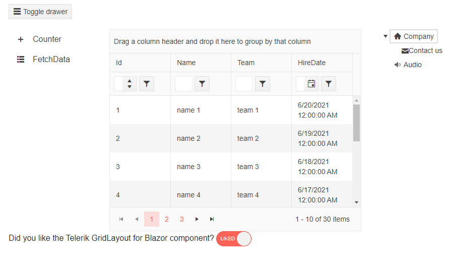
@* Create a page layout with the Telerik Components *@

<TelerikGridLayout>
    <GridLayoutColumns>
        <GridLayoutColumn Width="200px"></GridLayoutColumn>
        <GridLayoutColumn Width="500px"></GridLayoutColumn>
        <GridLayoutColumn Width="200px"></GridLayoutColumn>
    </GridLayoutColumns>
    <GridLayoutRows>
        <GridLayoutRow Height="50px"></GridLayoutRow>
        <GridLayoutRow Height="400px"></GridLayoutRow>
        <GridLayoutRow Height="100px"></GridLayoutRow>
    </GridLayoutRows>
    <GridLayoutItems>
        <GridLayoutItem Column="1" Row="1" ColumnSpan="3">
            <span>
                <TelerikButton OnClick="@(() => DrawerRef.ToggleAsync())" Icon="@("menu")">Toggle drawer</TelerikButton>
            </span>
        </GridLayoutItem>
        <GridLayoutItem Column="1" Row="2">

            <div style="width: 200px">
                <TelerikDrawer Data="@DrawerData"
                               MiniMode="true"
                               Mode="DrawerMode.Push"
                               @ref="@DrawerRef"
                               IconField="@nameof(DrawerItem.Icon)"
                               @bind-SelectedItem="@SelectedItem">
                </TelerikDrawer>
            </div>

        </GridLayoutItem>
        <GridLayoutItem Column="2" Row="2">

            <TelerikGrid Data="@GridData"
                         AutoGenerateColumns="true"
                         Height="100%"
                         Width="100%"
                         Pageable="true"
                         Sortable="true"
                         Groupable="true"
                         FilterMode="Telerik.Blazor.GridFilterMode.FilterRow"
                         Resizable="true"
                         Reorderable="true">
            </TelerikGrid>

        </GridLayoutItem>
        <GridLayoutItem Column="3" Row="2">
            <TelerikTreeView Data="@TreeViewData">
                <TreeViewBindings>
                    <TreeViewBinding IconField="@nameof(TreeViewModel.Icon)" />
                </TreeViewBindings>
            </TelerikTreeView>
        </GridLayoutItem>
        <GridLayoutItem Column="1" ColumnSpan="3">
            <TelerikSwitch @bind-Value="@likedLayout" Width="70px" Id="layout-liked" OnLabel="Liked" OffLabel="Not"></TelerikSwitch>
            <label for="layout-liked">Liked!</label>
        </GridLayoutItem>
    </GridLayoutItems>
</TelerikGridLayout>

@code {
    public bool likedLayout { get; set; } = true;

    public List<TreeViewModel> TreeViewData { get; set; }

    protected override void OnInitialized()
    {
        GenerateData();
    }

    public void GenerateData()
    {
        TreeViewData = new List<TreeViewModel>();

        TreeViewData.Add(new TreeViewModel()
            {
                Id = 1,
                Text = "Company",
                ParentId = null,
                HasChildren = true,
                Icon = SvgIcon.Home
            });

        TreeViewData.Add(new TreeViewModel()
            {
                Id = 2,
                Text = "Contact us",
                ParentId = 1,
                HasChildren = false,
                Icon = SvgIcon.Envelope
            });

        TreeViewData.Add(new TreeViewModel()
            {
                Id = 3,
                Text = "Audio",
                ParentId = null,
                Icon = SvgIcon.FileAudio
            });
    }

    public class TreeViewModel
    {
        public int Id { get; set; }
        public string Text { get; set; }
        public bool HasChildren { get; set; }
        public int? ParentId { get; set; }
        public ISvgIcon Icon { get; set; }
    }

    public IEnumerable<SampleData> GridData = Enumerable.Range(1, 30).Select(x => new SampleData
        {
            Id = x,
            Name = "name " + x,
            Team = "team " + x % 5,
            HireDate = DateTime.Now.AddDays(-x).Date
        });

    public class SampleData
    {
        public int Id { get; set; }
        public string Name { get; set; }
        public string Team { get; set; }
        public DateTime HireDate { get; set; }
    }

    TelerikDrawer<DrawerItem> DrawerRef { get; set; }
    DrawerItem SelectedItem { get; set; }
    IEnumerable<DrawerItem> DrawerData { get; set; } =
        new List<DrawerItem>
                {
            new DrawerItem { Text = "Counter", Icon = SvgIcon.Plus },
            new DrawerItem { Text = "FetchData", Icon = SvgIcon.GridLayout },
                    };

    public class DrawerItem
    {
        public string Text { get; set; }
        public ISvgIcon Icon { get; set; }
    }
}