Blazor ChunkProgressBar Overview
The Blazor ChunkProgressBar component tracks the execution of operations and displays what portion of it is completed in predefined number of sections (chunks). For very long tasks, you can also make it indeterminate while waiting for an update.
 Start Free Trial
Creating Blazor ChunkProgressBar
-
Add the
<TelerikChunkProgressBar>tag. -
Set its
ValueandMaxparameters to denote the completed progress. Read more about the relationship between them in the Chunk Count, Value and MaxValue section.
@*Basic configuration of the ChunkProgressBar*@

<TelerikChunkProgressBar Value="@ChunkProgressBarValue" Max="@MaxValue" />

@code {
    public double MaxValue { get; set; } = 5;
    public double ChunkProgressBarValue { get; set; } = 3;
}
Chunk Count, Value and MaxValue
This section explains the connection between the ChunkCount, Value, and MaxValue parameters. In the Matching Values and the Non-matching Values sub-sections you can see how the ChunkProgressBar will render its chunks in these scenarios.
Matching Values
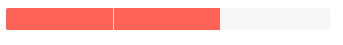
When the Max and ChunkCount parameters match in value, the Value parameter represents the number of chunks that are highlighted.
<TelerikChunkProgressBar Value="2"
                         Max="3"
                         ChunkCount="3">
</TelerikChunkProgressBar>
The result from the code snippet above
Non-matching Values
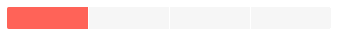
Each chunk (section) represents an equal part of the maximum value (Max/ChunkCount). So, when the Max and ChunkCount parameters do not match in value, the Value parameter highlights the number of chunks that is less than or equal (<=) to the full fractions that it represents.
In the example below each chunk is "worth" 10 / 4 = 2.5. The Value is 3 so the full chunks this covers is 3 / 2.5 = 1.2, so 1 chunk will be highlighted. If the Value is set to 4, one chunk will remain highlighted, a second chunk will be highlighted when the Value becomes 5.
<TelerikChunkProgressBar Value="3"
                         Max="10"
                         ChunkCount="4">
</TelerikChunkProgressBar>
The result of the code snippet above
ChunkProgressBar Parameters
| Parameter | Type and Default Value | Description |
|---|---|---|
Class | string | Renders a custom CSS class to the <div class="k-progressbar"> element. |
Max | double ( 100) | The maximum value of the ChunkProgressBar. It must be greater than 0. |
Value | double | The value of the ChunkProgressBar. This value indicates the progress of the tracked process and is distributed in the chunks (sections) of the ChunkProgressBar. It is a fraction of the Max. Read mode in the Chunk Count, Value and MaxValue section. |
ChunkCount | unsigned int ( 5) | The number of chunks the ChunkProgressBar will be separated into. |
Orientation | ProgressBarOrientation ( Horizontal) | Controls the orientation of the Chunk Progress Bar. |
Indeterminate | bool ( true) | Controls if the Chunk Progress Bar is in indeterminate state. Read the Indeterminate article for more information. |
Examples
Responsive ProgressBar
The progress bar will resize with the parent element dimensions when you set its width to 100%
<div style="width: 50%; border: 1px solid red;">

    <style>
        .width-100 {
            width: 100%;
        }
    </style>

    <TelerikChunkProgressBar Class="width-100" Value="44" />
</div>