Card Layouts
When working with a collection of Cards, you can control the collection layout by wrapping all the Card instances in a container and apply the desired styles to position them.
The Telerik Themes provide the following layouts through built-in classes:
In addition, any layout can be created with suitable CSS code. For example - a Tile layout of Cards that wrap to multiple rows.
Cards in Deck Layout
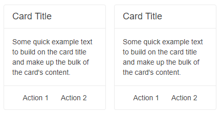
Add the k-card-deck class to the wrapping container of the Cards to organize them in a Deck Layout. All Cards will display in a single row with some empty space between them. All Cards will expand vertically to have the same height as the highest card in the deck.
Cards in Deck Layout. The result from the snippet below.
@*Cards with Deck Layout*@

<div class="k-card-deck">

    <TelerikCard Width="200px">
        <CardHeader>
            <CardTitle>Card Title</CardTitle>
        </CardHeader>
        <CardBody>
            <p>Some quick example text to build on the card title and make up the bulk of the card content.</p>
        </CardBody>
        <CardSeparator></CardSeparator>
        <CardActions Layout="CardActionsLayout.Center">
            <TelerikButton Class="k-flat">Action 1</TelerikButton>
            <TelerikButton Class="k-flat">Action 2</TelerikButton>
        </CardActions>
    </TelerikCard>

</div>
Cards in List Layout
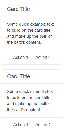
Add the k-card-list class to the wrapping container of the Cards to organize them in a List Layout. All Cards will display in a single column.
Cards in List Layout. The result from the snippet below.
@*Cards with List Layout*@

<div class="k-card-list">

    <TelerikCard Width="200px">
        <CardHeader>
            <CardTitle>Card Title</CardTitle>
        </CardHeader>
        <CardBody>
            <p>Some quick example text to build on the card title and make up the bulk of the card content.</p>
        </CardBody>
        <CardSeparator></CardSeparator>
        <CardActions Layout="CardActionsLayout.Center">
            <TelerikButton Class="k-flat">Action 1</TelerikButton>
            <TelerikButton Class="k-flat">Action 2</TelerikButton>
        </CardActions>
    </TelerikCard>

</div>
Cards in Group Layout
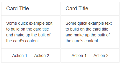
Add the k-card-group class to the wrapping container of the Cards to organize them in a Group Layout. All Cards will display in a single row with no space between them. All Cards will expand vertically to have the same height as the highest card in the group.
Cards in Group Layout. The result from the snippet below.
@*Cards with Group Layout*@

<div class="k-card-group">

    <TelerikCard Width="200px">
        <CardHeader>
            <CardTitle>Card Title</CardTitle>
        </CardHeader>
        <CardBody>
            <p>Some quick example text to build on the card title and make up the bulk of the card content.</p>
        </CardBody>
        <CardSeparator></CardSeparator>
        <CardActions Layout="CardActionsLayout.Center">
            <TelerikButton Class="k-flat">Action 1</TelerikButton>
            <TelerikButton Class="k-flat">Action 2</TelerikButton>
        </CardActions>
    </TelerikCard>

</div>