The more images you take, the more difficult it is to find exactly the one you're looking for. The Telerik UI for Xamarin Calendar control features flexible styling, support for appointments, and full data-binding support. A developer can easily bind a Calendar to a list of images, expose the dates that the images were tagged, and display them by day, week, month, or year.
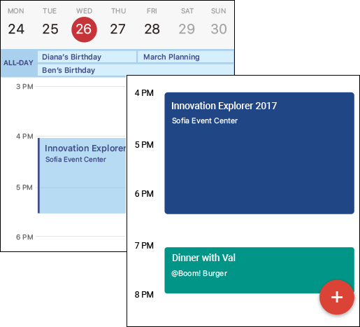
Information contained in a calendar is often presented differently than other types of data. Not only are items on the calendar associated with a specific time frame, they are frequently color-coded and formatted based on other attributes. To simplify managing lists or collections of calendar items, Telerik UI for Xamarin defines a unique IAppointment interface that can easily be implemented in your own models:
public interface IAppointment
{
DateTime StartDate { get; set; }
DateTime EndDate { get; set; }
string Title { get; set; }
Color Color { get; set; }
bool IsAllDay { get; set; }
string Detail { get; set; }
}
By creating a model that implements the IAppointment interface and passing the relevant image information into the class constructor, we can populate a Calendar control with information about a collection of images:
this.Timeline.Add(new ImageCreationEvent(
image.CreatedDate,
image.CreatedDate.AddMinutes(1),
image.Caption,
Color.FromHex(image.AccentColor)));
This is the basis for allowing Tagit to display images by date.
In Part 2, we built a navigation system using the Telerik for Xamarin UI SideDrawer control. One of the items in the SideDrawer menu is a "Timeline" command that navigates to the Timeline page. To provide users with the ability to view images based on the dates they were tagged, we declare a Calendar control in that page and bind it to the view-model's Timeline property, which contains a collection of IAppointments representing photos:
<telerikInput:RadCalendar
AppointmentsSource="{Binding Timeline}"
SelectedDate="{Binding SelectedDate, Mode=TwoWay}" />
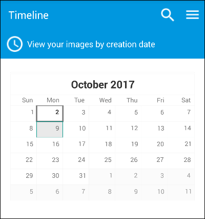
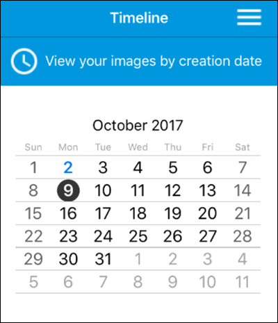
As a mobile developer, one of your toughest challenges is ensuring that your user interface looks consistent across platforms, and that it conforms to the standards and expectations of the host operating system. For example, on an iOS device, calendars render slightly differently, and they use circles rather than rectangles to denote selected dates. All Telerik UI for Xamarin controls emit native controls under the hood, and the Calendar control is no exception.
The lack of screen real estate on a mobile device means that space for displaying lists of calendar items for the date that is currently selected is limited. This provides a great opportunity for us to connect a ListView control to the Calendar control and use it to list all the photos that were uploaded and tagged on a specific date.
The Calendar control fires an assortment of useful events, including AppointmentTapped, DisplayDateChanged, SelectedDateChanged. Displaying a list of images tagged on a specific date is as simple as filtering a collection of images each time the user taps a date, and binding the filtered list to a ListView control. In code-behind, Tagit implements an event handler that gets called each time the user selects a date on the calendar:
private void UpdateTimelineEvents(DateTime? value)
{
this.SelectedImages.Clear();
foreach (var image in this.TaggedImages)
{
if (image.CreatedDate.CompareTo(value.Value) >= 0 && image.CreatedDate.CompareTo(value.Value.AddDays(1)) < 0)
{
this.SelectedImages.Add(image);
}
}
}
The event handler initializes the view-model's SelectedImages property with a filtered list of images, and because the ListView is bound to that property, a list of images tagged on the selected date appears underneath the calendar. As a helpful visual clue, the colored bar to the left of each ListView item is initialized with the accent color of the image — the accent color that was returned by the Computer Vision API.
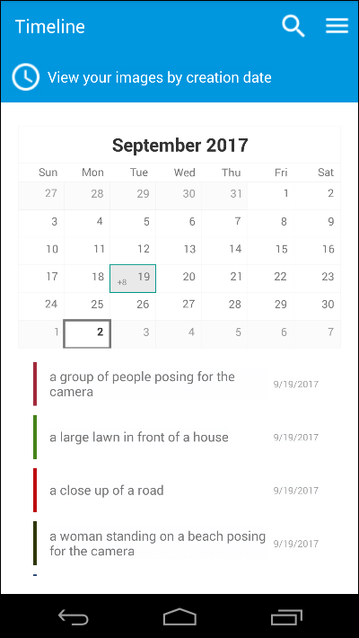
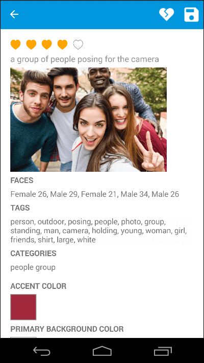
Tapping an item in the ListView goes to the image-details page for that image, enabling users to quickly and easily view the image and the metadata associated with it.
Tagit's user experience is almost complete. In Part 6, we'll finish up by using the Radial Gauge, TabView, and Pie Chart controls to add data visualizations to the app, enabling users to quickly and easily view a breakdown of images by tags or categories.
Featuring the ListView and BusyIndicator controls and the Computer Vision API.