Before we can create a compelling search experience, we need to answer a few questions:
Q: What information is available to help users find what they're looking for?
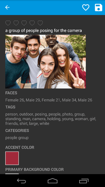
A: Thanks to the Computer Vision API, each image is accompanied by metadata that includes:
All of these can form the basis for a rich search experience. Want to find all images containing a cat? Our search algorithm can simply scan all tagged images for ones accompanied by the keyword "cat" and present them to the user in the search results.
Q: How do users expect to find content?
A: Search experiences come in a variety of flavors, but allowing a user to type a term such as "cat" or "river" into an input field and tap a Search button to initiate a search is both simple and universally understood.
Q: Are there ways to help users find what they're looking for?
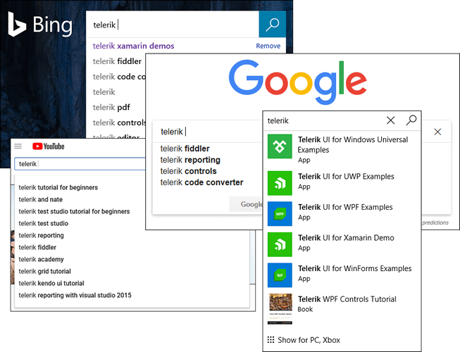
A: Absolutely. In fact, providing a drop-down completion list or autosuggest list as the user types is a common and straightforward way to make search terms discoverable, as well as to minimize the amount of typing required. The latter is especially important on phones and other devices that lack a physical keyboard.
Now let's apply the principles outlined here to Tagit.
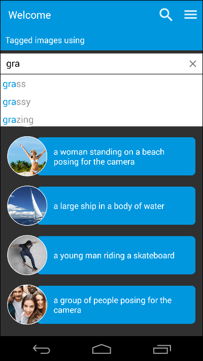
Telerik's AutoComplete control makes short work of implementing autosuggest in a search field. All we need to do is declare a control instance, populate the view-model's AllTags property with a list of all the tags present in the image collection, bind the control's ItemsSource property to the view-model's AllTags property, and wire up a handler for the SuggestionItemSelected event fired by the control when a suggestion is selected. Here's how it looks in XAML:
The event handler navigates to the search-results page and displays a list of images tagged with the search term. Couldn't be much simpler!
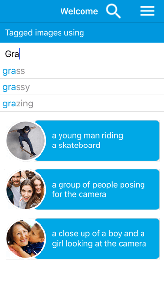
Here's the same search experience on iOS:
And it gets even better. Setting DisplayMode to "Token" on the AutoComplete control enables multiple-selection, which could be used to allow users to search for images containing a combination of tags:
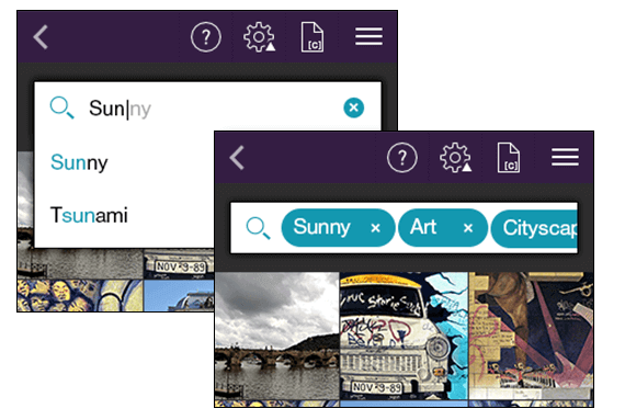
Tagit users can now use search to retrieve images based on the content of those images. They can also designate images as favorites. Shouldn't they be able to show all the favorited images and unfavorite them, too? Let's make it happen.
The previous post spotlighted the ListView control and used it in a couple of different capacities. But it didn't touch on one of ListView's coolest features: support for item swiping, also known as cell swiping. Set the control's IsItemSwipeEnabled property to true and a series of events culminating in an ItemSwipeCompleted event fires when an item in the control is swiped left or right. Furthermore, you can use the control's ItemSwipeContentTemplate property to specify content to be revealed alongside the item when a swipe occurs. That content can include interactive elements such as buttons.
This is the approach Tagit uses to allow images that have been tagged as favorites to be "unfavorited." The Favorites page uses a ListView control to show all the images that have been designated as favorites. The control has item swipe enabled and an ItemSwipeContentTemplate that looks like this:
Swiping an item to the right reveals an Unfavorite button (note the Button control with the Image overlay in the template) that, when tapped, unfavorites an image and removes it from the list:
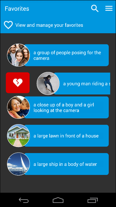
You can designate an image as a favorite immediately after it's uploaded, or on the page that shows the image details. But thanks to item swipe, unfavoriting an image is a lot sexier (and a lot more fun).
Designating an image as a favorite or a not-favorite is very binary; it's either-or. Let's finish up by using Telerik's Rating control to allow images to be rated on a scale of 1 to 5.
Have you ever tried to create your own rating control? It's not impossible, but it is a lot of work if you want to do it right. The Telerik Rating control saves you all this work. It features four built-in shapes — stars, circles, diamonds, and hearts — and if that's not enough, you can use shapes of your own.
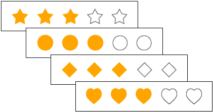
Incorporating a Rating control in an app can be as simple as this:
ItemShape can be set to any of the built-in shapes, or it can be initialized with a template that incorporates whatever content you want. Tagit uses both stars and hearts:
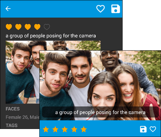
Featuring the ListView and BusyIndicator controls and the Computer Vision API.