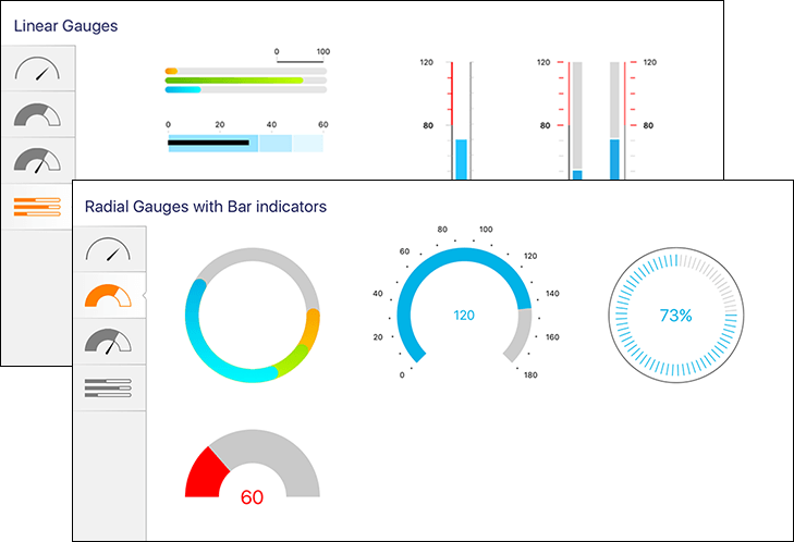
By now, you're familiar with the Telerik Tagit app, and know that it uses Microsoft's Computer Vision API to tag images with captions, keywords describing objects in the images, accent colors, and categories. Suppose you've tagged hundreds or even thousands of images, and you'd like to be able to view a breakdown of images by category or by the individual tags assigned to them. The Radial Gauge control makes it easy to create stunning visualizations depicting such information.

A single line of code is sufficient to generate a list of categories from the tagged images as well as a count of the images tagged with each category:
var categoryAnalysis = allCategories.GroupBy(n => n,
(key, values) => new { Category = key, Count = values.Count() }).OrderByDescending(o => o.Count);
Displaying the data in a Radial Gauge is then a simple matter of declaring a control instance and binding to the relevant property of the view-model:
<telerikGauges:RadRadialGauge
BindingContext="{Binding CurrentCategoryAnalysis}"
AxisRadiusFactor="0.9"
StartAngle="90"
SweepAngle="360" />
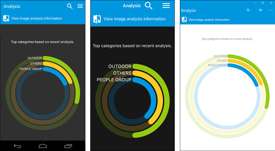
Control over specific visual elements of a Radial Gauge is achieved through axis and indicator properties. In Tagit's Analysis view, the Radial Gauge uses GaugeLinearAxis elements to specify control attributes:
<telerikGauges:GaugeLinearAxis
Minimum="0"
Maximum="1"
StrokeThickness="0"
ShowLabels="False" />
In addition to styling its axis, Radial Gauge permits you to style the text that it displays using GaugeTextIndicator elements like this one:
<telerikGauges:GaugeTextIndicator
Text="{Binding Tag1Label}"
TextColor="{Binding Tag1Label, Converter={StaticResource GaugeLabelForegroundColorConverter}}"
HorizontalTextPlacement="Left"
VerticalTextPlacement="Center"
TextMargin="4"
Position="Start"
Offset="15" />
The result is a great-looking visual representation of the top image categories assigned to your photos, with a clean, consistent look on all platforms:

The Radial Gauge control is versatile enough to be used in a variety of scenarios, and is useful any time you want to display data visualizations in an app. But it's not the only way to present rich analytical information to the user. There is also the Chart control.
Radial Gauge makes quick work of displaying limited quantities of information, but could get cluttered with more values. With the Chart control, you can show trends with line charts, area charts, and spline-area charts, show data comparisons with bar charts, and even depict proportions with pie charts. The latter is perfect for enhancing Tagit with the ability to summarize the tags assigned to the photos in your collection.
Adding a Pie Chart control to the Analysis view is no more difficult than adding any other Telerik UI for Xamarin control. In this example, the PaletteName and SelectionPaletteName properties are used to select a light color theme:
<telerikChart:RadPieChart
PaletteName="Light"
SelectionPaletteName="LightSelected">
Pie charts are built out using one or more series. To add a series to our Pie Chart control, we define a PieSeries and bind its ItemsSource property to the TagBreakdown property of the view-model:
<telerikChart:RadPieChart.Series>
<telerikChart:PieSeries LegendTitleBinding="Label" ItemsSource="{Binding TagBreakdown}" ShowLabels="False">
<telerikChart:PieSeries.LabelBinding>
<telerikChart:PropertyNameDataPointBinding PropertyName="Label"/>
</telerikChart:PieSeries.LabelBinding>
<telerikChart:PieSeries.ValueBinding>
<telerikChart:PropertyNameDataPointBinding PropertyName="Value"/>
</telerikChart:PieSeries.ValueBinding>
</telerikChart:PieSeries>
</telerikChart:RadPieChart.Series>
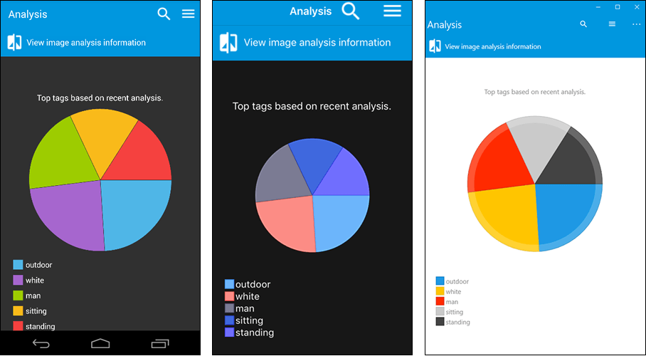
Telerik UI for Xamarin charts are extremely flexible. We could easily label segments of the pie chart using the tags obtained from the images by setting ShowLabels to true. Instead, Tagit uses a Legend element to display tags in a legend underneath the pie chart:
<telerikChart:RadLegend LegendProvider="{x:Reference Name=pieChart}"/>
The result is a great-looking pie chart showing the most common tags assigned to your images.

Rather than present different views of the data in separate pages, let's use the TabView control to host them in a single page. Tabbed views have long been a mainstay of mobile app UIs, so it's no surprise that Telerik UI for Xamarin offers its own version that works cross-platform.
A TabView can have any number of tabs. Declaring a tabbed view that features a Radial Gauge in one tab and a Pie Chart in another is a simple matter of declaring each in a TabbedViewItem:
<telerikPrimitives:RadTabView>
<telerikPrimitives:RadTabView.Items>
<telerikPrimitives:TabViewItem>
<Grid><!--insert Radial Gauge control--></Grid>
</telerikPrimitives:TabViewItem>
<telerikPrimitives:TabViewItem>
<Grid><!--insert Pie Chart control--></Grid>
</telerikPrimitives:TabViewItem>
</telerikPrimitives:RadTabView.Items>
</telerikPrimitives:RadTabView>
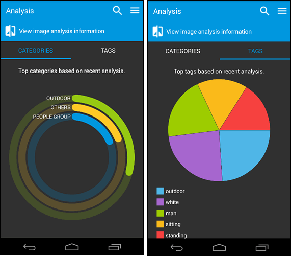
The result is a single page in which users can easily switch between a Radial Gauge showing image categories and a Pie Chart depicting image tags:

Tagit is now complete. By leveraging the Xamarin platform, sprinkling in some Telerik UI for Xamarin magic, and adding a dash of Microsoft Cognitive Services, we created a rich cross-platform mobile app that uses artificial intelligence to tag photos and Telerik controls to make those photos accessible. Feel free to modify to Tagit to include additional features of your own, and to take advantage of more of the very best features that Telerik UI for Xamarin has to offer.
Featuring the ListView and BusyIndicator controls and the Computer Vision API.