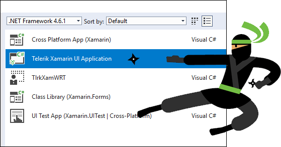
In this article and the ones that follow, we will build the Tagit app described in the previous article. Assuming you want to build it yourself, begin by starting Visual Studio 2017 and creating a new Telerik Xamarin UI Application project:

Selecting Telerik Xamarin UI Application as the project type ensures that all the required Telerik assemblies are added automatically. Once the project is created, adding a "Getting Started" component is as simple as adding a page, adding a reference to the appropriate Telerik namespace, dropping in a SlideView control, and connecting it to the view-model:
<telerikPrimitives:RadSlideView Margin="0,-80,0,0" Grid.Row="1" SelectedIndicatorColor="{DynamicResource AppAccentColor}"
IndicatorColor="{DynamicResource AppTextColor}"
IsAnimated="True" ShowButtons="False"
VerticalOptions="FillAndExpand" HorizontalOptions="FillAndExpand"
BindingContext="{Binding}" SlideButtonsColor="{DynamicResource AppAccentColor}"
IsInfiniteScrollingEnabled="True" ItemsSource="{Binding}">
<telerikPrimitives:RadSlideView.ItemTemplate>
<DataTemplate>
<Grid HorizontalOptions="Center" VerticalOptions="Center">
<StackLayout WidthRequest="300" HorizontalOptions="Center" VerticalOptions="Center">
<Label HorizontalTextAlignment="Center" Text="{Binding Title}" Style="{DynamicResource TitleStyle}" />
<Image HorizontalOptions="Center" Source="{Binding Image}"/>
<Label Margin="10,0" HorizontalTextAlignment="Center" Text="{Binding Subtitle}" Style="{DynamicResource SubtitleStyle}" />
<Image IsVisible="{Binding IsFinalItem}" HorizontalOptions="End" Grid.Row="1" Margin="0,40,0,0" Source="ic_start_all_dark.png">
<Image.GestureRecognizers>
<TapGestureRecognizer Tapped="OnGetStartedTapped" />
</Image.GestureRecognizers>
</Image>
</StackLayout>
</Grid>
</DataTemplate>
</telerikPrimitives:RadSlideView.ItemTemplate>
</telerikPrimitives:RadSlideView>
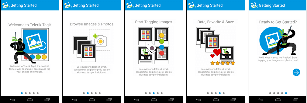
The result is a helpful "Getting Started" experience consisting of five pages. Even if the user has no prior experience with this app, he or she should be able to quickly figure out what Tagit is all about:

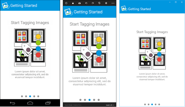
Because SlideView works cross-platform, the startup experience is consistent across iOS, Android, and Windows. There's a lot of magic that takes place under the hood to achieve this consistency, but those are details you don't have to sweat because Telerik UI for Xamarin sweats them for you.

Implementing a "Getting Started" experience is key to creating a great first impression and a first step in crafting a better user experience overall. Now that that's accomplished, we need to ensure that it's equally easy for users to access the features presented in Getting Started.
In the world of cross-platform mobile apps, navigation can be a challenge because different platforms favor different navigation paradigms. Android standardizes on the vertical-dot menu in the upper-right corner, but iOS devices tend to place menus at the bottom. Even though Xamarin helps, managing navigation across a range of devices can be overly unwieldy and complex.
Telerik UI for Xamarin offers a handy solution in the form of the SideDrawer control. Patterned after the "hamburger" menu featured in many Web sites and mobile apps, SideDrawer provides a simple and straightforward way for users to navigate your app. But SideDrawer takes the hamburger menu to new levels. For example, it lets you specify its position on the page (top, bottom, left, or right), and it features several built-in effects and transitions. SideDrawer is an excellent tool for creating a clear and consistent navigation experience. That's why it is featured prominently in Tagit.
Adding a SideDrawer control to Tagit requires little more than declaring the control in a page and wiring it up to the view-model. Here is a version, simplified for clarity, of the XAML that creates an instance of SideDrawer in Tagit:
<telerikPrimitives:RadSideDrawer DrawerTransitionDuration="0.2" DrawerLocation="Top" DrawerTransitionType="SlideInOnTop" x:Name="drawer" DrawerLength="300">
<telerikPrimitives:RadSideDrawer.DrawerContent>
<StackLayout>
<Button Text="Home"/>
<Button Text="Gallery"/>
<Button Text="Timeline"/>
<Button Text="Analysis"/>
<Button Text="Favorites"/>
<Button Text="Settings"/>
</StackLayout>
</telerikPrimitives:RadSideDrawer.DrawerContent>
<telerikPrimitives:RadSideDrawer.MainContent>
<local:UploadView/>
</telerikPrimitives:RadSideDrawer.MainContent>
</telerikPrimitives:RadSideDrawer>
SideDrawer exposes two properties that we initialize using XAML's property-element syntax: DrawerContent and MainContent. The former defines a menu or "drawer" of navigational items, which for Tagit is a series of buttons linking to the various pages in the app. MainContent declares the content shown on the page. Rather than define DrawerContent items statically as shown above, Tagit fetches them from an ObservableCollection in the view-model. Among other things, this allows items in the menu to be localized based on the user's language-preference settings.
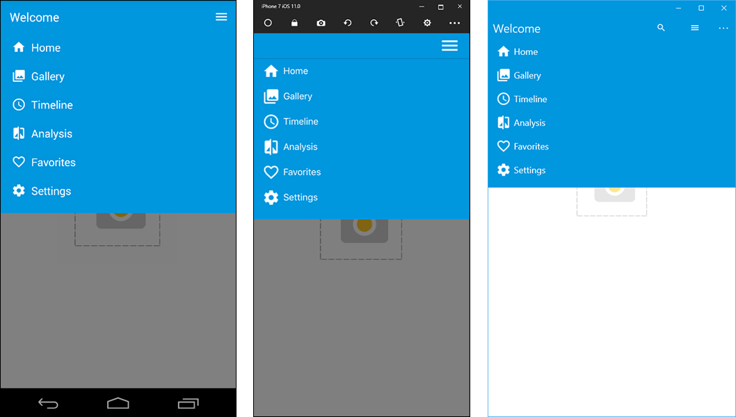
Tagit locates the menu at the top of the page by setting SideDrawer's DrawerLocation property to Top, and configures the menu to slide down by setting DrawerTransitionType to SlideInOnTop. Here's how it looks on all three platforms when the menu is pulled down:

Using just two controls from Telerik UI for Xamarin, we have implemented a helpful startup experience and provided a framework for navigating between pages. More importantly, we've eliminated a key reason users cite for uninstalling apps after running them for the first time. That's the perfect segue into Part 3, in which we will add to Tagit the ability for users to tag and caption images by placing calls to Microsoft's Computer Vision API.
Featuring the ListView and BusyIndicator controls and the Computer Vision API.