First Steps with ThemeBuilder
In this ThemeBuilder tutorial, you will learn the basics and then explore advanced features. By using ThemeBuilder, you can style the Telerik and Kendo UI components to match the design requirements of your project.
Most steps in this tutorial require an active free trial or a ThemeBuilder subscription.
Prerequisites
To follow the steps in this tutorial, you need a Telerik account. If you do not have a Telerik account yet, register and start your free ThemeBuilder trial in a single step.
If you do not have a ThemeBuilder subscription, you can start a free trial by following the instructions in this guide.
Creating a Telerik and Kendo UI Project
To start applying your styles and customizing your favorite themes, you must create a ThemeBuilder project. ThemeBuilder is a cloud application and it automatically saves the changes in your project as you make them. You can also share projects with colleagues and collaborate.
To create a new ThemeBuilder project:
-
Navigate to ThemeBuilder.
-
Enter the credentials for your Telerik account and log in.
-
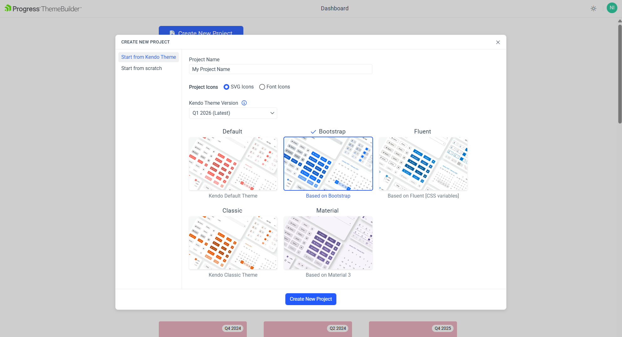
Click the Create New Project button.
-
Choose the Start from Kendo Theme tab.
-
Enter a name for your project and then choose a Theme version compatible with the version of your Telerik and Kendo UI components. By default, the latest version is selected and recommended.
-
Select the Kendo Bootstrap Theme base theme. Bootstrap is one of the five themes that you can use as a starting point for your customizations.
-
Finally, click Create New Project.
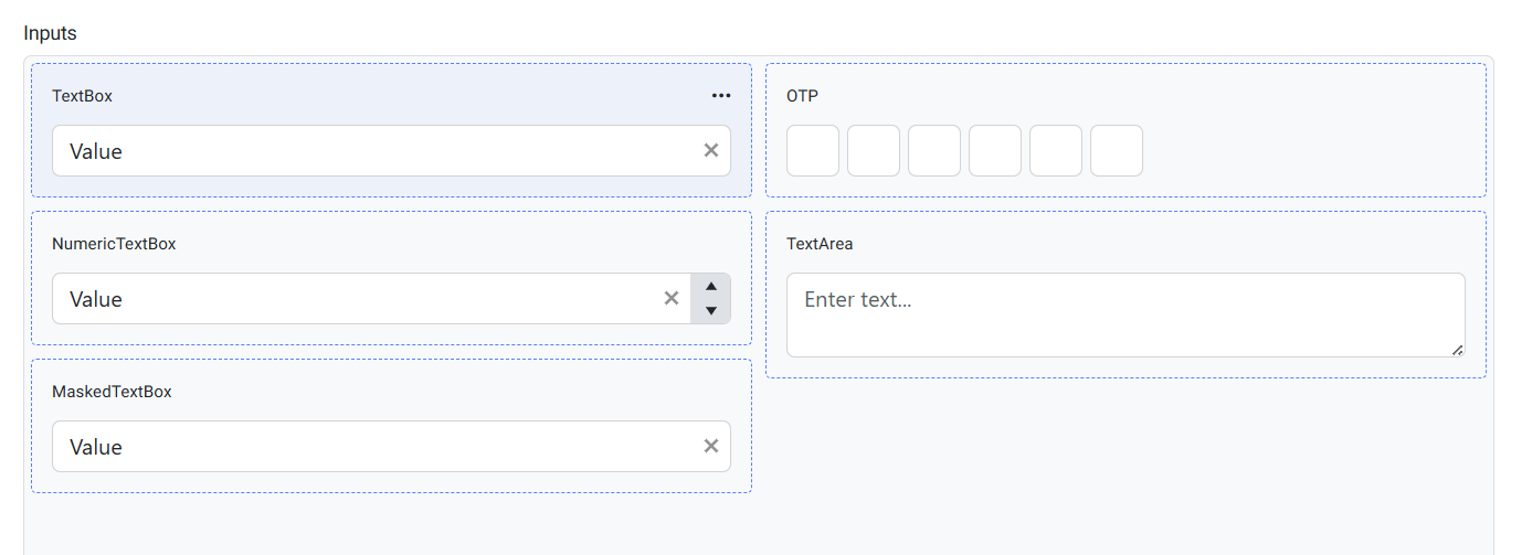
After creating the project, you will see the ThemeBuilder workspace:
-
The UI components are in the center of the screen. These are live components—any change to their styles is immediately rendered on the screen.
-
The Kendo variables are in the THEME STYLES pane on the left-hand side of the screen.
(Optional) Activating Your Free Trial
This tutorial demonstrates various features that require the ThemeBuilder subscription or a free trial license. If you already have access to the paid features, continue to the Customizing Theme Variables section.
To activate your free trial:
-
Locate and click the Start Trial banner in the toolbar or one of the star icons in your ThemeBuilder project, for example:
-
Click the banner at the top of the ThemeBuilder screen.

-
Click the star icon near Typographies and Colors on the left side of the screen.
-
-
In the new window that opens, click Start a Trial. Then accept the license agreement.
Customizing Theme Variables
A visual theme consists of multiple Sass or CSS variables, their values, and complex style inheritance relations. Customizing these variables is the first step to meeting the application requirements.
To customize the variables for this tutorial:
-
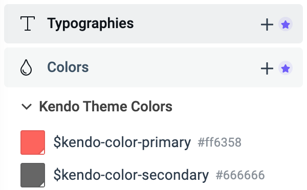
In the STYLES pane, select the
$kendo-color-primaryvariable. -
In the color editor that appears, change the primary color value to
#40C676. The primary color and all components that use it are immediately updated, and you can see their new appearance on the screen. All changes that you make in ThemeBuilder are applied to the live components almost instantly. -
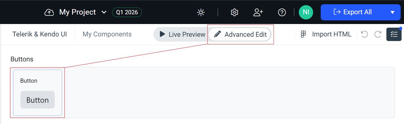
To access more customization options, switch from Live Preview to Advanced Edit.
-
To access the component-specific variables of the Button component, enable the Advanced Edit mode and then click on the Button component.
-
In the STYLES pane, use the search box to find and update the values of the following variables:
Variable New Value Description $kendo-button-text#004284Changes the text color in the Buttons $kendo-button-bg#EFF4F9Changes the background of the Buttons $kendo-button-border-width2pxChanges the border width of the Buttons
You will use the component-specific variables later in Using Advanced Customization.
Creating Custom Theme Variables
Adding new variables gives you endless possibilities to style the UI components as you like or as required by the application design.
To create the custom variables for this tutorial:
-
Navigate to the STYLES pane and click the + button next to the Color section.
-
In the ADD COLOR editor:
2.1. Enter
Custom variablesas a category name and$button-borderas a name for the new variable.2.2. Enter
#DBE3EDas the value for the new variable.2.3. Click Create.
-
Repeat the steps above to add the following new variables:
New Variable Value Description $primary-button-border#19B859The border for the Primary Button $input-border#CED4DAThe border for the Input components $label-color#004284The color for labels
The newly added variables appear in the Custom variables category.
Adding Custom Typography
Adding custom typography allows you to change various font-related styles.
-
Select the + button next to Typographies.
-
Enter
Custom typographiesas a category name and$text-typographyas a name for the new variable, then set the following properties:- Select the
Verdanafont family. - Set the font weight to
400. - Set the font size to
14px. - Set the line height to
24px.
- Select the
Using Advanced Customization
To enable the advanced mode, select the Advanced Edit button at the top of your screen. This will allow you to select a specific component, edit all its properties, and apply the custom variables that you created earlier in this tutorial.

Editing Advanced Button Properties
-
To access the properties of the Button component and see all its states, select the Button frame in Advanced Edit mode.
-
Change the typography of the secondary Button component:
2.1. Select the Button in its Normal interactive state.
Adjust the zoom level by using the
+and-keys orCtrl+ mouse wheel.2.2. In the COMPONENT PARTS pane on the right, select Button. The COMPONENT PARTS pane represents the DOM tree and informs you about the structure of the component.
2.3. In the PROPERTIES pane on the right, locate the Text property.
2.4. From the drop-down menu, select
$text-typography—the custom typography that you added in the previous part of this tutorial.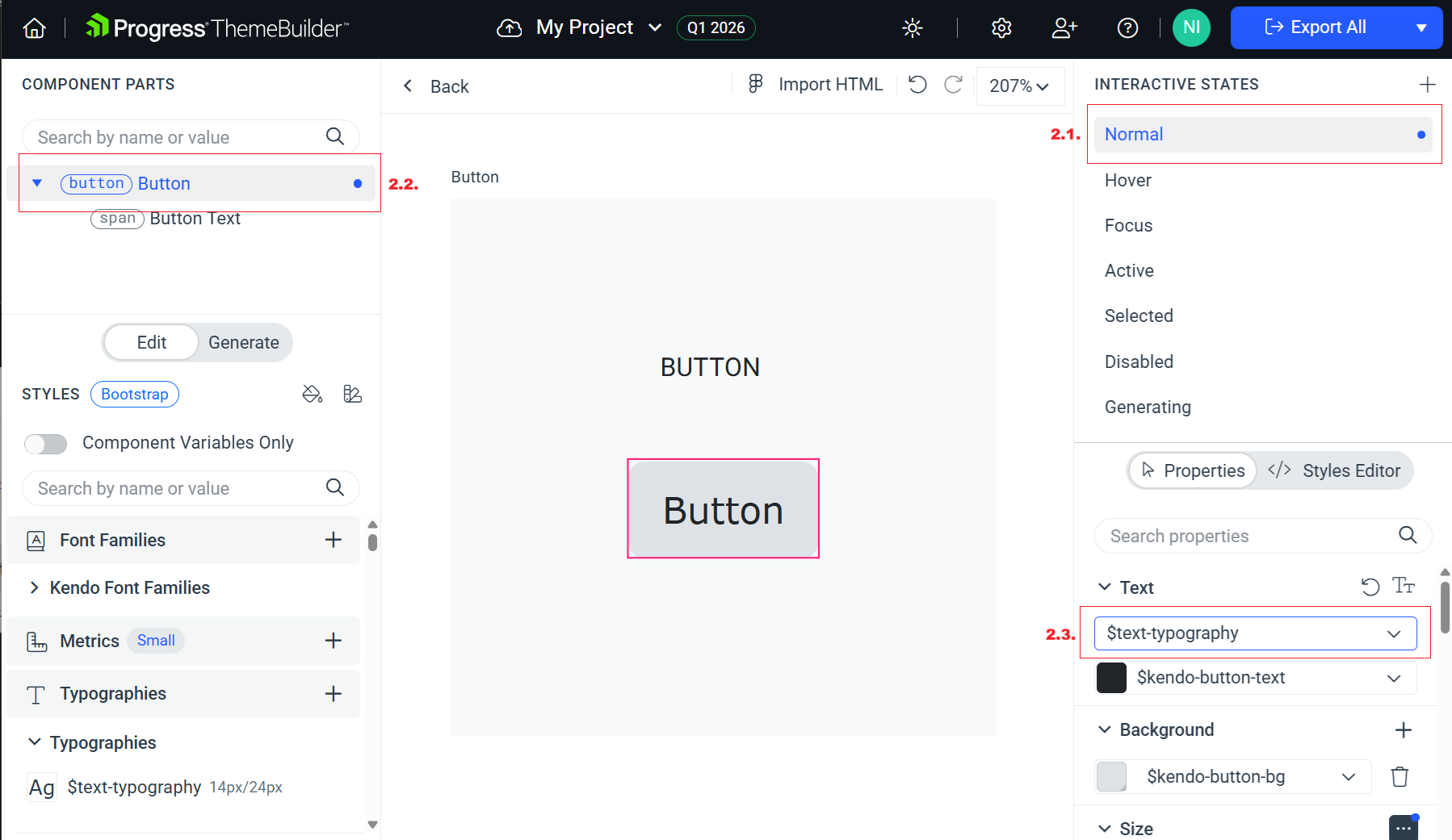
The top left component propagates its styles to all other instances of the component. That is why applying style changes from left to right and from top to bottom is the main styling strategy that you can use in ThemeBuilder. This approach saves time and allows you to style more components because it takes advantage of the built-in style inheritance.
-
Change the border of the Button component:
3.1. In the PROPERTIES pane, locate the Border property.
3.2. Enter
2pxas a value for the border width.3.3. To change the border color, select
$button-borderfrom the border color drop-down list on the right. You added this color earlier in this tutorial.
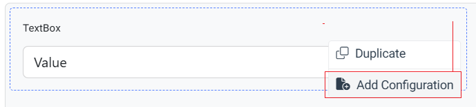
Editing Advanced TextBox Properties
Next, you will customize the style of the TextBox component. Note that the same approach applies to all Kendo and Telerik components (available from version Q1 2026).
To access the advanced properties of the TextBox component, select < Back to exit the advanced view for the Button component and see the frames with all other components. Then select the TextBox.
To style the TextBox component:
-
(Optional) Switch to Advanced Edit and open the meatball menu (three horizontal dots) in the top-right corner of the component.
-
Select Add Configuration and set the desired component property values.
- Choose the configuration properties.
- Set a descriptive name for the template.
- Click Add Configuration.
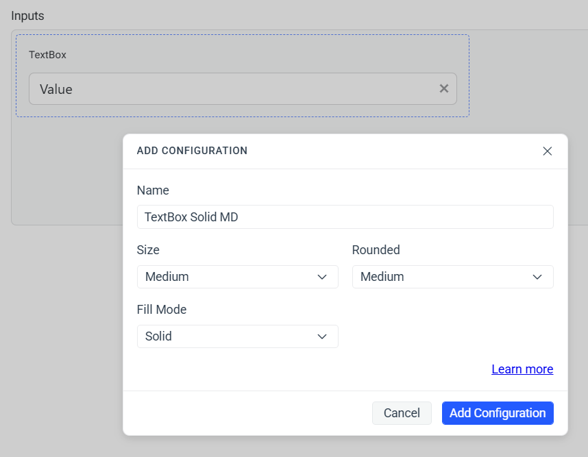
If you work with the default template, ThemeBuilder applies styles globally for the selected component (in this case the TextBox component).
-
Drill down into the selected configuration in Advanced Edit.
-
Select the root component part (span) TextBox from the COMPONENT PARTS pane to the right.
-
Select the Normal state from the INTERACTIVE STATES pane on the left.
-
In the PROPERTIES pane on the right, locate the Border property:
- Enter
2pxas a value for the border width. - To change the border color, select
$input-borderfrom the border color drop-down list on the right. You added this color earlier in this tutorial.
- Enter
Using Generative AI
To create a custom Kendo theme using generative AI, select the Generate tab at the top of your screen. This allows you to provide natural language instructions and let the AI create the theme efficiently based on your prompt.
Learn more about using AI to generate Kendo themes.
Creating Custom UI Components
Custom components in ThemeBuilder allow you to enrich your set of available UI components. They are based on pure HTML and can be styled using the out-of-the-box features and capabilities of ThemeBuilder.
To create a custom UI component for this tutorial:
-
Click the + Add Component button.
-
Enter
My Formin the Name field as a name andFormsin the Category field, and then select Add Component. -
Enable the advanced mode by clicking the Advanced Edit tab on the top of the screen.
-
Click My Form to open the component for editing.
-
Click </> Add HTML to open the HTML editor and paste the following code:
html<div class="my-form"> <input class="my-input" type="text" /> <button class="my-button">Click Me</button> </div> -
Select Save & Close from the drop-down button in the top-right corner.
-
Select the My Form frame on the screen to access the properties of the component.
-
To style your custom component, apply the same styles that you used for the Telerik and Kendo Button component and Telerik and Kendo TextBox component earlier in this tutorial.
That's it! You styled the Telerik and Kendo UI Button and TextBox components and then added a custom component by using HTML. Then, you applied the styles you used for the Telerik and Kendo UI components to your custom component.
Exporting Your Theme
When you are done styling the Telerik and Kendo UI components, you can export the theme that you created by clicking Export in the top right corner.
The exported file is a zip archive that contains:
-
An npm package—You can use it in version control so that your styles are versioned.
-
A minified compiled CSS—You can directly reference these styles in your application.
-
Sass files—You can add them to the build of your project to style the components.