Creating and Styling Kendo Projects in ThemeBuilder
Use the workflow below to go from a base Kendo theme to precise component-level styling.
Workflow at a glance:
- Select a base Kendo theme and swatch.
- Optional: Generate a starting theme with AI.
- Define reusable variables and adjust global Kendo variables.
- Create component configurations for your design templates.
- Use Advanced Edit to refine component parts and states.
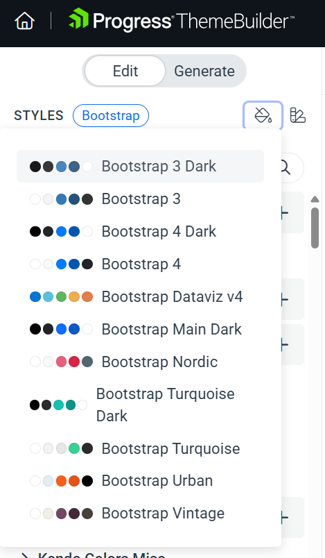
Start with a Base Theme and Swatch
When you create a new ThemeBuilder project, select the Kendo theme that matches your product. After the project is created, choose a color swatch from the STYLES pane to set a visual baseline for the theme. Swatches are predefined color variations for each Kendo theme and provide a fast way to align the overall palette with your design.
To select a swatch, use the dedicated drop-down button in the STYLES pane.
Optional: Import Styles from Figma
If your design system lives in Figma, you can import styles and variables with the ThemeBuilder plugin for Figma. The plugin exports styles, color and number variables, SVG icons, and components so you can continue the workflow directly in ThemeBuilder. See the ThemeBuilder Plugin for Figma Overview for details.
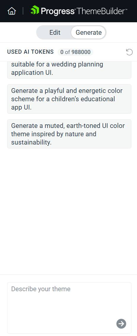
Optional: Generate a Theme with AI
If you want a fast starting point, use the Generate tab to create a custom theme from a natural-language prompt. This option is available for projects based on Kendo Theme Q2 2025 or later. For details, see Generate Custom Kendo Themes with AI.
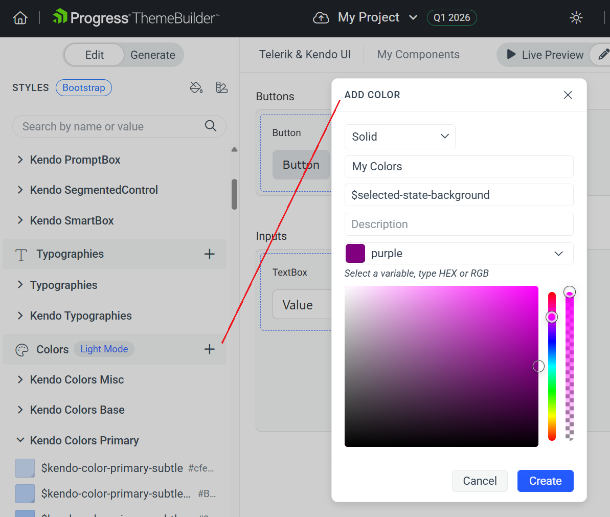
Define Reusable Variables
Use variables instead of hard-coded values to keep styling consistent and easy to change.
For example, if you need to change the background colors for all components that have a selected state, you can create a variable called selected-state-background and use this variable wherever necessary.
If the design changes later, you can update the variable once instead of revisiting every component.
Add Custom Fonts with Typography Variables
Add a custom font to the project first so it becomes available in the Font Family drop-down. You can manage fonts from the Custom Fonts flow and then use them across components. For detailed instructions, see Using Custom Fonts.
To make font updates easier to scale, create a typography variable and apply it across components.
To use a custom typeface with a variable:
- (Optional) Add a new variable in the Typographies section of THEME STYLES by using the + button.
- Select Advanced Edit.
- Select the UI component that you will style.
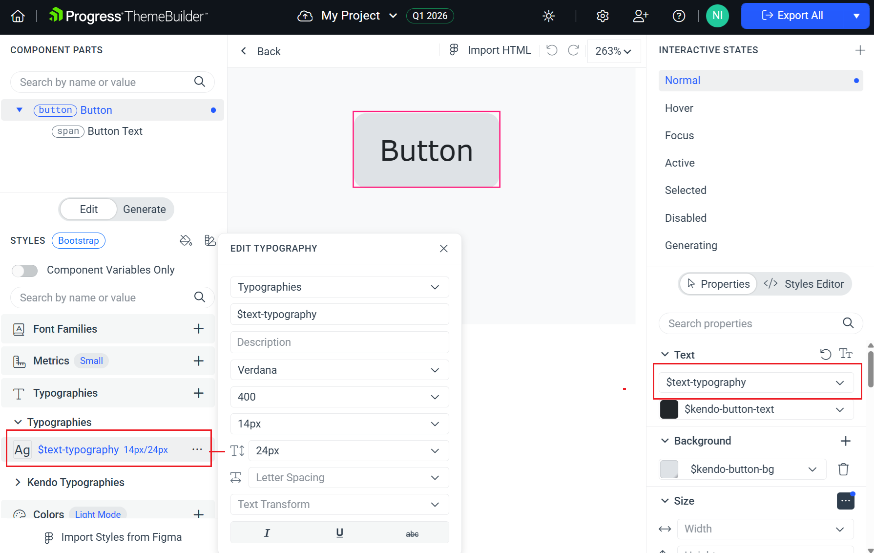
- In the COMPONENTS PARTS pane, select the part that contains text.
- In the PROPERTIES pane, go to the Text section and select your typography variable.
Modify Global Kendo Variables
When working with any Kendo theme, the STYLES pane contains predefined groups with exposed Kendo variables. These variables show the default values defined in the theme. Because all variables are editable, you can override global Kendo styles to match your design requirements.
For example, you can change the value of the $kendo-color-primary variable to update the primary color across all components.
To access Kendo variables:
- Locate the variable from a selected category in the STYLES pane and click it.
OR
- Open a component template in Advanced Edit mode.
- Toggle on the Component Variables Only switch in the STYLES pane to access more specific component variables.
Learn more about the variable structure and usage in the following articles:
- Supported Variable Types in ThemeBuilder
- Working with Variables in ThemeBuilder
- Creating Variable Modes in ThemeBuilder
- Variables in Kendo Default
- Variables in Kendo Bootstrap
- Variables in Kendo Material
- Variables in Kendo Fluent
- Variables in Kendo Classic
Create Component Configurations
By default, ThemeBuilder lists base components with their properties set to Default and the base component variation selected. Styling the default template generates styles that apply globally to all instances of that component. This is useful for broad adjustments, but it is not ideal when you need specific variants that follow your design templates.
Component configurations let you create variants based on built-in Kendo properties and features (such as size, theme color, fill mode, and rounded). When you style a configuration, ThemeBuilder generates a more specific selector that targets only that configuration.
To add a component configuration:
- In ThemeBuilder, select Advanced Edit.
- Hover over the drill-down container with the desired component and select the ... button (more options).
- Select Add Configuration.
- In the ADD CONFIGURATION popup:
- Enter a name for the new component variant, for example,
Primary Large Button. - Select the desired options from the drop-downs.
- Enter a name for the new component variant, for example,
- Select Add Configuration to add the new component variant.
The new configuration appears next to the default one. Use the ... menu and See Configuration to review the applied options.
Learn more about creating component configurations and duplicates.
Apply Advanced Customizations
After you have created the required component configurations, use Advanced Edit to modify the component styles. This mode turns the components pane into an infinite canvas where you can inspect and edit all UI components and their variants.
- Select the component configuration and drill down into the template.
- Use the COMPONENT PARTS pane to select the part you want to style.
- Use the INTERACTIVE STATES pane to select the state (or a combination of states).
- Use the PROPERTIES pane or the STYLES EDITOR to apply your changes.
Learn more about using Advanced Edit.
Use Project Versioning
ThemeBuilder enables you to create a project snapshot through the versioning feature. Keeping dedicated project versions is a good practice and allows you to revert a batch of unwanted changes by quickly loading a saved snapshot.
Learn more about creating and using project versions.