How to Create a Unique Look for the TextBox Component
In this ThemeBuilder tutorial, you will learn how to create a unique look for the Telerik and Kendo TextBox component by using ThemeBuilder's component configurations and duplicates. While the article highlights the TextBox component as an example, the same approach applies to all Kendo and Telerik components exposed in ThemeBuilder.
Understanding Component Variants
In a typical application, developers often require various variants of the TextBox component. For instance, they may need small and large text boxes to fit different layout requirements. Additionally, they might use different fill modes, such as outlined or filled, to create visual distinctions for different input purposes. Rounding options can also play a significant role in aligning the TextBox design with the overall aesthetic of the application. These variations help enhance the user experience, whether it's for forms, search bars, or comment sections.
In projects created with Kendo theme version Q1 2024 or earlier, only the most commonly used combinations of the TextBox component are available for editing on the canvas.
Starting with Kendo Theme version Q1 2026, ThemeBuilder introduced component configurations for all exposed Kendo and Telerik components. This version also expanded the TextBox component configurations to cover the full set of exposed TextBox options.
Using Component Configurations
Component configurations are available in projects based on Kendo Theme version Q1 2026 or later. For earlier versions, if the variants listed on the canvas are insufficient, refer to Duplicating Components.
To create a unique look for the TextBox using a component configuration, follow these steps:
-
Enable Advanced Edit in ThemeBuilder.
-
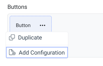
Hover over the drill-down container of the TextBox component and select the ... button (more options).
-
Select Add Configuration.
-
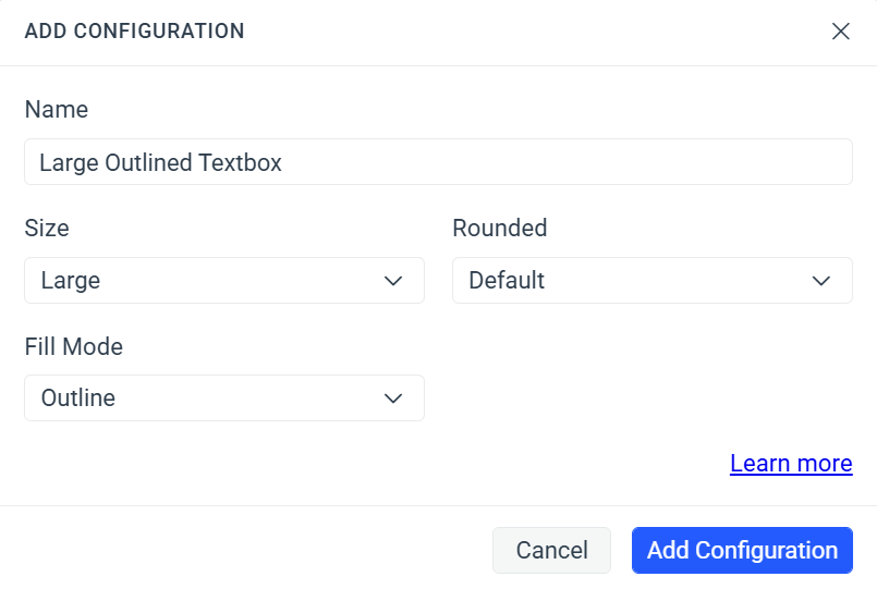
In the ADD CONFIGURATION popup:
-
Enter a name for the new component variant, for example,
Large Outlined TextBox. -
Select the desired values for the exposed component properties. For the TextBox component, the available properties are
Size,Fill Mode, andRounded. You can omit any of the properties.
-
-
Select Add Configuration to add the new component variant.
-
Apply advanced customizations to the newly created component variant.
To use the styles applied to the component variant through ThemeBuilder, render it in your application by choosing the same options you used in the component configuration:
    <kendo-textbox
        size="large"
        fillMode="outline"
        rounded="medium"
></kendo-textbox>Duplicating Components
Similar to component configurations, component duplicates enable you to create different variants of the TextBox component. However, instead of relying on configuration options like size, fill mode, and rounding, they use custom classes. To use component duplicates to create a unique look for the TextBox component, follow these steps:
-
Enable Advanced Edit in ThemeBuilder.
-
Hover over the drill-down container of the TextBox component and select the ... button (more options).
-
Select Duplicate.
-
In the DUPLICATE popup:
-
Enter a name for the new component variant, for example,
Error TextBox. -
Enter a class name, for example,
my-error-textbox—this becomes the unique selector for the newly created component variant.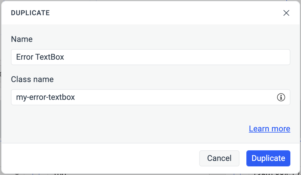
-
-
Apply advanced customizations to the newly created component variant.
For projects based on Kendo theme versions Q1 2024 or earlier, make changes to the default top-left templates on the canvas of the component duplicate. This allows you to apply styles by adding a custom class to the component when rendering it, without setting additional configuration options as detailed in Using Component Configurations.
To use the styles applied to the component variant through ThemeBuilder, render it in your application by choosing the class name you used in the creation of the duplicate:
<kendo-textbox class="my-error-textbox"></kendo-textbox>