Creating Component Variants
Component variants in ThemeBuilder allow you to expand the collection of available component variations by adding new ones. The variants you add are based on the components that are already available in ThemeBuilder.
Out of the box, the Telerik and Kendo UI components deliver an extensive set of component variants that allow you to achieve a specific look and feel. The Button, for example, offers a number of variants based on the component's state (normal, hover, active, and others), the component's fill mode (solid, outline, and flat), the component's color theme (primary and secondary), and even more.
If the built-in variations cannot cover your requirements, you can add new component variants in two ways:
Both approaches help you achieve similar results but in a different way.
Component Configurations Overview
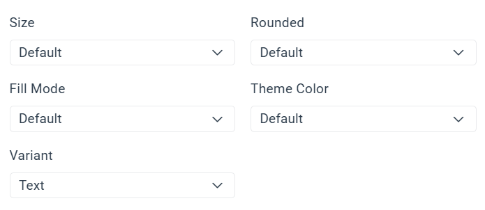
By default, ThemeBuilder lists the base components from the Kendo/Telerik suites with all properties set to Default and with the base component variation.
In most cases, the default configuration should remain your main styling template for a component. Create additional property-based configurations only when your design requirements call for distinct styling that must apply to a specific combination of built-in component options.
For example:
- The default styling template for the Button component corresponds to a button with
size,rounded,fillMode, andthemeColorset toDefault(this is the default value introduced in all Kendo theme flavors starting from version Q1 2026) and with the base variant set toText(a Kendo Button can have three variants:Text,Icon & Text, andIcon Only).
When assigning a custom style directly on the default styling template, behind the scenes ThemeBuilder creates styles that apply globally to all Buttons.
For example, the generated CSS looks as follows:
.k-button {
  font-size: 12px;
}
The above works for creating common styles, but it is not a good approach for creating cascading styles for multiple button variants based on their built-in Kendo properties and features (variants). This is where creating component configurations or component duplicates comes in handy.
While the examples in this article use the Button component, the same configuration approach applies to all Telerik and Kendo UI components exposed in ThemeBuilder projects based on version Q1 2026 or later.
When creating a component configuration, you create a styling template in ThemeBuilder that generates styles with higher specificity based on the applied properties and variants.
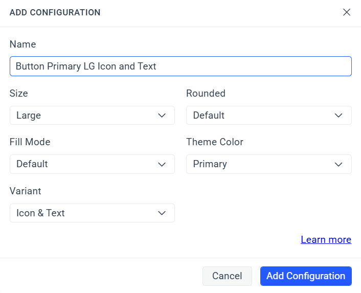
For example, let's assume that you want to have a Button with themeColor set to Primary, size set to Large, and Variant set to Icon & Text. Then you can add the following configuration:
Behind the scenes, custom styles applied to that configuration generate a rule similar to the following:
.k-button.k-button-lg.k-button-primary {
  /* custom CSS here */
}

.k-button.k-button-lg.k-button-primary .k-button-icon {
  /* custom CSS here */
}

.k-button.k-button-lg.k-button-primary .k-button-text {
  /* custom CSS here */
}
With the above, you can now create your buttons in your application and the generated styles apply only to those that are explicitly using the defined properties and variants.
Adding Component Configuration
By adding a new component configuration, you create a new component variant by modifying the component properties provided by the theme. Such properties include size, theme color, fill mode, rounded, and other component-specific options.
Adding component configuration is a feature introduced for all Kendo and Telerik components with version Q1 2026 of the Telerik and Kendo UI themes. Projects with versions between Q2 2024 and Q4 2025 support component configurations only for the Button and TextBox components. If your project is based on a Telerik and Kendo UI theme earlier than Q2 2024, the Add Configuration feature is not available.
To create a component variant by adding component configuration:
- In ThemeBuilder, select Advanced Edit.
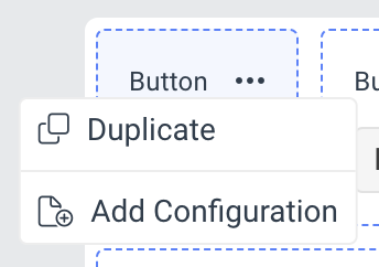
- Hover over the drill-down container with the desired component and select the ... button (more options).
- Select Add Configuration.
- In the ADD CONFIGURATION popup:
- Enter a name for the new component variant, for example,
Primary Large Button.
- Enter a name for the new component variant, for example,
- Select the desired options from the drop-downs.
 1. Select **Add Configuration** to add the new component variant.
The newly created component variant with all applied options appears next to the default one. To see the applied options, select the ... button and then click See Configuration.
Using Component Configurations in Your Application
After you export the theme from ThemeBuilder and integrate it into your application, you use a component configuration by rendering the same Telerik or Kendo UI component with the same appearance-related properties that you selected in ThemeBuilder.
For example, if you keep styling changes in the default configuration, the exported styles apply when the component is rendered with its default appearance settings.
If you create a more specific configuration, the exported styles apply only when the rendered component matches that configuration. This lets you keep the default configuration for broad styling and add targeted configurations only for cases that need a distinct look.
For example, a configuration created for a Button with themeColor set to Primary generates styles for a selector similar to .k-button.k-button-primary. A more specific configuration that combines themeColor, size, and fillMode generates a more specific selector that applies only when all selected options are present.
The same principle applies in all Telerik and Kendo UI suites:
- In KendoReact, set the corresponding component props.
- In Kendo UI for Angular, set the corresponding component inputs.
- In Telerik UI for Blazor, set the corresponding component parameters.
- In other Telerik and Kendo UI suites, use the matching component configuration API so the rendered markup includes the same built-in classes targeted by the exported theme.
Representative example using a Button component:
<Button>
  Default Button
</Button>

<Button themeColor={'primary'}>
  Primary Button
</Button>

<Button themeColor={'primary'} size={'large'} fillMode={'outline'}>
  Large Primary Outline Button
</Button><button kendoButton>
Default Button
</button>
<button kendoButton themeColor="primary">
Primary Button
</button>
<button kendoButton themeColor="primary" size="large" fillMode="outline">
Large Primary Outline Button
</button><TelerikButton>
Default Button
</TelerikButton>
<TelerikButton ThemeColor="primary">
Primary Button
</TelerikButton>
<TelerikButton ThemeColor="primary" Size="lg" FillMode="outline">
Large Primary Outline Button
</TelerikButton>The important part is not the specific component, but the match between the options configured in ThemeBuilder and the options used in the application. The same approach applies to all components exposed in ThemeBuilder, each with its own supported appearance-related properties and variants.
Start by styling the default configuration and use it as the main design template for the component. Add more specific configurations only when you need styles for a particular combination of built-in component properties.
Migrating Older Projects to Q1 2026
Projects migrated to version Q1 2026 require special attention because ThemeBuilder changed how the default component templates work.
In earlier ThemeBuilder projects, the default template of a component could correspond to a predefined set of property values from the underlying Telerik and Kendo UI theme. For example, older theme versions could treat the default Button template as a Button with themeColor set to Base, fillMode set to Solid, and size set to Medium.
Starting with Q1 2026, the default template no longer represents a component with preset appearance values. Instead, ThemeBuilder lists components with their built-in properties set to Default, which means the component configuration does not preselect concrete appearance values.
Because of this change, when an older project is migrated to Q1 2026, ThemeBuilder can automatically create additional component configurations so that the previously customized styles remain preserved under the new model.
For example, if an older project contains styles that previously targeted a component whose rendering depended on a combination such as a primary solid Button, the migrated project can contain several separate configurations, such as:
- A new default configuration with no preset property values.
- A configuration for the selected
themeColor, for example.k-button.k-button-primary. - A configuration for the selected
fillMode, for example.k-button.k-button-solid.
This automatic split preserves the migrated styles, but it can leave the project with more configurations than you actually need. In most cases, after migration you should review the automatically created configurations and simplify them.
The recommended approach is usually the following:
- Review the migrated default configuration and the automatically created property-based configurations.
- Move the styles that should apply broadly to the new default configuration.
- Keep only the configurations that are still needed for intentional, design-specific property combinations.
- Delete the redundant auto-created configurations after you confirm that the default configuration now carries the shared styling correctly.
This cleanup is usually necessary to complete the migration successfully and to align the project with the Q1 2026 configuration model.
For more information about the underlying theme change, refer to the Telerik and Kendo UI themes breaking changes article for version 13.0.0: Default styling values changed to Default.
For the general ThemeBuilder project migration workflow, see Migrating Projects to New Theme Versions.
After migrating to Q1 2026, do not assume that every automatically created configuration should remain in the project. Keep the default configuration as the main styling template whenever possible and retain extra configurations only when they represent intentional design requirements in the final application.
Component Duplicates Overview
Apart from creating component configuration, another approach for creating distinct styling variations of your components is to create and use duplicates. When a component in ThemeBuilder is duplicated, you use the exact same Kendo/Telerik property values and variants—the difference comes from a custom CSS class that needs to be explicitly added.
Duplicating a Component
When you duplicate a component, you create a new component variant by applying a new class to the existing component. You can duplicate not only the default component variants but also component variants created by adding component configuration.
To create a component variant by duplicating an existing Telerik and Kendo UI component:
- In ThemeBuilder, select Advanced Edit.
- Hover over the drill-down container with the desired component and click the Copy icon button. If the drill-down container has a ... button, then select ... > Duplicate.
-
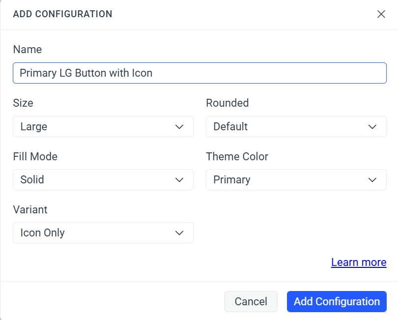
In the DUPLICATE popup:
-
Enter a name for the new component variant, for example,
Error Button. -
Enter a class name, for example,
my-error-button—this becomes the selector for the newly created component variant.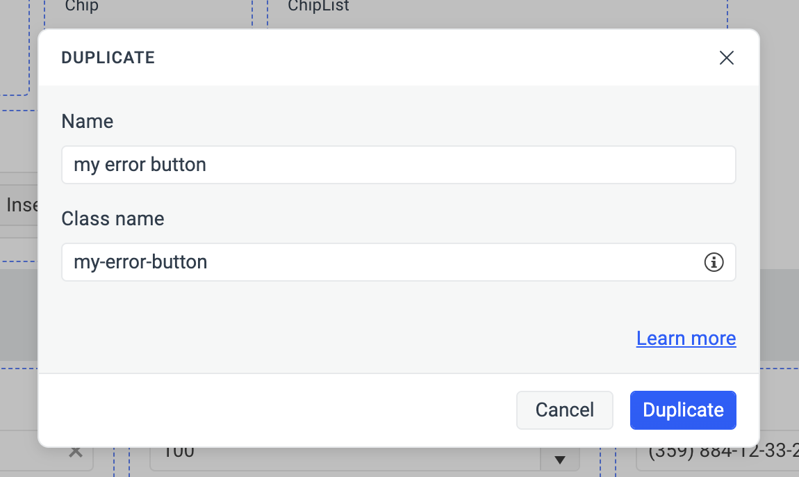
-
-
Select Duplicate to add the new component variant.
The class name for the new component variant must be unique, as it serves as a component variant selector. To deduce the complete selector for the new component variant, append the class name that you assigned to the root class of the component. For example,
.my-error-button.k-button, where the root class is.k-buttonand the class name that you assigned ismy-error-button.
Duplicating a Duplicate
You can generate additional component variants by building upon previously created and styled variants. This lets you reuse the styles that you've already applied to a component variant. By duplicating a duplicate, you take advantage of the inheritance chain, eliminating the need to restyle the original Telerik and Kendo UI components from scratch.
To duplicate a previously created and styled component variant:
- In ThemeBuilder, select Advanced Edit.
- Hover over your component variant and select the ... button (more options) in the upper-right corner.
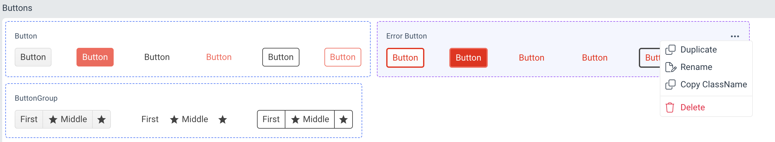
- Select Duplicate from the drop-down menu.
- In the DUPLICATE popup:
-
Enter a name for the new component variant, for example,
Circle Error Button. -
Enter a class name, for example,
my-circle-error-button—this becomes the selector for the newly created component variant.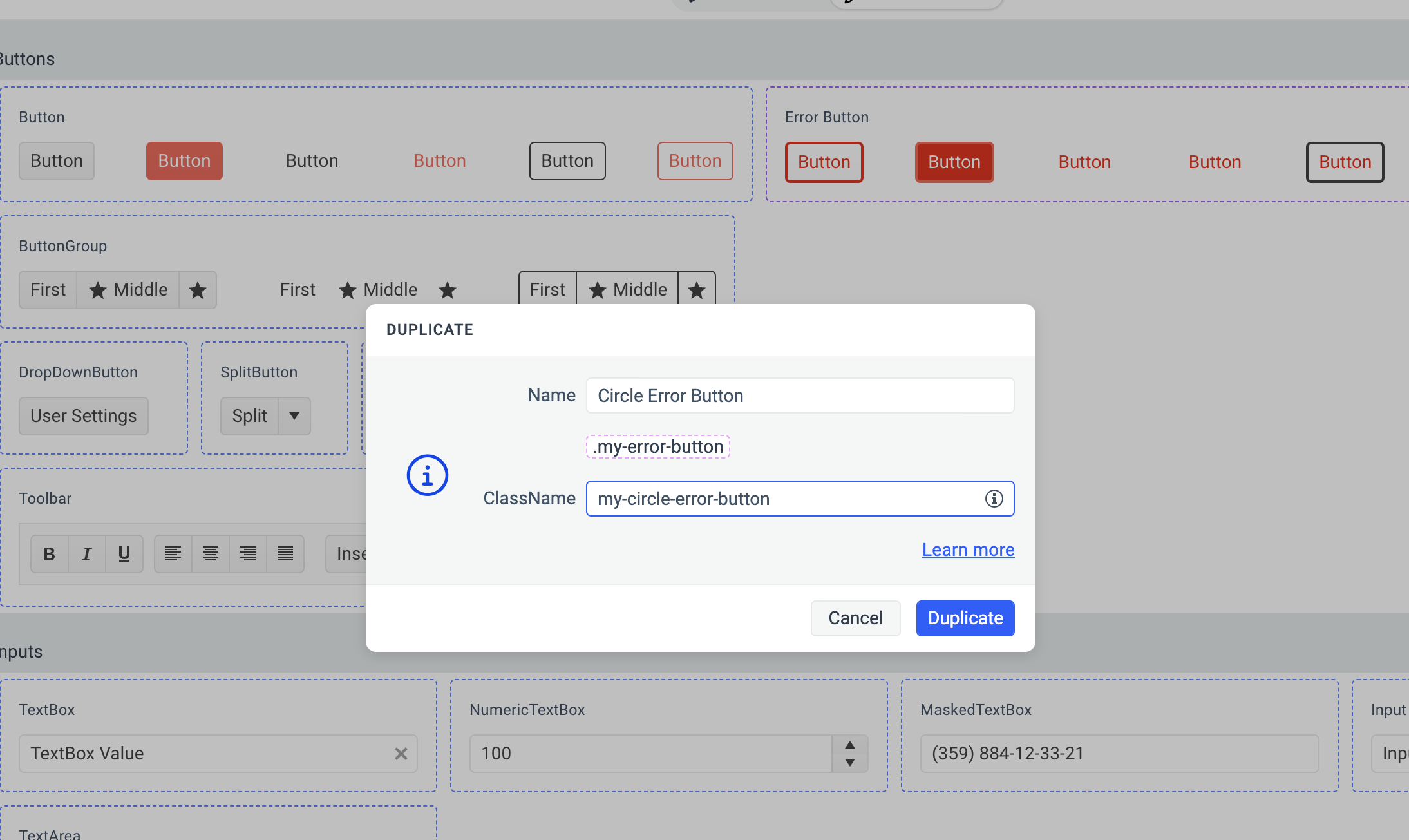
-
- Select Duplicate to add the new component variant.
The DUPLICATE popup displays a hint with the chained predecessor classes, for example,
.my-error-button. Use this information to deduce the complete selector for the newly created variant. For example,.my-circle-error-button.my-error-button.k-button, where.k-buttonis the selector for the root Button component,.my-error-buttonis the selector of the previously created variant, and.my-circle-error-buttonis the selector for the last variant in the chain.
Styling Component Variants
Consider the following when styling a component variant:
- Styling component variants works in the same way as with the base Telerik and Kendo UI components. For more details, see the Advanced Customization article.
- The component variant that you create inherits all styles from the duplicated component. For example, when duplicating the Button component, the new variant inherits all
.k-buttonstyles. For more information, see the article on styling strategies.
Components Supporting Added Configuration
The following components support creating new variants by adding component configuration—a feature first introduced with Telerik and Kendo UI themes version Q2 2024. These components have an Add Configuration button in their ... (more options). Every subsequent ThemeBuilder version will add more components that support this functionality.
| Component | Supports Added Configuration since |
|---|---|
| Button | Q2 2024 |
| TextBox | Q2 2024 |
| All Other Kendo and Telerik Components | Q1 2026 |
When migrating projects with theme versions earlier than Q2 2024 that contain styled Button or TextBox components to projects with theme versions Q2 2024 or later, the corresponding component variants are created automatically.
Related Articles
- Creating and Styling Component Variants (Knowledge Base Article)
- Setting the Color of a Flat Button in Its Hover and Focus States
- Applying Advanced Customizations
- Migrating Projects to New Theme Versions
- How to Create a Unique Look for the Button Component
- How to Create a Unique Look for the TextBox Component