Advanced Edit
In ThemeBuilder, you can manually edit UI component properties and apply advanced styling strategies that can completely transform their appearance.
To enable advanced functionality and start editing UI component properties, open your ThemeBuilder project and select Advanced Edit. This button lets you drill down into the selected components and turns the components pane into an infinite canvas where you can inspect and edit all UI components and their variants.
Before proceeding with advanced customization, use ThemeBuilder to build your own visual styles that you can apply in a granular way to the UI components in Advanced Edit.
General Guidelines
-
Create a component configuration in Advanced Edit by using the Add Component Configuration option.
-
Once the configuration is created, proceed by selecting it and drilling down into the configuration template.
In Advanced Edit, the selected Kendo UI component is previewed as a styling template in the chosen configuration. The templates in ThemeBuilder follow recommended rules that save time:
-
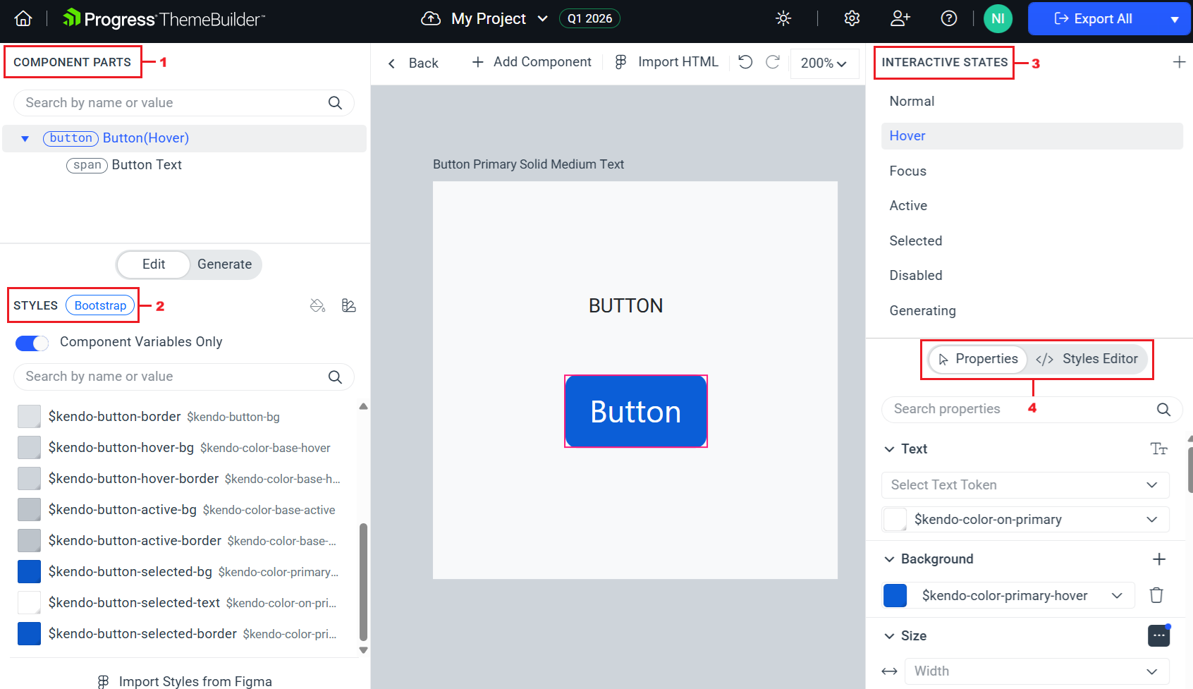
Use the COMPONENT PARTS pane—Inspect the component parts and select the ones that you would like to customize.
-
Use the STYLES pane—Modify related Kendo variables or use custom ones to assign styles for component-specific variables.
-
Use the INTERACTIVE STATES pane—Start with the most common interactive state of the component, for example, the Button component in its
normalstate. Continue with the states for which you would like to have custom styles.The INTERACTIVE STATES pane allows you to create a combination of multiple interactive states that have their own custom styling (applied when all selected states are triggered simultaneously).
-
Use the PROPERTIES pane—Once the desired component part and interactive state are selected, proceed with fine-tuning the styles through the PROPERTIES pane (interactive UI) or the STYLES EDITOR pane (declarative editor).
Editing the Component Properties
Plan and execute changes to UI component appearance by considering the guidelines above. ThemeBuilder offers a complete set of property editors that allow you to change the CSS properties of the Telerik and Kendo UI components and customize them.
To edit the UI component properties:
-
Open an existing ThemeBuilder project and select Advanced Edit.
-
Select the frame with the desired UI component, zoom in, and then select the component.
-
In the COMPONENT PARTS pane, select the desired component part.
-
Use the Properties or Styles Editor to enter the desired values. The Styles Editor lets you edit the CSS directly, while Properties lets you define your styles in a user-friendly grid. When using the Properties view:
- To enter a value, expand the desired property, click the editor and type the desired value.
- If the property that you edit supports variables, you can select the desired variable from the combo box.
Some browsers (Firefox, for example) limit the clipboard permissions, and you cannot paste content that you copy from other browser tabs or windows. As a result, when you use such browsers, you can copy styles from ThemeBuilder and paste them there, but you cannot paste CSS copied from another browser tab or window.
If you set any non-default values through an editor, the editor will automatically expand when you select the modified UI component. You can use the Reset button of the editor to revert these modifications.