Kendo UI for Angular
What's New 2025 Q2
What's New HistoryWhat's New 2025 Q2
Multiple Enhancements in Kendo UI for Angular Grid
The Kendo UI for Angular Grid is powered by built-in state management, which handles the persisting of key UI states resulting from data operations like paging, sorting, and filtering, as well as column interactions such as resizing, reordering, locking, etc. In that way developers can focus on building, not plumbing. The result is a more intuitive, high-performance Grid experience with less setup and greater flexibility.
And that’s not all! Other Angular DataGrid enhancements are also in-store for you:
- Multiple Range Selection
- Built-in External Editing
- Column Chooser Toolbar Tool
- Toolbar Editing Tools
- Row Spanning
.jpg?sfvrsn=de11a459_2)
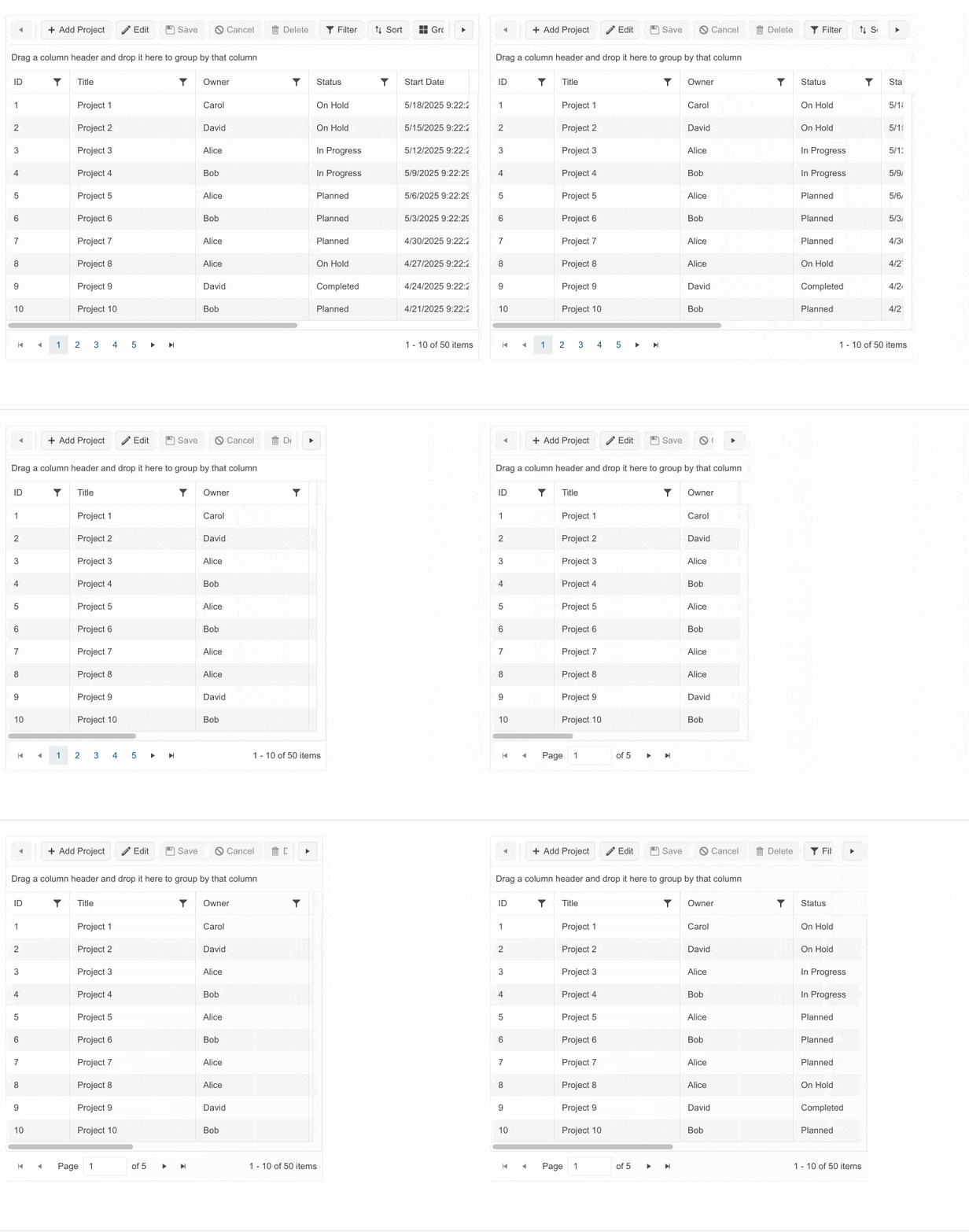
Adaptive Grid UX: A Seamless Experience Across All Devices
We’ve made the Kendo UI for Angular Grid fully adaptive, transforming its UX for optimal mobile experience. This update includes adaptive editing, smarter form components, and a responsive pager that ensures usability on any screen size. Key toolbar tools are now available - including sorting, filtering, and grouping - dynamically adjusting to available space. Popups and dialogs have been transformed into ActionSheet for better behaviour in constrained layouts. Altogether, the Grid now provides a fluid, touch-friendly, and consistent experience across all devices - with no extra configuration required. And stay tuned for more changes – different modes for data visualization on mobile devices are on our radar.
See Kendo UI for Angular Grid adaptiveness demo

Codemods CLI for Assisted Migration to the Newest Kendo UI Version
We’ve launched a Codemods CLI — an assisted migration tool designed to take the pain out of upgrading to new Kendo UI for Angular versions. Whether you're modernizing APIs, or restructuring imports, the Codemods CLI automates tedious code transformations with precision. Developers can choose the source and target versions, preview changes with diff-style output, and review a detailed migration report before applying updates. With built-in safety checks and support for a couple of legacy versions, this tool helps teams confidently adopt the latest features, eliminate deprecated patterns, and accelerate UI modernization — all while minimizing risk and effort.
Check out the Kendo UI for Angular Codemods CLI documentation

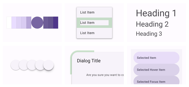
Modernized Look and Feel with the Updated Material Theme (Material 3)
The Telerik and Kendo UI libraries now feature an updated Material theme that aligns with Google’s latest Material 3 design guidelines, delivering a more intuitive, and consistent user experience. With improved spacing, updated color palettes, refined typography, and enhanced component styling, the new Material theme brings a cleaner, more modern aesthetic to your applications.

What's New 2025 Q1
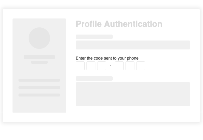
Kendo UI for Angular: New OTP Input Component
Enhance the security of application login with the new Kendo UI for Angular OTP Input component. It simplifies multi-factor authentication by streamlining one-time password entry for the user. Shipping with forms support, mobile-friendly adaptiveness, WAI-ARIA attributes support and keyboard navigation, the Angular OTP Input is flexible and accessible. Fully customizable, this new component supports various input types (number, password, text), different styling options, disabled and read-only modes, and more.
See Kendo UI for Angular OTP Input demo

Kendo UI for Angular: Adaptive Mode for ColorPicker, Tabstrip and Toolbar
The new adaptive rendering feature allows the ColorPicker, Tabstrip and Toolbar components to adapt to the screen size by adjusting dynamically based on the screen dimensions.
Adaptive behavior needs to be defined per-component as a UI-specific solution. For example, the adaptive Kendo UI for Angular TabStrip enables users to scroll through its tabs when the tab list cannot fit in the component boundaries. For the Angular ColorPicker, adaptive mode provides a mobile-friendly rendering of its popup by changing it to an action sheet. The ToolBar adjusts its rendering based on screen size, ensuring overflowing tools remain accessible.
See the Angular ColorPicker Adaptiveness demo
See the Angular TabStrip Sizing demo
See the Angular Responsive Toolbar demo

Multiple Kendo UI for Angular Data Grid Enhancements
With this release, the Angular Grid is enriched with row spanning, enhanced column resizing, resizable grid, drag handle and hint customization.
The new Angular Grid row spanning feature allows cells in a specific column to extend across multiple rows. This works the same way as "cell merging" in Excel. You can implement any custom logic for spanning the desired cells depending on the current Grid state and the application's requirements.
The enhanced column resizing introduces a constrained mode, support for RTL mode, and virtual and reorderable columns.
A third exciting feature the Kendo UI for Angular Grid now boasts is that you can now enable grid resizing to give users greater control over the appearance of the data and how they interact with it.
Lastly, the new built-in ability to customize the drag hint used for row reordering makes your Angular grid even more user-friendly.
See the Angular DataGrid Row Spanning demo
See the Angular DataGrid Column Resizing demo
See the Angular DataGrid Resizable Grid demo
See the Angular DataGrid Row Reordering demo

Kendo UI for Angular: Enhanced UI Customization Tooling
Progress Page Templates and Building Blocks collection got enriched with 12 new Building Blocks such as Dashboard cards, AI App Welcome screen and AI-powered editor, alongside a new AI Usage Monitoring dashboard template.
Page Templates and Building Blocks are pre-configured with Kendo UI for Angular components embedded and come for free with the newly introduced subscription packages.
-770.jpg?sfvrsn=7f021022_2)
Kendo UI for Angular - 2025 Q2
- What's New 2025 Q2
- Multiple Enhancements in Kendo UI for Angular Grid
- Adaptive Grid UX: A Seamless Experience Across All Devices
- Codemods CLI for Assisted Migration to the Newest Kendo UI Version
- Modernized Look and Feel with the Updated Material Theme (Material 3)
- What's New 2025 Q1
- Kendo UI for Angular: New OTP Input Component
- Kendo UI for Angular: Adaptive Mode for ColorPicker, Tabstrip and Toolbar
- Multiple Kendo UI for Angular Data Grid Enhancements
- Kendo UI for Angular: Enhanced UI Customization Tooling


