Styling RadGridView
Figure 1: The default RadGridView control
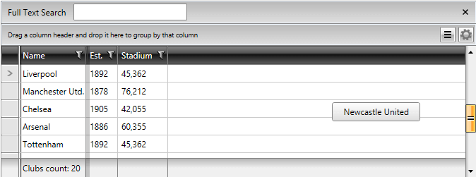
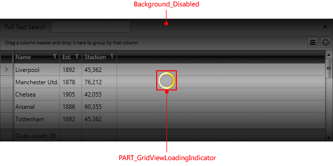
Figure 2: RadGridView template structure

Targeting the RadGridView Element
In order to style all instances of RadGridView in your application, you should create an appropriate style targeting the RadGridView control.
You have two options:
-
To create an empty style and set it up on your own.
-
To copy the default style of the control and modify it.
To learn how to modify the default RadGridView style, please refer to the Modifying Default Styles article.
Example 1: Styling all instances of RadGridView in an application
	<Style TargetType="telerik:RadGridView">
	    <Setter Property="Foreground" Value="Red"/>
	</Style>
If you're using Implicit Styles, you should base your style on the RadGridViewStyle.
Setting RadGridView's Style Property
RadGridView exposes a Style property that allows you to apply a style to a specific RadGridView control.
Example 1: Setting RadGridView Style
<telerik:RadGridView Style="{StaticResource RadGridViewStyle}" />Controlling RadGridView Appearance through Properties
RadGridView also exposes a number of properties with which you can easily customize the control without the need of modifying its default style. They can be separated into the following categories:
General
This section covers the following properties:
-
GridLinesVisibility: Control the way by which the grid lines are visualized. You can choose one of the four possible values defined in the GridLinesVisibility enumeration - Both, Horizontal, Vertical and None.
-
ShowColumnHeaders: Shows\hides the column headers.
-
ShowColumnFooters: Shows\hides the column footers.
-
ColumnBackground: Defines the default background color for all columns.
-
VerticalGridLinesBrush: Defines the default color for all vertical grid lines.
-
HorizontalGridLinesBrush: Defines the default color for all horizontal grid lines.
Here is a small sample, demonstrating the usage of some of the above properties.
Example 2: Usage of General properties
	<telerik:RadGridView GridLinesVisibility="Vertical"
	                 ShowColumnFooters="True"
	                 ShowColumnHeaders="False"
	                 ColumnBackground="Bisque"/>
The final result should be similar to this:
Figure 3: The result of the modified General properties
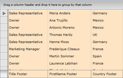
You can see that the columns headers are not visible while the column footers are; moreover, there are only vertical gridlines and the background of all columns is set to Bisque.
Columns
This section covers the following properties:
-
MinColumnWidth: Gets or sets the minimum width constraint of a GridViewColumn. The minimum width of the object, in pixels. This value can be any value equal to or greater than 0. However, System.Double.PositiveInfinity is not valid.
-
MaxColumnWidth: Gets or sets the maximum width constraint of a GridViewColumn. The maximum width of the object, in pixels. The default is System.Double.PositiveInfinity. This value can be any value equal to or greater than 0. System.Double.PositiveInfinity is also valid.
-
ColumnWidth: Gets or sets the width of a GridViewColumn.
Here is a small example that demonstrates the usage of some of the above properties.
Example 3: Usage of Columns properties
<telerik:RadGridView MinColumnWidth="20" MaxColumnWidth="100" ColumnWidth="80"/>Rows
This section covers the following properties:
-
RowIndicatorVisibility: Shows\hides the row indicators, located on the left of each row.
-
RowDetailsVisibilityMode: Controls the way by which row details are visualized. You can choose from one of the three possible values defined in the GridViewRowDetailsVisibilityMode enumeration: Collapsed, Visible and VisibleWhenSelected.
-
AlternationCount: Controls the alternate rows count. For example, when set to 2, every second row will have alternating style applied.
-
RowStyle: Specifies a style for the rows. Read more
-
AlternateRowStyle: Specifies a style for the alternate rows. Read more
-
RowDetailsStyle: Specifies a style for the row details. Read more
-
HeaderRowStyle: Specifies a style for the header row. Read more
Here is a small example that demonstrates the usage of some of the above properties.
Example 4: Usage of Rows properties
	<telerik:RadGridView RowIndicatorVisibility="Collapsed"
	                 RowDetailsVisibilityMode="VisibleWhenSelected"
	                 AlternationCount="2">
	    <telerik:RadGridView.RowDetailsTemplate>
	        <DataTemplate>
	            <Border BorderThickness="2" Height="35">
	                <TextBlock Text="{Binding Name}" VerticalAlignment="Center" HorizontalAlignment="Center"></TextBlock>
	            </Border>
	        </DataTemplate>
	    </telerik:RadGridView.RowDetailsTemplate>
	</telerik:RadGridView>
Figure 4: The result of the modified Rows properties
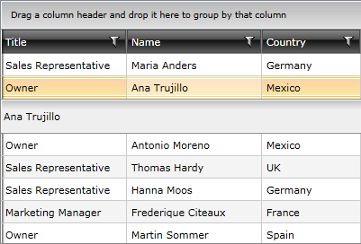
You can see that the row indicators are missing and the row details are displayed only for the selected row. Moreover, each even row has different styling because of the AlternationCount property.
Groups
This section covers the following properties:
-
ShowGroupFooters: Shows\hides the group footers, located at the bottom of each group.
-
ShowGroupPanel: Shows\hides the group panel, located at the top of the RadGridView control.
-
GroupRowStyle: Specifies a style for the group row. Read more
-
GroupFooterRowStyle: Specifies a style for the footer group row. Read more
Here is a small example that demonstrates the usage of some of the above properties.
Example 5: Usage of Groups properties
	<telerik:RadGridView ShowGroupFooters="True"
	                 ShowGroupPanel="False">
	    <telerik:RadGridView.GroupDescriptors>
	        <telerik:GroupDescriptor Member="Country">
	        </telerik:GroupDescriptor>
	    </telerik:RadGridView.GroupDescriptors>
	</telerik:RadGridView>
Figure 5: The result of the modified Groups properties
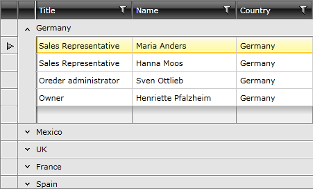
You can see that the group footers are shown while the group panel (located at the top of the RadGridView) is no longer visible, thus making any changes in the grouping impossible.